


Pattern splicing interior design: a step-by-step mixing guide
This guide walks through how to combine prints, motifs, and colorways across a room so the result reads as confident rather than chaotic. By the end, you'll know how to choose an anchor pattern, build a color strategy, and distribute patterns across surfaces plus lower-risk entry points for anyone not ready to commit to a full transformation.
The logic behind pattern splicing interior design
Pattern splicing is a practical description of something many people attempt instinctively but rarely execute with full clarity: layering prints across a room so they create visual tension rather than simply match.
The approach gets interesting when archival motifs with deep historical roots are placed in color contexts they were never designed for. Designer Claire Vallis of Clayworth set out to create "something shocking, unusual, different, and unexpected" with her Bedford Park textile collection, applying Victorian-era Arts & Crafts patterns to backgrounds drawn from the psychedelic palettes of the 1960s and '70s, per Elle Decor. The same collection also includes quieter colorways, period-accurate soft greens and blues, that produce rooms with very different energy but equally deliberate results.
Both ends of that range are valid. Successful pattern splicing balances contrast with cohesion through three levers: scale, color, and motif continuity. Get those three in the right relationship and a room reads as confident. Miss them and it just reads as busy.
What pattern splicing is (and what it isn't)
Pattern splicing is the intentional layering of prints that share some underlying logic, whether a color relationship, a scale contrast, or an era reference, while deliberately introducing visual surprise through at least one of those dimensions. The distinction between splicing and clashing comes down to intentionality. A spliced room looks like someone made choices. A clashed room looks like someone kept shopping.
Think of it like a good cover version: it only works if you understand what made the original worth revisiting. A bad cover replaces everything. A good one keeps the melody and changes what's underneath it. The motif is the melody; the color, scale, and surface placement are what you rewrite.
The Bedford Park collection operates at both ends of the spectrum. At the bold end, Arts & Crafts florals land on bright backgrounds. Vallis identified "the surprising element of seeing a Morris design on a bright background" as the conceptual starting point, Elle Decor reported in mid-2024. At the quiet end, Voysey-derived patterns kept their original period palette. The gentle greens and blues are "authentic to both the period and Voysey's original vision," and Vallis describes the effect as having "breathing space" and "Art Nouveau stencil naiveté," per Elle Decor.
Both are pattern splicing. Neither is random.
How to mix patterns in interior design: a step-by-step approach
Prerequisites: Before buying anything, identify your room's dominant light source. Natural and artificial light read pattern colors very differently, and a print that looks warm and grounded in daylight can shift significantly under incandescent bulbs. Know whether you're working with existing furniture or starting from scratch, and decide whether your first move will be a wall surface or a textile. These factors determine where you anchor your choices and how tightly you need to constrain your color range.
Step 1: Choose one dominant pattern and commit to it
Pick one print to lead, usually the largest-scale motif with the most visual weight. In most rooms this will be wallpaper or a large upholstered piece. Everything else gets calibrated against this anchor.
A dense, intricate heritage floral in deep color calls for secondary patterns with more open structure and lower visual complexity. A quieter, more spacious print can support a bolder secondary. The anchor sets the ceiling for the room.
Hold any new pattern you're considering physically against the anchor before deciding. Your eye will usually answer faster than your reasoning.
Step 2: Add a second pattern at a noticeably different scale
A large, complex motif generally works better paired with a smaller geometric, a narrow stripe, or a more open print than with another dense pattern of similar size. Two prints that are close in scale but slightly different in character tend to read as a mistake rather than a choice. If the contrast isn't obvious enough to look deliberate, it probably isn't.
One structural move from the Bedford Park approach is worth borrowing directly: nearly all the collection's patterns are rendered in both fabric and wallpaper, with scale varying between the two, so they can coordinate across surfaces without simply repeating, according to Elle Decor. Coordination without matching reads as intentional rather than repetitive.
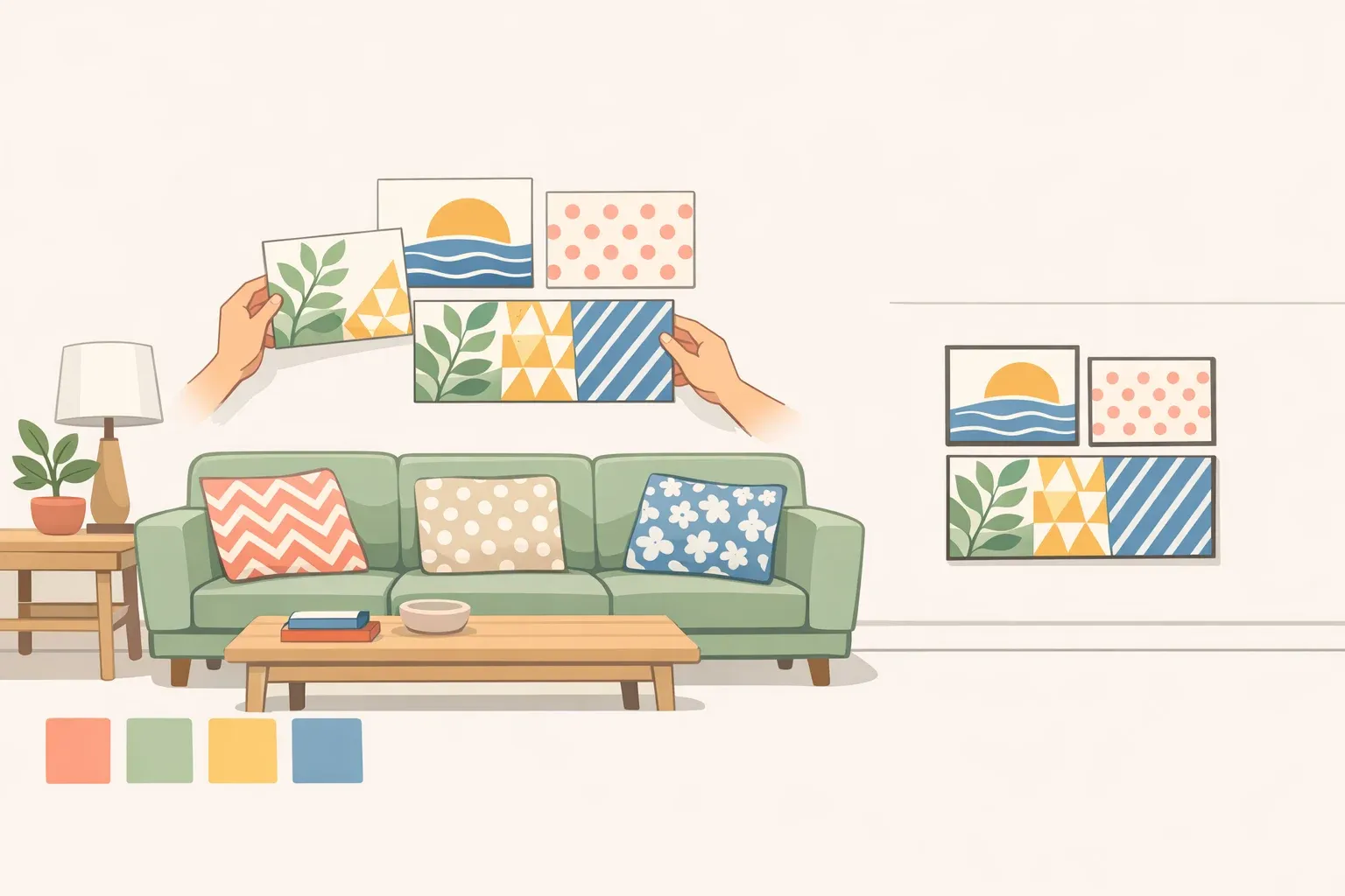
Concrete example: a dense heritage botanical on the wallpaper, a narrow stripe on the chair upholstery, a solid or near-solid on the curtains. The stripe is subordinate in complexity; the solid gives the eye a rest. Three surfaces, clear hierarchy, no two prints competing directly.
Step 3: Lock your color strategy before adding anything else
This is where pattern combinations hold together or come apart. Two coherent options exist. Pick one before proceeding.
Option A, era contrast: Place archival motifs on background colors they were never designed for. Vallis drew explicitly on "punky colors, bright pinks, and the psychedelic tones" of the 1960s and '70s as backgrounds for Victorian-era patterns, producing immediate visual impact through the collision of eras, per Elle Decor. Use this when you want the pattern combination to be the room's primary statement.
Option B, period palette: Keep colors historically consistent with the motif's origins. The Voysey designs in Bedford Park stay in gentle greens and blues "authentic to both the period and Voysey's original vision," Elle Decor noted. The motifs carry the room without color adding extra noise, though this approach requires the prints themselves to be strong enough to hold the space unassisted.
One practical limit worth setting: if the prints don't share at least one color thread across the combination, the room will tend toward visual noise regardless of how strong each individual pattern is. A single shared tone, even a subtle one, does more structural work than any individual pattern choice.
Once the color strategy is fixed, assessing any new pattern becomes considerably faster. You have a filter.
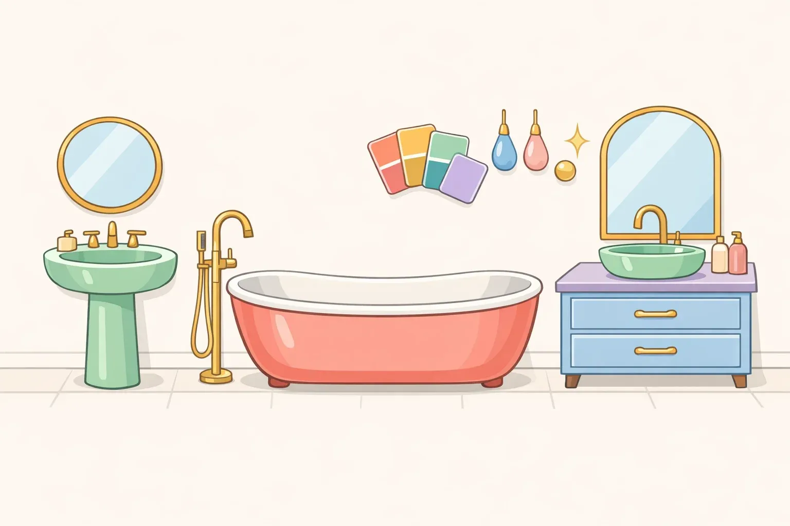
Step 4: Distribute patterns across surfaces with intention
Patterns need to be placed deliberately, not filled in. A surface hierarchy to work from:
- Walls carry the heaviest visual load per square foot. Lead with your anchor pattern here or on the largest upholstered piece, not both simultaneously unless you're committing to full maximalism.
- Upholstery (sofas, armchairs) is the second-highest-impact surface. Use a pattern that's clearly subordinate to the wall in scale or complexity; use a solid if the wall is already working hard.
- Curtains can anchor a pattern combination or recede from it. Long panels in a heritage print bring period weight; in a solid or near-solid, they become negative space that lets everything else breathe.
- Rugs add a floor-level pattern layer that doesn't compete directly with the primary surfaces, useful for adding complexity without overwhelming the room.
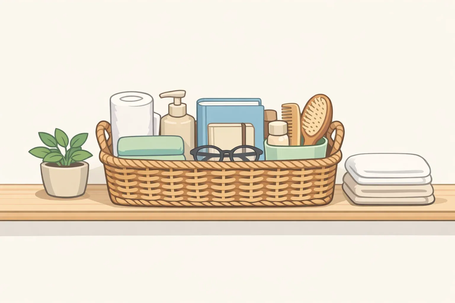
- Cushions and smaller textiles are the most flexible surface and the lowest-stakes way to test a pattern combination before committing to anything structural.
Concrete example: heritage botanical wallpaper, striped upholstery chair, solid curtain, geometric cushions in one of the wallpaper's secondary colors. Four surfaces, three patterns, one solid anchor, clear hierarchy.
Even the boldest pattern-heavy rooms need at least one surface where the eye can recover. Without it, a room stops reading as a statement and starts reading as exhausting.
Step 5: Calibrate intensity and know when to pull back
Full maximalism, pattern across every surface at high density, is a legitimate choice, but only with full commitment. Vallis noted that the most eye-popping Bedford Park pieces were designed to make someone feel "rebellious, like they want to make a statement," while deliberately keeping other colorways subtle, per Elle Decor. Both ends of the dial are valid. Landing halfway between them without meaning to is the mistake.
If full coverage isn't the goal, concentrate pattern density in one zone: a single wallpapered wall plus the upholstered pieces facing it, with other surfaces receding into plain paint or texture. A room where pattern is concentrated reads as curated. A room where pattern is distributed thinly across every surface with no visual resting space reads as tentative.
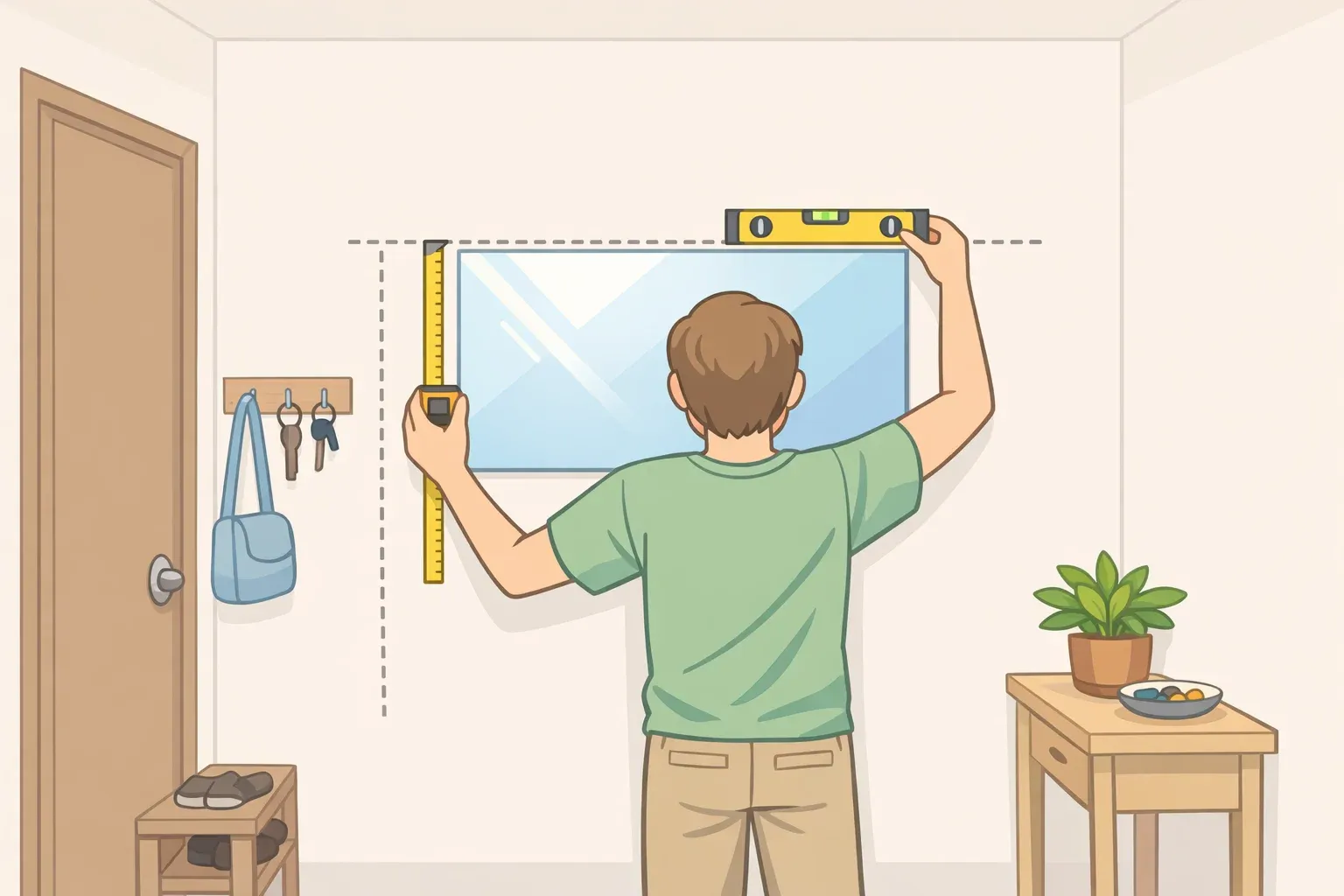
Order physical samples and live with them for several days in the room's actual light before committing to any wall treatment. A motif that looks manageable on a swatch can shift dramatically at room scale, and no digital visualizer captures how patterns interact with each other in real conditions.
Pattern mixing also isn't purely a volume dial. A quiet room with two carefully chosen heritage prints can be just as arresting as one covered in five loud ones. The relationship between prints matters more than the count.
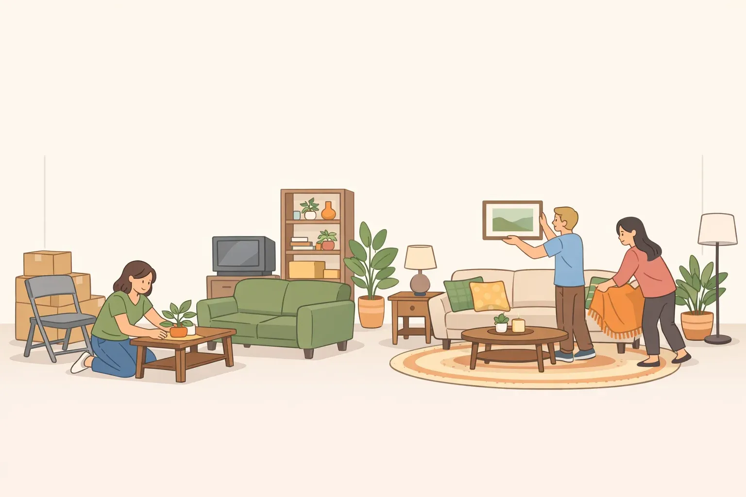
Mixing wallpaper and fabric patterns: lower-risk entry points
Not everyone will wallpaper an entire room, and they shouldn't have to. These moves are fully reversible and cost very little to undo if they don't work.
- Cushions and throws on a plain sofa are the easiest starting point. Try two or three prints at different scales in a shared color family and see whether the combination reads as intentional.
- A single upholstered piece, an ottoman or accent chair in a heritage print against plain walls, lets you assess scale and color impact before committing to any surface that requires installation.
- A wallpapered nook or alcove (a reading corner, a chimney breast, the interior of a bookcase) contains the pattern to one zone, makes the effect easy to control, and is straightforward to reverse with a steamer.
- Curtain panels in a contrasting pattern put scale and motif in play without touching walls or furniture.
Starting small isn't about permanent hedging. It's about finding out whether you like living inside pattern combinations before you commit to ones that are expensive to change.
What comes next
The appeal of pattern splicing isn't that it breaks rules. It's that it applies old motifs in new contexts with enough clarity that the result reads as a position rather than an accident. The Bedford Park collection makes this concrete: some colorways stay faithful to period palettes while others collide Victorian-era motifs with psychedelic pinks, and both work because neither is ambiguous about what it's doing, as Elle Decor reported in mid-2024.
The single most useful next step before buying anything: spend time with historical textile archives. The Victoria and Albert Museum's collection is freely accessible online and covers the full range of Arts & Crafts, Art Nouveau, and related motifs. Understanding what a print was originally designed to do makes the decision to remix it considerably more interesting, and considerably better-informed, than responding to whatever's currently on the shelf.


Comments
Be the first, drop a comment!