



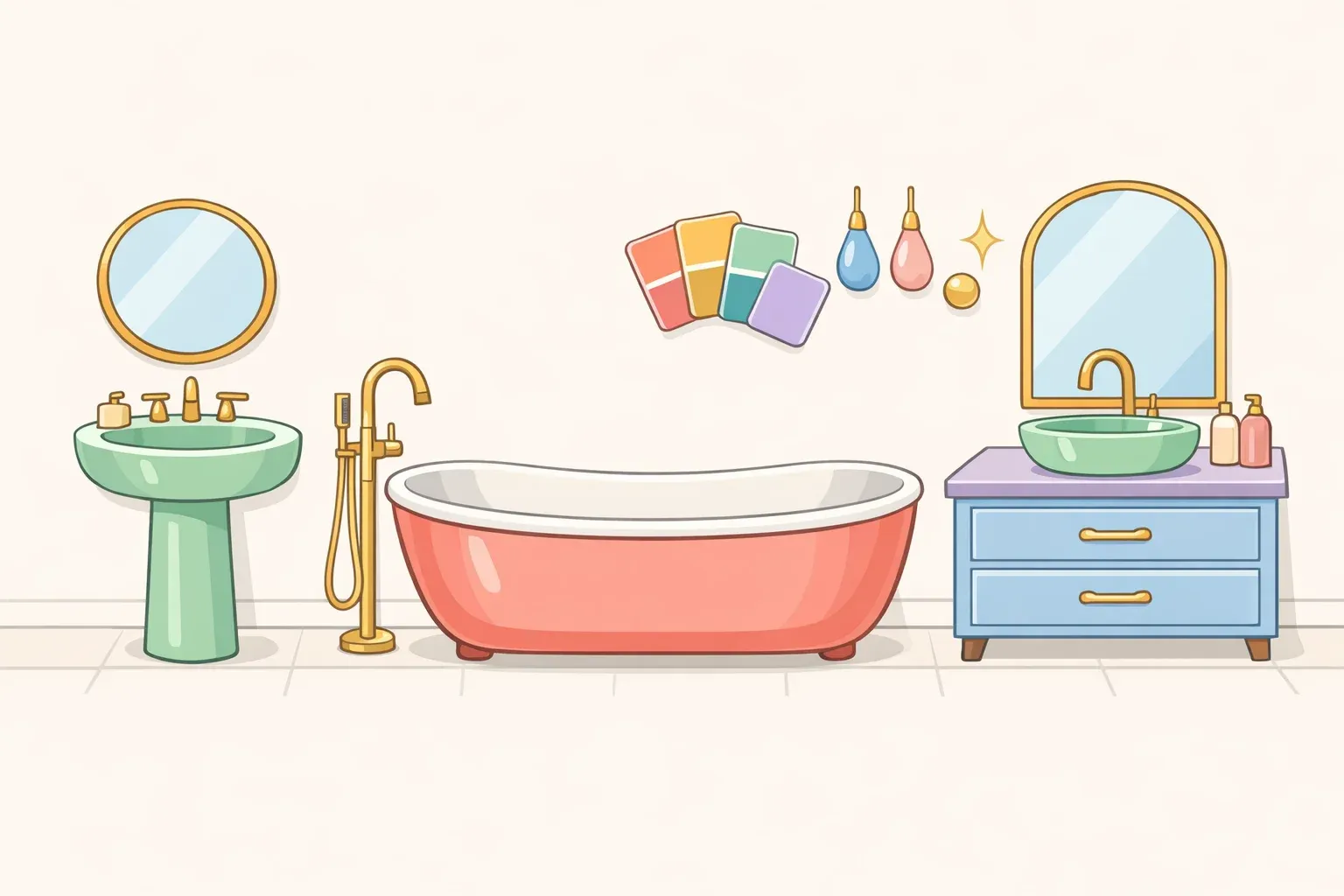
White porcelain swept through American bathrooms about thirty years ago and never left. Now it's losing ground. The colored bathroom fixtures trend has been gaining real traction across social media, shelter magazines, and design-forward renovations, and the appetite behind it is broader than you might expect.
A Kohler-commissioned survey found that 88% of homeowners expressed interest in moving beyond white and chrome for their next renovation. It's manufacturer research, so treat it as appetite data, not a market survey. But it's consistent with what independent designers describe as a genuine shift in how homeowners think about the bathroom as a designed space.
The case is simple enough: one fixture, chosen deliberately and built around properly, can turn a purely functional room into one that has a point of view. The practical question is which fixture, in which room, for which homeowner. The answer that comes back most consistently from designers isn't the toilet, despite all the social media coverage. It's the tub.
This is most useful for homeowners planning to stay put. If resale is on the near-term horizon, that doesn't mean stop reading. It means pay close attention to which choices carry risk and which ones don't.
Why white was the anomaly, not the baseline
White porcelain as a universal fixture standard is only about thirty years old. Interior designer Alison Giese traces the full arc: pastel pinks, baby blues, and butter yellows in postwar 1950s bathrooms; earthy goldenrod and olive tones through the 1960s and 70s; black, almond, and biscuit-colored fixtures through the 1980s and 90s before white swept the field.
Understanding that history matters because it reframes what's happening now. This isn't a bolt-from-the-blue aesthetic moment. It's a return to something that existed for decades before a single neutral tone became the default.
Designer Symington connects the revival to a broader current running through interiors. "There's a strong thread of nostalgia running through interiors right now, a return to tradition, to craftsmanship, to the kinds of details that felt joyful and personal," he told Good Housekeeping. "Colorful fixtures tap into all of that." The wellness-driven bathroom upgrade cycle is amplifying the same impulse. Demand for natural materials, spa-influenced fixtures, and more deliberately designed bathroom spaces has been climbing steadily, with homeowners treating the room as worth the same attention as any other in the house.
Colored fixtures fit that logic. They're another way of treating a utilitarian object as a designed one.
What changes when a fixture gets color
For years, toilets were cropped out of design photographs or disappeared into white walls. Fixtures were infrastructure, not composition. Colorado-based designer Miranda Cullen describes the shift plainly: "What was once neutralized in white porcelain or deliberately cropped out of photos is now intentionally spotlighted," she told Good Housekeeping. Putting a colored fixture into a room is a decision about what the room centers on.
Cullen's own work shows how this plays out. In a recent project, she paired a black toilet with richly patterned, moody wallpaper. Rather than competing with the backdrop, the toilet held its own within it. "It reads as a sculptural object, holding its own within a richly patterned, maximalist backdrop," she said. The fixture wasn't minimized or camouflaged. It was treated as a deliberate piece of the composition.
The practical implication follows directly: a colored fixture rarely works in isolation. Historically, colored toilets appeared as part of a coordinated suite where tub, sink, and toilet all matched. Today's design advice favors a single standout fixture rather than a full matching suite, but that single fixture still requires the surrounding room to acknowledge it. Giese puts it plainly: a colored toilet should seem intentional and ideally complement the existing palette. Drop one in without adjusting walls, tile, or hardware, and it tends to look accidental rather than chosen.
Think of it like introducing a piece of upholstered furniture in a contrasting fabric into a room that's otherwise all neutrals. The furniture works only if the room acknowledges it, through a rug that picks up the color, hardware that complements it, or walls that give it space to read. A colored fixture operates on the same principle.
How to try the colored bathroom fixtures trend without regret
Start with the tub. Multiple designers consistently name the bathtub as the strongest single place to introduce color. Giese says directly that if she were injecting color into one fixture, she'd make it the tub. Symington takes the same position. His preferred version of the trend is a colorful cast-iron tub paired with white sinks and toilets. "Color where it's unexpected, white where it anchors everything," he told Good Housekeeping.
Cast iron has a practical advantage worth understanding: it can be repainted. Symington describes this as "particularly freeing." Committing to a color on a cast-iron tub doesn't mean living with that choice indefinitely, since the exterior finish can be updated as tastes change. The available research doesn't cover the refinishing process, cost ranges, or DIY feasibility, so homeowners inclined to go that route should research those specifics separately before committing.
Use the powder room if you want a colored toilet. The powder room is the most defensible location for this experiment. Giese calls it "a space that can be more design-forward without too much risk." A guest bath rarely carries the same weight in resale decisions as a primary bath, and it's a contained, lower-cost test of the idea.
The risk profile scales with commitment. A single colored toilet is relatively inexpensive and easy to swap out. A full primary-bath renovation, colored tub, matching sink, coordinating floor tile, puts a future buyer in the position of tearing out an entire room if the palette doesn't suit them. That's where real estate agents caution most firmly, though it's worth noting their concerns are anecdotal: there's no transaction data showing whether colored fixtures materially affect sale price or time on market, only individual agents' read of buyer psychology.
Choose grounded colors over striking ones. Kohler's internal research suggests homeowners are gravitating toward greens. Earthy tones that reference nature tend to feel more approachable and livable than high-saturation or primary colors. The broader logic applies regardless of manufacturer. A color you want to spend fifteen minutes in every morning is a different calculation from one that photographs well.
Build the hardware around the fixture. A colored fixture is only as successful as the room assembled around it. Matching every faucet, bar, and fitting to a single metal finish is no longer the prevailing standard. One dominant finish on the most prominent fixtures, a secondary accent echoed in at least two other places, and a hard limit of two or three metals total. That's what keeps the mix reading as deliberate rather than accumulated, according to Block Renovation. The repetition is what separates intentional from haphazard.
The short version:
Do it if you're in the home long-term and willing to build the room's design around the fixture
Use the powder room if you want to experiment with limited financial and resale exposure
Start with a cast-iron tub if you want the version designers most consistently endorse
Hold off if you're selling within a few years, and a colored fixture would require a full primary-bath redesign to work properly
What the trend is actually about
Colored bathroom fixtures hold up as an idea because this isn't really about a specific color or product. It's about rejecting the premise that bathroom fixtures are neutral background objects. Treating them the same way you'd treat any other element in a designed room, as something that should earn its place visually, is a durable design principle, not a passing aesthetic.
The most consistent version across sources: one colored fixture as a deliberate anchor, white elements providing contrast, mixed metals completing the composition without overwhelming it. The tub remains the most recommended starting point. It's the most visible, the most flexible through repainting, and less fraught from a resale perspective than a full coordinated suite.
Symington's advice cuts through the deliberation cleanly: "Pick a color you genuinely love rather than one you think you should love and let the bath be your starting point. Trends will come and go, but a bathroom that makes you smile every morning is never wrong." The broader shift toward wellness-driven bathroom investment, natural materials, and layered finishes has already repositioned the room as worth real design attention. A colored tub fits naturally into that frame. It's one more signal that someone actually thought about the space.














Comments
Be the first, drop a comment!