



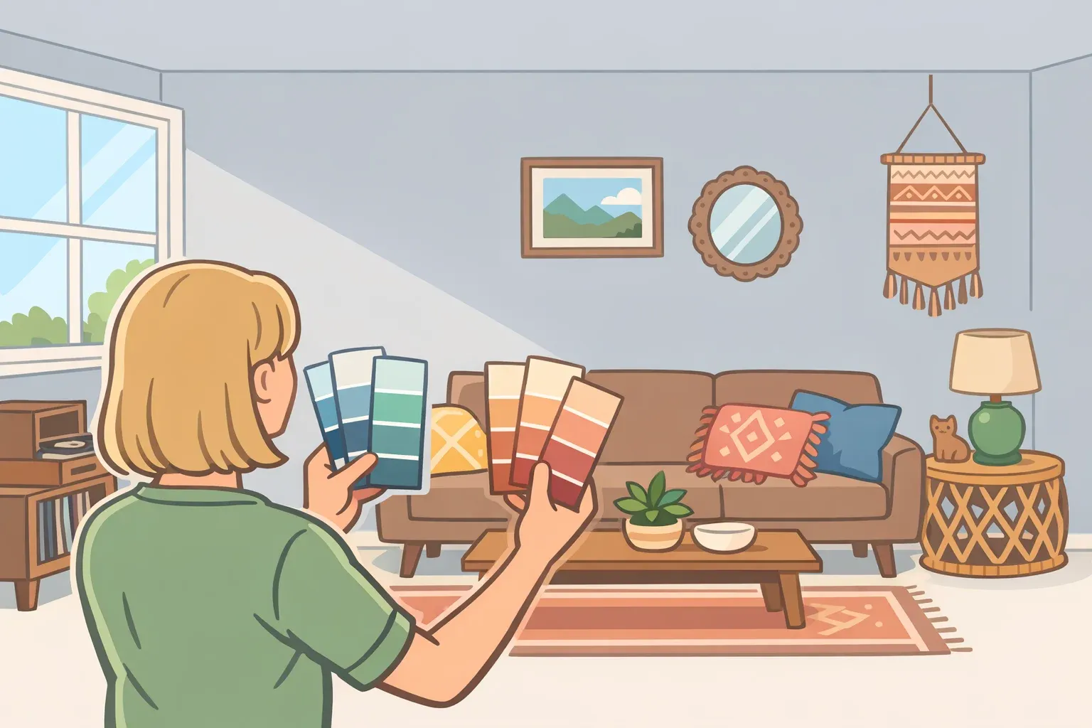
Outdated paint colors: a 5-step guide to diagnosing gray walls
Gray is not the problem. Worth stating clearly, because the current design conversation can make it sound otherwise. What multiple designers have identified across several publications over the past year is a more specific failure mode: cool gray applied to every surface without much thought walls, trim, cabinetry, floors as a safe default rather than a deliberate choice. That version of gray stopped feeling calm and started feeling empty.
This is not an article about whether gray ranks among the outdated paint colors in theory. It's about whether your gray is working in practice. The frame for making that call comes down to three variables: undertone, coverage, and how well your existing furnishings compensate for the color's limitations. Once you've read those signals, the path is clear: keep the gray as-is, rebalance the room without repainting, or repaint and replace it.
Interior designer Alice Moszczynski traces gray's rise to a logical place: after years of Tuscan-inspired yellows and heavy builder beiges, something cleaner and more minimal felt like relief, House Beautiful reported last September. Designer Dijana Savic-Jambert put the backlash just as plainly: "It became the default choice for everything, and in doing so, it's lost its soul." That's the version of gray worth diagnosing not gray as a considered option, but gray as a habit.
Why the backlash happened (the short version)
Understanding the complaint helps calibrate whether it applies to your room.
As gray spread from walls to cabinetry to furniture to fixtures, homes began to feel less like inhabited spaces and more like staged ones. New-build apartments and modern farmhouse interiors became nearly interchangeable, the same flat, cool palette regardless of architecture, owner, or light conditions, House Beautiful noted last September. Designer Terri Brien sums it up as "characterless and sterile," adding that spending full days inside those spaces during the pandemic made the emptiness impossible to ignore.
The design response has been consistent. Clients are now explicitly asking for homes that support their mental health and daily routines, spaces that restore rather than merely contain, Architectural Digest reported last November. Designer Zoë Feldman captured the underlying demand more plainly: "After years of oatmeal walls and sofas, people are ready for rooms with a pulse," she told Better Homes & Gardens last December.
The key phrase is "cold minimalism." The complaint isn't about neutrals as a category. It's about cool, flat, tonally uniform gray deployed at scale, and that distinction matters for the diagnosis below.
Where gray sits among other outdated paint colors in 2026
Gray gets special treatment in this conversation because it was deployed differently from other dated colors. Butter yellow, bright red, plum, and cool white are all on designers' lists of colors they'd rather not see this year, The Spruce reported earlier this year, but none of them achieved the same whole-home saturation. Butter yellow tends to appear as an accent or a kitchen choice; designer Jennifer Jones notes it "instantly dates a space" with what she calls "unmistakable granny vibes." Bright red and plum read as bold statements, not defaults. Cool white came closest to gray's ubiquity, but it was rarely applied to cabinetry, trim, floors, and sofas simultaneously the way gray was.
Gray's particular failure was scale. It became the neutral that ate everything, which is why it now registers differently from the others. That's what this assessment targets.
Diagnosing your gray: a five-step assessment
Before deciding whether to keep, rebalance, or repaint, work through these questions in sequence. Each one narrows the decision.
Step 1: Read the undertone.
Gray exists on a spectrum. Blue- and green-leaning grays, the ones that read almost silver in certain lights, are the version designers most consistently flag as problematic. They pull cold, particularly in rooms with limited natural warmth. Mushroom-adjacent and greige-adjacent grays have enough beige or yellow pigment in their base to read warmer. A quick check: hold a white sheet of paper next to your wall in natural daylight. If the gray has a distinctly blue or green cast against the white, it's on the cool end. If it reads more taupe or sandy, it has enough warmth to work with.
The Spruce draws a similar line, with designer Jennifer Jones advocating for "lighter, warmer neutrals" as the replacement direction. The implication is that the problem lies specifically with the cool-toned versions rather than with gray across the board.
Step 2: Assess coverage how many surfaces are gray?
This is often the more important variable. A single gray wall reads very differently than gray walls plus gray trim plus gray cabinetry. House Beautiful is explicit: "Soft creams and mushrooms and even warm grays can work beautifully. The key is restraint, because we don't want every wall and barn door and sofa screaming 'gray.'" If your gray is limited to one or two surfaces, the room is unlikely to have the clinical quality designers object to.
Three patterns tend to produce the worst outcomes, and they're worth naming directly:
- A rental kitchen with gray laminate cabinetry, gray tile, and cool LED overhead lighting
- A north-facing bedroom painted silver-gray with no warm materials in the furnishings
- An open-plan living space where walls, floors, and the main sofa share the same cool neutral
These aren't edge cases. They're the rooms this article is about.
Step 3: Inventory your warm materials.
Gray needs counterweight. Rooms that feel cold despite a mid-range gray often lack textural warmth in furnishings: darker woods like walnut or smoked oak, linen or wool textiles, leather, natural stone, warm brass or aged metal hardware. "Darker woods like walnut, mahogany, and smoked oak have taken center stage," designer Lauren Saab told Architectural Digest last November, describing the dominant counterbalance to gray's legacy across recent projects. The question isn't whether the wall is gray, but whether the room has enough opposing warmth to make the gray feel considered rather than cold.
Step 4: Check the light direction.
North-facing rooms receive cooler, more diffuse natural light, which amplifies the coldness in blue-leaning grays, sometimes dramatically. South- and west-facing rooms get warmer afternoon sun that can neutralize the same color. House Beautiful recommends considering light exposure first when evaluating any neutral. Test paint chips in both morning natural light and evening artificial light before committing; the same gray can shift considerably between the two.
Step 5: Does the room actually bother you?
Not a throwaway question. Multiple designers make the same point: personal preference is a legitimate design criterion. The Spruce puts it plainly designers stress that you should decorate with colors that make you happy. If the gray works for you and the room functions well, no trend cycle changes that. The point of this assessment is to identify rooms that feel off and understand why, not to disqualify gray on principle.
Keep, rebalance, or repaint: the decision
Keep the gray if the undertone reads warm or mushroom-adjacent, coverage is limited to one or two surfaces, and the room has enough natural material warmth wood, linen, stone to ground the palette. Confirm the gray reads consistently in evening artificial light as well as daylight, and factor in window orientation before drawing a conclusion.
Rebalance without repainting when the gray is on fixed or expensive surfaces like tile, cabinetry, or countertops; when repainting isn't practical due to budget, lease terms, or a recent paint job; or when the undertone is warm enough but the room feels flat because of furnishing choices. A plaster or limewash finish adds natural variation that flat paint eliminates, House Beautiful notes, so texture alone can shift how a color reads. Without touching the walls, introducing darker woods, layered textiles, or a warm-toned vintage piece can substantially change the character of a gray room.
Repaint when the undertone is noticeably blue or green and reads cold regardless of light, when gray covers multiple surfaces and the cumulative effect feels clinical, or when the room genuinely doesn't suit how you live in it. A north-facing, all-gray new-build bedroom is the clearest candidate. An all-gray open kitchen in a rental with fixed cabinetry might warrant the rebalancing path instead a judgment call based on what's fixed versus what can change.
What to paint instead: three replacement lanes
Organize the options by what problem you're actually solving, not by cataloguing every trending hue. Three lanes cover most situations.
Lane 1: Cautious swap dirty neutrals and warm whites
For anyone who wants the same neutrality that gray once promised but with more warmth, the category designers call "dirty neutrals" is the direct replacement. These are tones that live in the ambiguous middle ground between beige, taupe, and gray complex enough to shift slightly in different lights and warm enough to feel inhabited. House Beautiful identifies specific examples gaining traction: Farrow & Ball's Jitney, Benjamin Moore's Pashmina, and Sherwin-Williams' Shiitake, all warm and behaviorally different from flat cool gray. Benjamin Moore named a tone from this category its 2026 Color of the Year, House Beautiful reported last October.
For whites, the same principle applies. The replacement for cool, blue-leaning white is chalky off-white with warm or creamy undertones. As Savic-Jambert told The Spruce: "There's a world of difference between a warm, inviting white and one that feels like bleached paper."
Lane 2: Warmer and earthier for rooms that need personality
For those whose gray feels flat rather than merely cold, the step up is earthy and textured: terracotta, olive, warm ochre, cognac, mushroom. "Sun-baked terracotta, forest green, and deep brown are edging out the cool grays that hung on for years, balanced with creamy stone and warm white that let the palette breathe," designer Lauren Saab told Elle Decor last summer.
These colors reference natural materials soil, bark, dried botanicals rather than approximating a tonal void. They behave differently across the day and read as intentional rather than default. That's the practical distinction: a color doing something specific for a room versus one that simply stays out of the way.
Lane 3: Committed color for rooms ready to be a room
The furthest departure from gray is committing to depth: merlot, olive, moody teal, or terracotta used on all four walls. "For 2026, expect homeowners to embrace colors with depth: merlot, olive, moody blues, terracotta, and warm clay," designer Ashley Rose Walsh told Better Homes & Gardens last December. Designer Jasmin Reese's framing is worth holding onto: the goal is "colors that tell a story, not colors that stay out of the way."
For kitchens where gray cabinetry previously dominated, Better Homes & Gardens recommends smoky, herbaceous greens and inky blue-green, which bring depth and refinement without the coldness of the palette they're replacing.
Intentional is the new neutral
The design shift away from all-over millennial gray reflects something real, but the lesson isn't "stop using gray." The same logic now applies to any color: coverage, undertone, and whether the choice serves the room are the variables that matter. "Neutrals aren't gone, but they're getting richer, warmer, and more intentional," designer Zoë Feldman told Better Homes & Gardens last December. That last word is the one worth keeping.
One honest caveat before reaching for the paint roller: today's terracotta will eventually register the way Agreeable Gray does now. Paint isn't a permanent decision, and any era-specific palette will feel timestamped within a decade, House Beautiful noted last September. The durable standard isn't finding the correct trend. It's choosing with enough awareness of your specific room that the color is doing something deliberate for that particular space. Gray failed when it stopped being the former and became entirely the latter.










Comments
Be the first, drop a comment!