



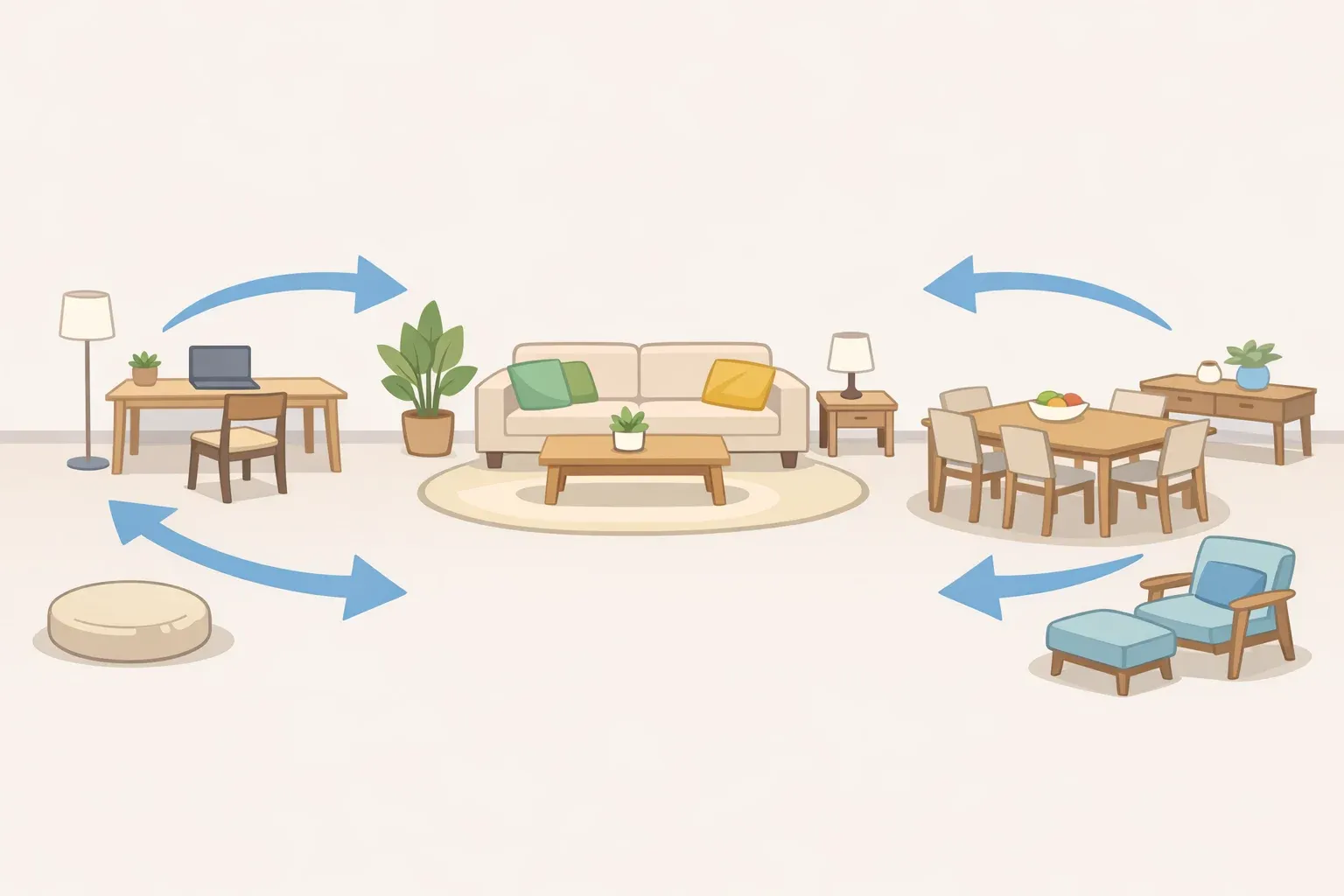
Figuring out how to use extra space in your home almost always starts with an urge to buy something and put it there. Talk to enough designers, though, and a different instinct shows up again and again: decide what the space is for, and how people will move through it, before deciding what goes inside it. Skip that order and the wrong furniture choice doesn't just fail to help. It creates a second problem on top of the first: a blocked path, a chair no one can reach, a room that reads as cluttered instead of finished.
The Spruce found, in reporting from two months ago, that homeowners tend to repeat the same handful of layout mistakes when they try to fill extra floor space in a living room, with several designers describing the same failure patterns independently. House Beautiful profiled designers earlier this year who turned leftover corners, including a former attic nook, into some of the most-used spots in a house, in each case by giving the space a job first. Business Insider reported yesterday that designer Mark Cutler recommends keeping rarely worn clothing in its own space, including through seasonal wardrobe swaps, rather than letting it clutter everyday storage.
This piece pulls concrete advice from multiple designers, each addressing a specific room or a specific problem, and organizes it into one repeatable sequence: name the job the space will do, map how people move through it, choose furniture that fits both, then balance the room visually.
The evidence behind this framework is strongest for two situations: awkward nooks and corners, and living rooms with extra floor space. The sequence should carry over to other rooms, but the specific rules below, on rug sizing and sofa orientation especially, come from living room reporting. Treat them as strong defaults elsewhere rather than fixed law.
How to use extra space in your home: start with purpose
Mina Lisanin, founder of ML Interiors, told The Spruce that unused large areas or awkward corners create an incomplete feeling in a room. Among the simplest ideas for unused space in your home, per that same reporting, is turning the corner into a reading nook or a small desk area instead of leaving it blank.
For what that looks like with a bigger budget, House Beautiful describes a corner reshaped into a custom bookshelf and floating desk, designed with a local millworker. A lower-cost way to borrow the same idea, no contractor required, is pairing a freestanding shelf unit with a narrow console desk: storage plus a work surface, without the custom build.
The same logic scales down into storage decisions, too. Business Insider reports that Cutler recommends keeping rarely worn clothing in its own defined space, including through seasonal swaps, rather than letting it blend into everyday storage, one of several awkward space storage ideas worth borrowing once a closet runs out of room. It's the same principle at a smaller scale: give overflow a job instead of letting it pile up by default.
Purpose doesn't have to mean human activity. House Beautiful describes a former attic nook converted into a dedicated spot for a client's dog, positioned near a window with food bowls close at hand.
Not every leftover corner deserves a function, though. A reasonable rule of thumb: skip assigning a job to a corner that sits directly in a walking path, gets too little light for whatever activity is under consideration, or is too shallow to hold furniture without narrowing the route past it.
In those cases, leaving the space open tends to work when it improves circulation, gives existing furniture room to breathe, or keeps the room flexible for a use nobody's settled on yet. It fails only when it's empty simply because no one decided otherwise. Once a job, or a deliberate absence of one, is settled, the next question is whether people can actually get to it.
Trace how people actually move through the room
Jessica Stambaugh, founder of JS Interiors, told The Spruce that living rooms without a clear traffic pattern often lose out on seating they could have, or force awkward movement to reach the seating that's already there.
Her fix starts with orientation: seating should face the direction people enter the room, not cut the room off from its own entry point, according to Stambaugh's comments to The Spruce. Brianna Untener, founder of Brianna Scott Interiors, offers a more visceral version of the same test: she told The Spruce there's nothing worse than facing the back of a sofa and having to walk around it just to sit down. It's a concrete way to catch a blocked path that vaguer "keep the flow clear" advice tends to miss.
Pushing furniture to the perimeter to fix this backfires. Lisanin told The Spruce that shoving everything against the walls leaves a room feeling barren, with a cold, empty center that discourages conversation.
The rug matters here too. Stambaugh told The Spruce that a small rug can throw off an entire layout, while a larger one lets furniture breathe and can be repositioned more easily if the room needs to change later.
None of this requires a designer's eye to test in advance. Mark the footprint of any proposed piece with painter's tape, string, or cardboard cut to its actual dimensions, then live with it for a day or two of normal use. It won't catch everything, but it flags the big problems.
The plan is worth keeping if, during ordinary use, no door swing gets blocked, the route from entry to main seating stays direct, sightlines into the room stay open, and every seat can reach a nearby surface without a detour. If any one of those fails, fix the plan before the furniture ships.
Let the purpose decide the furniture, not the other way around
Once the job and the path are settled, every furniture decision should answer one question: does this piece's footprint earn its place given the specific job this space is supposed to do? That's narrower than "does this look nice here," and it's the question that keeps a new problem from showing up in the first place.
Scale still has to be checked against the job. The Spruce notes that furniture needs to fit the room it's going into, and for a reading nook that means a chair the corner can actually hold without narrowing the path from the traffic check above, not the largest chair that technically fits through the door.
Surface needs matter as much as storage capacity. Stephanie Molster, founder of Stephanie Molster Interiors, told The Spruce that every seat should be within arm's reach of somewhere to set down a drink. A storage ottoman with a small, removable tray, an option The Spruce points to directly, handles the surface problem and the storage problem in one piece.
How permanent the seating should be depends on how settled the purpose is. House Beautiful describes a built-in that added book storage while its ottomans doubled as extra seating, a fixed solution for a purpose the homeowner was confident about. For a lighter commitment, and one of the more flexible ways to use dead space in your home, Kitchens Bedrooms & Bathrooms recommended bench seating three weeks ago for activating dead or underused corners, no construction required.
That points to a filter worth applying on top of any of this: favor reversibility in proportion to confidence in the purpose. A low-cost bench or ottoman can be moved or repurposed if the job changes. A built-in can't. That distinction matters most for renters, or for anyone testing a new use for a space before committing to it for good.
Finish with one focal point, not five
Furniture that individually fits its job and its path can still add up to a room that feels off. The fix at that stage is visual, not functional, and it's the last step for a reason: it only works once everything underneath it is already settled.
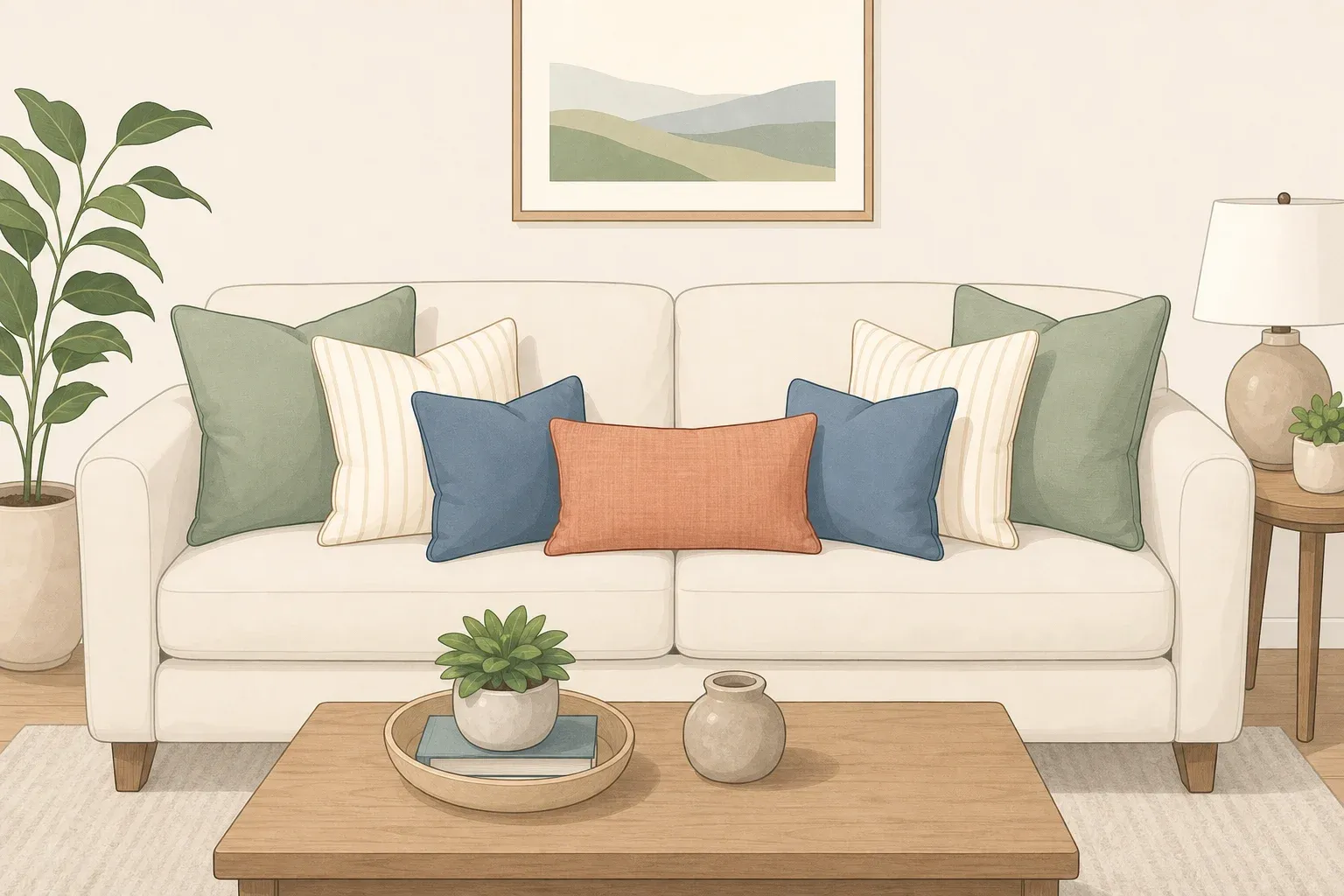
Madison Massaro, founder of Madison Lea Interiors, told The Spruce that furniture needs balanced "elemental weight," meaning size, height, color, pattern, and texture spread evenly enough that no side of the room feels heavier than the other.
A room also needs a clear focal point. Marie Cloud, founder of Indigo Pruitt Design Studio, told The Spruce that a living room without one can feel chaotic and unfocused, while too many competing focal points create the same cluttered, confusing feeling from the opposite direction.
Once that focal point is chosen, the newly purposed space needs to support it rather than compete with it. Untener told The Spruce that furniture has to be intentionally laid out to work with a room's feature areas, not just arranged around them as an afterthought.
Where to test this next
The order matters more than any single rule inside it: purpose, then circulation, then furniture, then visual balance. That sequence is what keeps a fix for one problem, unused space, from quietly creating another: a blocked path, an empty chair, a focal point competing with the wrong shelf.
The reporting behind this framework leans heavily on nooks and living rooms, where the designer advice is thickest. Applying it to a bedroom corner, a hallway landing, or an oddly shaped mudroom means running the same four questions there, not assuming they've already been proven for every room in a house.
Pick one underused space this week and run the mock-up test: tape on the floor, a day or two of living with it, then a check on doors, sightlines, and reachable surfaces. It costs nothing, and it gives a workable read on whether a plan holds up before a single piece of furniture gets ordered.














Comments
Be the first, drop a comment!