



Picture the room: a sofa faces a wall-mounted TV, the coffee table sits dead center, and the whole arrangement looks perfectly reasonable in photos. Then someone tries to walk from the front door to the kitchen without knocking a knee on the ottoman, and two people trying to have a conversation realize they're both staring at a screen instead of each other. That's not a decorating failure. It's a planning failure, and it's the thread running through nearly every one of the living room layout mistakes to avoid that designers keep flagging.
The fix follows a logical order: figure out how people need to move through the room, size the furniture to fit that space, then decide where each piece belongs. A Good Housekeeping roundup lists furniture spaced too close or too far apart, competing focal points, and ignored scale as the culprits designers see over and over. Martha Stewart makes a similar point from a different angle: even genuinely beautiful furniture "falls flat" when the underlying arrangement is off, and oversized sofas paired with undersized rugs are repeat offenders.
A 2026 study of 83 households in Wanasari Hamlet found a strong link between furniture arrangement and how often family members talked. Because the study focused on a small, specific group, the findings should be treated cautiously. Still, they support a familiar design principle: layout can shape behavior as well as appearance.
This guide walks through four steps, in the order they tend to surface once you start actually measuring a room: traffic flow, scale, the choice between floating and anchoring furniture, and zoning for how the room gets used.
Living room layout mistakes to avoid: start with traffic flow
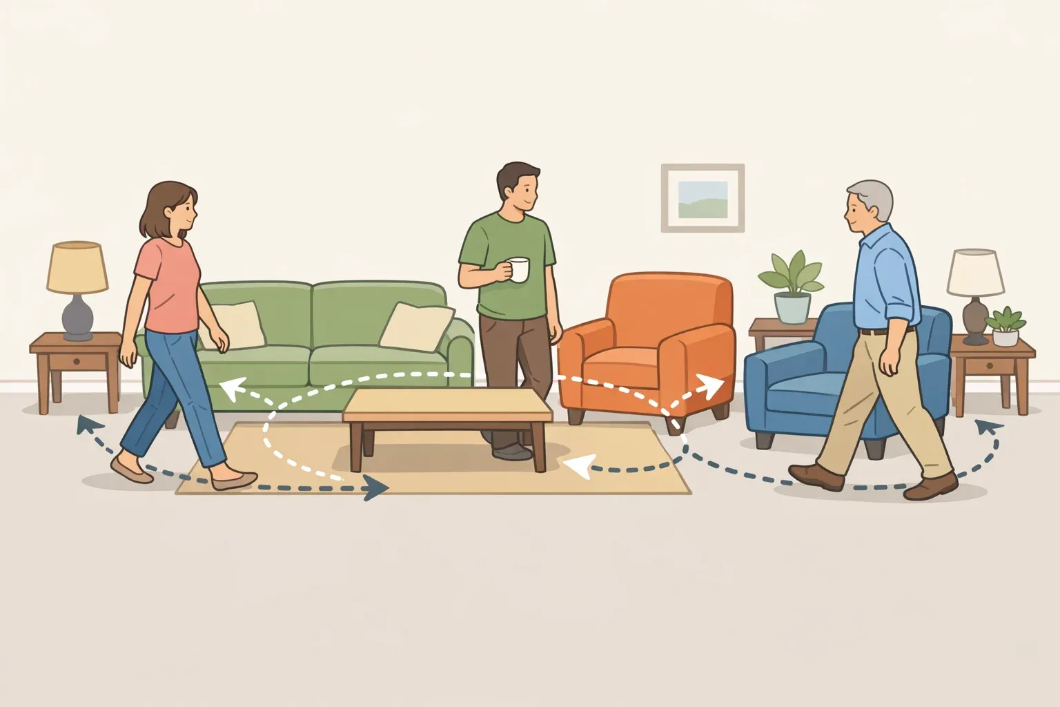
Before choosing a single cushion color, walk the room. Liz Williams, founder of Liz Williams Interiors, tells Good Housekeeping that aesthetics matter less than how people will actually move through the space, and that furniture blocking natural pathways makes a room "feel cramped and uncomfortable." Her advice is to plan the layout around main walking routes first and treat everything else as secondary.
That's not just a feeling designers have. Real estate professional Shaun Martin warns that blocking movement through a space reads as "cluttered, cramped, and chaotic," no matter how nice the individual pieces are. Martha Stewart backs this with actual numbers: leave 30 to 36 inches for major walkways and roughly 30 to 35 inches around a sofa for comfortable movement. Between individual chairs, aim for 18 to 24 inches of breathing room.
Here's a way to test a room before buying anything: walk the existing routes, door to hallway, seating to TV, kitchen pass-through, and mark them with painter's tape. Anywhere the tape line runs narrower than that 30-inch minimum, something needs to move. This isn't a designer's rule so much as basic geometry. A hallway too narrow for two people to pass is too narrow for furniture to sit next to, either.
Once the routes are clear, the next question is whether the furniture itself leaves enough room to use them.
Living room furniture placement mistakes: matching scale to the room
A sofa can be beautifully made and still wrong for the room it's in. Evelina Juzėnaitė, principal designer at Planner 5D, tells Martha Stewart that an oversized sofa "will clutter it up, take up all the space, and create a cramped feeling for everything else." That's a scale problem, not a housekeeping one, and no amount of tidying fixes it.
The same source flags another version of the issue: too many chairs, or several small side tables scattered around, which reads as visual noise rather than furnishing. The fix is consolidation, not addition. Pick one or two well-scaled tables instead of four small ones, and limit seating to what the room comfortably supports rather than what fits if everyone squeezes in.
Liz Williams makes the same case from a different angle, advising a few larger, cohesive pieces sized to the room instead of filling every gap with smaller furniture just because the floor space is available.
Rugs run into the same trap in reverse. An undersized rug creates a visible imbalance between the floor and the furniture sitting on it, and Martha Stewart's fix is straightforward: at minimum, the front legs of every major seating piece should sit on the rug. A rug that only touches the coffee table looks like an afterthought, because it is one.
The clearance numbers from the traffic-flow step still apply here, and they double as a useful gut check. If a sofa doesn't leave close to that 30-inch minimum on any side once it's placed, the room is telling you something about size, not just arrangement. Sometimes that means a smaller sofa. Sometimes it means the current sofa is right, but everything around it needs to shrink or go.
How to arrange living room furniture: floating versus anchoring
This is where good advice starts sounding contradictory, because it depends entirely on the room. Designer Button tells The Spruce that floating, meaning furniture placed away from the walls with clearance on every side, improves traffic flow and can make a room look larger, since no wall blocks the view of the piece from any angle. It also opens up more flexibility in how a room gets used, since nothing is locked into a fixed position along the perimeter.
But this isn't universal. In narrow, rectangular rooms, larger pieces like sofas will likely need to go against a wall, simply because the room's shape limits where things can physically sit.
Maggie Griffin, founder of Maggie Griffin Design, offers a layout built around that reality in the same Good Housekeeping piece: anchor a sofa to the wall with a pair of chairs nearby, which creates an inviting seating area without needing floor space in the middle of the room. Neither designer is wrong. Griffin's approach works well in a room where floating simply isn't an option, which is exactly the scenario Button flags as the exception.
The measurement standards for each approach aren't interchangeable, and mixing them up is an easy mistake. Button suggests at least one foot of clearance around a floated piece as a workable minimum, while Martha Stewart reserves the wider 30-to-36-inch standard for primary walkways. Treat the one-foot rule as a floor for space around a piece of furniture that isn't part of a main route, and reserve the wider number for anywhere people actually walk through daily.
If the room does allow for floating, the payoff shows up quickly. Martha Stewart notes that pulling furniture even 12 to 18 inches off the wall can make a room feel more intentional and less like storage lined up along the edges. It's a small move with a disproportionate effect, mostly because it forces the rest of the layout to organize around a real center rather than a flat perimeter.
Living room focal point ideas: building zones around how you live
Furniture placement solves half the problem. The other half is deciding what the room is actually for, which is where a lot of otherwise well-measured layouts still fall apart. Nureed Saeed, owner of Nu Interiors, tells Good Housekeeping that layout and function should be treated as connected ideas, the same way a kitchen gets organized around prep, cooking, and cleanup zones. A living room benefits from the same thinking: a zone for conversation, one for the TV, maybe one for a laptop, rather than one arrangement trying to do everything at once.
Too many competing focal points is its own version of this mistake. Saeed's specific advice: if a room has both a fireplace and a view worth looking at, let each one anchor its own distinct area rather than forcing both to compete for the same sightline. Splitting the attention deliberately reads as organized. Splitting it by accident just reads as cluttered.
The Wanasari study, published earlier this year, adds a useful caution here, even with its limitations acknowledged. Layouts built entirely around the television were the predominant configuration in the sample, and those layouts consistently produced seating that didn't face each other, limiting visual contact even though verbal exchanges stayed frequent.
This is a correlational finding from a purposively sampled group of 83 residents in a single location, not evidence that rearranging furniture will change how a household talks. Still, it's a reasonable argument against letting a single TV-facing sightline be the room's only organizing idea.
Liz Williams' fix addresses exactly this: balance TV viewing with social seating so the room works for movie night and conversation without redesigning the space for one or the other. Her related suggestion, using pairs of sofas or chairs, gives the room a more simplified, organized look instead of a scattered collection of individual seats.
Before choosing furniture, list what the room actually needs to support: TV, conversation, work, maybe a play space. Assign each activity a rough zone rather than assuming one arrangement can serve all of them equally. If the room doubles as a home office, a fold-away option like a secretary desk solves the space conflict without a permanent workstation eating into the living area during off hours.
Getting the order right
Circulation is the strongest starting point among everything covered here, largely because a blocked path affects every other decision downstream. But scale and rug sizing aren't just circulation problems wearing a different name. They're separate failure points: a sofa can leave enough walking room and still be wrong for the space it sits in, the same way a rug can be perfectly placed and still be too small to visually anchor the furniture on it.
Floating versus anchoring furniture isn't a rule to apply uniformly either. The Spruce and Good Housekeeping's designers aren't disagreeing so much as describing different rooms. A narrow rectangular space and an open square one call for different answers, and room shape should settle the question before personal preference does.
The layout research adds a longer-term argument for getting this right: how furniture sits in a room appears tied to how much visual contact and interaction happen inside it, based on the Wanasari findings. That link deserves real interest and modest confidence in equal measure, given the study's small, localized sample.
The most useful next step doesn't require a shopping trip. Measure the room's key pathways before moving anything, and treat the furniture already in the house as a layout problem to solve rather than a set of pieces to replace.














Comments
Be the first, drop a comment!