


By the time most people consider knocking down a wall or moving to a bigger apartment, the real culprits are already visible: furniture pushed to the perimeter, a sofa that's 15 inches too wide, and a rug that fits only under the coffee table. None of those problems requires more square footage to fix. These are the small living room mistakes to avoid if you want the space to feel easier to move through and worth actually sitting down in.
This guide covers the three decisions that designers consistently flag in small living rooms: traffic flow and layout, furniture scale, and rug sizing, plus a focused section on livability details that determine whether a well-laid-out room actually works to live in. Fix these in order. Layout first. Scale second. Rug third. Everything else is refinement.
Before you start: Sketch the room to scale on paper and mark door swings, window positions, and any fixed architectural elements. Test configurations before moving furniture. Layout problems almost always come down to measurements, and rearranging a sectional three times teaches nothing that a pencil and graph paper couldn't have settled in twenty minutes.
Small living room layout mistakes that make the space feel tighter
What goes wrong
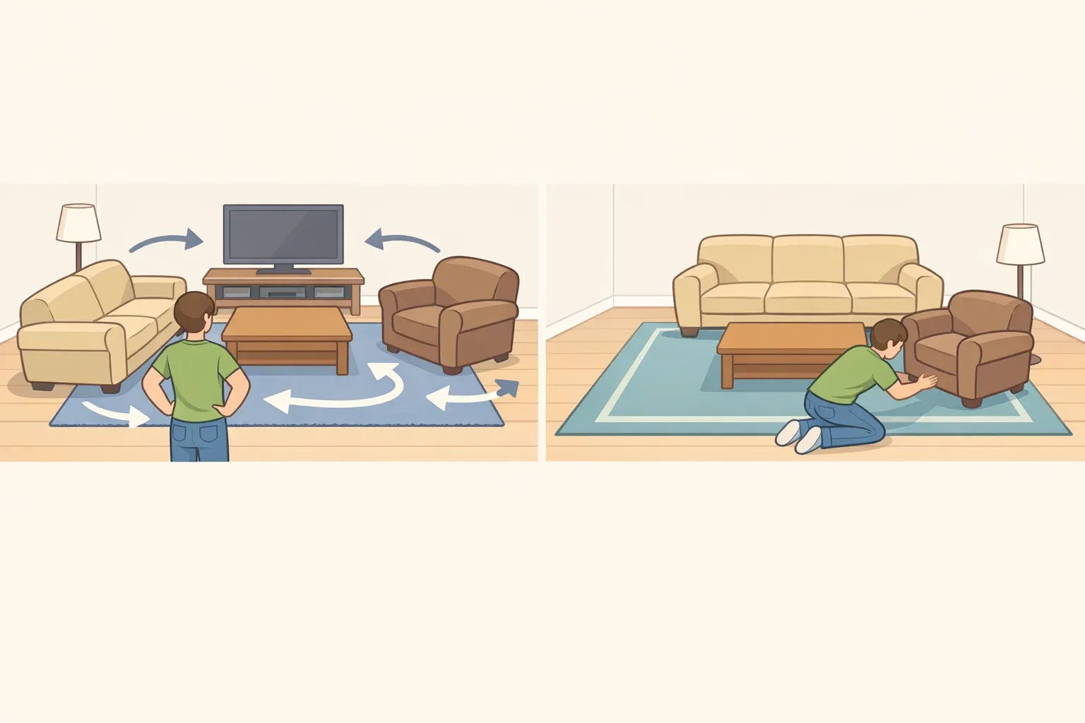
The instinct to push every piece to the perimeter is almost universal in small rooms. It's also almost always wrong. Pinning furniture to the walls hollows out the center, flattens the space visually, and this is the part most people don't anticipate, which kills circulation rather than improving it.
Designer Lin puts it plainly: pushing everything to the perimeter creates a visual void in the center that disrupts movement through the room. Mina Lisanin of ML Interiors adds that rooms without clear traffic flow are either missing seating opportunities or producing awkward arrangements that guests struggle to navigate.
Focal points are the second half of this mistake, and they cut both ways. A room without a clear anchor, as designer Marie Cloud of Indigo Pruitt Design Studio explains, feels chaotic and unfocused. Too many competing focal points create the same problem from the opposite direction: the furniture looks scattered, the eye doesn't know where to land, and the space reads as cluttered even when it isn't.
One anchor. Everything else in service of it, as designer Brianna Untener of Brianna Scott Interiors frames it: the furniture needs to be intentionally laid out to work with those feature areas.
What to do instead
Choose one focal point and commit. A fireplace, TV wall, or significant window works. Orient all primary seating toward it. Designer Jessica Stambaugh of JS Interiors notes that seating ideally faces the direction people enter from, rather than cutting off the space or forcing guests to walk around a sofa back to find a seat.
Float the sofa, at minimum by a few inches. Even 4–6 inches of clearance between the sofa and the wall makes the layout feel deliberate and reduces the visual weight behind the piece. For square rooms with adequate floor space, floating fully into the room outperforms any wall-adjacent arrangement. Lin's guidance is simple: always float a sofa off the wall, even slightly, to reduce visual clutter.
Exception: In very narrow rooms or tight apartment layouts where floating would block the only viable walkway, keep pieces closer to the perimeter and focus instead on protecting clearance in the central path.
Protect primary walkways. Leave 30–36 inches for main traffic paths through the room. Allow 15–18 inches between the sofa and coffee table; less than that and the seating zone becomes a puzzle to enter.
Quick test: If you have to turn sideways or step around the coffee table to reach a seat, the room is overfilled.
Activate corners rather than ignoring them. Lisanin explains that unused corners and large awkward areas create an incomplete feeling in the room. A single floor lamp, a small side table, or a slim accent chair turns a dead zone into part of the room's composition without adding bulk.
Getting the layout right establishes what size furniture can realistically live in the room, which makes the next decision considerably less guesswork.
Mistake 2: The furniture scale is wrong, usually in both directions
What goes wrong
Scale is the single decision in a small living room where it's possible to go wrong in two opposite directions, which is why it keeps coming up in designer feedback.
An oversized sectional eats up walkways, blocks windows, and turns a small room oppressive. Lisanin describes the result precisely: a small living room filled with oversized couches and multiple tables leaves little room for movement. But furniture that's too small creates an equally damaging problem: the room fills up with undersized pieces, none of which read as a clear anchor.
Designer Abigail Horace of Casa Marcelo describes what happens when buyers try to compensate by choosing smaller pieces: the room ends up feeling unfinished and sparse, which then triggers overcorrection with more small pieces. Designer Gideon Mendelson makes the same point from the other direction: most people use too much furniture to begin with, and the result is spaces that feel cramped and off-balance.
There's also a specific measurement gap most buyers don't know exists. Apartment-sized sofas run 70–80 inches wide with slim arms and a shallower depth profile. Standard sofas run 85–95 inches wide, with thicker arms, deeper seats, and a substantially heavier visual footprint. That 10–15 inch difference can be the distinction between a clear walkway and a furniture obstacle.
Small living room furniture layout tips for getting scale right
Choose fewer, better-proportioned anchor pieces. One well-scaled sofa reads as intentional. Four mismatched small chairs read as clutter. Robins puts it plainly: people who match small rooms with small-scale items end up with too many pieces and no clear focal point. Fewer, larger pieces make the space feel calmer and more considered.
Check sofa dimensions before shopping, not after. Apartment-sized sofas (70–80 inches wide, slim arms, shallower depth) typically give small rooms better flow and more flexibility than their standard counterparts. For sectionals, keep seat depth to 34–36 inches maximum and total width under 100 inches; deep, bulky sectionals are consistently identified as one of the biggest mistakes in tight spaces.
Quick test: If a sofa's width exceeds half the room's longest wall, it's likely too large.
Replace the sofa-and-loveseat combo with a sofa and two chairs. The matching loveseat packs the room with visual bulk and reads like a showroom floor setup. Two chairs, particularly leggy, slim-armed styles, read lighter, allow flexible repositioning, and leave circulation intact.
Prioritize exposed-leg furniture. Sofas and chairs with visible legs allow sightlines to continue under the piece, keeping the floor plane visually continuous. Skirted or boxy pieces block that view and add perceived weight even when they're not physically large.
Swap bulky square coffee tables for round, oval, or organic shapes. A round coffee table or upholstered ottoman has no sharp corners to navigate and reduces visual mass at the room's center. In very tight layouts, a lift-top coffee table that expands into a dining surface removes the need for a separate dining zone and keeps the room functional without crowding it.
Once the scale is resolved, the rug decision becomes more straightforward because you finally know what you're anchoring.
Mistake 3: The rug is too small to anchor anything
What goes wrong
Designers name the undersized rug as the mistake they notice first, and the one with the most predictable fix. A rug that sits only under the coffee table while surrounding furniture floats on bare floor fragments the seating group visually: nothing looks anchored, the room looks unresolved, and the space reads as smaller than it is.
Designer Rachel Sherman of Rachel Sloane Interiors puts it plainly: an undersized rug "unintentionally makes the room feel smaller," the exact opposite of what most buyers intend when they choose the smaller, less expensive option.
The counterintuitive part, confirmed by both Mendelson and Jay: a larger rug makes a small room feel simultaneously more spacious and more cozy. Meghan Jay makes the logic clear that rugs should be grounded under a furniture grouping, not floating in the middle of a room or sitting solely under a coffee table. A rug sized to anchor the seating zone pulls the furniture into one cohesive composition rather than leaving separate objects scattered across a floor.
What to do instead
When uncertain between two sizes, choose the larger one. Designer Gillian Segal's rule: size up when in doubt, because it makes the space feel more balanced. A rug that's slightly too large can be adjusted with furniture positioning. A rug that's too small requires replacing (House Beautiful, last month).
Anchor the furniture grouping, not just the coffee table. The front legs of the sofa and chairs should rest on the rug. Sherman notes that the replacement rug should sit at the center of the room with the main furnishings all touching it.
Quick test: If the rug could be removed without changing the relationship between any two pieces of furniture, it's too small.
Account for door clearance before buying. If the entry door swings into the room, measure that arc and subtract it from the usable rug dimensions before committing to a size. A round or oval rug can sometimes solve placement problems that a standard rectangle cannot.
Use the rug as a layout tool, not just a decorative layer. A properly sized rug gives the furniture composition flexibility; pieces can be shifted or swapped without the rug becoming irrelevant to the arrangement. Stambaugh puts it simply: a big rug allows the rest of the furniture to breathe and be properly repositioned if the room needs a change.
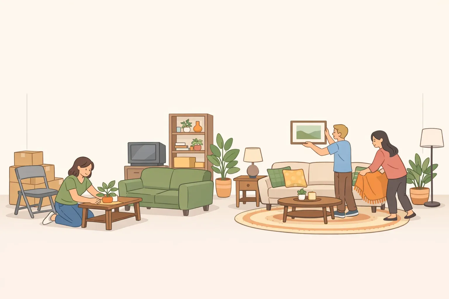
Get the layout, scale, and rug right, and the room will function. Whether people actually want to spend time in it comes down to the finishing layer.
Why a room that looks right can still feel wrong
What goes wrong
A room can nail layout, scale, and rug, and still fail the moment someone sits in it. Designer Mindy Kelson O'Connor is direct: a beautiful room that's uncomfortable to sit in, hard to navigate, or poorly lit will never feel stylish, regardless of how carefully it's been styled. The real measure is whether people want to stay in it.
Three failures appear most consistently. First, no surface near the seating: a room where guests hold their drinks for an entire visit because there's nowhere to set them down is a room that doesn't work.
Second, a layout designed for symmetry over conversation: O'Connor warns that it's easy to become overly focused on anchoring everything around a central architectural element, but designing solely for a visual focal point often sacrifices the seating arrangements that make relaxed socializing possible.
Sherman names the result: it makes a living room feel like a conference room instead of a warm gathering in someone's home. Third, inconsistent lighting: bulbs at different color temperatures create an "off" quality the moment someone enters.
Jay notes that one fixture casting cold light while others feel warm is one of the first things designers notice, and recommends matching Kelvin ratings across all fixtures and adding dimmers for flexibility.
What to do instead
Put a surface within reach of every seat. A storage ottoman with a removable tray, a nesting table, and a small cocktail table beside the sofa. The specific solution matters less than the result: every person seated should be able to set something down without getting up.
Arrange seating for conversation first, symmetry second. Angling chairs slightly toward the sofa rather than placing them in strict parallel lines makes the room feel gathered rather than formal. A layout that supports easy conversation will support watching television just as naturally.
Layer the lighting and match temperatures. An overhead fixture handles ambient light. A floor lamp or table lamp handles warmth and everyday atmosphere. Match all bulb Kelvin ratings. The number appears on every bulb package, so the room reads as consistent. Add dimmers where possible.
Choose upholstery that tolerates daily use. A sofa that people avoid sitting in properly because they're protecting the fabric is a functional failure dressed up as a design choice. High-performance fabrics that handle spills and daily wear are now widely available without aesthetic compromise.
The order of operations
Fix these in sequence: layout first, scale second, rug third, livability details last. The layout determines what size furniture can realistically occupy the room. The furniture scale determines what size rug makes sense. Getting those two right makes the livability decisions straightforward rather than compensatory.
The goal isn't to make a small room look bigger. It's to make it function with enough intention that it stops calling attention to its dimensions. Designer Madison Massaro of Madison Lea Interiors frames the target well: the room should distribute visual weight, furniture height, scale, and color evenly enough that no corner feels heavy and no corner feels abandoned. Walk into a room like that, and "small" isn't the first word that comes to mind.


Comments
Be the first, drop a comment!