


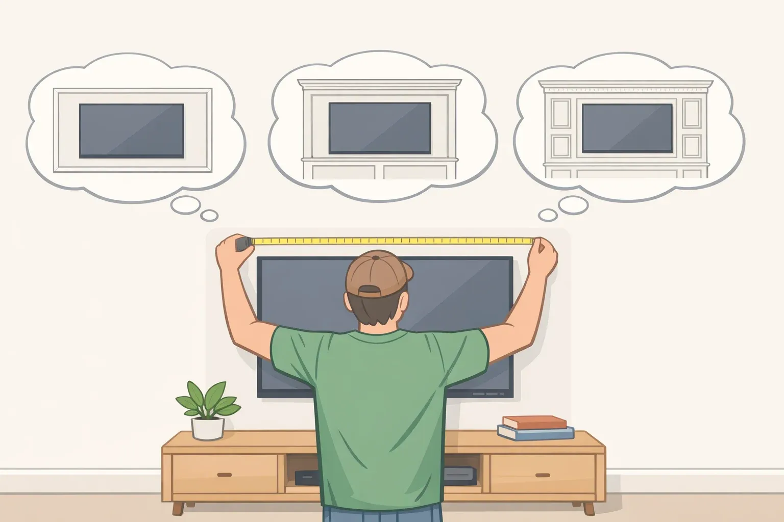
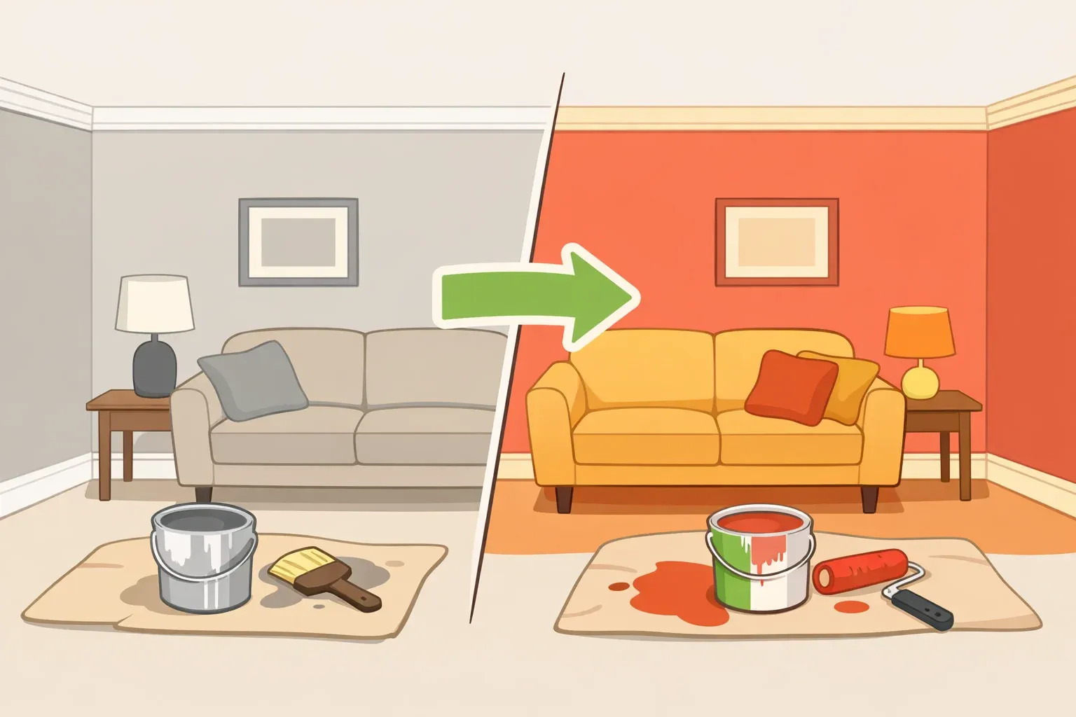
Most people who want more color in their home don't lack taste. They lack nerve. The commitment feels too permanent, the coverage too final, the regret too easy to imagine. The peekaboo paint theory sidesteps that entirely not by nudging you toward safer colors, but by changing where color goes. Small, tucked-away surfaces. The inside of a cabinet as you pull it open. A stair riser as you climb. A door edge that flashes color as it swings. This guide walks through how to identify which surfaces work best, how to choose a color that reads clearly without taking over, and where to start.
The name is new; the instinct behind it isn't. As designer Phillip Thomas told Architectural Digest in 2022, people have used paint to accent architectural details since the ancient Romans. What's useful about the current framing is its emphasis on low commitment and deliberate concealment. Helen Shaw of Benjamin Moore describes the trend as placing "small but striking flashes of colour in unexpected places," including cupboard interiors, skirting boards, and door and window edges, rather than painting full surfaces, according to Homebuilding in April 2026. Anna Hill of Fenwick & Tilbrook calls these "fleeting moments" of color, used in ways that deliberately avoid dominating a design scheme which, she notes, is exactly what makes them manageable for anyone who has hesitated at a feature wall.
That hesitation even has a name among designers. Shaw calls it being "colour-shy," and argues the peek-a-boo paint trend is built for it: a way to add personality through subtle but vibrant details without the anxiety of a large block of color.
How the peekaboo paint theory works in real rooms
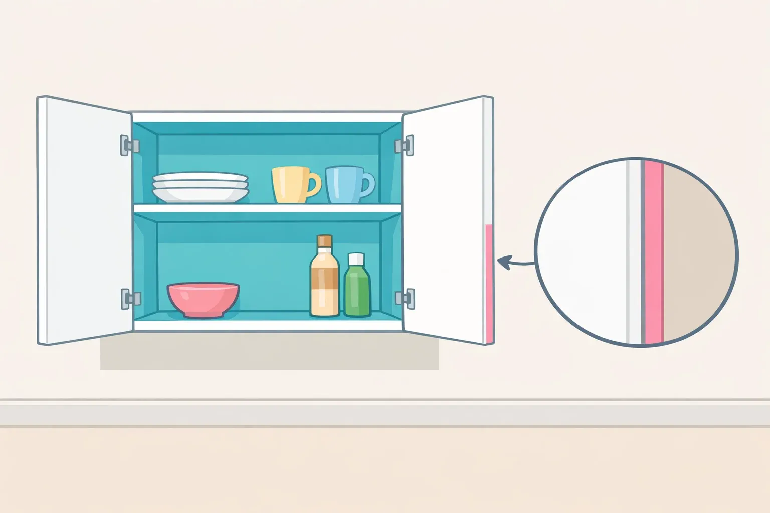
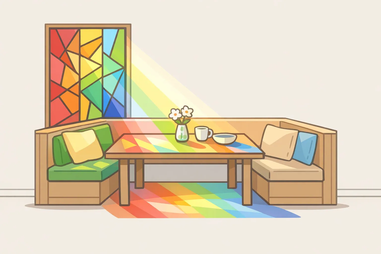
Not every surface qualifies. A good peekaboo location does three things: it's encountered in motion (opened, passed, approached), it sits against neutral or quieter surroundings that let the accent read clearly, and it's small enough that changing your mind costs very little. That's practical guidance, not a formula from a designer's brief. Apply that filter and the list of candidates narrows quickly: cabinet and cupboard interiors, stair risers, built-in shelving backs, door edges.
Cathryn Sanders of Earthborn told Homebuilding that the technique also works between rooms. A color glimpsed through a doorway as someone moves through the house creates continuity and a small moment of surprise. That's the peekaboo mechanic at its clearest: color appears in the corner of your eye and then disappears as you move on.
There's a spatial payoff too, beyond decoration. William McIntosh of William McIntosh Design notes that painting a built-in's recessed area in a contrasting darker color makes the niche appear to recede, with the secondary effect of making the surrounding room feel larger (Architectural Digest). A well-placed accent doesn't just add personality; it can change how a room reads spatially.
Rooms that are already visually crowded tend to absorb small accents rather than showcase them. Heavy pattern, competing objects, and multiple existing colors give the eye too much to process, so the pop disappears into the noise. The technique depends on contrast with quieter surroundings, so if the space doesn't have any, the effect won't land. A packed bookshelf, for instance, will simply swallow a painted backing.
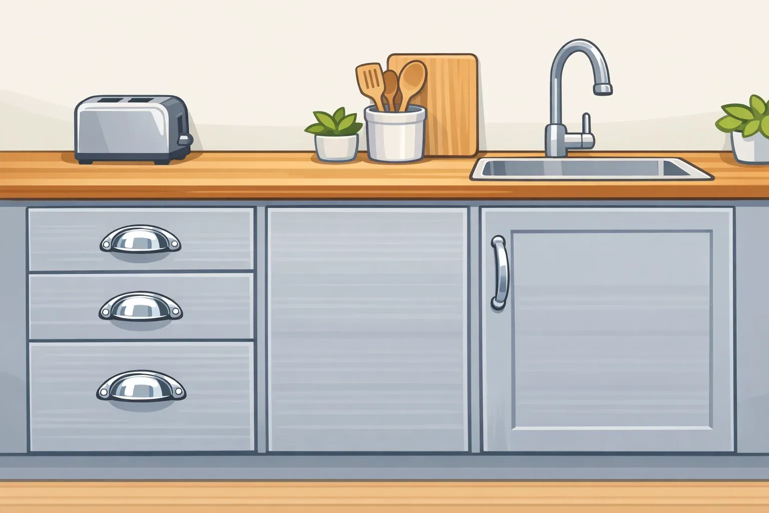
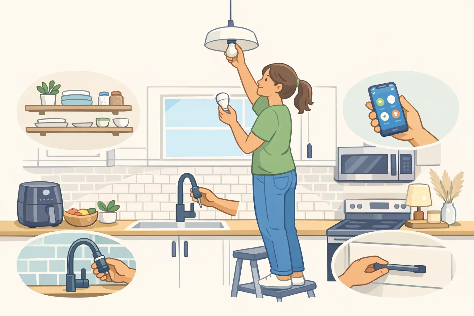
Best first project: The inside of a kitchen or living room cabinet. Small surface area, easy to assess the effect before committing further, and quick to repaint if you decide to change course. A single bookcase back panel is equally low-stakes.
Renters should check their lease before painting doors, trim, or built-ins; if paint is not allowed, a removable liner or painted insert panel can create a similar hidden-color effect without permanently changing the surface.
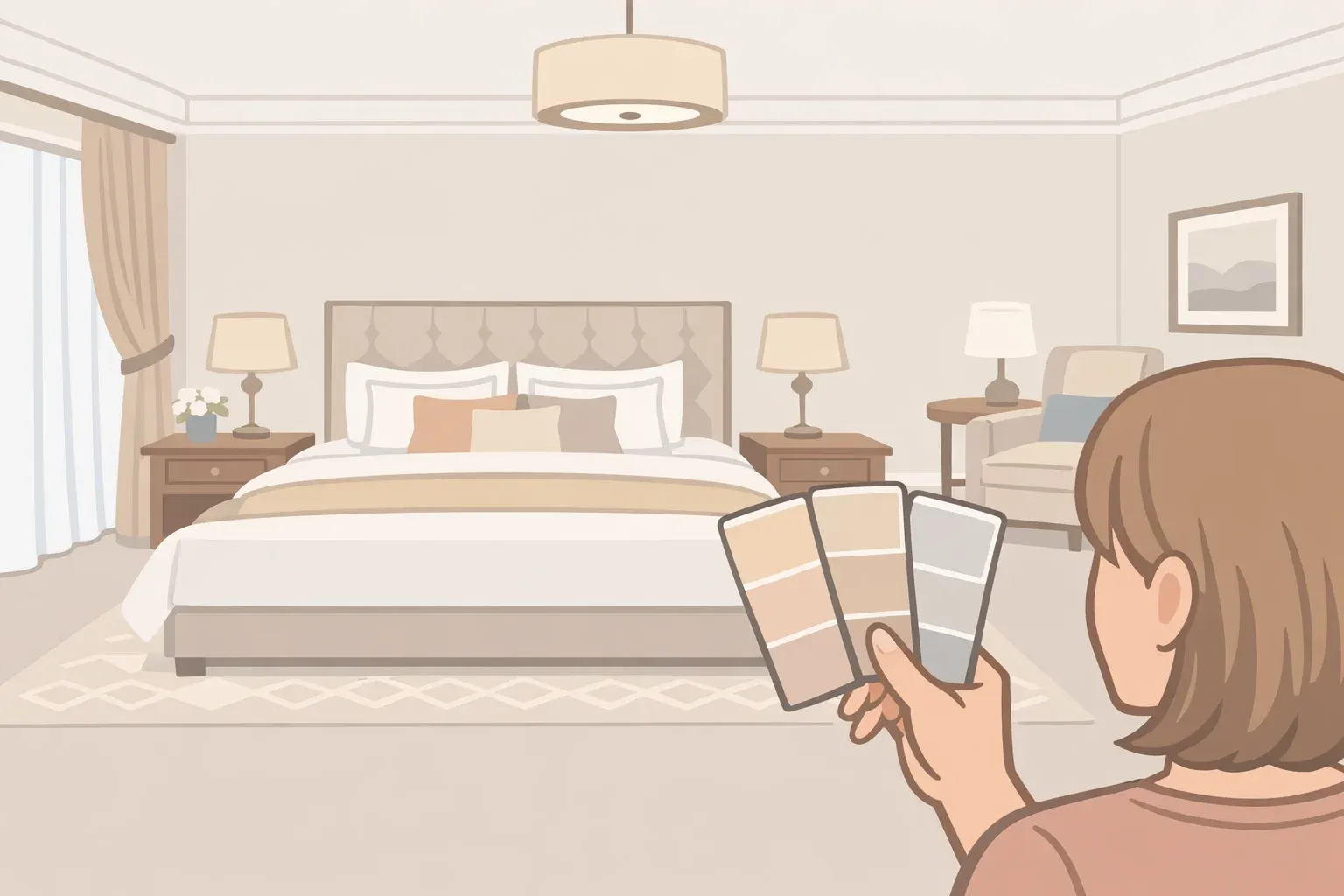
Choosing the right color and finish
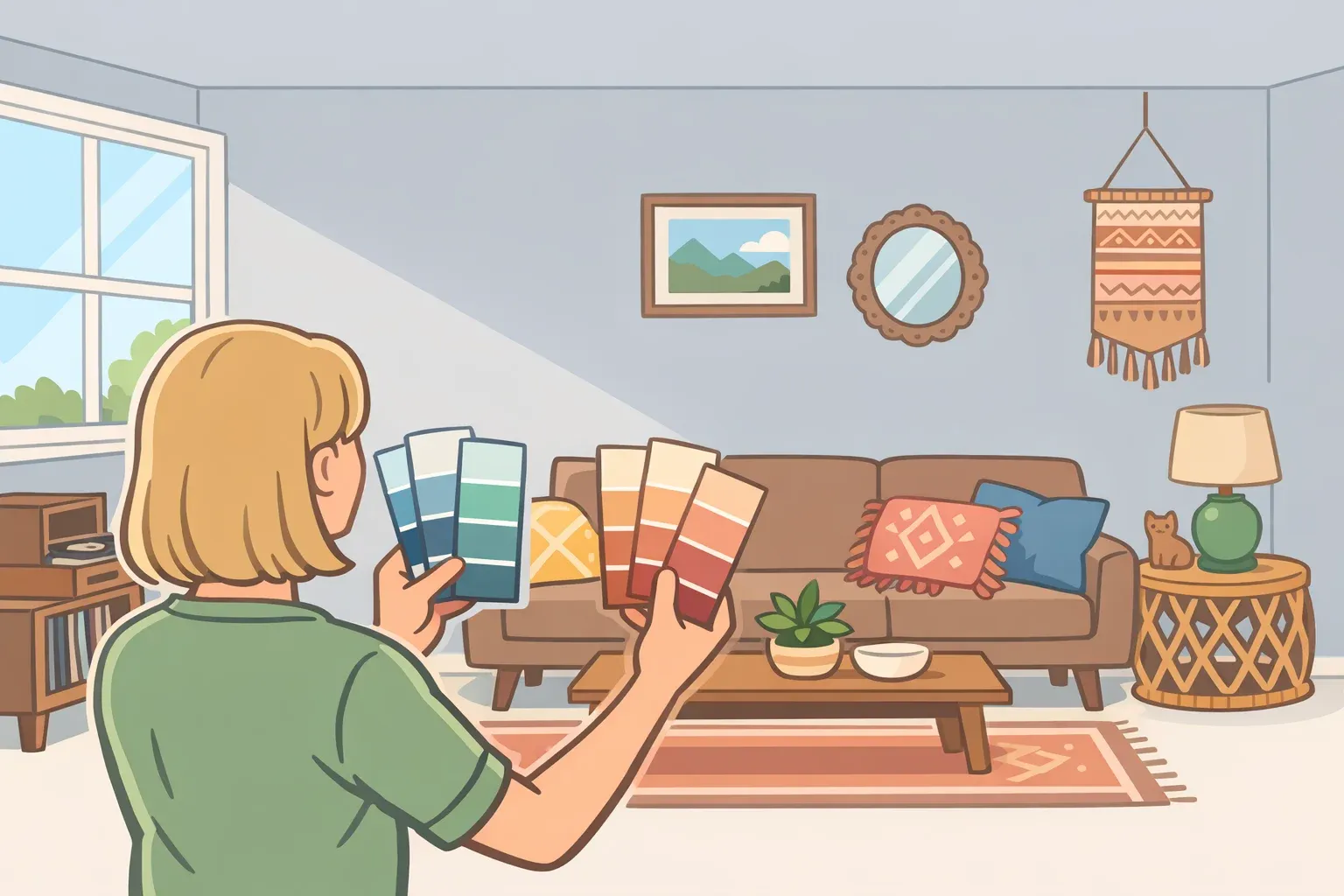
Color selection here follows different rules than wall painting. The surface is small and often enclosed, which means it can handle more saturation than a full wall can but saturation without a clear contrast target still looks chaotic. Hill's guidance is direct: think first about contrast, specifically where the pop will be most visible and against what background.
For most spaces, softer or chalkier versions of a complementary color work better than full-intensity hues. Cathryn Sanders puts it plainly: contrast works best when it feels "balanced rather than dramatic," and muted tones tend to be more livable in enclosed areas. A chalky sage inside a white kitchen cabinet reads as intentional and layered. The same color at full intensity on a stair riser in a narrow hallway may feel like it's shouting. The specific combination matters; this is where sampling earns its place.
Finish is worth considering alongside hue. Mixing paint sheens draws attention to existing architectural detail, as Architectural Digest noted in 2022 high-gloss against matte amplifies the visual pop even when the color itself is restrained. For the specific surfaces in this technique, a satin or semi-gloss finish is a practical choice: it catches light differently than flat surrounding walls and holds up better to handling. That's a working recommendation, not a sourced directive.
A practical way to choose a color:
Identify the dominant color already anchoring your room — the wall, sofa, or rug with the most visual weight.
Find its complement on a basic color wheel, then pull back toward a softer, grayer version of that complement.
Sample it in situ. Light inside an enclosed cabinet or on a sheltered stair riser behaves differently than open wall light, and color shifts noticeably in context.
Check the sample in the evening. Artificial light skews warm, and colors that read cool in daylight can shift significantly after dark.
One consistent pitfall: testing a sample on a flat, well-lit wall and assuming it will translate to an enclosed space. It won't. Test where the paint will actually go.
Applying the theory: surface by surface
With location and color settled, the application is straightforward. Restraint matters here as much as it did in planning.
Door edges are the lowest-friction starting point. Before painting, check that the edge does not rub tightly against the frame, since extra paint buildup can make a door stick. Paint only the edge visible when the door stands open: a narrow strip that appears as a sliver of color when you pass through and vanishes when the door closes. A small angled brush, minimal masking, very little paint. Homebuilding describes door sides as "a quick, easy and low-cost way to introduce the trend." A satin finish holds up to handling without looking plasticky.
Cabinet and cupboard interiors reward a bit of prep. Remove shelves before painting where possible; it makes cutting in along the back panel significantly cleaner. A satin or eggshell finish holds up better than flat in spaces that see humidity or regular contact. Let each coat dry fully, and allow extra curing time before reinstalling shelves or loading dishes, books, or decor back into the cabinet.
Stair risers take more wear than cabinets, so the paint needs to match. A trim-grade paint handles scuffs and cleaning better than standard wall paint; semi-gloss is practical. Mask the tread above and below each riser before starting. A small foam roller handles the flat section; a brush takes the edges.
Built-in shelving backs offer high visual impact for relatively little effort. This is where the peekaboo paint approach overlaps most directly with the older principle McIntosh describes: a deeper color in the recess creates a sense of depth that makes the whole unit feel more deliberate (Architectural Digest). Works especially well in living rooms and home offices where shelves are seen from a distance.
General prep applies across all surfaces. Clean before painting; grease, dust, and residue prevent adhesion. Lightly sand glossy surfaces to give new paint something to grip, but avoid sanding old or unknown paint unless you know it is lead-safe. Prime bare wood, laminate, or previously unpainted surfaces before applying the accent color.
On restraint: one or two well-placed accents read as intentional. Repeat the move too many times in the same room and the surprise starts to disappear; each pop competes with the last, and the cumulative effect is noise rather than discovery. Cathryn Sanders frames the goal well: this is about bringing "small moments of joy and individuality" that still feel "calm, intentional and easy to live with." Stop before the room stops feeling calm.
Where to go from here
The method in full: choose one surface you interact with daily, confirm it sits against neutral or quieter surroundings, pick a muted complement to your room's dominant color, apply a satin or semi-gloss finish, and live with it before adding anything else. As William McIntosh noted in Architectural Digest, paint is the quickest, easiest, and least expensive way to change how any part of a home feels. The peekaboo approach narrows the target further and raises the ratio of impact to effort.
Once the first accent is working, the natural next step isn't to replicate it immediately. Evaluate first: does the room feel sharper, warmer, more layered? If yes, try a second surface in an adjacent space: a color echo between two connected rooms, or a different hue from the same family on a door edge across the hall. Each decision builds on the same underlying logic: restraint, placement, and the moment when color appears where you weren't quite expecting it.


Comments
Be the first, drop a comment!