



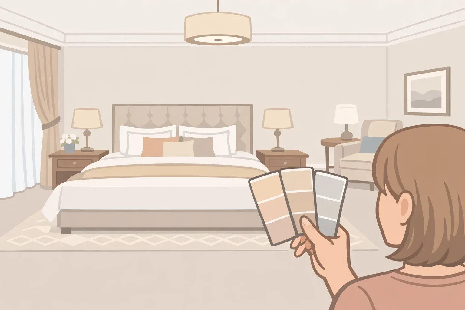
Walk into a well-designed hotel room and something shifts. The space feels calm, considered, and expensive without being showy. Most people assume this is about the thread count or the furniture. A significant part of it is the paint.
By the end of this guide, you'll know which paint colors that make your home feel like a luxury hotel are worth trying, why they tend to feel restful, and how to test them so they actually deliver in your specific room, not just on the chip.
The common assumption is that luxury hotel rooms are white or cream. Good Housekeeping recently featured seven hotels using shades like dark green, deep blue, near-black gray, and terracotta rather than the expected white-and-cream palette. But that's only half the story.
The designers behind those choices weren't chasing drama for its own sake. According to Kevin Francis Design, the reason most luxury properties anchor rooms in soft greiges, warm whites, and muted taupes comes down to longevity and flexibility, not timidity. The real formula is both things working together: a warm, low-saturation foundation plus carefully placed depth. Get that right, and the room reads expensive without trying.
Step 1: Build your base with warm neutral paint colors, not stark white
The first thing to understand about luxury hotel paint colors is that "neutral" no longer means white. Start here before thinking about anything else.
Warm whites, soft greiges, and muted taupes form the backbone of most high-end hotel rooms because they photograph cleanly, age gracefully, and provide a stable backdrop for furnishing updates, per Kevin Francis Design. On the practical side, touch-ups blend invisibly, and they don't show wear the way saturated colors do after a year of daily use.
There's real grounding in environmental psychology behind the preference. Research consistently shows that neutral, low-saturation surroundings support rest and reduce cognitive load, which is exactly what a bedroom or living space should deliver, Kevin Francis Design notes. This isn't an aesthetic opinion; it's why these colors keep appearing in spaces designed specifically to help people decompress.
The definition of "neutral" has also expanded considerably. House Beautiful noted earlier this year that today's design vocabulary now includes soothing sage greens, gentle mauves, and deep warm browns under the neutral umbrella shades that feel current and enduring, not beige-by-default.
What to do: Choose your base from the warm end of the spectrum: greige, warm taupe, cream with yellow or pink undertones, or a muted sage green. Avoid cool grays with blue or purple undertones; they tend to read clinical rather than calm. Skip pure white unless your room has exceptional natural light and warm-toned furnishings to counterbalance it.
Gotcha: Greige is not a single color. Agreeable Gray next to purple-toned trim can shift green; the same paint next to warm wood reads perfectly balanced. Your finishes determine what the wall actually looks like. More on that in Step 3.
Step 2: Add depth with restrained accent colors, the way hotels actually do it
This is where most attempts go wrong. The instinct is to pick a dramatic color and paint a whole room. Hotels almost never do that.
In well-executed hotel interiors, deeper shades are applied strategically rather than across entire rooms. Kevin Francis Design notes that forest greens, navy blues, and warm earth tones typically appear on headboard walls, in built-in joinery, or in upholstery, creating contrast and visual layering while keeping the maintenance-heavy surface area limited. A full-room dark palette looks striking on day one; it's far less forgiving over time.
Real hotel examples bear this out. The Atticus Hotel in Oregon uses Sherwin-Williams Shade-Grown (SW 6188), a moody dark green, to evoke the surrounding Pacific Northwest landscape. The designer described the goal as creating "warmth and intimacy," not drama. Drift Santa Barbara pairs Sherwin-Williams Iron Ore (SW 7069), a near-black dark gray, with light wood and linen to keep the effect "dreamy, not dreary." In each case, the bold color is one element, balanced by lighter materials and open space.
Current hospitality trends reinforce the layered approach. Wimberly Interiors, ranked 4th in the Top 100 Hospitality Giants in 2023, predicted that deep greens, earthy oranges, rich golds, and purples would dominate 2025 hotel interiors but always "complemented by classic neutral shades to create a harmonious balance." There's also a clear shift toward tonal layering within a single color family: slight value variations of the same hue rather than contrast for contrast's sake, a technique Kevin Francis Design identifies as growing in high-end hospitality.
What to do: Pick one surface to go deeper, a single feature wall, a built-in bookcase, a bathroom vanity wall, or a hallway. Strong candidates from real hotel use, per Good Housekeeping, include deep forest green (Shade-Grown SW 6188), deep blue (Benjamin Moore Blue Note 2129-30), dark gray (Iron Ore SW 7069), or a warm teal (Paint & Paper Library Deep Water Green 599). Keep the remaining walls in your warm neutral base. The contrast does the work.
Gotcha: Darker colors require better prep. Wall imperfections, skim-coat patches, and uneven texture will show far more under a dark shade than under a light one. Sand and prime carefully before committing.
Step 3: Test before you paint lighting and undertones determine everything
The most common reason a "perfect" paint color fails at home is that nobody tested it properly. This step is not optional.
Paint doesn't create color; it reflects light. The exact same paint can read warm, cool, bright, muted, or stark depending on the room it's in, according to Suite Minded. Window direction, time of day, bulb temperature, and surrounding finishes all shift what you actually see on the wall.
Bulb temperature is a specific and controllable variable. Warm bulbs (2700K–3000K) enhance warm undertones; cream reads creamier, beige reads richer. Neutral to cool bulbs at 3500K and above can make warm colors feel dull or muddy and push neutral grays toward a clinical blue-gray, per Kylie M Interiors.
Warm, low-level lighting enhances the cozy, inviting atmosphere that defines well-designed hotel spaces, Hospitality Net notes, and that combination of warm paint choices with warm bulbs is a significant part of what you're noticing when a room feels expensive.
Surrounding finishes pull paint color in unexpected directions, too. Place a relatively neutral color like Agreeable Gray next to a finish with a stronger purple-pink bias, and it can look green in comparison, Kylie M Interiors explains, not because the paint changed, but because of how contrast perception works. Even small mismatches between wall color and millwork "can read as a quality issue," Kevin Francis Design notes.
What to do:
Buy sample pots of two or three similar candidates, not just one. Comparison is the fastest way to spot undertones you'd otherwise miss on a single chip, per Kylie M Interiors.
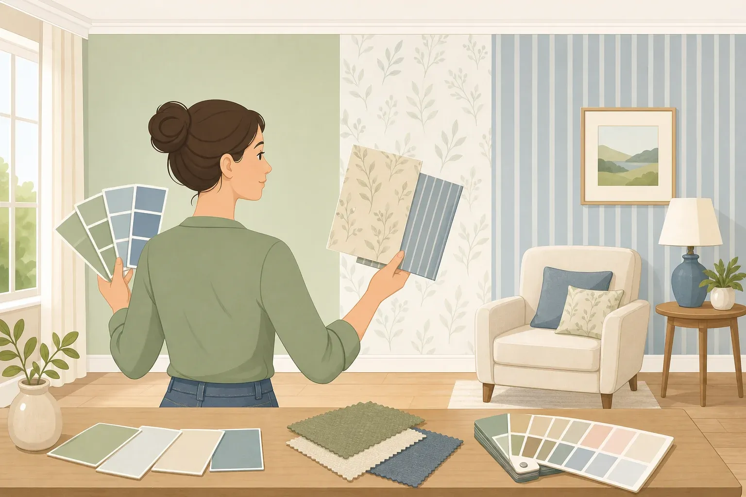
Paint swatches directly on the wall in the actual room, not on white card stock held up in different rooms. The wall color around the swatch matters.
Hold swatches vertically against your dominant finishes: flooring, trim, countertops, cabinetry. Look for undertone clashes, not just whether you like the color in isolation, per Kylie M Interiors.
Check at three points in the day: morning natural light, afternoon natural light, and evening under your artificial bulbs. A color that looks perfect at noon can read gray and cold at 8 p.m. under a daylight-temperature bulb, per Suite Minded.
Match your bulbs to your base color temperature. Warm neutrals and earth tones need 2700K–3000K bulbs to perform, per Kylie M Interiors. Switching even one recessed fixture to a cooler bulb can undercut the entire effect.
Step 4: Choose the right finish to make the color last
Paint color gets the attention. Paint finish determines whether it still looks good in two years. Hotels understand this and choose accordingly.
Eggshell and satin are standard in hospitality interiors because they strike a balance between durability and visual softness. Fully matte finishes require more maintenance despite their visual appeal, according to Kevin Francis Design. For a home that actually gets lived in, that tradeoff matters.
Finish also changes how color reads on the wall; it's a design decision, not just a practical one. House Beautiful highlights designer Ashi Waliany's use of Farrow & Ball Broccoli Brown in high gloss, where the same earthy brown takes on a lacquered, striking quality that a flat finish would never deliver. The color stays the same; the sheen transforms how it feels in the room.
Tonal layering painting walls, trim, and ceiling in slightly different values of the same color creates depth without sharp contrast. Kevin Francis Design identifies this as a growing technique in high-end hospitality, particularly in wellness-oriented properties. At home, it works by painting walls in a mid-value neutral, trim in a slightly lighter version, and the ceiling in the lightest. The room feels cohesive and elevated without looking like a paint chart exploded.
What to do: Use eggshell for bedrooms and living spaces; satin for hallways, bathrooms, and kitchens where wipeable surfaces matter. Reserve flat or matte for ceilings only, where scuffing isn't an issue. If you're painting a feature wall in a darker shade, test both eggshell and satin on your sample swatch; the sheen difference under your specific lighting may surprise you.
Gotcha: High-gloss finishes on walls amplify every surface imperfection. Unless the wall prep is close to perfect, reserve gloss for trim, built-ins, or furniture rather than flat wall surfaces.
Where to start: a practical order of operations
The conclusion most guides skip is the one that actually gets you moving. Here's the sequence that avoids the most common mistakes.
Choose your base color first, then test it against your finishes. Before committing to any accent color, get the foundation right. A north-facing bedroom with limited natural light needs a warmer, slightly deeper neutral, something like a soft greige or warm taupe to avoid reading dull. A bright south-facing living room can handle a cooler or lighter neutral without the same risk.
Fix the bulbs before you repaint. Swap any 4000K or daylight-spectrum bulbs for 2700K–3000K warm bulbs, then live with the room for a week. Neutral bulbs can make a warm cream look muddy, per Suite Minded. You may find the room you already have looks significantly better with that one change alone.
Add one dark accent last, not first. Once the base color is confirmed and the lighting is sorted, identify a single surface for depth: a headboard wall, a built-in, or a hallway. Keep everything else in the neutral base. The contrast is what makes the bold color read as intentional rather than heavy.
That's the full formula: warm neutral foundation, one restrained accent, and lighting that supports both. Soft greiges, muted earth tones, and the expanded neutral palette House Beautiful describes sage greens, muted mauves, warm browns all work as starting points. The specific color matters less than testing it properly in your actual room, under your actual light.
From here, apply the same thinking to finish selection and trim color. Both have as much impact on the final result as the wall color itself.
















Comments
Be the first, drop a comment!