



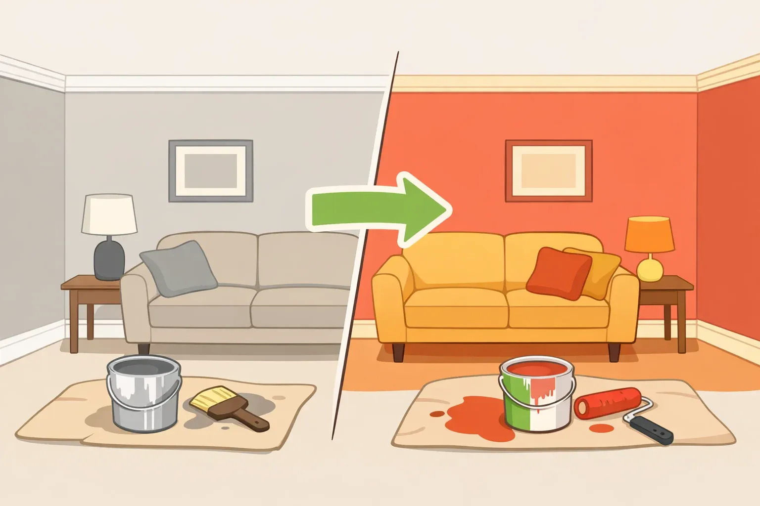
For years, cool gray, builder-grade greige, and flat beige felt like rational paint choices — not because they looked especially interesting, but because they felt safe. They photographed cleanly, worked with common finishes, and seemed unlikely to hurt resale value.
That safety-first logic is shifting. Better Homes & Gardens' coverage of Zillow's 2026 home-trend analysis found that mentions of "color drenching" — painting walls, trim, and ceilings in the same saturated hue — rose 149% in listings heading into 2026. That does not mean every room needs a dramatic ceiling or matching trim, but it does show that more sellers are willing to market color and character instead of hiding behind the safest neutral.
The colors losing ground are not all neutrals. The problem is colder, flatter, more generic versions: cool gray that turns icy, greige that looks builder-grade, and beige that feels unfinished. Here's how to tell whether your walls still work, what makes these shades look dated, and which warmer colors are replacing them.
How to tell if your neutral paint looks dated
Before repainting, check three things: undertone, lighting, and contrast.
Cool gray usually looks most dated when it turns blue or icy in natural light. Greige looks tired when it has no visible warmth or depth. Beige looks flat when it leans yellow, blends into the floor or furniture, and has no contrast from wood, stone, art, or textiles.
Paint a large sample board before committing. Look at it in morning light, afternoon light, and at night with your usual bulbs on. If the color looks dull in every condition, shift warmer instead of simply choosing a darker version of the same shade.
Why safe neutrals started to look stale
Cool gray, greige, and flat beige did not take over because every homeowner loved them. They spread because homeowners were trying not to make a mistake.
Gray photographed cleanly, paired well with stainless appliances and white trim, and read as modern without asking for much commitment. Greige softened that look without leaving neutral territory. Beige offered a familiar fallback for anyone who wanted walls that would not compete with furniture, flooring, or resale expectations.
That same safety is now the weakness. Any color chosen mainly to disappear can start to feel stale through overuse. Designers quoted by Real Simple have been especially direct about the fatigue around "millennial gray" and "sad beige," pointing to a broader move toward warmer neutrals, richer earth tones, and rooms that feel more personal.
The trend signals here come from designer commentary, paint-trend coverage, and listing language — not controlled paint-sales data or proof that one wall color raises resale value. Treat them as direction, not a formula: cold, flat neutrals are fading, while warmer and more layered colors are gaining ground.
The 3 neutral paint colors to rethink in 2026
1. Cool gray
Cool gray is the clearest example of a once-safe color starting to read dated. The issue is not gray itself. It is cool-toned gray, especially with blue or green undertones, applied across walls, cabinets, flooring, and trim until the whole room feels cold.
Good Housekeeping's 2026 paint coverage points to a warmer direction, with cool gray giving way to creams, blues, greens, and stronger contrast. That does not make every gray wall a mistake. A soft gray can still work if the room has warm wood, aged brass, woven textures, creamy trim, or richer accent colors to balance it.
Cool gray looks most dated when it is the only decision in the room: gray walls, gray floors, white trim, stainless steel, and little else. If the room feels more like a flipped listing photo than a lived-in space, the gray is probably doing too much of the design work.
Better replacements include warm taupe, mushroom, clay, stone, gray-green, and soft warm white. These colors keep the flexibility people liked about gray but add more warmth and depth.
2. Builder-grade greige
Greige is not finished. The problem is the low-saturation builder version that looks like it was chosen to meet nobody's objection rather than anyone's taste.
A complex warm greige can still be beautiful. It should shift slightly in different light, pick up warmth from wood or stone, and feel intentional with the rest of the room. The dated version looks the same at every hour of the day and could belong in any new-build hallway, rental, or resale renovation from the past decade.
The stronger 2026 neutral is warmer and more grounded. Think sandy khaki, warm stone, camel, mushroom, soft taupe, or clay beige. A 2026 Colors of the Year roundup shows the same direction across several paint brands, including Sherwin-Williams' Universal Khaki, Behr's smoky jade Hidden Gem, Valspar's Warm Eucalyptus, Benjamin Moore's brown-charcoal Silhouette, and Glidden's Warm Mahogany.
That range matters because it proves the point: neutrals are not disappearing. They are getting warmer, deeper, and less generic.
3. Flat beige
Flat beige is different from warm beige, cream, camel, sand, or plaster. The dated version is thin, yellowish, and underdesigned. It does not feel earthy enough to be warm or crisp enough to feel clean, so it reads as a non-choice.
Beige can still work when it acts as a backdrop for stronger materials: natural wood, stone, linen, leather, warm white, muted green, or deeper brown. It fails when the whole room is beige-on-beige with no contrast, texture, or visible point of view.
The better replacements are wheat, sand, clay, soft tan, warm cream, plaster pink, camel, and brown-based neutrals. These colors share beige's approachability but add warmth and dimension.
For a low-risk update, start with the surfaces you already have. If your floors are orange-toned wood, avoid beige that turns too yellow. If your countertops are cool stone, test taupe or mushroom instead of jumping straight to cream. If your furniture is already beige, bring in contrast through paint, art, curtains, or a deeper accent wall.
What to use instead of cold, flat neutrals
The replacement colors fall into two broad groups: warmer neutrals with depth and more expressive colors that still feel livable.
The easiest shift is earthy warmth. Browns, clays, sands, creams, khakis, warm whites, and muted greens are showing up across 2026 paint coverage because they add character without overwhelming a room. They also pair well with materials many homes already have: wood floors, stone counters, brass hardware, woven shades, linen upholstery, and leather furniture.
The second path is more colorful but still grounded. Smoky blue-green, moss green, oxblood, plum, charcoal brown, mineral blue, and muted terracotta can make a room feel current without going neon or overly trendy. These colors work best when they are repeated somewhere else in the room, even in a small way — a pillow, framed art, rug, lampshade, cabinet color, or upholstery fabric.
If resale is part of the decision, avoid assuming plain white or beige is always safest. Real Simple's coverage of Zillow's 2026 Paint Color Analysis found buyers responded favorably to character-rich but livable colors such as chocolate brown, sage green, charcoal gray, and pale blue, while ochre yellow performed poorly. The takeaway is not to chase every color trend before selling. It is to choose colors that feel warm, current, and easy to imagine living with.
How to update these colors without overcorrecting
If you already have cool gray, builder-grade greige, or flat beige on your walls, do not repaint just because a trend changed. First, check whether the color has warmth, depth, and enough contrast from the rest of the room.
Cool gray is easier to keep when it is balanced by warm wood, aged brass, woven textures, creamy trim, or richer accent colors. It looks most dated when it sits flat against white trim, gray flooring, stainless steel, and little else.
Greige still works when it has a clear warm undertone and changes slightly in different light. If it looks the same at every hour of the day and could belong in any new-build hallway, it is probably the builder-grade version designers are moving away from.
Beige needs contrast. Pair it with natural wood, stone, linen, warm white, muted green, or deeper brown so it reads as a backdrop, not a blank space.
Before choosing a replacement, paint a large sample board and move it around the room. Check it in morning light, afternoon light, and under your usual bulbs at night. The safer update is not automatically a bolder color. It is a more intentional one: warmer, deeper, better tested in your light, and supported by the materials already in the room.














Comments
Be the first, drop a comment!