



White paint doesn't make a room feel larger. It makes it bright. Architect Sarah Jacoby puts it plainly: "White doesn't make things bigger, it just makes it white." Designer Emily Frank of Frank & Co. Home goes further: "White reflects light, but brightness and spaciousness are not the same thing." Those are two different perceptual signals, and paint color addresses only one of them.
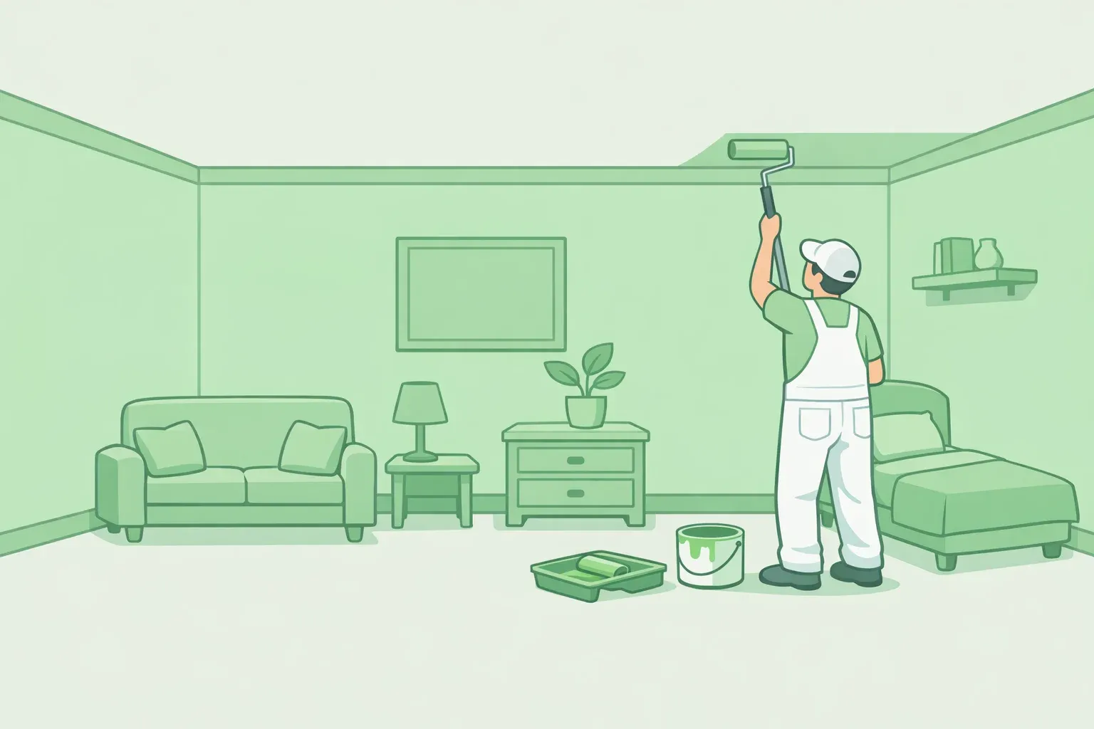
The fix this guide covers is continuous color application: wrapping walls, ceiling, trim, and baseboards in one unbroken treatment to eliminate the contrast lines that signal where the room stops. Lighting and furniture scale support that approach. Structural changes are out of scope. If a wall you can't move is the problem, this is still the right article.
Step 1: Understand what you're actually changing: edges, not brightness
The real problem in most small rooms is visual fragmentation. Every contrast line between wall, ceiling, and trim registers as a boundary. A white room with contrasting trim, a colored ceiling, and baseboards in a third tone gives the eye three hard stops to process before it reaches any furniture. Each one announces where the room ends.
Removing those contrasts doesn't add square footage. It removes the signals that broadcast how little square footage there is. Color applied with intention creates "atmosphere, depth, and even a sense of mystery, qualities that often make a small room feel larger emotionally than it is physically," as designers explained to Architectural Digest this month. That's a description of how spatial perception responds to compositional cues, not a soft aesthetic claim.
One structural limit worth naming before anything else: ceiling height and floor-plan shape are primary drivers of perceived openness in small living spaces. That finding speaks to what the study measured; it follows, as a practical inference, that paint alone can't fully compensate for those structural constraints. This technique will meaningfully change how a room reads. It won't double its apparent size.
The goal throughout: a continuous visual envelope running from baseboard to ceiling with no contrast lines interrupting it.
Step 2: How to make a small room look bigger with paint: light drench, dark drench, or mid-tone
Match the approach to the room
Two variables determine which direction to go: how much natural light the room receives, and how much commitment you're ready to make.
Light drenching uses a mid-tone or softly saturated hue across all surfaces. It's the lower-stakes entry point and works in most conditions without requiring good light exposure. Dark drenching applies deep, moody tones to every surface. Higher reward, but it needs adequate natural light to read as dimensional rather than just dim. If the room gets little sun, start with a mid-tone and test from there.
Room type matters too. Bedrooms and bathrooms are the strongest candidates for dark drenching because they're small by nature and benefit most from the jewel-box effect: drama that works because of the room's intimacy, not despite it. Entryways and hallways suit either approach. Living rooms with multiple light sources and sightlines into adjacent spaces are better served by lighter or mid-tone color drenching in small spaces.
Renters: if your lease prohibits paint, skip to Step 3 for wallpaper options. Step 4 on lighting requires no paint at all.
Executing the envelope: walls, ceiling, trim, and baseboards
Alissa Friedman of Bright Design Lab calls the full-coverage approach "color capping." The idea is to wrap walls, ceilings, and trim in one rich hue, creating what she describes as a seamless envelope. Her summary of the result: "It feels like a hug rather than a cage." Seamless is the keyword. A baseboard in a contrasting tone makes the floor a hard edge. A door frame that doesn't match keeps that boundary visible. Every surface goes into the treatment.
For finish: eggshell on walls, satin or semi-gloss on the ceiling in the same color. The slight sheen difference reflects marginally more light without breaking the color match. Trim and baseboards in the same color as the walls, matched finish. Avoid flat on ceilings in bathrooms or anywhere moisture is ongoing.
Dark paint for small rooms works through depth rather than reflected light. Christene Barberich painted both tiny bedrooms in her Brooklyn apartment in two of Farrow & Ball's darkest grays, Down Pipe and Hopper Head. Her account: the color creates "a dimensional feeling that actually activates a smaller space, almost like an emotional spark that draws you into the feeling as opposed to the dimensions."
Dark drenching only works as an envelope, not as an accent. A single dark wall surrounded by white trim and a white ceiling produces the opposite effect. The room reads as a dark wall inside a small white room, which makes every boundary more visible. If you go dark, go dark everywhere.
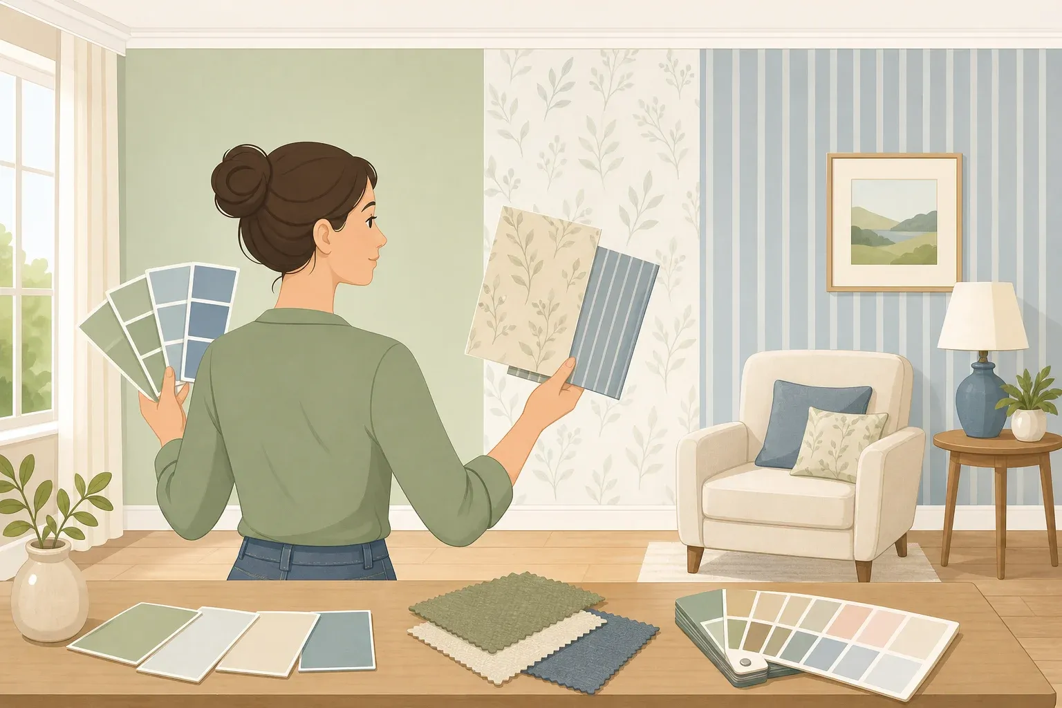
Test before buying full coverage. Deep tones shift significantly by orientation. A forest green or navy that reads as rich and dimensional in a south-facing room can flatten to near-black in a north-facing one. Paint a sample at least 12 by 12 inches directly on the wall and observe it in morning and evening light before committing to full coverage.
Step 3: Extend continuity with pattern: wallpaper and tile
Vertically oriented wallpaper doesn't mean literal stripes. Any pattern that repeats up and down the paper length guides the eye toward the ceiling, exploiting the same perceptual mechanism as paint continuity. The eye follows vertical lines upward and registers height rather than measuring the actual floor-to-ceiling distance.
The integration rule: match the wall paint to the dominant color in the wallpaper. Designer Sarah McCann explains that "a paint that closely matches the most prominent color in the wallpaper helps the room to appear more expansive as it begins to blur the boundaries of the walls." Applied with this principle, bold wallpaper can make the walls recede entirely. As Friedman puts it: "The walls disappear, and the story takes over." The viewer's attention goes to the pattern, not the perimeter.
Graphic tile applies the same small room paint logic to horizontal surfaces. A repeating pattern creates rhythmic flow that keeps the eye moving around the space rather than settling on its edges. In a bathroom or kitchen where tile runs from floor to backsplash, continuity of pattern across that transition cuts the number of visual stops.
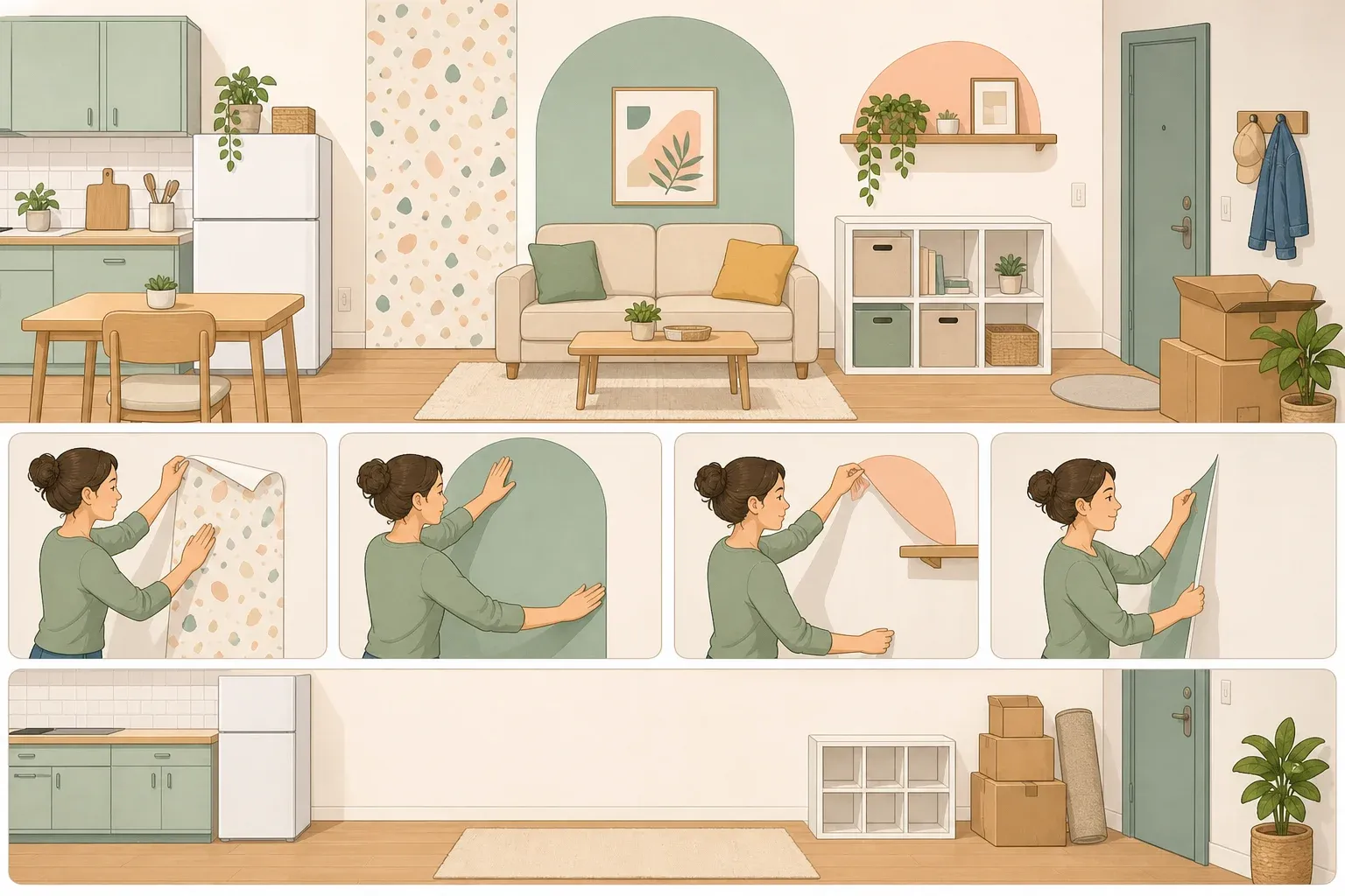
Renter note: peel-and-stick wallpaper in vertically flowing patterns is a functional substitute. The directional effect works the same way, and the matched-paint rule still applies wherever painted surfaces are adjacent.
Step 4: Position lighting to reinforce the vertical, not interrupt it
A pendant hung low from a low ceiling does exactly what boundary blurring aims to prevent: it marks the ceiling's proximity and pulls the eye down to the room's most constrained dimension. McCann is direct about the fix: "Swap to wall lighting, as well as oversized floor lamps and tall table lamps." Move sources off the ceiling and raise their effective position.
Wall sconces, tall floor lamps, and table lamps placed above the furniture sightline push pools of light onto the upper third of the wall. "When the table lamps are placed above this line, the pools of light hit higher on the wall, helping to create a sense of elongated space," McCann says, calling it "one of the simplest yet most effective ways to instantly draw the eye up." The eye travels upward to find the light, reinforcing the same vertical direction that paint and pattern already establish.
Perceptual research provides useful context. In controlled VR studies, how far and in which direction the eye could travel accounted for 36.3% of the variance in perceived spaciousness, a larger effect than surface color. Lighting direction operates on the same general principle: give the eye a clear upward path, and the room reads taller. That research addresses physical window access, not artificial lighting; the parallel is a reasonable extrapolation, not a direct experimental comparison.
One condition to settle before repositioning lights: wall-directed and upward-aimed sources work with the color envelope only if the ceiling is part of that envelope. Upward light hitting a white ceiling while the walls are dark highlights the contrast rather than dissolving it. Commit to the full surface treatment first.
Step 5: Calibrate furniture scale to preserve the envelope
Every piece of furniture introduces visual edges, silhouettes the eye registers and catalogs. A room full of undersized pieces doesn't feel airy. It feels fragmented because more objects mean more interruptions to the continuous field the color treatment is working to establish.
Friedman has a name for what happens when small-room advice is followed too literally: the Dollhouse Effect. "When every piece is underscaled, a room can begin to feel fragmented and unsettled, tiny chairs, narrow tables, and diminutive case goods create more visual noise because there are simply more individual objects competing for attention," she says. Her preference runs the other direction: fewer pieces with stronger proportions. One substantial vanity, one well-proportioned chair, one large mirror rather than a cluster of smaller objects competing for the same territory.
The payoff connects directly to what the color envelope is trying to accomplish. "When the furnishings are appropriately scaled and intentional, the eye reads the composition first and the square footage second." The envelope creates a unified field; properly scaled furniture lets that field read without interruption.
On keeping things off the floor: "There's a real line between collected and claustrophobic, keep visual weight in mind, and keep things off the floor," Friedman says. Exposed legs reveal floor area and reduce visual weight. Pieces that sit flush to the floor shrink the visible floor plane and work against everything the envelope accomplishes.
Implementation checklist
Choose a color register based on natural light and room type: light, mid-tone, or dark drench.
Apply it to walls, ceiling, trim, and baseboards; eggshell on walls, satin or semi-gloss on the ceiling in the same color.
Add vertically oriented wallpaper or a repeating pattern with adjacent paint matched to the dominant color.
Move light sources above furniture sightlines and off the ceiling.
Reduce furniture count, raise pieces off the floor, let the composition do the work.
The perceptual evidence supports the underlying mechanism. Window access alone accounted for 36.3% of spaciousness variance in controlled VR testing, driven entirely by how far the eye could travel rather than what color surrounded it. Paint continuity and light direction operate on the same logic, pushing the eye outward and upward rather than letting it land on the room's edges.
One calibration before committing: the design case for dark paint and full color drenching rests on strong practitioner consensus, not a controlled head-to-head study against white walls. Friedman and Barberich's results are real, but a north-facing bathroom may behave differently than a Brooklyn bedroom with southern exposure. Sample generously, observe across light conditions, and treat the first coat as a test rather than a finish. The specific color requires your own room as the laboratory.
To go further from here: paint undertones and how they shift between artificial and natural light, sourcing vertically flowing wallpaper for low-ceiling rooms, and evaluating sheen levels across different room orientations are all worth the next round of research.














Comments
Be the first, drop a comment!