



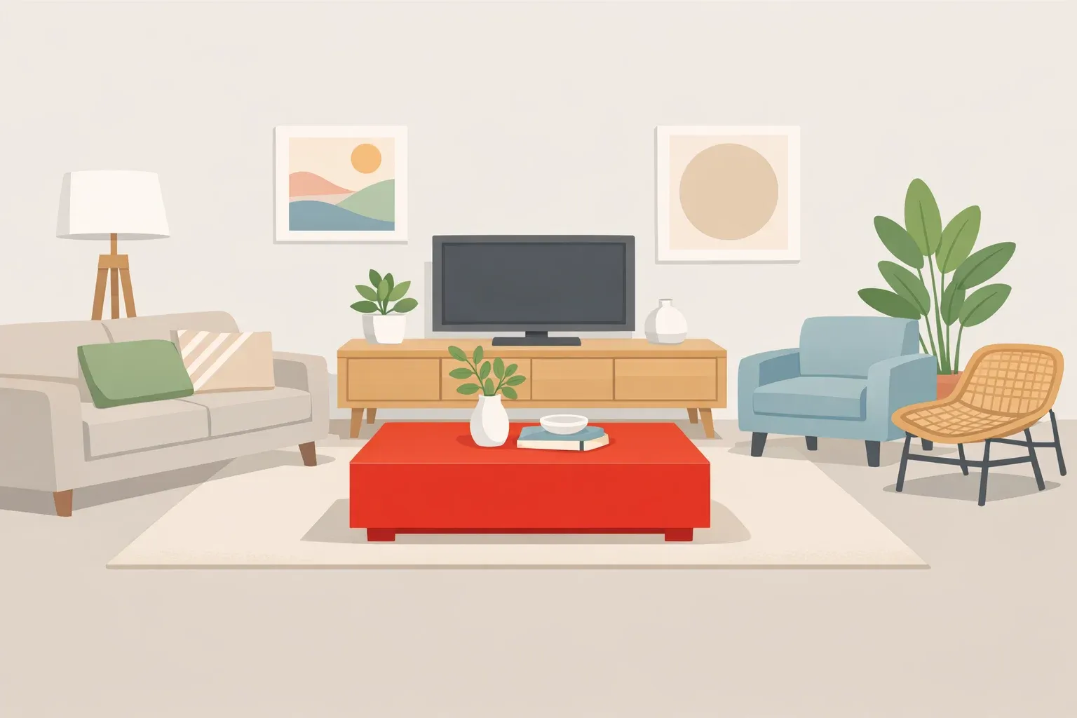
A red lamp in a cream living room or a burgundy vase on a pale wood table can change where the eye settles. That simple effect is the basis of the unexpected red theory: one surprising red accent can make a room feel more considered.
Brooklyn interior designer Taylor Migliazzo Simon popularized the idea in early 2024 after noticing red details in rooms with otherwise very different styles. The accent does not need to match the main palette. Its contrast is the point.
Still, red is not a guaranteed decorating fix. The result depends on the object's shade, size, material, and placement. Used carefully, it can create focus and give a restrained room more energy. Used poorly, it can feel distracting or forced.
What is the unexpected red theory?
The theory is a styling prompt rather than a fixed rule. It involves placing one red object where the color would not ordinarily be expected.
A neutral living room might gain a red table lamp. A pale-blue kitchen could include a brick-red stool. A soft pastel hallway might feature a small crimson frame.
The object should stand out without looking disconnected. Its shape, finish, material, or period should relate to something nearby, even when its color does not.
A glossy red lamp may suit a contemporary room with polished finishes. A faded burgundy textile may sit more naturally beside antique wood furniture. The color supplies the surprise; the object's other qualities help it belong.
Why the trick can work
Red often attracts attention when it contrasts sharply with the colors around it. In a muted room, even a small red object can become a focal point and make the surrounding palette appear more deliberate.
Scientific research does not prove that a red accessory improves a room. A virtual-reality study of environmental colors found higher skin-conductance responses in some red-room conditions, but only under certain combinations of lightness and saturation. Participants did not report matching changes in mood or arousal.
The more useful explanation is contrast. A surprising accent breaks up visual sameness and keeps a space from looking overly coordinated. Red can do that quickly, but it is not the only color capable of doing so.
How to use the unexpected red theory
Start with the room
Identify the dominant colors in the walls, flooring, furniture, and largest textiles. Pay particular attention to permanent finishes such as tile, countertops, and built-in cabinetry.
The red does not need to match those surfaces, but it should look intentional beside them.
Test one movable object
Begin with something inexpensive and easy to remove, such as:
A red book or tray on a neutral coffee table
A burgundy vase on a wood console
A crimson lampshade on a brass or ceramic base
A cherry-red frame within a muted gallery wall
A brick-red stool in a cream or pale-blue kitchen
Avoid buying several matching red accessories at once. When the color appears in every corner, it stops being unexpected and becomes the room's main scheme.
Choose the undertone carefully
Warm reds such as brick, rust, coral, and tomato often work well with cream, tan, brass, terracotta, warm wood, and earthy green.
Cooler reds such as cranberry, raspberry, crimson, and burgundy may sit more naturally beside blue, gray, silver, mauve, and cool white.
These are starting points, not strict rules. When uncertain, begin with a muted red. Deep burgundy, faded brick, and soft rust are usually easier to introduce than a highly saturated primary red.
Consider the material
The same red can feel very different depending on the surface.
Glossy lacquer creates a sharper, more contemporary effect. Velvet, wool, aged leather, matte paint, and faded textiles soften the color.
A bright plastic object may look playful in a modern kitchen but misplaced in a formal sitting room. An oxblood leather stool can add contrast without the intensity of a bright scarlet accessory.
Check the placement and light
Place the accent near an existing focal area, such as a coffee table, reading chair, fireplace, gallery wall, or entryway console.
Then view it in daylight and under the room's evening lighting. A red that looks deep and balanced in natural light may appear orange, pink, brown, or overly intense under warm bulbs.
Move the object to two or three positions and photograph each arrangement. A photo can reveal whether the red supports the room or dominates it.
How to tell whether it works
The accent should attract attention without becoming the only feature you notice.
It is probably working when:
It creates a clear focal point.
The surrounding colors look more purposeful.
Its material or style relates to another object.
The room feels flatter when the accent is removed.
Reconsider it when the object looks temporarily placed, clashes with fixed finishes, dominates every photograph, or joins so many matching red pieces that the room feels themed.
Before abandoning the idea, try moving the object or choosing a deeper, softer shade.
Why the idea has lasted
Unexpected red is no longer a new social-media trend. It has lasted because it turns a familiar decorating technique — using contrast to direct attention — into a simple, low-commitment experiment.
The principle has also moved beyond color. Architectural Digest highlighted the related unexpected lamp theory in December 2025, applying the same idea to lamps with surprising scales, styles, materials, or placements.
Both ideas reject the assumption that every object must match perfectly. One contrasting detail can give a room more character, but it still has to work with the colors and materials around it.
Start with one movable red object. Keep it only when it improves the room as a whole, not merely because it stands out.














Comments
Be the first, drop a comment!