



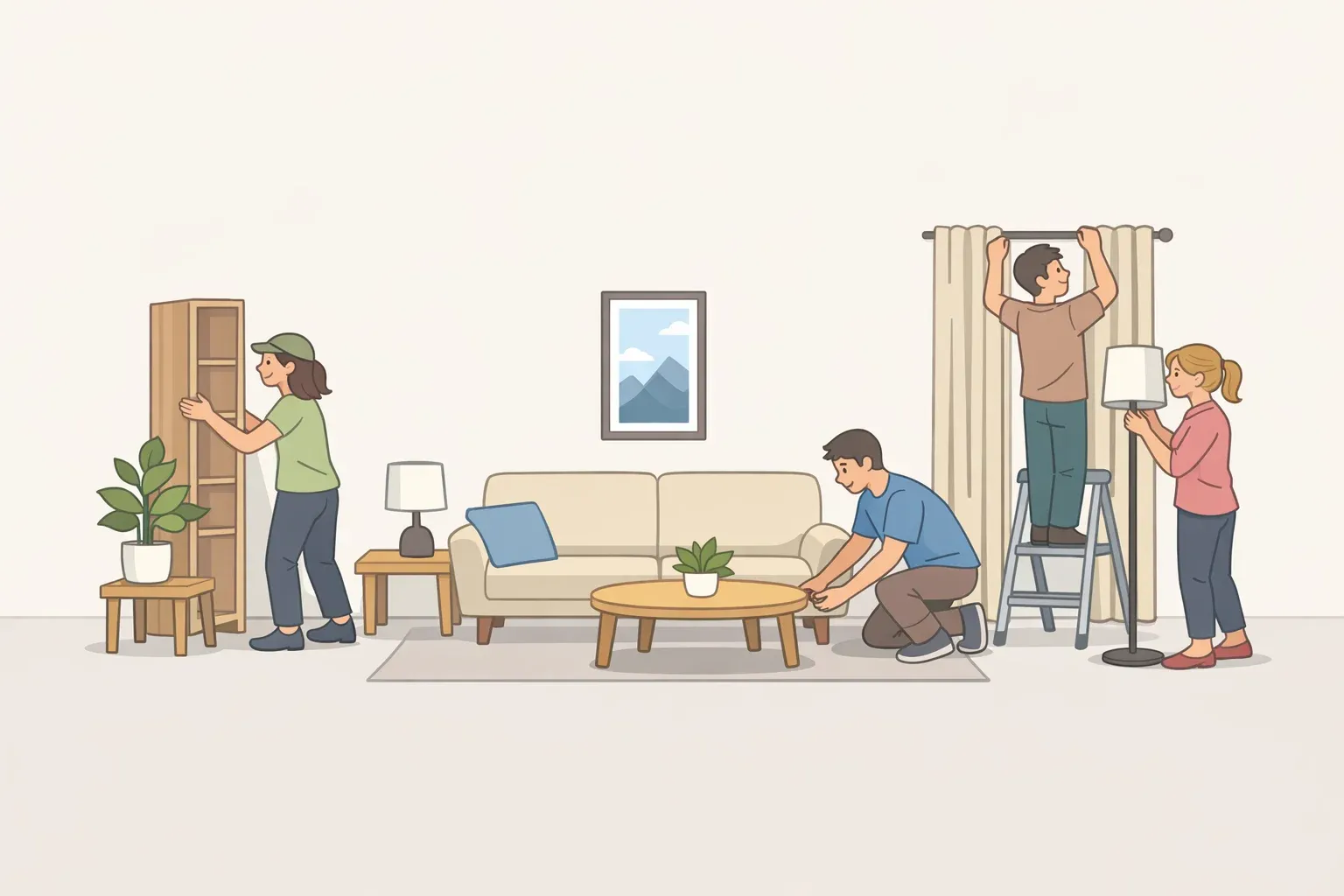
How to make a small room look bigger, according to designers
This guide walks through four design principles color continuity, vertical emphasis, furniture scale, and light management that make any small room look bigger and feel genuinely larger. The principles apply across bedrooms, living rooms, home offices, and studios. Each section leads with the highest-impact move and explains the visual mechanism behind it.
Here's the core problem with most small-space advice: it tells you what to do without explaining why it works. Paint it white. Buy small furniture. Keep it minimal. These instructions produce inconsistent results because they treat symptoms rather than causes. Architect Sarah Jacoby is blunt on the white-paint myth: white doesn't make a room bigger, it just makes it white (Architectural Digest). Her colleague Emily Frank of Frank & Co. Home sharpens the distinction: brightness and spaciousness are not the same thing, and confusing them leads to a lot of rooms that feel both pale and cramped (Architectural Digest).
What actually drives the perception of space is uninterrupted visual flow. Every edge where color changes, every piece of furniture that stops the eye, every shadow that collapses a corner these are the real sources of smallness. As JJones Design Co. notes, a room's sense of openness has far more to do with scale, flow, and visual decisions than with actual square footage. The four steps below address each interruption in turn. They work best applied together, though each one produces results on its own.
One governing rule before starting: the rooms that designers describe as genuinely spacious are the ones where every decision was made deliberately and confidently. Hedging painting everything a cautious off-white, buying furniture that's a little small, keeping everything a little sparse produces rooms that feel tentative, not open (Architectural Digest). Commit to the approach.
Step 1: Eliminate color breaks across every surface walls, ceiling, trim, and furnishings
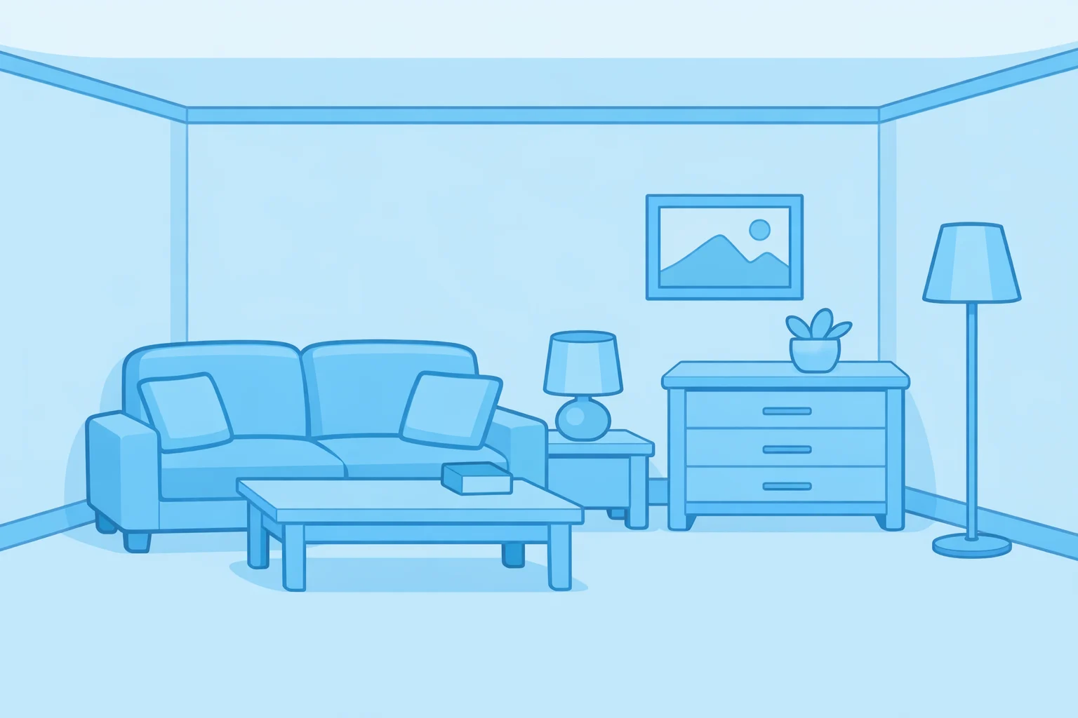
What visual interruption this removes: Every place where one color stops and another starts is a boundary the eye registers and counts. Multiply those stops across walls, trim, ceiling, and floor, and a room reads as a collection of small surfaces rather than one continuous space.
The highest-impact move: Paint the ceiling, walls, baseboards, trim, built-ins, window casings, and door frames the same color. All of them. Designer Rozit Arditi of Arditi Designs applied Farrow & Ball's Railings a near-black navy across every surface in a small bedroom, including the ceiling, and found the result felt both larger and considerably cozier (House Beautiful). Her reasoning: dark colors make edges recede rather than announce themselves. Designer Natasha Willauer reaches the same conclusion from the lighter end of the spectrum, recommending a single color across all surfaces in rooms with sloped or peaked ceilings because it eliminates the visual breaks between wall and ceiling planes (Architectural Digest).
Light or dark, the mechanism is the same. Jennifer Jones, principal designer of Niche Interiors in San Francisco, identifies it directly: a room with minimal contrast gives the eye no stopping points between wall and ceiling, and the space reads as larger for it (Architectural Digest). Alissa Friedman of Bright Design Lab calls the full treatment "color capping" wrapping walls, ceilings, and trim in a rich, continuous hue to create what she describes as a seamless envelope: "It feels like a hug rather than a cage" (Architectural Digest).
Extend the principle to furnishings. Paint and trim are the foundation, but the envelope approach works best when rugs, upholstery, bedding, and millwork all stay within a tight tonal range. Designer Ovadia describes the goal: when the millwork, the bed, and the textiles all operate within a very tight tonal window, nothing visually jumps out the eye reads the room as a whole composition rather than individual pieces, which softens edges and stretches perceived space (Architectural Digest). In a living room, this means choosing a sofa, rug, and drapes that share the same tonal family. Not identical, but not in contrast.
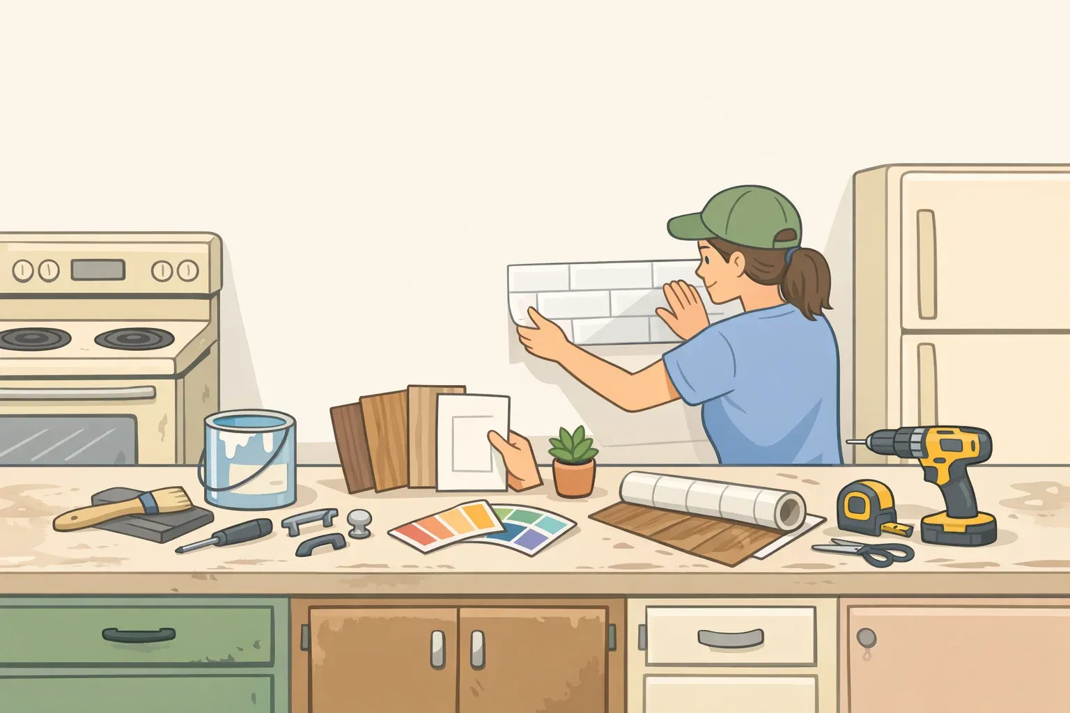
For renters: Peel-and-stick removable wallpaper applied consistently carried up onto the ceiling achieves a comparable boundary-blurring effect without permanent commitment. Prime walls first; the adhesive bonds better on a smooth, even surface (Better Homes & Gardens).
Tradeoff to manage: If the wallcovering or paint has a graphic pattern, keep furnishings in solid, lighter-toned fabrics. Pattern and furniture fighting for attention across a tonal-envelope room recreates the visual fragmentation you're trying to eliminate.
Step 2: Pull the eye upward using three high-impact moves
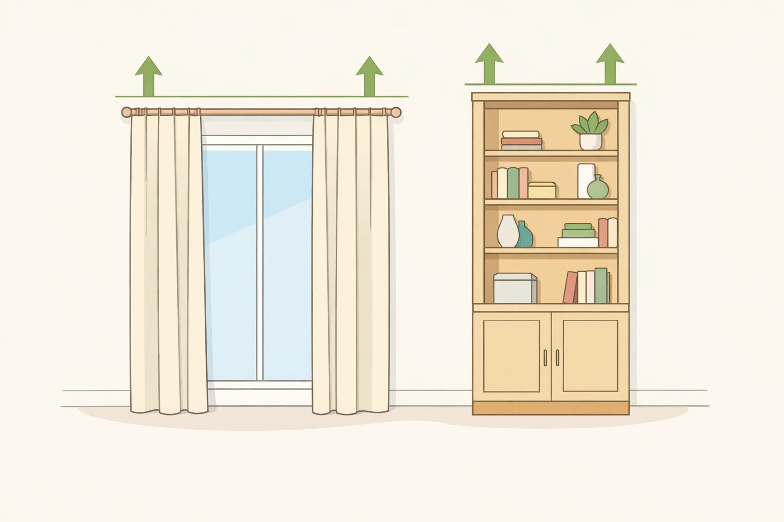
What visual interruption this removes: When furniture and visual weight concentrate at floor level, the upper two-thirds of a room go unused and the room reads as compressed. Vertical emphasis forces the eye to scan upward, creating perceived volume that square footage can't provide.
Designer Rayman Boozer of Apartment 48 identifies this as essential rather than optional in small spaces: drawing the eye up and around creates volume (Architectural Digest). Designer Mandy Cheng describes the failure mode clearly when everything sits at floor level, a room feels cramped; extending design elements upward creates openness and envelops rather than crowds (Architectural Digest). Three moves deliver the most reliable results:
Move 1: Mount curtains at ceiling height, not window height. Hang drapery hardware as close to the ceiling line as possible and run panels floor-to-ceiling, regardless of where the actual window sits. Designer Darlene Molnar describes floor-to-ceiling drapery as a way to elongate a room and make windows appear to soar (Architectural Digest). Designer McClure takes it further in living rooms and offices without generous windows curtains run wall-to-wall and ceiling-to-floor even when the window is small, which stretches the visual architecture of the entire wall (House Beautiful). Use fabric that hangs in clean, simplifyd folds; heavily decorative or gathered treatments add bulk where you want height.
Move 2: Run shelving or millwork to the ceiling. Built-in millwork that reaches the ceiling reads as architecture rather than furniture it becomes part of the room's structure rather than an object sitting inside it. Boozer calls this his go-to solution for adding storage and height simultaneously (Architectural Digest). The budget version: wall-hung prefab shelving installed in a continuous vertical run, carried all the way to the ceiling rather than stopping at eye level. Shelves that cap at shoulder height cap the visual height of the room with them.
Move 3: Install a statement pendant or ceiling fixture. A small, recessed, or understated ceiling fixture anchors attention at the ceiling plane without lifting it. A considered pendant appropriately scaled and hung at the right height pulls the gaze upward and gives the room presence. Designer Christine Markatos Lowe of Christine Markatos Design uses a statement light fixture deliberately to pull the gaze upward, elongating the space and enhancing the sense of height (Architectural Digest). McClure puts it plainly: tiny fixtures emphasize the lack of scale; a larger pendant gives the room confidence (House Beautiful).
Supporting moves for rooms where the above aren't possible: Vertical stripe patterns in wallpaper or drapery fabric elongate walls on the same principle that lengthens appearance in fashion (Architectural Digest). Decorative crown molding, large-format wall art hung high, and wall sconces with upward-facing light all draw the eye to the upper portion of the room and compound the effect.
Small room design tricks that reduce visual clutter
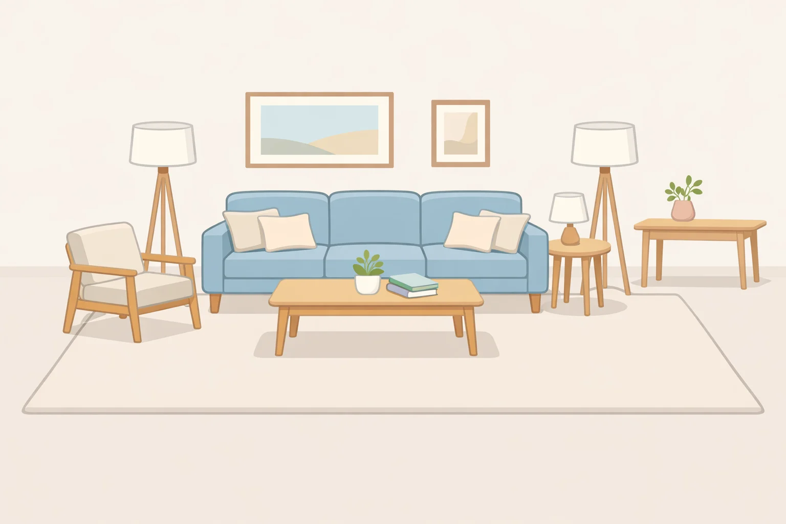
What visual interruption this removes: More objects mean more stopping points for the eye. Underscaled furniture multiplies those stopping points without providing the compositional weight to organize them. The floor disappearing under furniture and clutter collapses the room's sense of depth.
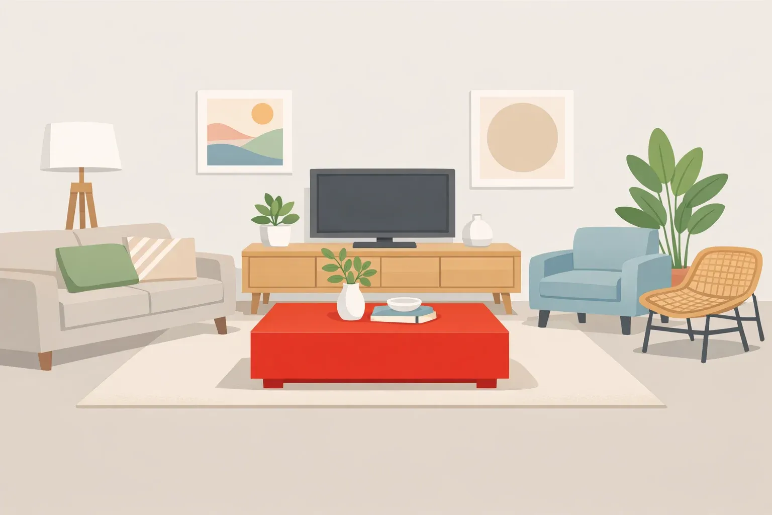
The scale misconception. The standard instinct is to buy smaller furniture for a smaller room. Alissa Friedman has a name for where this leads: the Dollhouse Effect. When every piece is underscaled, the room fills with more individual objects competing for attention, and the result is fragmented and visually unsettled rather than open (Architectural Digest). The fix is not oversized furniture for its own sake, but fewer pieces at proper scale with breathing room around them. When furnishings are appropriately scaled and intentionally chosen, the eye reads the composition first and the square footage second (Architectural Digest). Designer McClure makes the same case: one substantial piece with space around it beats a collection of smaller items competing for attention (House Beautiful).
Apply this practically:
- In a living room: one well-scaled sofa rather than two small loveseats. Reduce side tables and accent chairs until what remains has room to breathe.
- In a bedroom: treat the bed as the architectural anchor. Designer Stephanie Kraus of Stephanie Kraus Designs used the linear frame of a canopy bed to echo the pitch of a ceiling, creating layered geometry that takes up volume without generating visual clutter a room within a room (Architectural Digest).
- In a home office: one substantial desk and one chair at appropriate scale, rather than three small supplementary pieces that each claim their own zone.
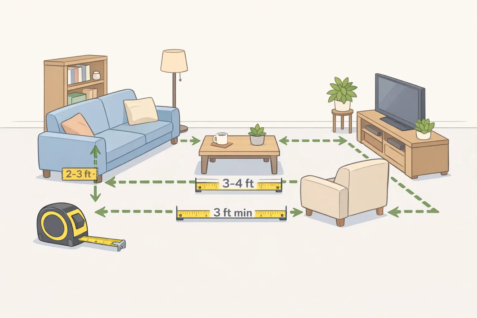
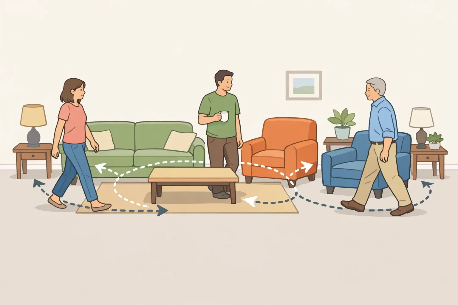
Expose the floor plane. Furniture with visible legs rather than pieces that sit flush to the floor keeps sightlines open beneath the furniture line. JJones Design Co. notes that properly scaled pieces with exposed legs and balanced proportions consistently read as more cohesive and more spacious than floor-hugging, heavy-based alternatives. Maintain walkways of at least 30–36 inches wherever possible clear paths prevent the compression that makes a space feel smaller than its actual floor plan. Keep the floor itself clear: Friedman's caveat on bold, layered rooms is specific watch visual weight accumulation and keep things off the floor to stay on the right side of the collected-versus-claustrophobic line (Architectural Digest).
Use a larger rug, not a smaller one. Designer Molly Torres of DATE Interiors identifies this as the most counterintuitive move in small-space design: a rug that nearly fills the room leaving only six inches to a foot of exposed floor at the perimeter grounds all the furniture in a single composition and makes the space read as more expansive, not less (House Beautiful). All furniture should have at least its front legs on the rug, which visually connects the pieces and reduces fragmentation.
Tradeoff to manage: If you opt for one large-scale anchor piece, protect the walkway clearance around it. A properly scaled sofa pushed against a wall with clear paths on both sides reads very differently than the same sofa centered in a room with no room to move.
Step 4: Manage light and mirrors to extend sightlines and eliminate dead corners
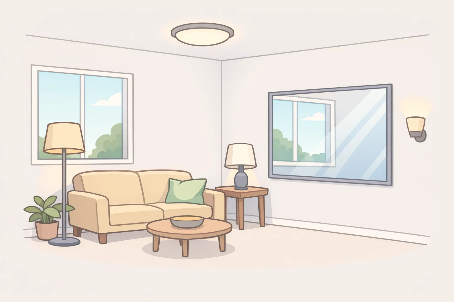
What visual interruption this removes: Shadowed corners visually compress a room by implying it ends where the light does. A single overhead fixture creates uneven illumination by definition, leaving the perimeter darker than the center. Dark perimeters make walls feel closer.
Layer your light sources. One ceiling fixture in the center of a room will almost always create uneven illumination (JJones Design Co.). Replacing or supplementing it with a combination of floor lamps, table lamps, and wall sconces at different heights reduces corner shadows and creates the perception of depth. Warm bulbs in the 2700K–3000K range create softness and depth; cool, harsh lighting flattens a room and makes it feel sterile rather than expansive. The mechanism is the same in living rooms, bedrooms, and home offices.
Use mirrors to extend depth, not just to decorate. Julien Legeard, founder and principal designer at Legeard Studio in New York, treats mirrors as spatial tools rather than decorative afterthoughts: in bedrooms and closets, they dissolve boundaries and extend the perception of depth (Architectural Digest). The most effective placement is directly opposite a window, where a large mirror doubles the apparent depth of the room while amplifying available daylight into areas natural light doesn't reach directly (JJones Design Co.; Better Homes & Gardens). Size matters: a large mirror reads as an extension of space; a small decorative mirror reads as an object.
Maximize natural light during the day. Keep blinds and curtains open to let in daylight. If privacy is a concern, sheer panels preserve light flow better than blackout treatments (Better Homes & Gardens). This is the lowest-cost, highest-return step available and it compounds every other principle here by revealing the continuous color envelope, the vertical emphasis, and the clear floor plane that the other steps create.
By room condition:
- Dark room with minimal natural light: prioritize layered artificial lighting at the perimeter and a large mirror opposite whatever light source exists.
- Room with adequate natural light but shadowed corners: add floor lamps to dark corners, warm bulbs only.
- Narrow room: place the mirror on a short wall to suggest depth along the longest axis rather than width.
What to do first and in what order
The four principles share one goal: reducing the number of places the eye stops and registers a boundary. But they're not equally fast or equally cheap. Starting in the right sequence matters.
If budget and time are both limited, move the curtains first. Hanging drapery hardware at ceiling height costs almost nothing and changes the proportions of a room immediately it's the single edit with the best return on an afternoon. Next, address furniture scale: removing two underscaled accent chairs and replacing them with one well-proportioned piece reduces visual noise without requiring a repaint. Then tackle lighting. Adding two floor lamps to opposite dark corners eliminates the shadows that make a room feel small after dark, particularly in a space where the ceiling principle has already opened up the upper register.
Color continuity repainting walls, ceiling, trim, and built-ins in a single hue takes the most commitment but produces the most dramatic result. Do it last, once the furniture plan is settled, so the color envelope wraps a composition rather than a work in progress.
These decisions compound. A room doesn't need to be bigger it needs to stop announcing its own dimensions (Architectural Digest). Two principles applied confidently will outperform four applied halfway.










Comments
Be the first, drop a comment!