


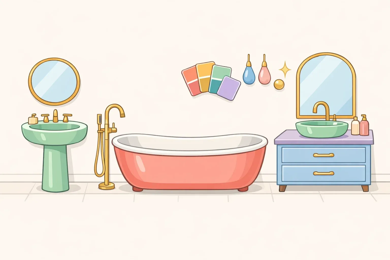
Create Designer Color Palettes That Actually Work Together (No Expensive Consultant Required)
Got 10 minutes and a neutral room that feels flat? This "color echo" technique creates palettes that look professionally designed without expensive consultations. The method builds on how colors naturally flow together, creating sophisticated schemes that feel both intentional and effortless—just like the seamless transitions you see in nature.
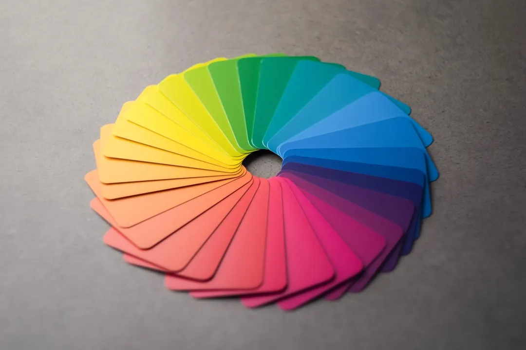
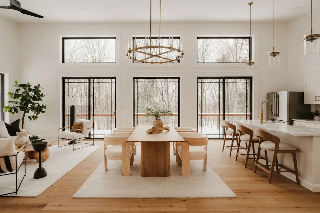
Color echo works by layering related hues throughout a space to create visual rhythm and unity. Designers use this approach to establish cohesive palettes that feel naturally harmonious, according to Elle Decor. The technique mirrors how colors appear in nature—like sunset transitions from sky to horizon—making spaces feel balanced and calming while avoiding the chaos that comes from random color choices.
Difficulty: Novice
Time: 2-3 hours for planning and initial application
Cost: $25-75 depending on room size
Why You'll Like This (Quick Intro)
Traditional color rules feel limiting—match everything perfectly or risk looking amateurish. Color echo breaks that cycle by using the visual relationships your brain already finds pleasing. Instead of fighting to coordinate random colors, you're working with nature's own palette logic to create spaces that feel thoughtfully designed rather than accidentally assembled.
What makes color echo actually work
The secret lies in understanding how neighboring colors create natural visual connections across a room. Color echo uses adjacent hues on the color wheel to build palettes that share underlying pigment characteristics, research from BY Design & Viz shows. These analogous relationships create harmony because the colors literally contain shared chemical properties—they're color relatives, not strangers.
Unlike traditional accent walls or bold contrasts that fight for attention, echoed colors support each other by creating gentle transitions throughout your space. Studies indicate that analogous color schemes produce positive psychological effects, with research showing they make rooms feel more cheerful and interesting than stark neutral schemes. One 2019 study found that analogous colors in workplaces created the most positive feelings, particularly purple-blue combinations.
Your brain processes these color relationships as naturally pleasing because they mirror patterns found everywhere in nature—from autumn leaves transitioning through warm tones to ocean depths flowing from teal to navy. This is why color echo feels sophisticated rather than chaotic—you're working with your visual system instead of against it.
Choose your anchor color first
Every successful echo palette starts with one dominant hue that grounds the entire space. This anchor color appears on your largest surfaces—walls, major furniture pieces, or area rugs, as BY Design & Viz explains. Choose something you genuinely love because it will set the tone for everything else, becoming the foundation that all other colors either echo or complement.
Your anchor should work in at least three places throughout the room to create proper visual balance. Think beyond just wall color—consider how this hue might appear in upholstery, window treatments, built-in elements, or even artwork frames. The goal is creating a foundation that feels intentional rather than accidental, like you planned the entire palette around this central choice.
Test your anchor choice at different times of day since lighting dramatically affects color perception. Natural light changes from sunrise to sunset, Better Homes & Gardens notes, shifting from cool blue morning light to warm golden evening tones. Spend time in your space observing how the color shifts throughout the day—a green that looks fresh in morning light might appear muddy under warm evening lamps.
Add your supporting echo colors
Once you've established your anchor, select two colors that sit adjacent to it on the color wheel. These become your echo colors—they create gentle contrast without disrupting the overall harmony. The key is choosing shades that share temperature consistency with your anchor color, maintaining either warm or cool undertones throughout your palette.
Echo colors work best in medium-scale applications: throw pillows, artwork, side chairs, or decorative accessories. They shouldn't compete with your anchor for dominance but rather support and enhance it. Think of them as the supporting actors in your color story—present enough to create interest, but never stealing the spotlight from your main character.
Pay attention to temperature consistency as you select these supporting hues. Cool forest green pairs beautifully with teal and blue-green, creating a fresh, nature-inspired palette, research from BY Design & Viz indicates. Warm olive works better with golden yellow-greens and sage, building an earthy, grounded feeling. Mixing temperatures—cool blues with warm yellows—breaks the echo effect and creates visual tension instead of harmony.
Layer light and dark variations
Color echo isn't just about hue—it's about creating depth through value variations that prevent your palette from feeling flat or monotonous. Include both lighter and darker versions of your selected colors to create visual interest while maintaining harmony. Light tones keep spaces feeling airy and expansive while darker versions add sophistication, visual weight, and grounding elements, as BY Design & Viz explains.
For example, a green-based echo palette might progress from pale mint walls to sage upholstery, olive accent pillows, and deep moss artwork frames. This creates a complete story that your eye can follow throughout the room, with each value playing a specific role in the overall composition.
Use darker tones on lower elements like rugs and sofas to create visual stability, and lighter versions on upper elements such as walls and curtains to maintain an airy feeling. This follows nature's own logic—think of how landscapes typically show lighter skies above darker ground planes. The contrast between light and dark values also helps define different areas within open floor plans, using deeper shades to create cozy conversation areas while keeping connecting spaces lighter and more flowing.
Apply the 60-30-10 distribution rule
Professional designers use specific proportions to make color echo palettes feel balanced rather than overwhelming. Apply your anchor color to about 60% of the space, your primary echo color to 30%, and your secondary echo color to 10%. This creates visual hierarchy while maintaining the harmony that makes color echo work, according to Foyr.
The largest proportion (60%) typically covers walls, major furniture, or flooring—the elements that establish your room's overall mood. The middle proportion (30%) might include window treatments, area rugs, or accent furniture that supports your anchor without competing with it. The smallest proportion (10%) appears in decorative accessories, artwork, or small accent pieces that add sparkle and visual interest.
This distribution prevents any single color from overwhelming the space while ensuring each hue has enough presence to create the echoing effect that ties your palette together. You can adjust these proportions slightly based on your room's specific needs and your personal comfort level with color, but maintaining some version of this hierarchy keeps the palette feeling intentional and professionally designed rather than accidental.
Use texture to enhance the echo effect
Texture becomes crucial when working with similar colors because it prevents the palette from feeling flat or boring. When colors share similar hues, texture variations help your eye distinguish between different elements while maintaining the overall harmony. Natural materials help reinforce your color story by providing warm, grounded neutrals that support rather than compete with your chosen hues, BY Design & Viz research shows.
Consider pairing your echo colors with materials like rattan, linen, oak, jute, textured ceramics, or clay finishes. These introduce warmth and visual interest while preventing colors from feeling too artificial or clinical. Add at least one warm wood tone to keep the palette feeling organic and lived-in, creating a connection to nature that makes the space feel welcoming rather than sterile.
Vary your textures within the same color family—pair matte linen pillows with velvet curtains, or combine smooth painted surfaces with rough woven textiles. This creates visual interest while maintaining color harmony. For example, sage green might appear in a smooth ceramic vase, nubby wool throw, and glossy painted cabinet door, each texture reflecting light differently to create subtle variations within your echo palette.
Where color echo works best (and where to avoid it)
Color echo shines in spaces where you want to create calm, cohesive atmospheres that feel both sophisticated and restful. It works beautifully in bedrooms, living rooms, and dining areas where comfort and relaxation are priorities, Elle Decor reports. The technique also excels in open floor plans where you need visual flow between connected spaces without jarring color transitions.
The versatility of color echo makes it effective in both period homes and modern interiors. In older properties, it can highlight architectural features such as cornices and picture rails, research from Elle Decor shows. In newer or more minimalist spaces, it adds depth and warmth, giving clean surfaces a richer, more dynamic quality that prevents modern homes from feeling cold or stark.
However, avoid color echo in rooms that are already dark, have low ceilings, small windows, or limited space, according to Elle Decor. These conditions can make echo palettes feel oppressive rather than harmonious. In such spaces, consider using the technique only with very light values, or stick to accent pieces rather than large surfaces.
Safety First
Adult supervision required when using ladders or step stools for high surfaces
Ensure proper ventilation when painting, especially with oil-based products
Wear drop cloths and old clothes—color echo often involves more painting than expected
Test paint colors in multiple lighting conditions before committing to large surfaces
Troubleshooting common echo palette problems
Problem: Colors look muddy together → Fix: Check that all hues share the same temperature (warm or cool) and adjust undertones as needed. Mix cool greens only with cool blues, not warm yellows.
Problem: Palette feels too intense → Fix: Reduce saturation levels and incorporate more neutral tones to balance the stronger colors. Add white, cream, or natural wood elements.
Problem: Room feels flat despite using multiple colors → Fix: Add more value contrast by including both lighter and darker versions of your chosen hues. Ensure you have true light, medium, and dark tones.
Problem: Colors clash instead of harmonizing → Fix: Verify that your colors are truly adjacent on the color wheel and share common undertones. Sometimes what looks adjacent isn't actually neighboring colors.
Variations for different comfort levels
Beginner approach: Start with textiles only—use echo colors in pillows, throws, and curtains while keeping walls neutral. This lets you experiment without major commitment or painting projects.
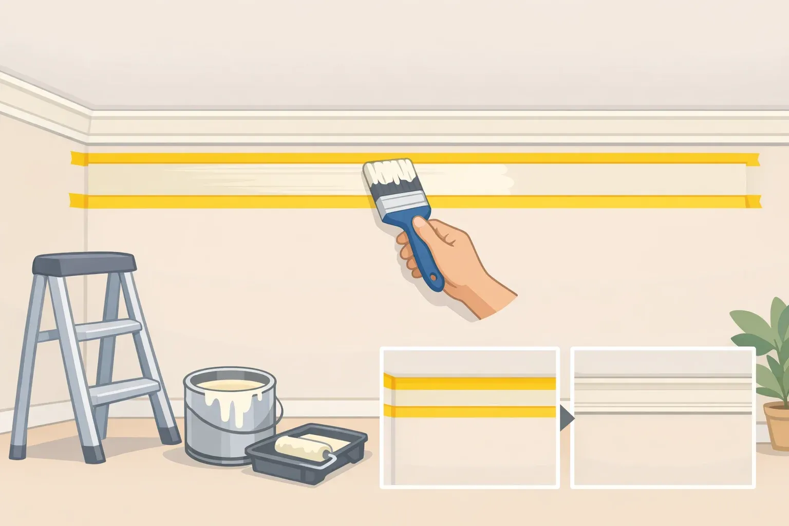
Intermediate method: Apply color echo to one accent wall plus coordinating accessories, creating a focal point without overwhelming the entire space. Perfect for testing how the palette feels before expanding.
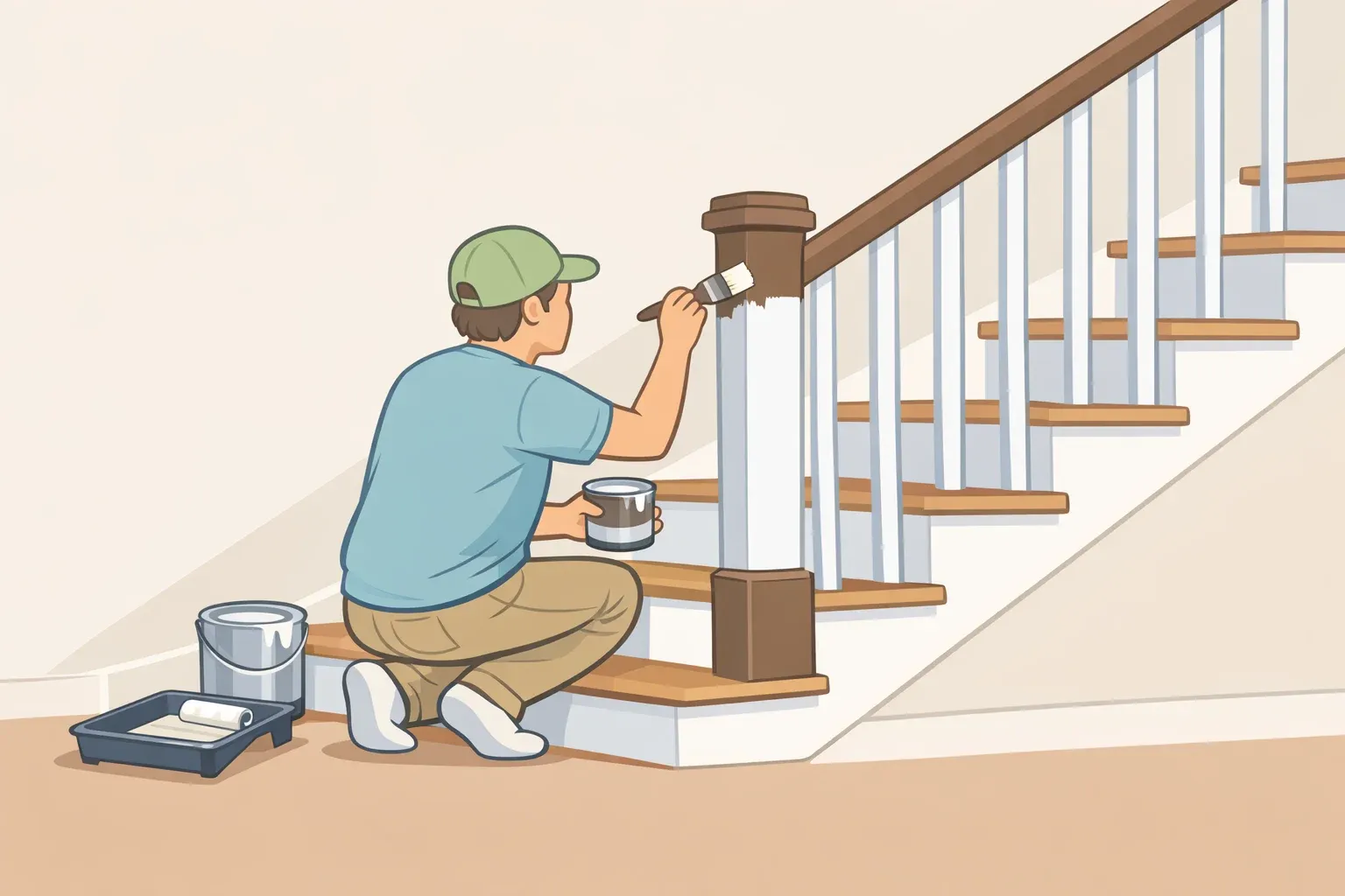
Advanced technique: Extend the palette to trim, doors, and built-in elements for a fully immersive color experience that feels professionally designed throughout the entire room.
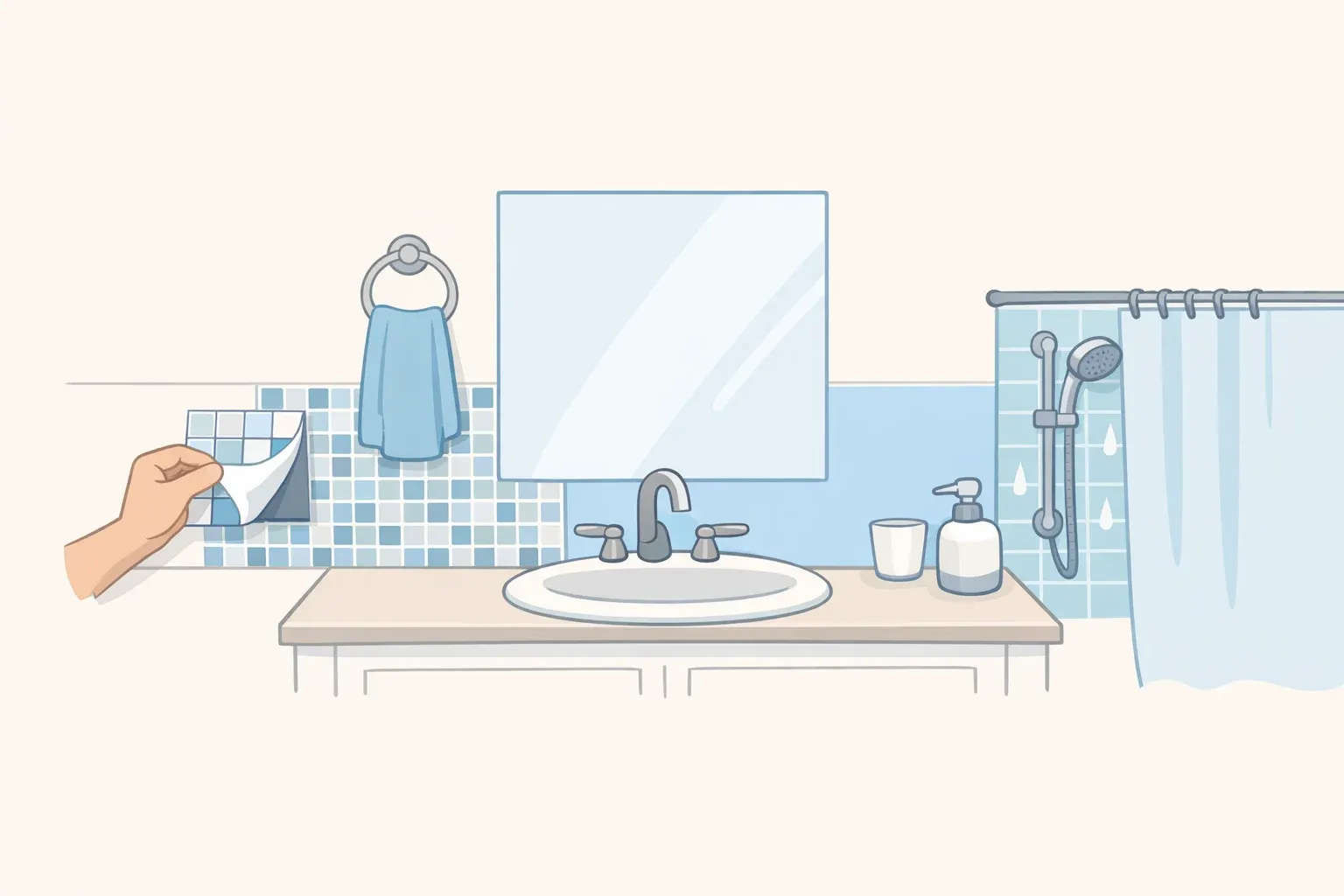
Renter-friendly option: Focus on removable elements like rugs, artwork, and furniture rather than permanent paint applications. Use repositionable wallpaper for accent walls that won't damage surfaces.
Your palette that actually works together
Color echo transforms random color choices into sophisticated, intentional palettes that feel naturally harmonious. The technique works because it mirrors how colors appear in nature—creating gentle transitions rather than jarring contrasts that fight for attention. By starting with one anchor color and building outward with related hues, you create spaces that feel both vibrant and restful, energizing yet calming.
The beauty of this approach lies in its flexibility and forgiving nature. Whether you prefer soft neutrals or bold jewel tones, the echo principle ensures your colors work together rather than compete for attention. Your room will feel designed rather than decorated—and that's the difference between amateur and professional-looking results that people notice but can't quite explain.


Comments
Be the first, drop a comment!