



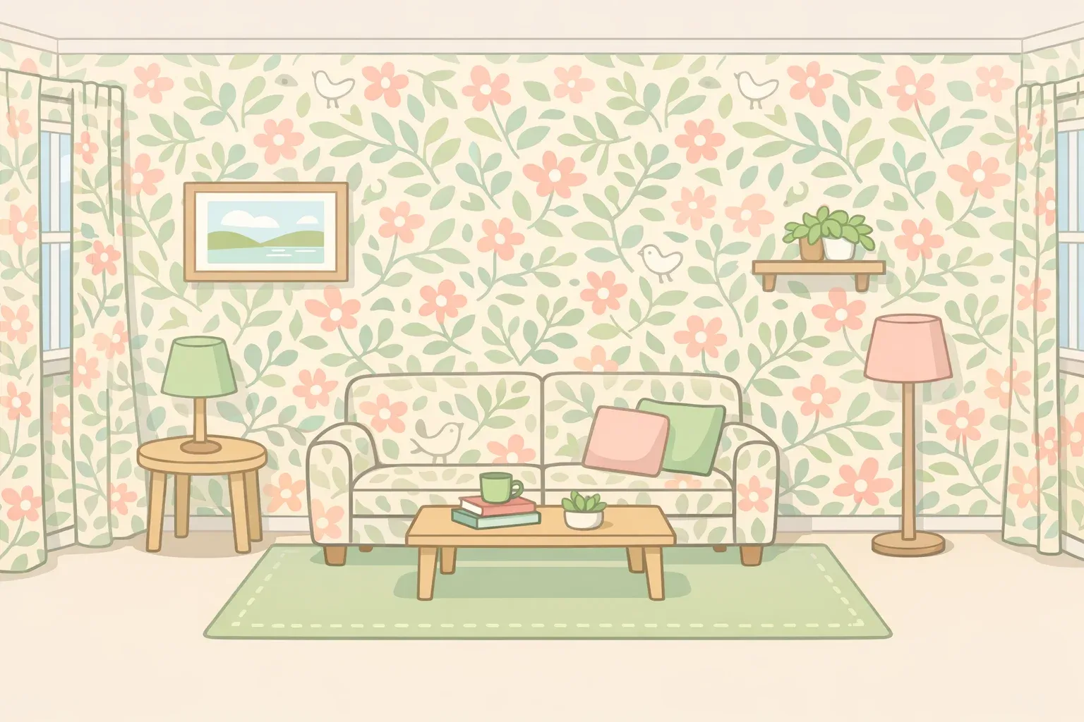
The standard advice for small rooms has always been the same: keep it simple, keep it light, keep it sparse. Pattern drenching does the opposite, wrapping a room in a single motif across walls, ceiling, upholstery, and curtains. Designers are increasingly arguing it works better, and the pattern drenching wallpaper trend has pushed beyond powder rooms, with clients now open to papering living rooms and bedrooms too, according to designers surveyed by House Beautiful.
The counterintuitive claim worth examining: a small room covered entirely in one coordinated pattern tends to feel larger, calmer, and more resolved than the same room with a cautious accent wall or a collision of competing surfaces.
One thing to settle before the design argument gets going. The National Association of Realtors noted last year that while wallpaper has regained appeal through improved materials and modern patterns, widespread use throughout a home can deter buyers, particularly those with memories of difficult removals.
NAR specifically flags wallpapered ceilings as popular in design circles but poorly received at the point of sale. If selling is on the near-term horizon, full-room pattern coverage is a risky choice. This technique is best approached by people designing for themselves, not for a future buyer.
What is pattern drenching in interior design?
Pattern drenching extends the logic of color drenching: painting walls, ceiling, trim, and doors a single continuous shade by swapping that uniform color for a repeating motif carried across multiple surfaces. The wallpaper continues onto the ceiling, curtain fabric matches or coordinates with the wall treatment, and upholstery pulls from the same motif or palette. Every surface shares the same design logic.
Havenly's director of design Heather Goerzen traces the technique's origins to the 1970s and describes it as a shortcut to a space that's entirely personal, a room no one else could have designed by accident.
Pattern drenching is not the same as layering unrelated prints throughout a room. The technique depends on a dominant single motif, sometimes supported by one closely related secondary pattern at a smaller scale.
Insight Ginie's guide puts the goal plainly: intentionality, not just piling on prints. Multiple surfaces, but one design logic tying them together. The distinction matters because the two approaches produce very different results. One feels wrapped and resolved, the other just busy.
Why all-over pattern makes small spaces feel bigger, not busier
High contrast between surfaces is what makes small rooms feel confined. A white ceiling against a painted wall against a dark floor forces the eye to register every boundary constantly. When a single pattern runs continuously across both surfaces, those transitions dissolve; the room reads as one unbroken volume rather than a box with visible seams, as Insight Ginie explains. The brain struggles to identify where the wall ends and the ceiling begins, which creates a sense of depth that a plain room simply can't produce.
Lulu Lytle, founder of Soane Britain, describes the effect as "tent-like"; the room becomes enclosed and wrapped, which reads as comfort rather than constraint. Her fuller explanation, via House & Garden this past April: "A room that commits fully to one idea can be surprisingly calming, because your eye isn't constantly negotiating contrast.
There's a particular kind of peace that comes from immersion. When the walls, ceiling and upholstery are all saying the same thing, the room feels resolved, and that sense of resolution is deeply comfortable."
Pattern also absorbs awkward architectural realities rather than advertising them. Sloped ceilings, uneven angles, off-square proportions: the eye follows the motif instead of the geometry.
One common misconception on pattern scale: conventional wisdom says small rooms need small patterns. Designers push back. Dense, intricate prints at small scale tend to read as visual noise, while a well-proportioned larger motif used consistently across surfaces often feels more expansive, according to Insight Ginie. This is expert opinion, not perceptual research, but it's consistent across every source here.
The rooms that benefit most are small and contained: powder rooms, home offices, walk-in closets, and bedrooms, where the cocooning quality reads as deliberate rather than claustrophobic. Open-plan spaces and rooms that flow into hallways raise a practical problem no source resolves neatly: where does the pattern stop, and does that boundary look intentional? For a first attempt, a single room with four clear walls is the sensible test case.
When pattern drenching fails
The technique has real limits, and naming them before the execution advice is the more useful order.
Resale is the most concrete. NAR is direct: wallpaper in multiple areas throughout a home, particularly in patterns that feel dated or immersive, can deter buyers. Wallpapered ceilings may be exactly what design-forward clients want right now, but they're also exactly what cautious buyers flag. Moderation matters at the point of sale; full immersion does not serve everyone.
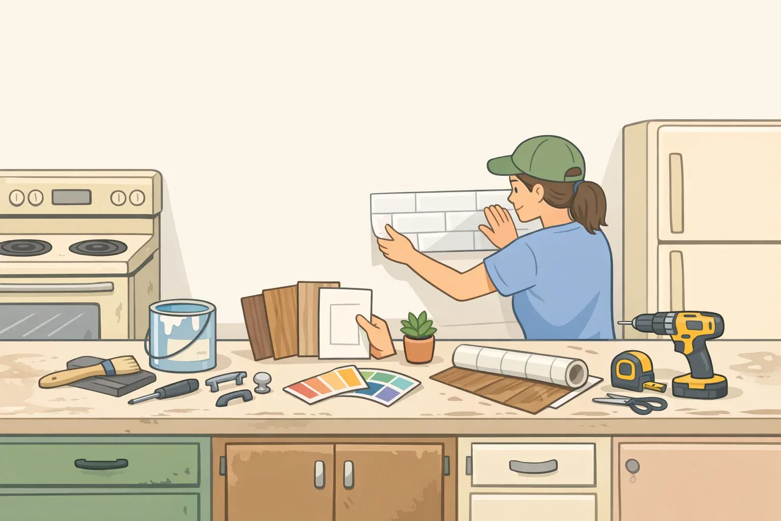
Installation is the second constraint. Where pattern meets pattern at corners, ceiling joints, and seams requires genuine mastery from the wallpaper hanger. Misaligned seams undercut the entire effect. A small room is a reasonable scale for a capable DIYer; the ceiling adds real difficulty and is worth professional installation if seam alignment matters, and in a drenched room, it does.
Lighting is the third problem, and an easy one to underestimate. Patterned surfaces absorb more light than plain white walls, and a drenched room without layered sources wall sconces, task lamps, ambient overhead can feel flat and dim, per Insight Ginie. That's a practical cost that doesn't disappear just because the pattern photographs well.
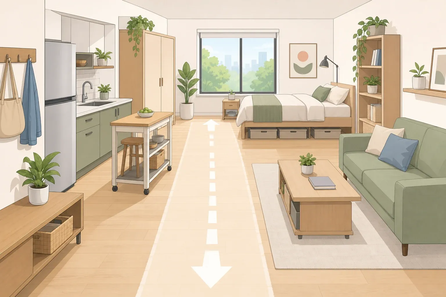
Open-plan layouts create a fourth problem. The technique depends on enclosure. A living room that opens into a kitchen or a dining room that bleeds into a hallway lacks the clear boundaries that make the effect work; a pattern that stops awkwardly at a threshold looks uncertain rather than bold.
How to use pattern drenching with wallpaper in small spaces
Start with the right room. The ideal candidate is small, self-contained, and used at low intensity. A powder room or home office lets full commitment happen without the entire household living inside the decision every day. Rooms with unusual angles or tight proportions actually benefit more from the technique than standard rectangular spaces, Insight Ginie notes, because the pattern disguises the geometry rather than advertising it.
Choose one hero pattern and a tight color palette. A distinct, limited color palette is what makes multiple patterned surfaces feel cohesive rather than chaotic. Without it, there's nothing to tie the room together. Start with a dominant hero pattern, then introduce a secondary pattern only at a smaller scale and in a quieter register. Mixing styles that don't share a design lineage a traditional toile alongside a sharp modern geometric produces conflict rather than cohesion, both Insight Ginie and Havenly emphasize.
The motif determines the room's emotional register, so choose accordingly. Botanical prints with soft organic shapes tend toward calm; geometric patterns and stripes read as more energetic and modern, according to Insight Ginie. For a first attempt, a botanical in two or three colors on a light ground gives the maximum immersive effect with the lowest risk of the room feeling heavy.
Take it onto the ceiling. The fifth wall is the one most often ignored, and it's the one that seals the boundary-dissolving effect. Covering the ceiling in the same pattern as the walls is the key to total immersion, Insight Ginie argues. Designer Meghan Jay describes the wall-to-ceiling extension as adding "depth, atmosphere, and intention," reflecting what she sees as a broader desire to use wallpaper to shape the feeling of a space rather than simply decorate it, per House Beautiful. If matching curtains exactly isn't feasible, a coordinating tone in the same color family accomplishes most of the work.
Give the eye somewhere to rest. Havenly recommends mixing in at least one or two solid-colored pieces: a plain linen lampshade, a velvet sofa in a tone pulled from the pattern, painted woodwork in a complementary solid to provide contrast without breaking the room's continuity. Solid elements let the pattern breathe; without them, the room tips from immersive to relentless.
Be realistic about cost. Pattern drenching requires more material than a single accent wall, but a powder room or home office uses a fraction of the yardage a living room would, making it a high-impact project at a manageable scale, per Insight Ginie. Don't skimp on lighting to compensate budget for layered sources, because the pattern will absorb what a single overhead fixture provides.
What committing fully actually gets you
Designer Meghan Jay describes 2026 wallpaper as being used to "shape the feeling of a space, not just decorate it," an ambition that is categorically different from the statement wall it replaces. The accent wall was a compromise position, born from early-2000s minimalism and a reluctance to commit. Pattern drenching is the argument that the compromise wasn't worth making.
Lulu Lytle's summary is the plainest version of what the technique actually requires: "When you stop hedging your bets, the pattern stops feeling decorative and starts to feel integral to the architecture of the room," she told House & Garden. Stopping halfway produces a room that looks uncertain. Full commitment produces one where the boundary between decoration and architecture gets genuinely blurry.
For readers not ready for full immersion, the alternatives are real wallpapered furniture faces, closet interiors, bordered treatments. The "micro moment" applications House Beautiful describes are a genuine middle ground.
The version of this technique with the clearest practical case is also the most contained: one small room, a palette of two or three colors, the hero pattern run onto the ceiling to erase the boundary between wall and overhead plane, one or two solid pieces to anchor the space, and enough layered light sources to compensate for what the pattern absorbs. That's where the perceptual effect is strongest, the installation stakes are lowest, and the gap between what standard decorating advice predicts and what you actually get is widest.











Comments
Be the first, drop a comment!