



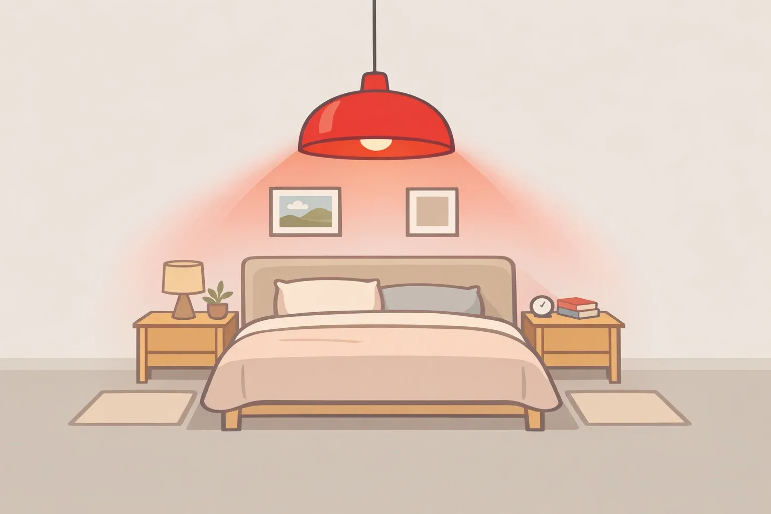
A red pendant light hanging in an otherwise white or greige bedroom does something specific: it makes the room feel finished. Not busy. Not loud. Finished. That outcome has a name now: the unexpected red theory. And while it originated on TikTok, the mechanism behind it is considerably older than social media.
According to The Aesthetics of Joy, the concept was coined by a TikTok creator who observed that adding red to a space where it has no obvious design permission tends to make the room feel more cohesive rather than chaotic. Design researcher Ingrid Fetell Lee connects this to her research on the "surprise aesthetic": an unanticipated element in a familiar space produces a meaningful boost of joy through pattern disruption, not color accumulation. The unexpectedness, she argues, is precisely what does the work.
Even a small pop of bright color can break the monotony of a greige interior and make it feel fresh and alive, and the effect doesn't require a palette overhaul. That's what makes this a genuinely useful principle for how to use red in home decor rather than just a TikTok moment with a shelf life.
This piece uses a bold red light fixture as its primary example to show exactly why the theory works, where it works best, and how to apply it without overshooting. The science does most of the explaining.
Why a light fixture is the best vehicle for this effect
Red's power is disproportionate to its surface area. Because decorators and homeowners routinely avoid it due to its perceived intensity, even a small red object carries outsized visual charge. Red is a color people often shy away from in decor, so a little goes a long way in making a space feel vibrant and alive. Scarcity is part of the mechanism.
A light fixture also occupies one of the most reliable sightlines in any room. It hangs at or above eye level, reads against the ceiling typically the lightest plane in a space and is an object people look at rather than past. That positioning concentrates red's attention-pulling force at the room's natural focal point, which is where red light fixture decor lands most cleanly. The fixture isn't competing for attention at counter height or getting lost among books on a shelf. It hangs alone.
The effect is also specific to object type. A red pendant or ceiling fixture delivers red as a defined shape in a fixed location. Red ambient lighting a bulb that tints the entire room is a different design decision, one that creates mood rather than accent. The unexpected red theory applies to the former.
The fixture versus other red objects: a focal hierarchy
Other red objects work on similar principles but less effectively. Understanding why makes the fixture's advantages concrete rather than intuitive.
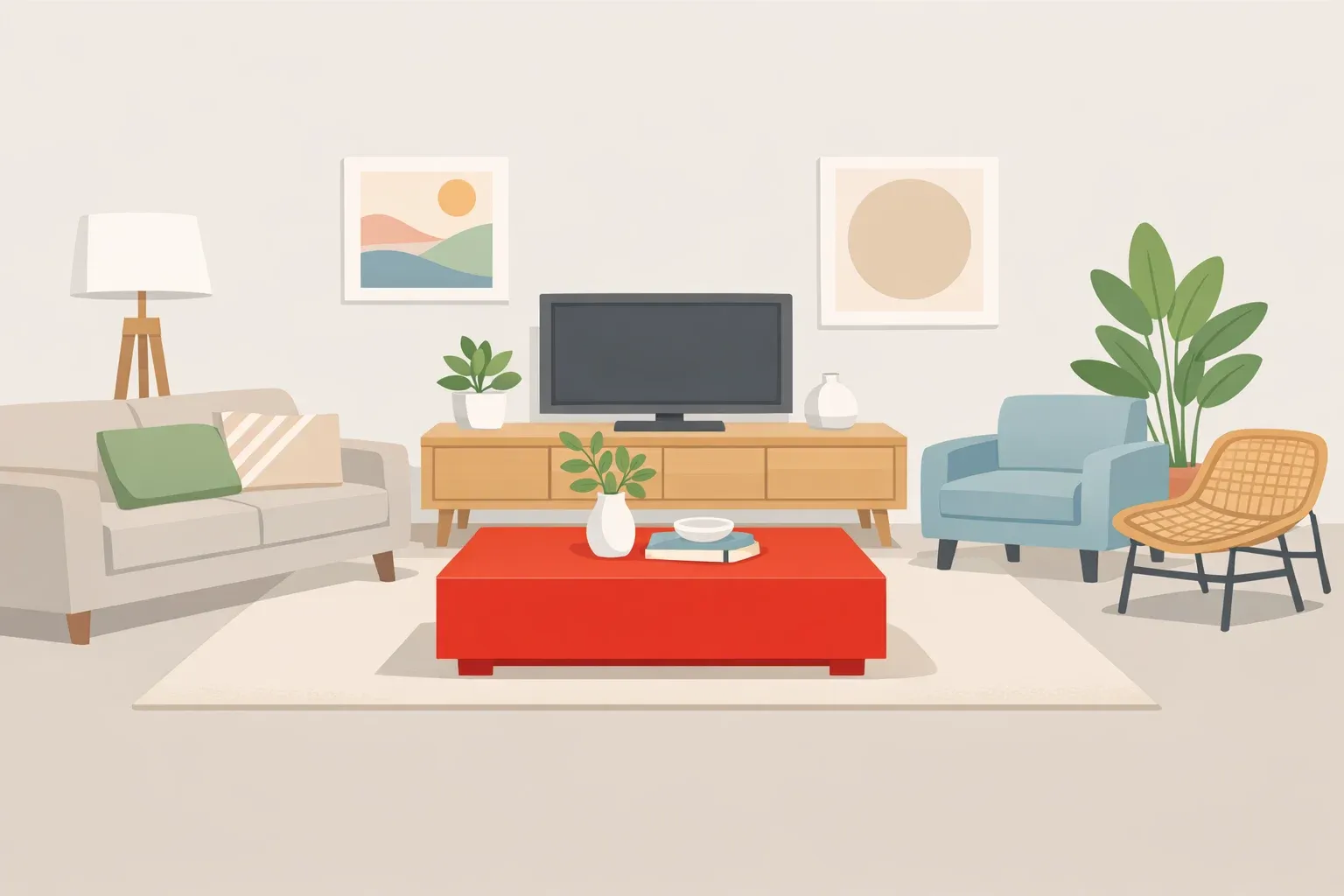
Soft furnishings like throw pillows or blankets distribute color across a variable surface. The shape shifts depending on arrangement. Two pillows instead of one and the color has already started multiplying; the object reads as a quantity rather than a statement. The result can land as unresolved rather than deliberate.
A red vase or ceramic operates on the same logic as a fixture but sits at a lower sightline and much smaller scale. Still valid a single red ceramic on an all-white shelf is a legitimate application of the theory. The problem is legibility. At table or shelf height, competing objects fragment attention before it can land anywhere specific.
Red accent walls signal coordination rather than surprise. A wall says the room was built around red. The unexpected red theory depends on violation of expectation, and a feature wall announces itself too deliberately to violate anything.
Wall art sits in the middle of the hierarchy. A single large red print in a neutral room can produce the surprise effect, particularly if the color reads before the subject does. But art competes with furniture for mid-wall sightlines, and frames can soften the color's edges. The fixture wins on isolation: it hangs against the ceiling plane, framed by nothing but white or off-white.
Sightline, scale, isolation, and object legibility are the four variables that determine focal power. A red ceiling fixture scores highest on all of them that's an analytical judgment, not an established finding, but it follows directly from how the theory's conditions work.
What actually counts as red here
This is where the unexpected red theory interior design conversation gets practical, and where most people misstep.
Saturated, unambiguous red primary-color paint chips, cherry lacquer, classic enameled cookware is what the theory is built on. That shade produces the physiological arousal response, commands attention as a focal point, and reads as unmistakably intentional against a neutral backdrop.
Oxblood, burgundy, and deep wine read as sophisticated and dark rather than activating. They don't generate the focal tension the theory depends on. A burgundy pendant in a gray bedroom looks like a considered choice. It doesn't look like an unexpected one.
Terracotta and rust present a similar problem. These shades have moved so firmly into warm-neutral palettes that they no longer register as color in the way red does. A terracotta fixture in a room with linen upholstery and raw wood reads as coordinated, not surprising. The effect the theory describes doesn't kick in.
The working definition: if you'd describe the color as "red" without a modifier, it's probably doing the work. If you reach for a qualifier dusty red, oxblood red, terracotta red it probably isn't.
Why red specifically: attention, arousal, and evolutionary precedent
Not every accent color would produce this result. A dusty blue pendant might be striking. A forest green fixture might read as bold. A red one is hard to look away from. That difference has biological and cultural explanations that run deeper than personal taste.
Saturated colors trigger a physiological response researchers call arousal a measurable increase in alertness and energy, The Aesthetics of Joy explains. Red is particularly potent. Studies have found that exposure to red light increases blood pressure, respiratory rate, skin conductance, and eye blinking, all standard markers of heightened physiological excitement, according to the research.
The attention pull may run deeper than learned response. Many evolutionary biologists believe human color vision developed partly to help primate ancestors detect ripe red fruit among green foliage, per The Aesthetics of Joy. If that's right, the visual system has been primed to prioritize red for a very long time. Red also happens to be the complementary color of green, which explains why it cuts through warm, plant-rich, or wood-toned interiors with unusual clarity.
There's a social signaling layer, too. Certain emotions anger, embarrassment cause blood to rush into the face, and researchers suggest a flushed face has historically been a signal worth paying attention to, according to the research. Red is also associated with blood, which suggests danger and snaps attention into focus whether the threat is real or not.
Stop signs, fire engines, emergency indicators: the cultural reinforcement of red as a priority signal has been running for a long time. In studies, red captures and holds attention in emotionally charged conditions better than other colors, not just on first glance but across continued exposure, The Aesthetics of Joy notes.
Red is also explicitly associated with the descriptors "stimulating," "exciting," and "warm" across color studies, per the research qualities a builder-grade beige living room or a white kitchen typically lacks.
One nuance worth naming: red's effects run in both directions. The same arousal response that makes a red fixture energizing in a living room may work against winding down in a bedroom. VR research found that perceived red illumination lowered pain thresholds compared to other colors, according to The Aesthetics of Joy. Restraint isn't just an aesthetic preference it follows from the physiology.
Where unexpected red theory works and where it doesn't
A cross-cultural study of work environments found that people in more colorful offices reported higher alertness, confidence, and friendliness than those in monochromatic spaces, per the research. The finding suggests targeted color can shift how a room feels without requiring a full renovation.
The theory's core rule: one intentional red object in a neutral room reads as deliberate. Multiple scattered red accents dissolve the surprise and can make a space feel unresolved. A throw pillow, a candle, a small vase, a picture frame, a plant pot five small red accents distributed across a neutral room produce no single focal point. The eye wanders. The surprise that gives the theory its name never lands.
Where a red fixture tends to work best:
Entryways and living rooms: high-traffic, high-sightline spaces where the arousal effect reads as energy rather than agitation
White kitchens and gray dining rooms: the contrast against cool neutrals is sharpest, and the fixture reads from across the room
Any space where the eye currently has nowhere specific to land; a red fixture solves that problem immediately
Where the risk increases:
Bedrooms oriented toward rest; the physiological arousal response may undercut the room's function; if red is used here, a matte finish and lower placement can reduce intensity
Rooms already containing warm-toned elements like terracotta, rust, or blush; a red fixture in that context reads as coordinated rather than unexpected, and the contrast that drives the theory diminishes
Shade and finish matter:
Glossy or lacquered red amplifies the visual pop. Matte finishes read quieter, which is useful in rooms where the goal is accent rather than statement. Bulb color temperature is worth considering: a warm-white bulb inside a red shade reads as rich and intentional, while a cool-white bulb inside the same fixture can feel discordant, the red of the shade fighting the blue-white of the light.
How to read the room before buying the fixture
This is where the theory becomes a checklist rather than a principle. Four questions narrow the field quickly.
Is the room predominantly neutral? Whites, grays, greiges, and natural wood tones all work. If the room already has a dominant warm or cool palette, the fixture will read as an extension of it rather than a break from it. The extension might be attractive. It won't be unexpected.
Does the room have a working focal point? A dramatic fireplace, a large piece of art, or a statement sofa already anchors the eye. Adding a red fixture above an existing focal point compounds rather than creates focus, which is a different design move entirely. In a room without a clear anchor, the fixture does real structural work.
Are warm reds already present in the palette? Terracotta cushions, rust-toned rugs, blush upholstery any of these will absorb a red fixture into the room's existing color logic. The surprise evaporates before anyone notices the pendant.
Is the fixture visible from the room's entry point? The pop of red in a room lands hardest on arrival, when the eye is still scanning for orientation. A fixture tucked into a corner or obscured by a ceiling beam loses most of its effect. The theory depends on red appearing where it has no permission to be; that landing moment requires a clear sightline.
If the answers run yes, no, no, and yes, the conditions are right.
One more consideration that rarely comes up: ceiling height and finish. The theory works best in rooms with plain, unremarkable ceilings standard white drywall, no coffering, no dramatic beams. A bland ceiling creates a clean field against which red registers immediately. An architectural ceiling already commands attention above eye level. When that's the case, the red fixture has to compete with the room's own structure for focal priority, and it often loses.
One object, done right
The unexpected red theory holds up because it describes a real perceptual mechanism. Red commands attention, triggers measurable physiological arousal, and creates focal contrast effects documented across attention research, arousal studies, and environmental psychology. None of that is contingent on trend cycles.
The "unexpected" qualifier is load-bearing. A room that already anticipates red through a coordinated palette or multiple scattered accents doesn't produce the surprise effect. The theory works through violation of expectation, and that requires restraint.
A red light fixture earns its position as the theory's most effective physical application not simply because it's red, but because of where it sits: high, isolated, framed by the ceiling plane, with nothing nearby competing for the eye. Placement and object type determine whether the theory lands or misfires.
The practical implication is simple enough. If the effect is what you're after, isolate the fixture against a neutral ceiling and leave the rest of the room quiet. Red has been earning a second look for considerably longer than TikTok has existed. The pendant just makes it easy to hang.















Comments
Be the first, drop a comment!