


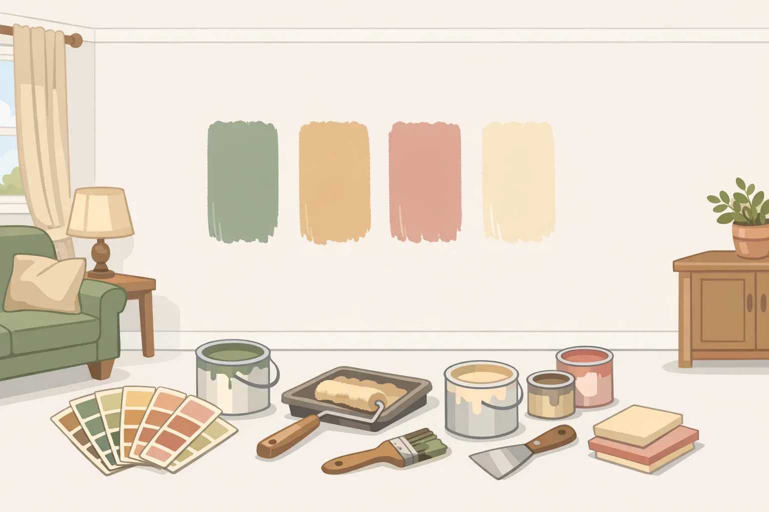
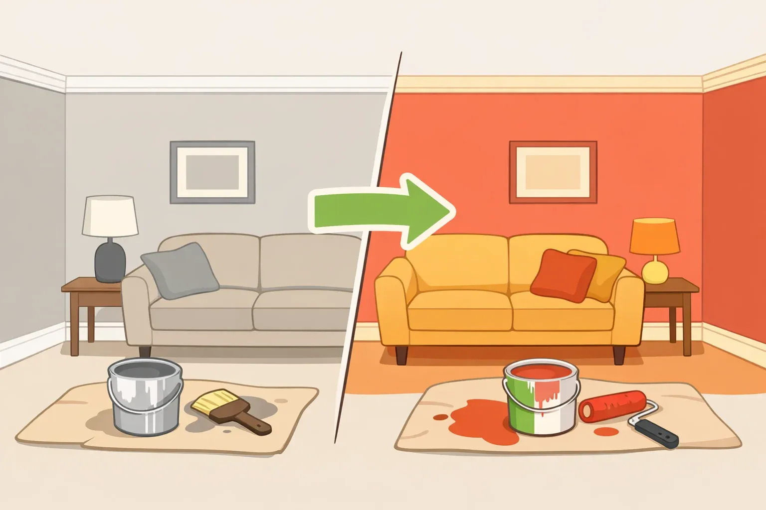
White walls aren't going anywhere. But their grip on interior design has finally loosened, and what's filling the space isn't a new palette; it's a very old one. Bolder, deeper colors ranked as Architectural Digest's top trends — not a niche preference, but a consensus. What's striking is which colors designers are actually reaching for: avocado green, dusty rose, herbal sage, hunter green, butter yellow. Shades with a past.
This isn't exact period recreation. Nobody is pulling swatches from 1970s kitchen catalogs or Victorian parlor archives. These are historically familiar color families: warm greens, earthy ochres, muted pinks, and moody burgundies returning in reformulated versions that are softer, deeper, or warmer than their originals, and built to work within today's material context. That distinction matters: it's what separates a color that will feel considered in ten years from one that will feel like a timestamp.
This piece examines why vintage paint colors are coming back now, how each family has been recalibrated for modern use, which ones carry genuine longevity, and how to apply that framework to an actual repaint decision.
Why these colors are coming back, and why now
The emotional argument is real. "Trends are emotional, they're a response to the world around us," Jade Joyner, cofounder and principal designer at Metal + Petal, told Architectural Digest. "After long stretches of minimalism, we crave warmth. After chaos, we want calm."
The specifics bear it out. Color consultant Sarah Karon notes that when life feels unpredictable, people gravitate toward shades that feel familiar — soft yellows, earthy greens, dusty pinks — because those colors deliver comfort in a way crisp white simply cannot, as documented in Southern Living.
Butter yellow's resurgence is being read as optimism made visible; color strategist Lauren Battistini notes it surpassed classic white in popularity back in 2012 before retreating, and designers are actively recommending it to clients again.
Burgundy sits among the most frequently cited shades in current design conversations. Designer Annie Obermann describes it as symbolizing "comfort, individuality, intensity, and sophistication," a combination that fits the current mood better than any neutral.
Color doesn't shift in isolation. The vintage color revival is part of a wider turn toward homes that feel personal rather than merely photographable. "People want color, and they want their homes to tell a story," Molly O'Neil, founder and creative director at Molly O Interior Design Studio, told Architectural Digest.
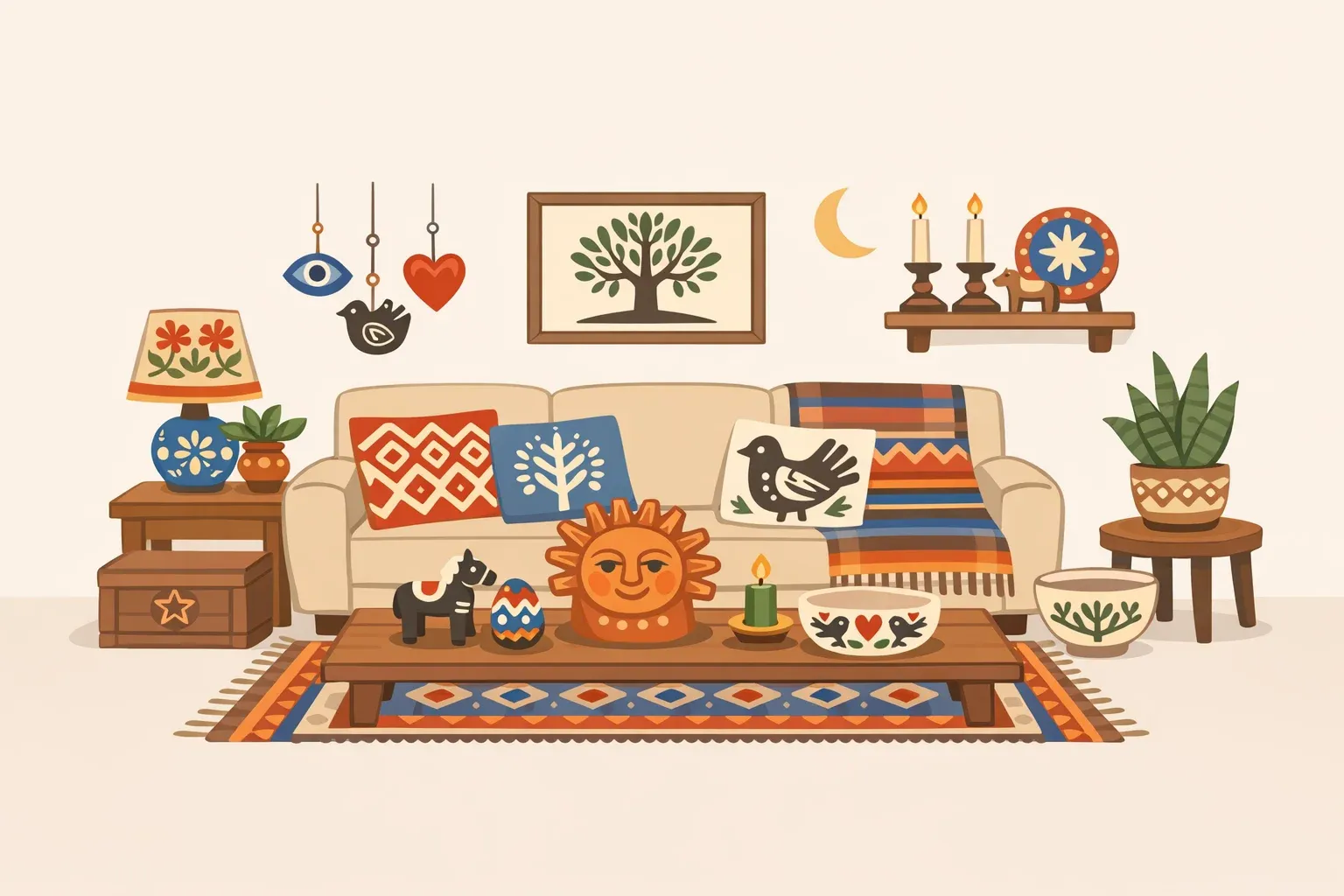
Designer Lauren Saab notes that darker woods — walnut, mahogany, smoked oak — have taken center stage, with designers moving away from pale oak toward finishes that feel richer and more architectural. Designer Colleen Bennett adds that drapery and wallpaper are back alongside these shifts. These material changes and the color revival appear to be reinforcing each other.
How the best vintage paint colors have been updated for modern interiors
Every vintage color family making a comeback has been recalibrated. The originals aren't being reproduced; they're being reinterpreted. Understanding what changed is the most practically useful thing a reader planning a repaint can take from this trend.
Greens are the strongest family across every major forecast. Avocado green, most associated with 1970s kitchens, now appears in a form Karon describes as "equal parts bold and sophisticated," pairing naturally with warm woods and natural textures rather than dated laminate. Farrow & Ball's Bancha evokes the deep earthy tone of an avocado peel, she says, without the period-piece quality of the original.
Hunter green from the 1980s has returned with slightly reduced chroma, still richly pigmented and complex, but "a little deeper and more sophisticated," according to certified architectural color consultant Lisa Jenkins. The effect reads as intentional rather than inherited.
Herbal and sage greens are being repositioned as the new neutral. "Calming, herbal greens were go-tos in post-war 1940s cottages, and saw a resurgence in the 1990s," Karon told Southern Living. "Now, they're back as the ultimate modern neutral fresh yet understated." Nature-inspired greens feature across multiple 2025 paint brand forecasts, with Sherwin-Williams, Benjamin Moore, and BEHR each including options in that family.
Warm dark tones occupy a different register entirely. Designer Brad Ramsey says 2025's palette sits firmly "in the rich earthy zone," with olive, ochre, eggplant, and burnt red as defining colors, and color drenching remains one of the most effective ways to deploy them. At the quieter end sits Pantone's 2025 Color of the Year, Mocha Mousse, a warm, cocoa-adjacent brown that Pantone Color Institute executive director Leatrice Eiseman characterizes as expressing "thoughtful indulgence."
Joyner names burgundy, olive, ochre, and tobacco as the shades "defining this era of color confidence." What distinguishes the current versions from their predecessors is depth and saturation: these aren't the flat, sometimes-muddy browns of the 1970s or the high-gloss interpretations of the 1980s. They absorb light rather than bounce it, which changes how a room reads entirely.
The softer, nostalgic shades have been adjusted more subtly. "The walls of Victorian parlors were often painted dusty pink. Queen Victoria's favorite color was mauve, and these colors reemerged in the 1980s," Karon told Southern Living. Today's versions land closer to warm peach than the cooler mauves of earlier cycles, per Battistini.
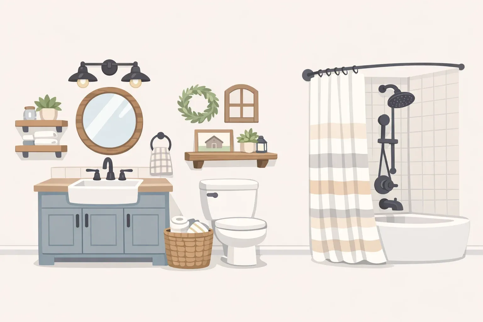
Benjamin Moore's 2025 Color of the Year, Cinnamon Slate, reads as a smokier, more introspective descendant of earlier-generation light mauves. Jenkins describes it as a shade that "can make a room feel like it has hidden secrets." Purple has been rewarmed: the 1980s and 1990s versions ran cool and graphic, while current recommendations carry a touch of added red to shift the tone toward something more livable, per Battistini. Powdery blues perennial fixtures in kitchens and bathrooms since the early twentieth century, per Karon, have returned in their classic soft form, with the key update being unlacquered brass hardware rather than the chrome that accompanied earlier versions.
Creamy whites belong to this revival logic too, even if they're less dramatic. Karon reports receiving weekly requests for a warm white that doesn't read as yellow — an upgrade from cool white, not a departure from it.
Why some historic paint colors age well, and others date a room fast
Before picking a shade, it helps to understand what actually drives longevity in color. Not all vintage wall colors survive their own revival intact.
The colors that tend to endure share a common quality: undertone complexity. Sage green, earthy ochre, warm brown, these aren't single-pigment colors. They're mixed from multiple base pigments, which means they shift subtly depending on light conditions, reading differently at noon than at dusk, differently against warm wood than against painted trim. That variability is exactly what gives them staying power. The room never quite looks static.
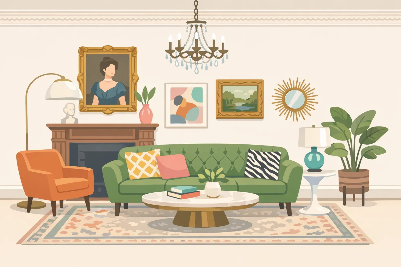
Wood tone interaction matters enormously. Darker, richer woods — walnut, mahogany, smoked oak — "bring weight and warmth to a room and pair naturally with textured plaster and warm stone." Against those tones, deep burgundy and hunter green read as intentional. Against pale oak or white-painted floors, the same colors can feel stranded, too heavy for their context, too dependent on a material partnership that isn't there.
Metal finish is the detail most people underestimate. Unlacquered brass with powdery blue reads as considered and classic; chrome with the same color can suggest a bathroom that was never updated. Brass with burgundy creates warmth; nickel with the same shade creates tension that's hard to resolve. The color is only part of the equation.
Saturation level is the primary risk factor for statement shades. Highly saturated colors, such as deep aubergine, vivid avocado, and rich plum, are more likely to feel period-specific as the broader material context shifts. The 1970s avocado kitchen looked wrong in 1990, not because the color was inherently bad, but because everything around it changed. That dynamic will apply to current choices, eventually. Colors with more muted, complex undertones age more gracefully because they don't depend as heavily on their era's supporting palette to make sense.
Daylight is the final variable, and the one least accounted for in trend coverage. North-facing rooms drain warmth from most colors; a sage green that looks calm and grounded in a south-facing kitchen can read as cold and grey in a north-facing bedroom. Warm ochres and creamy whites are more forgiving across light conditions. Powdery blues and dusty pinks are more direction-sensitive.
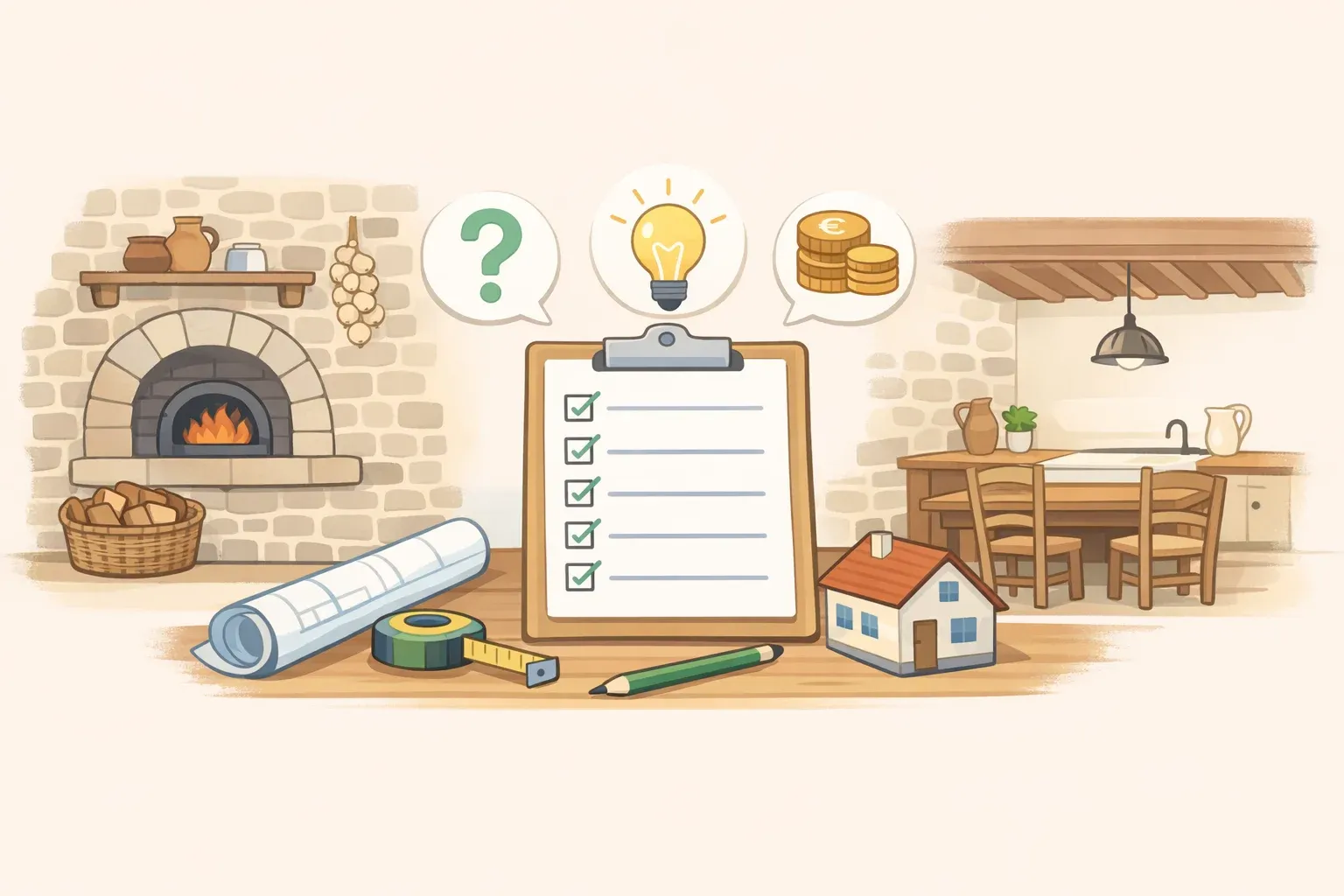
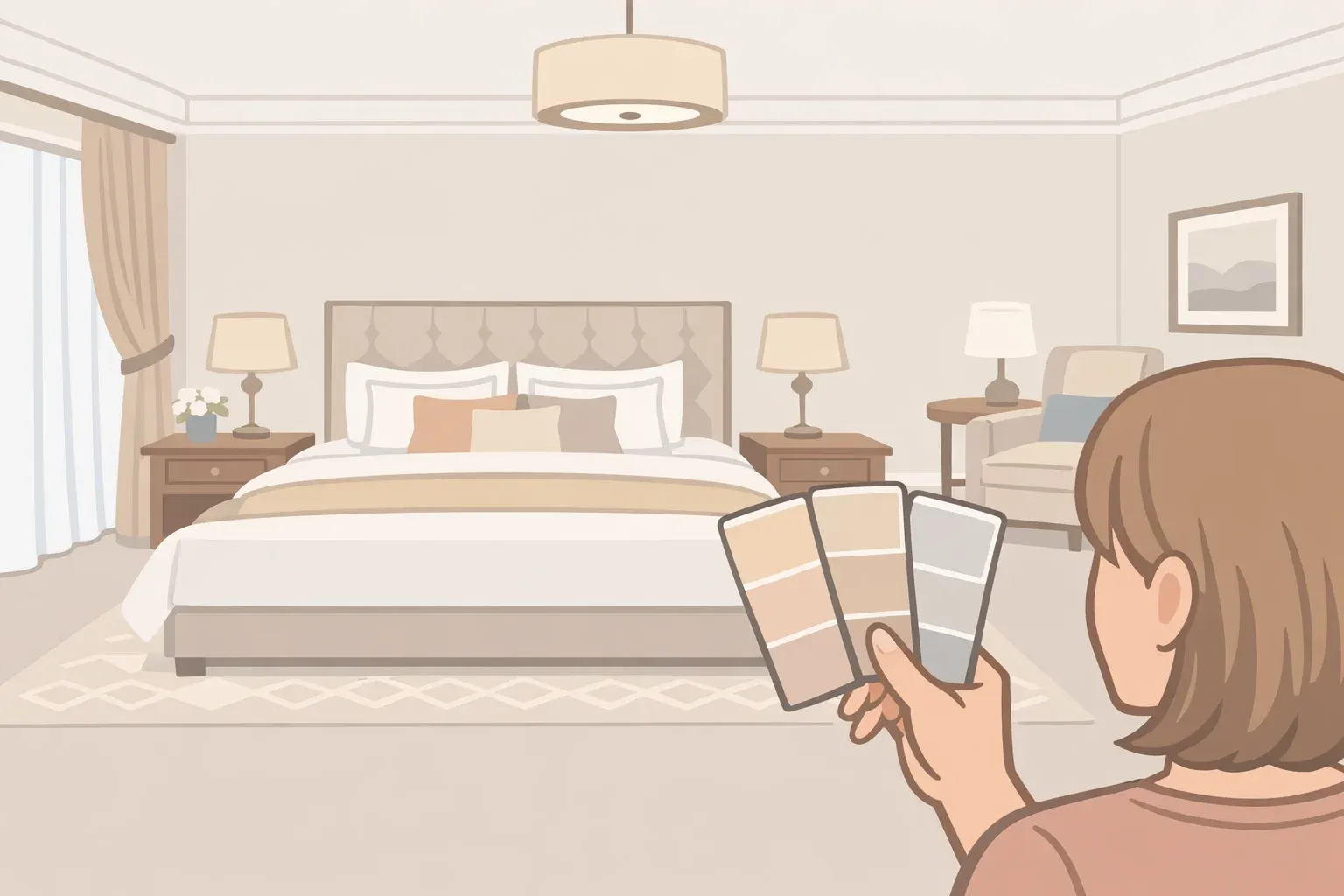
Testing retro paint colors before you commit
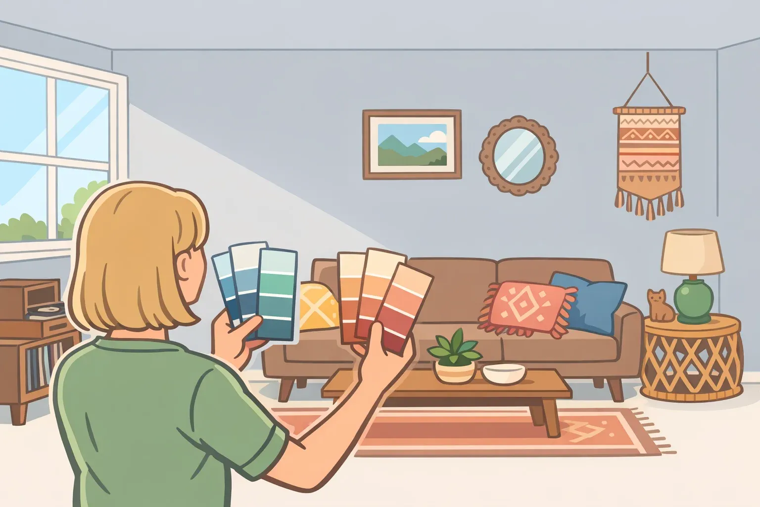
Sampling is the one step most people skip and later regret. Paint a color on a small swatch, hold it against the wall, and judge it in artificial light, and the result will mislead you almost every time.
The better method: apply samples in large patches, at least 12 inches square, on multiple walls, including a corner where two surfaces meet. Colors behave differently depending on which direction a wall faces, how much light it receives, and what adjacent surfaces are reflecting back. A north wall and a south wall in the same room can make the same color look like two different shades.
Then observe across a full day. Morning light is typically cooler and bluer; afternoon light warms as it shifts toward the orange end of the spectrum; evening artificial light can flatten saturation or introduce color casts depending on bulb type. A sage green that looks perfect in afternoon sun may turn grey-green under LED lighting at night. Burgundy that reads rich and warm in lamplight may look nearly black under overhead fluorescents.
Compare each sample against your existing elements: floor color, trim paint, hardware finish, and any large upholstered pieces you're keeping. Hold a fabric swatch from a sofa against the sample patch. These comparisons are far more reliable predictors than any color chip viewed in isolation. If the sample looks right across multiple lights and against your actual materials, the color has earned the commitment. If it only works in one specific condition, that's useful information before you've opened a gallon.
The best vintage paint colors to use if you want them to last
Choosing a vintage paint color for a repaint involves two decisions that most trend roundups conflate: how committed you want to be, and how long you need the choice to hold up. Different questions, different answers.
The low-risk, high-longevity options share one characteristic: they function as neutrals with added warmth.
Herbal and sage greens have appeared across multiple design eras, postwar cottages, the 1990s, and now, because they anchor rooms without demanding attention. They work across furnishing styles and moods, which is why Ramsey and multiple forecasters name green as among the most versatile choices in the current palette.
Warm creamy whites occupy the lowest-risk end: an upgrade from cool white, not a departure from it, pairing with antiques and modern accents alike.
Earthy ochres and warm browns, including Mocha Mousse-adjacent shades, sit in the neutral-adjacent zone. They photograph well, feel timeless rather than specific to a moment, and are less dependent on particular material partnerships to succeed.
The statement's end requires more honesty about commitment.
Burgundy, aubergine, and deep plum need dark woods, brass, and natural stone to read as intentional rather than heavy. Color-drenched, they can be extraordinary. Without that material support, they become oppressive.
Avocado green is the most time-coded of the revival shades. Its associations are strong, and while the current iteration is more sophisticated than the original, it requires warm materials and natural textures to escape its nostalgic references.
Powdery blue is the most context-dependent of the group. Paired with unlacquered brass and warm wood, it reads as considered and classic. Paired with chrome and white cabinetry, it risks suggesting someone's 1998 bathroom renovation.
Reduced commitment doesn't mean avoidance. Jewel tones work in small doses, a hallway, a nook, a reupholstered chair, without the psychological weight of an entire room. Cabinetry is the lowest-commitment entry point for retro-adjacent shades: BEHR's palette notes that Colorful Leaves, a deep spicy orange, adds retro character specifically when applied to moldings and cabinetry rather than full walls.
What to actually do with this
The vintage color revival is real, voiced by multiple designers across multiple forecasts, and it spans a wide enough range from muted sage to saturated aubergine that "which shade" matters less than "which register." Colors grounded in natural pigment and long design history, warm greens, ochre, earthy brown, dusty rose, will likely outlast this trend cycle because they've already outlasted several others. Moody statement shades carry more risk of feeling period-specific as the broader material context shifts, particularly if the dominant wood tones or metal finishes change again.
The practical rule: match your shade's temperature to the materials already in the room, or to the materials you're prepared to change. Hunter green against walnut floors and unlacquered brass reads as intentional. The same green against pale oak and nickel hardware reads as mismatched. High-chroma colors — vivid avocado and deep plum — are worth avoiding unless the full supporting palette is already in place or you're prepared to build it. The color isn't the whole decision. It never was.
Comments
Be the first, drop a comment!