



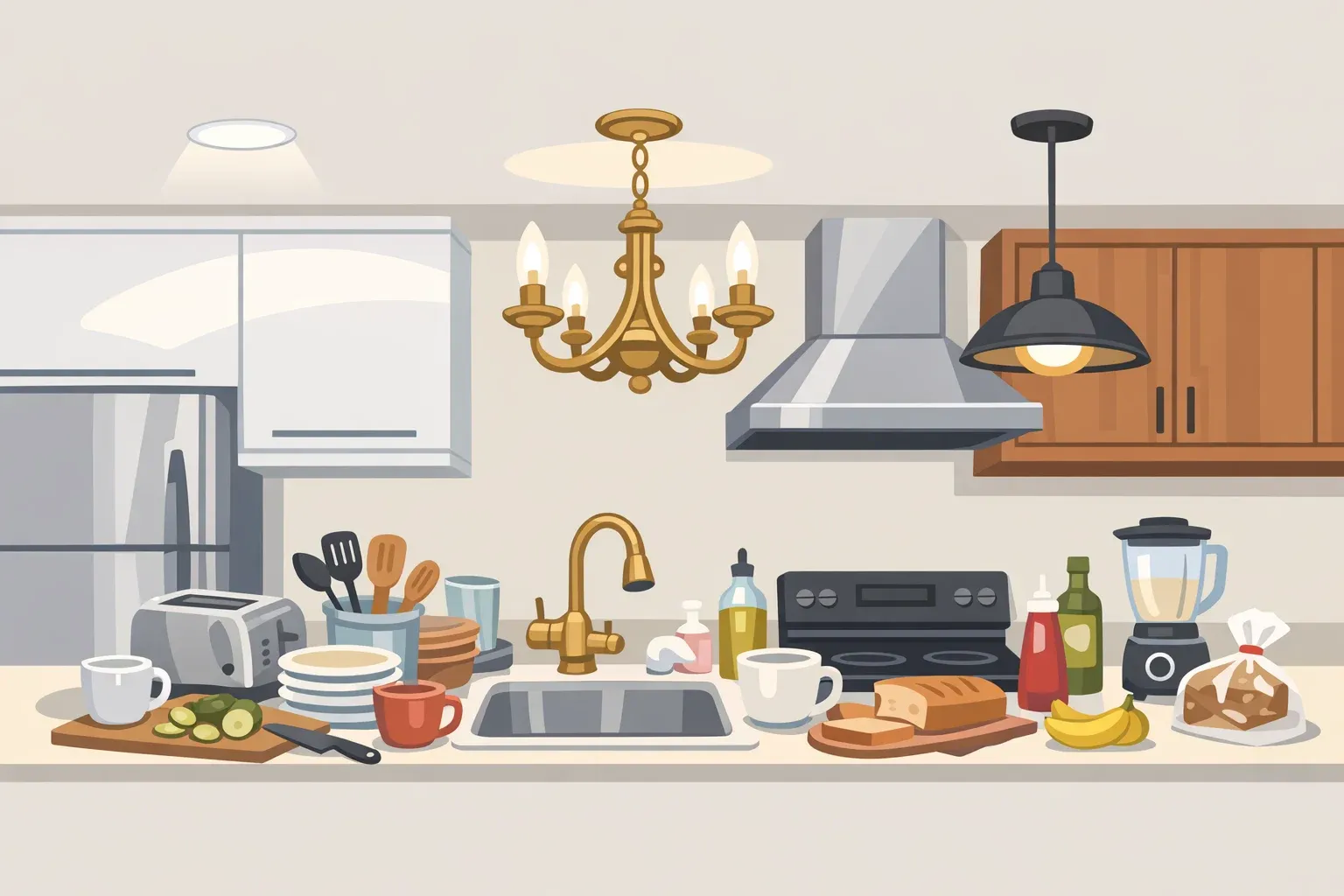
Interior designers keep flagging the same three culprits behind a cheap-looking kitchen: visible clutter, flat lighting, and features that fight how the room actually works. Across the designer interviews reviewed for this piece, these three kitchen design mistakes that make your kitchen look cheap turn up again and again, and fixing them doesn't require gutting the room. Some of these cheap-looking kitchen mistakes cost nothing to correct. Others are worth a modest hire. None demand a full remodel.
Kathy Kuo, founder of Kathy Kuo Home, keeps every appliance she doesn't use daily off the counter and out of sight, a habit she treats as non-negotiable. Designers describe flat, poorly planned lighting in similarly blunt terms: it "flattens materials, kills the warmth of natural wood, and makes even the most beautiful stone look lifeless," according to that same reporting. And regardless of budget, one standard keeps surfacing in designer interviews: "Every detail in a kitchen should feel considered and cohesive."
This piece walks through those three mistakes, with a fix for each sorted by effort: what to do this weekend, what's worth a modest upgrade, and what's worth planning for if a renovation is already on the table. The order below moves from cheapest to most involved, so start at the top and work down until the budget or the ambition runs out.
Mistake #1: Letting everyday clutter become the décor
The core problem here is simple: countertops and open storage end up doing double duty as both function and decoration, with nothing hidden. That's a recipe for a kitchen that looks lived-in rather than designed, no matter how nice the cabinets are.
The test worth applying to anything sitting out is frequency, not looks. A coffee maker used every morning earns its spot. A stand mixer used twice a month does not, and belongs behind a cabinet door until it's needed. Kuo's rule follows the same logic: daily use earns counter space; everything else goes away.
Do this weekend: Clear the counter of anything that fails the daily-use test, and find it a home in a drawer or cabinet.
Small upgrade: Conceal the trash. Designer Emma Corner of Emma Corner Interiors insists a kitchen "must have a discreet, designated spot for trash," and a roll-out bin fitted into an existing base cabinet handles that without touching the layout.
The same logic applies above the stove. Designers call books or art displayed above a range hood "not practical, and dangerous," since grease and grime accumulate there even though the setup photographs well. As Kiva Brent, a Pittsburgh-based interior stylist, put it: "Your books and art will get covered in grime, but it does make for a great photograph." It looks considered in a photo and reads as clutter the first time someone cooks bacon.
Open shelving is the harder call, and worth treating as a trade-off rather than a rule. Designers note it can "look great on Pinterest but often reads as messy and cluttered in real life" once cereal boxes become part of the display. One designer's compromise is to allow "a touch" of open shelving while warning that too much of it turns into a dusting chore rather than a design feature. Smaller kitchens that genuinely need the extra storage can keep a small run of it open, provided what's on display stays curated rather than functional overflow.
That shortlist — clear counters, hidden trash, a considered range hood, open shelving used sparingly — covers most of the kitchen decor mistakes to avoid before spending a dollar on anything else. It's the most immediately fixable of the three mistakes, and it's rarely about what's in the kitchen. It's about what's visible.
Mistake #2: Treating lighting as an afterthought
The second mistake shows up as a familiar setup: one overhead fixture expected to do every job by itself, usually in a cool white bulb with no dimmer to soften it. Designers who solve this tend to separate light into layers rather than treating it as one decision.
Ambient light is the overall illumination, from a chandelier or pendant, that sets the room's mood. Task light is aimed at where the work happens, over a sink or a stretch of counter. Accent light is the smaller, decorative layer, tucked under cabinets or behind a backsplash, that adds depth without adding brightness.
One designer put the stakes plainly: "Without layered lighting, the kitchen becomes frustrating to work in." Another described the layering itself: "You need layers; think island pendants, under-cabinet lighting, or even a sconce over the window or a shelf"
Do this weekend: Swap the bulbs in the ambient fixtures. Kuo recommends 2,700K warm bulbs in place of cool-white ones for sconces, pendants, and cabinet lights, a bulb change rather than a rewiring project.
Small upgrade: Add a dimmer to the ambient layer. Kuo calls it essential for "matching the mood to the occasion" in a room used constantly throughout the day, and a dimmer retrofit on an existing fixture is a modest electrician visit rather than a remodel.
If you're already renovating: Add the task and accent layers together. Under-cabinet or backsplash lighting adds both function and polish, but there's a catch worth knowing before installation: the strip itself needs to stay hidden. As Tribbett puts it, "nothing's worse than when you can see the under-cabinet lighting strips."
Among interior designer kitchen tips, this is the one that scales best to any budget. A $10 bulb swap and a full three-layer lighting plan solve the same underlying problem; they just sit at opposite ends of the same fix.
Mistake #3: Adding features that fight the kitchen's layout
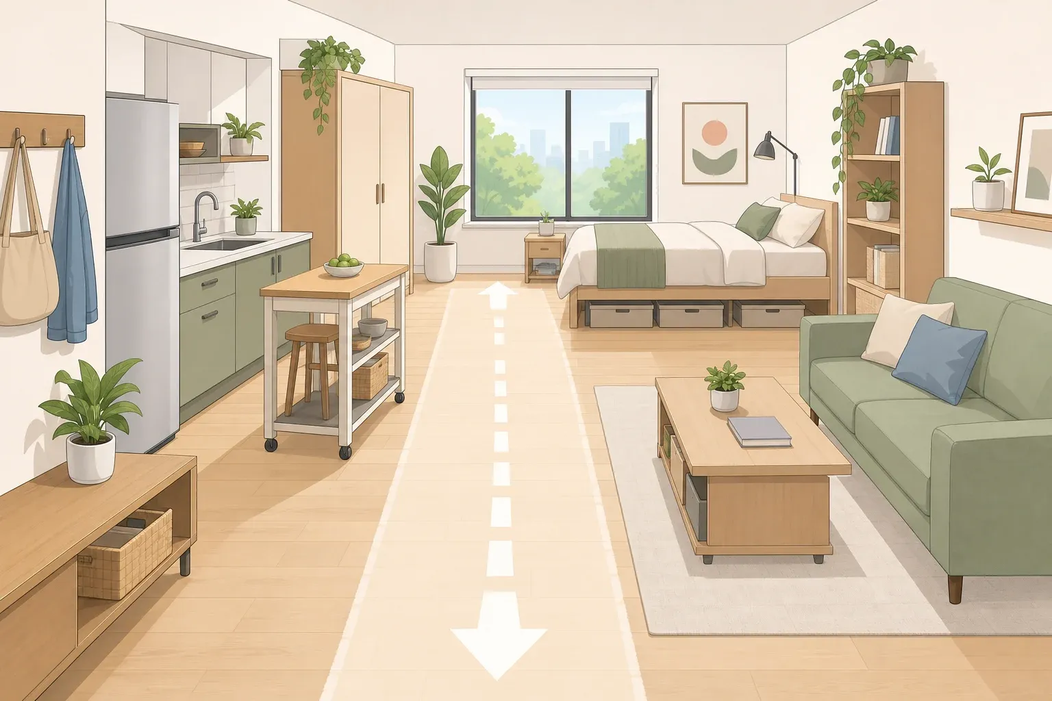
The third mistake is broader: a feature, whether decorative or structural, that looks impressive but interrupts how people actually move and cook in the room. The fix here depends heavily on whether a renovation is already planned. Before committing to anything big, walk the existing space and check three things: the distance between counters, whether the dishwasher sits next to the sink, and whether a planned addition duplicates something the kitchen already has.
If you're not renovating: rationalize what's already there
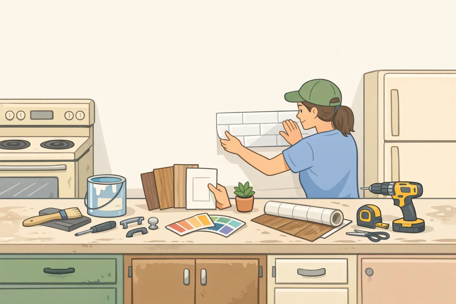
Mixed metal finishes are a matter of taste rather than a hard rule, but current designer opinion leans away from them. Combining brass, black, nickel, and bronze in one kitchen can feel "like adding too much makeup when you go out to a party," according to one designer, who added that the "jewelry of hardware" idea can quickly become "overdone rather than refined." Treat this one as a preference to weigh, not a mistake to panic over. Paring back to two finishes, rather than swapping out hardware altogether, is usually enough to settle it.
If you're renovating: plan for function first
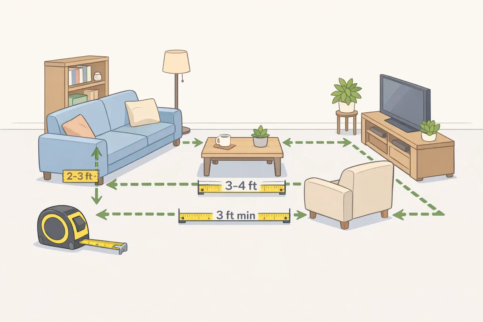
Start with clearance. Designer Nicole Roe of R. Nickson Interiors recommends a minimum of 42 inches between counters, with 48 inches ideal, a concrete benchmark worth measuring against before finalizing an island size or cabinet run. If a floor plan comes in under that, the island probably needs to shrink, not the walkway around it.
Check appliance placement next. The team at LTA Interiors notes the dishwasher should sit right next to the sink to prevent dripping water across the floor and to simplify cleanup, a placement detail that's easy to get wrong on paper.
Then question the showpiece additions before signing off on them. Bethany Adams of Bethany Adams Interiors describes navigating a double island as requiring footwork that would be "ludicrous," pointing out that a kitchen large enough for two islands probably has a dining room that could serve the same guests instead. Pot fillers get a similar skeptical read: one designer calls them "yet another expensive kitchen trend" that saves at most a couple of seconds, while a cook still has to carry the pot to a nearby sink to dump the water.
None of this is absolute. A double island can work in a genuinely large kitchen, and a pot filler earns its keep in a household that cooks at real volume. The test designers apply isn't whether a feature looks impressive in photos; it's whether it supports how the room gets used every day.
Kitchen design mistakes that make your kitchen look cheap: where to start
The three mistakes above show up across designer interviews far more consistently than opinions on any specific material or trend. Where those same designers split is on individual finishes. Victoria Armour of Stil James says flatly, "I hate quartz," preferring what she calls the soul of natural stone instead.
Gena Kirk, vice president of corporate studio at KB Home, makes the opposite case, recommending marble-look quartz over natural white marble because it resists the stains and etching that come with an unsealed stone counter. Two designers, two different answers, on the same material.
That gap is the useful part. A cheap-looking kitchen has less to do with any single countertop material or hardware trend than with whether the room feels controlled and intentional. Among the ways to upgrade a cheap-looking kitchen, the fastest wins live in the first two mistakes covered here: clearing the counters and warming up the light. Both can be done in a weekend without hiring a contractor, and both change how the room reads before any decision about materials even gets made.
Layout fixes are the one category worth saving for a renovation that's already happening. Clearance widths, dishwasher placement, and decisions about a second island or a pot filler are hard to unwind once cabinets and plumbing are in place, so they belong on the renovation plan, not the weekend to-do list. Start with what's free, spend modestly on lighting, and save the structural calls for when the walls are already open.













Comments
Be the first, drop a comment!