



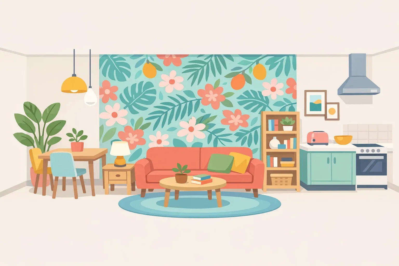
How to decorate with lots of color without overwhelming a room
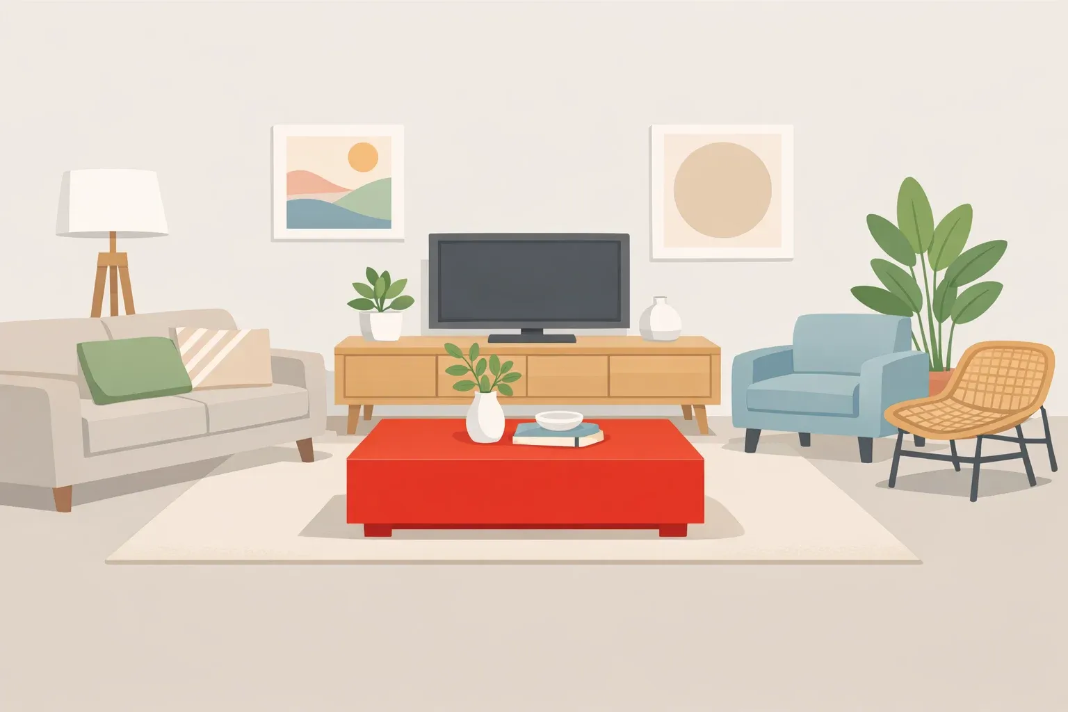
A 540-square-foot rental in Los Angeles has tropical peel-and-stick wallpaper, checkerboard floors, black cabinets, and a mix of thrifted midcentury furniture packed into one bedroom, one bathroom, and a kitchen you could cross in four steps. By any reasonable color count, it should feel chaotic. Instead, interior designer William Hutton, who lives there with his partner Kevan, describes a home where "there are so many colors within our home, but it's not overpowering," he told Architectural Digest two years ago. That gap between the color count and how the room actually feels is the whole question behind how to decorate with lots of color without overwhelming a room: it's less about how many hues you use and more about how you manage the ones you pick.
Hutton names the operating principle himself: "Even color can feel neutral with the right balance," he says (Architectural Digest). Color research backs the instinct, if not the exact math. A VR study published last year had 20 people evaluate 36 wall-and-furniture color pairings and found that as the differences in saturation and brightness between paired colors grew, perceived harmony tended to fall (Journal of the International Colour Association). That's a finding about contrast, not hue count, and it's about as close as the research gets to explaining what designers like Hutton do by feel.
Put plainly: a colorful room holds together when new choices respond to something already fixed in the space, a floor, a tile, a cabinet color, and when the brightness and intensity of those choices stay in a compatible range. More hues don't automatically mean more chaos. A maximalist color palette just needs more discipline about what everything is answering to.
How to mix colors in interior design: start with what's already fixed
Hutton's kitchen is the clearest demonstration. He and Kevan added a bold tropical-print wallpaper to one wall, but the checkerboard floor and black cabinetry were already there before either of them touched a paintbrush (Architectural Digest). "The print could feel overwhelming on its own," Hutton says, "but with the floor, it balances out" (Architectural Digest). The wallpaper isn't competing with the floor for attention; it's answering it. Read that kitchen closely and the wallpaper works as a single bold move layered onto materials that were already fixed, rather than one of several statements fighting for the same wall. That's an inference from looking at the room, not something Hutton spells out directly, but it fits everything else he says about balance.
Three terms are worth pinning down here, since the rest of this framework depends on them. Hue is the color family: red, blue, green. Saturation is how intense or muted a color looks. Value, sometimes called brightness, is how light or dark it reads. The VR study found saturation and value differences between paired colors tracked closely with harmony ratings (Journal of the International Colour Association). In practice, that means two colors can come from entirely different families and still feel calm side by side, as long as their intensity and lightness are close.
One rough, no-cost way to check swatches before committing: photograph paint chips or fabric samples side by side, then convert the photo to grayscale. If the shapes blur into similar shades of gray, the values are close. The VR study didn't test this trick directly, but it's a decent shortcut for approximating "value difference" without a colorimeter, useful as a rough guide, not a measurement.
How to use bold colors in a room without visual overload
Bold color and pattern aren't universally comfortable, and it's worth building that into the plan rather than discovering it after the paint dries. A review published last month by researchers from more than 20 institutions, spanning clinical neurology, optometry, psychology, and engineering, found that features of built environments, including lighting, contrast, pattern, and print, can place enough demand on visual processing to cause real discomfort (University of Stirling).
The effects documented range from eyestrain and migraine to trouble reading and a general sense of being overwhelmed, even in situations that don't bother everyone else. People with migraine, autism, ADHD, dyslexia, or epilepsy may be more sensitive to it than others (University of Stirling). Review lead Paul Hibbard frames this as an opportunity rather than a case against bold design: "If lighting, contrast, pattern, screens, and print contribute to discomfort, they can also be designed with greater care, to ensure that spaces and locations are accessible to everyone" (University of Stirling).
That review is about built environments broadly, not home interiors specifically, but the questions it raises translate well to a room you're about to repaint. Does the space have at least one visually quiet surface, a plain wall or an uncluttered corner, where the eye can settle? Are two high-contrast patterns competing in the same sightline? Would the room still feel comfortable at the end of a long day, not just on the first walkthrough? None of that comes from a study of living rooms specifically. It's a practical translation of the review's broader point, and it costs nothing to check before committing to paint.
A 540-square-foot case study, room by room
The apartment's bathroom shows the same instinct at a smaller scale, which Hutton is happy to joke about: "The bathroom is so small that you can sit on the toilet and wash your hands," he says (Architectural Digest). He and Kevan painted the ceiling a grayish green to match the existing vintage floor tiles, then added simple crown molding instead of introducing a second pattern (Architectural Digest). One new color, tied to one fixed material, no competing print fighting it for space.
The apartment also had a head start. Original 1920s details, including a barrel ceiling, the existing kitchen cabinetry, and windows on every wall, meant the couple weren't starting from a blank box (Architectural Digest). Whether those untouched surfaces function as visual resting points, in the way the comfort research above describes, isn't something the source confirms directly. But it's a reasonable read of a room that stays calm despite the color count, and it fits the same logic as the wallpaper and the bathroom ceiling: work with what's already there instead of covering it up.
Pull those examples together and a four-step process emerges. Identify what's already fixed and hard to change: a floor, a tile, cabinetry. Choose one dominant color or pattern move that responds to it. Keep anything nearby within a similar value and saturation range. Leave at least one surface visually quiet. The apartment isn't a palette to copy color-for-color. It's the same four steps applied twice, in two different rooms, with two different starting materials.
Balanced colorful interior design on a renter's budget
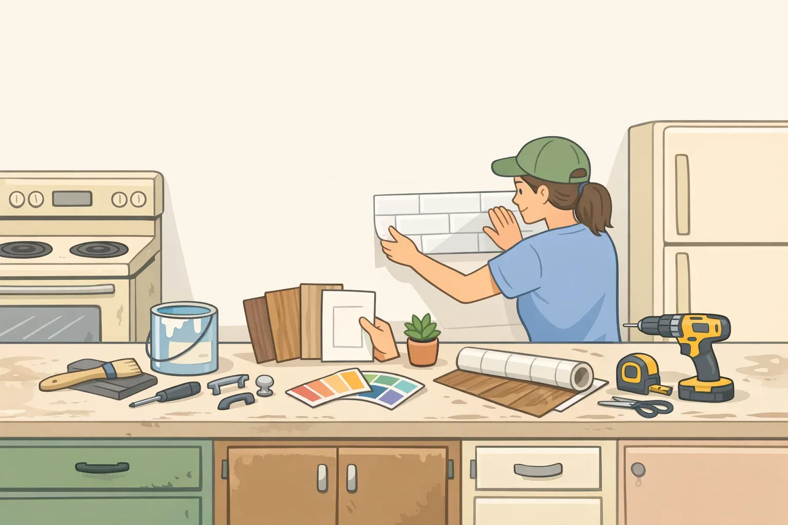
Part of what makes this apartment a useful case study is that almost nothing in it is permanent. The kitchen wallpaper is peel-and-stick. A bar-nook shelf got a removable faux-walnut treatment instead of new material. The bedroom's vintage side tables were repainted rather than replaced, a cheaper swap, though repainting existing furniture isn't quite the same low-stakes commitment as peel-and-stick paper you can strip off a wall (Architectural Digest).
The furniture mix tells a similar story: a chair from a Santa Barbara thrift store, a Danish lounge chair and ottoman off Craigslist, tables from the Long Beach Flea Market, alongside pieces from IKEA, CB2, Target, and Amazon (Architectural Digest). None of it required a big financial swing to test something new.
Hutton's advice to renters doubles as a testing strategy: "Don't be afraid to try out temporary wallpaper and paint, but always check in with your property manager," he says, adding, "I've had a good history where mine have been happy to let me do modifications, especially if they add value" (Architectural Digest). That's his own experience with his own property managers, not a universal guarantee. But the underlying strategy holds regardless of who owns the walls: reversible materials let you test one contrast at a time and walk it back if it doesn't work.
A few practical warning signs, not tied to any specific study but drawn from the logic above, tend to show up when a bold room tips into too much. Two high-contrast patterns competing in the same sightline with no clear lead. Several equally saturated focal points with nowhere obvious for the eye to land first. No low-stimulation surface anywhere in the room. When one of those shows up, the fix is usually to mute or remove an element, not add a fourth color to referee the other three.
Where to start
A colorful room reads as calm when new choices anchor to something already fixed and when brightness and saturation stay in a compatible range, not necessarily when the number of hues is limited. None of this requires a 1920s apartment or a trained designer's eye. Pick one surface or piece of furniture, hold the swatch next to whatever's already fixed in the room under both daytime and evening light, and live with just that one change for a week or two before adding a second bold move. The framework holds regardless of how many colors are eventually on the wall.














Comments
Be the first, drop a comment!