



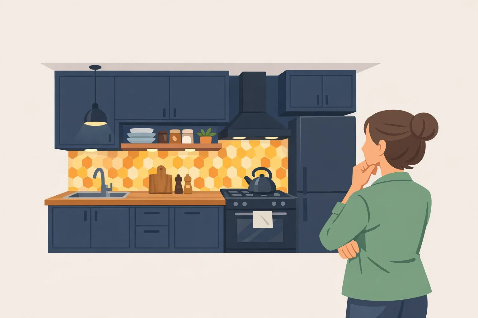
Dark paint won't make a small kitchen measure a single square foot bigger. No pigment changes a floor plan. The real question isn't whether dark paint can make a small kitchen look bigger, since paint doesn't move walls; it's whether the room can stop feeling cramped and start feeling deliberate. That's what a careful application of dark paint colors for small kitchens can actually deliver: a look that reads as chosen on purpose, not defaulted into by whatever gallon was on sale.
Most color advice points the other direction. Soft whites, pastels, and muted tones are the standard recommendation for making a small space read as open, while deep, saturated shades are generally described as creating intimacy, the same quality that makes a large room feel cozier rather than a small one feel more expansive.
An industry trend survey backs the same direction: the NKBA's 2025 Kitchen Trends Report, compiled from feedback from 523 North American design professionals, names light, warm, and natural tones as an anticipated theme for kitchens over the next three years. Neither source rules out dark small kitchen ideas. They just mean the execution has to carry more weight than the color chip alone.
This guide walks through five steps: sizing up whether the kitchen can support dark color at all, deciding where to put it, building a dark color palette for a small kitchen, testing that palette before committing, and painting cabinets versus walls, which take entirely different prep. One thing up front: bad task lighting, poor storage, and an awkward layout won't be fixed by any of this. Handle those first. Color is the last decision in a small-kitchen renovation, not the first.
Step 1: Score the kitchen before you pick a color
Don't rely on a single yes/no test. Weigh four variables together, and be honest about where the room actually lands on each before anything gets picked off a paint chip.
Natural light
Low: One small window or none; dim most of the day.
Medium: Direct sunlight for part of the day.
High: Multiple windows with several hours of direct sunlight.
Artificial lighting
Low: One overhead fixture with no task lighting.
Medium: Overhead lighting plus some under-cabinet or task lighting.
High: Layered ambient, task, and accent lighting already installed.
Existing contrast
Low: Dark floors, counters, and trim.
Medium: A mix of light and dark surfaces.
High: Light floors, counters, and trim.
Surface area going dark
Low: The whole room, including cabinets, walls, and the island.
Medium: Cabinets plus one wall, or the island plus the walls.
High: One element only, such as the lower cabinets, island, or a single wall.
The columns aren't a formal scoring system, just a way to see the room clearly. A kitchen that scores low on natural light and existing contrast is a candidate for the "one element only" column, not the whole-room column, regardless of how much the dark scheme appeals. A kitchen scoring high on daylight and contrast has more room to experiment, but that's still a starting recommendation to check against a real sample, not a guarantee.
Rooms with strong daylight throughout the day can generally support darker or more saturated colors without feeling closed in, though that works best paired with light-reflecting surfaces elsewhere in the room, not as a standalone green light. In rooms with limited daylight, lighter hues reflect what light is available and keep the space feeling brighter, a real constraint if the kitchen has one small window or none at all.
A simulation-based study modeled how the reflectance of a room's vertical and horizontal surfaces interacts with the lighting power needed to meet visual-comfort standards, and produced a color chart from the scenarios it tested. It isn't a verdict on any single kitchen, but it makes the point worth carrying into the budget: going dark isn't a decision that ends with the paint. Plan for the lighting upgrade alongside the color, not after the walls are already covered.
If the table points to "not yet," there are still options. Darken only the lower cabinets or the island and keep the uppers and walls light. Choose a mid-tone from the same color family instead of near-black. Or commit to one uninterrupted focal wall instead of the whole room. None of these mean abandoning the scheme; they scale it to what the room's light and contrast can actually support.
If the kitchen's real problem is bad task lighting, insufficient storage, or a work triangle that doesn't function, solve that before any of the above. Color is a cosmetic layer on top of a structural decision, and it only pays off once the structural one is settled.
Step 2: Dark paint colors for small kitchens: cabinets, walls, or both?
A lower-risk place to start: dark cabinets in a small kitchen, paired with a lighter countertop and backsplash. It grounds the room without covering every surface, which matters when it's still unclear how far to take the scheme.
For dark kitchen wall colors in a small space, treat the wall as one continuous plane rather than something broken up by open shelving or heavy trim. That's a design instinct worth checking against the sample board in Step 4, not an established rule.
Layering light, medium, and dark versions of a single hue creates depth without the visual noise of stitching together several unrelated colors. It's a way to get drama without starkness, and a useful building block for a small kitchen dark palette that doesn't turn busy.
There's also a real choice between coordinating and contrasting. Matching cabinet, countertop, and backsplash colors produces a continuous, cohesive look; deliberately contrasting them instead — dark cabinets against a light countertop — adds visual dimension. Both are legitimate depending on the effect wanted, and dark cabinets paired with a light floor is an example ARC recommends for that contrast approach.
Color aside, storage still matters. In one small Berlin kitchen limited by two doors and an oversized window, the designers built a corner bench with integrated storage and used mirror-fronted wall cabinets, a detail the design writeup specifically credits with making the room appear larger.
That kitchen was painted bright, not dark, and the size illusion is attributed to the mirrors rather than the storage plan as a whole. Still, the underlying idea holds for a dark scheme too: reflective surfaces do visual work that paint color alone can't.
Step 3: Build a dark color palette for a small kitchen
Light comes before color. The same paint chip behaves differently under different bulbs, so treat the following as starting points to confirm on an actual sample board, not settled findings.
Warm ambient light tends to soften color, while cool light intensifies it. In a kitchen with mostly warm lighting, test a cooler-leaning dark, blue-green or teal, against a true charcoal or black, since warmth can push black toward looking muddy. Confirm it in the room before deciding, not in the paint aisle.
Test near-black or true charcoal only in kitchens that already have real contrast in place: a light countertop, a light floor, or bright walls. That existing contrast appears to be what keeps a very dark hue from reading heavy under cool bulbs; without it, the same near-black can look flat rather than dramatic. Treat this as a pattern to watch for, not a rule that holds in every kitchen.
If the kitchen already carries a lot of wood or stone, try a softer deep hue such as forest green or burgundy before defaulting to stark black. It plays off natural material instead of fighting it. There's a related example from a different angle: the Berlin kitchen left its refrigerator panels unpainted to show the natural grain of ash, deliberately offsetting its bold painted cabinet fronts. One bold surface, one natural counterweight; that balance holds whether the bold surface is bright or dark.
None of this replaces testing the actual color in the actual room, which is what the next step covers.
Step 4: Sample it before you commit
Paint a sample board large enough to judge honestly, closer to a folder than a paint chip, and test the leading one or two candidates this way, propped against the actual cabinets, countertop, and floor. Small swatches consistently misrepresent how a color reads at full scale, and a bigger board gives an honest read before a full gallon gets ordered.
Watch the board across daylight and evening lighting, under whatever bulbs will actually be running when the kitchen gets used most. A color that looks crisp at noon can go flat or muddy under evening light, and that mismatch is worth catching on a test board, not on every wall in the kitchen.
Move the board around, too. Try it near the window, in a corner, and next to the cabinets, since the same paint can read differently depending on what's nearby.
Give the sample time before ordering paint, long enough to see it in every light the kitchen gets over the course of a normal day. If it reads too black, too flat, or muddier than expected once it's actually in the space, that's the moment to size down to a lighter shade in the same family or scale back to an accent wall or lower cabinets only. That correction is cheap now. It's expensive after the whole kitchen is painted.
Step 5: Prep and paint, cabinets and walls are different projects
None of the research behind this guide covers paint chemistry or cabinet-specific trade standards, so treat this step as a checklist to verify against the specific products in hand, not settled fact. Cabinet material, existing finish, and the primer or paint system chosen together determine what prep actually works.
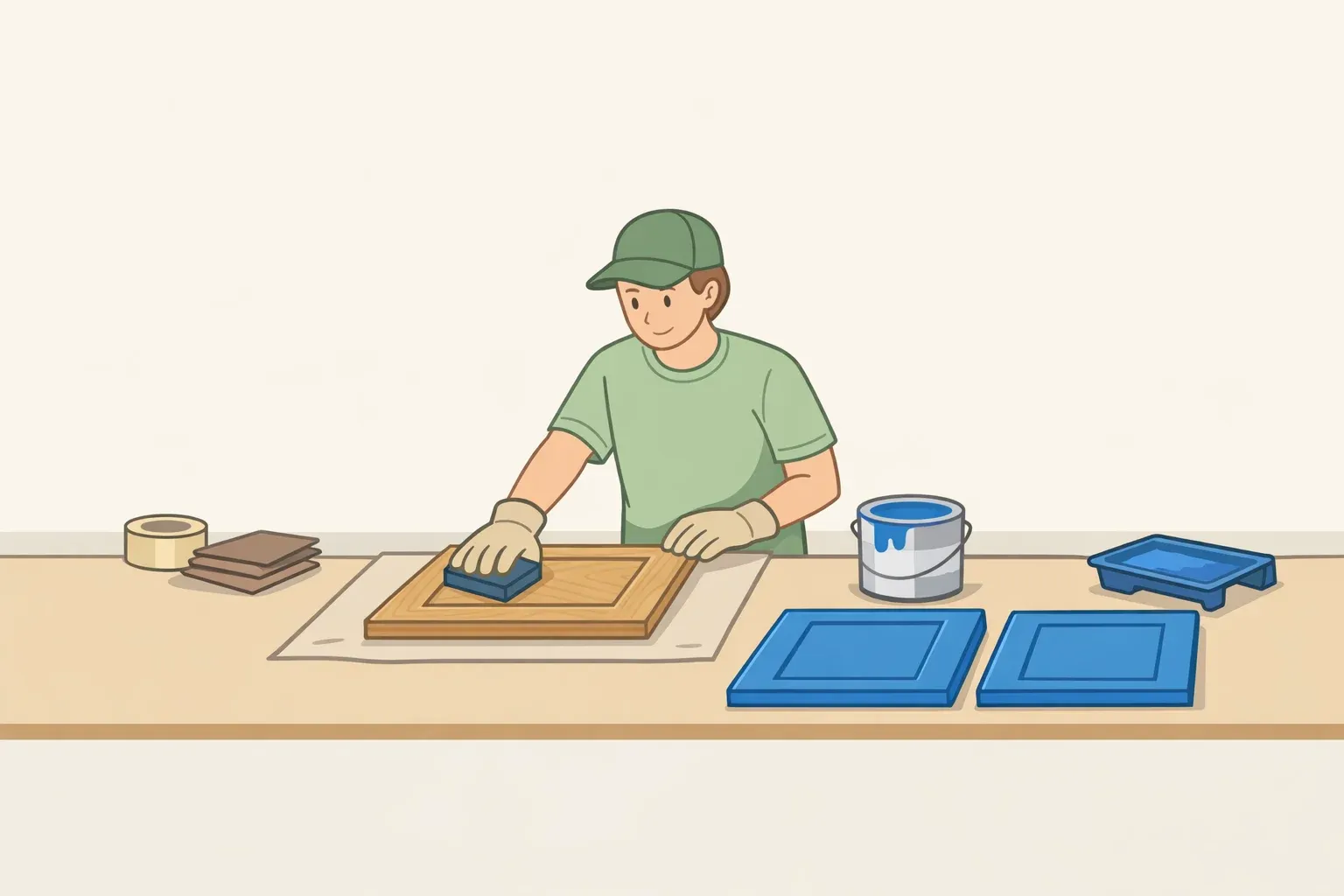
If painting cabinets:
Identify the base material before buying anything: solid wood, veneer, laminate, thermofoil, or an existing factory finish. Check the manufacturer's instructions for the specific primer and paint being used; they'll state which surfaces the product is rated for.
Remove doors and hardware, and label each piece so it goes back where it came from.
Clean and degrease thoroughly before doing anything else, especially cabinets closest to the cooktop.
Test adhesion on an inconspicuous spot, like the inside of a door, before committing to the full set.
Follow the recoat and cure times printed on the product label rather than a general timeline. These vary by brand and formulation.
If painting walls:
Distinguish ordinary painted drywall from anything glossy, damaged, or exposed to grease near the stove, and prep those areas according to the primer manufacturer's instructions before painting.
Check the paint manufacturer's specification for kitchen-appropriate finishes, since washability and recommended sheen vary by product line.
Either project, follow the number of coats specified on the product itself rather than assuming two is standard; coverage depends on the paint and how much the new color needs to hide. Sheen is worth checking too, since finish affects how much light a surface bounces back into the room, a real factor in a small kitchen where every surface sits close to the eye. Confirm the sheen options and their light-reflective properties for the specific product line before buying.
Settle the lighting plan alongside the paint, not after. The IBPSA study modeled how surface reflectance interacts with the lighting power needed to meet visual-comfort standards under the conditions it tested; take that as a reason to install any new fixtures or bulbs before the final walkthrough, not once the paint has already dried.
Conclusion
None of this requires committing to a full dark kitchen on day one. The safer sequence is a lower cabinet run, an island, or a single wall first, tested against the actual room across a full day of light using the process in Step 4, and expanded only once that test holds up. It's slower than picking a color and repainting the whole kitchen at once, but it skips the part where the shade looks nothing like the chip once the sun goes down.
With light, warm, and natural tones named as the industry's stated direction for kitchens over the next three years, a carefully tested dark kitchen reads as a considered choice rather than a trend chased without the groundwork to back it up. The groundwork is the whole guide. The color is just the last step.












Comments
Be the first, drop a comment!