



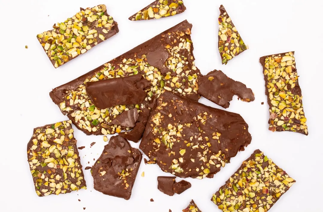
Spring 2026 Interior Color Trends: Why Brown and Pistachio Work
After a decade of oat-milk walls and white oak everything, the retreat from safe neutrals has arrived somewhere specific. Earthy brown anchors the room. Pistachio green lifts it. Taken together, the signals emerging from designer client briefs, paint brand announcements, and furniture retail data point toward a warmer brown-and-green palette and the spring 2026 interior color trends story is really a year-long market shift that's only now reaching living rooms.
Spring is just when it arrives. The evidence behind it is a fuller story.
Last fall, ELLE Decor polled designers who reported clients asking for walnut instead of white oak, merlot instead of greige richer wood finishes, warmer wall colors, combinations chosen for atmosphere rather than inoffensiveness. Paint brands landed in the same territory independently: Benjamin Moore selected Silhouette, a rich espresso brown with charcoal undertones, as its 2026 color of the year; Valspar chose Warm Eucalyptus, a muted green; Behr picked Hidden Gem, a smoky jade. Three commercial bets arriving at the same earthy, nature-linked family, without coordination. On the retail side, furniture brand Loaf's green fabric rose to its second best-selling color category after creams and whites, with sales up 50 percent year over year, according to The Telegraph. That's purchasing behavior, not editorial opinion.
This piece examines why the brown-and-pistachio pairing works, what it changes beyond color preference, where it fails, and how to bring both shades in at whatever level of commitment makes sense.
Why sad beige is losing ground and what's replacing it as warm paint colors for spring 2026
The rejection of gray and beige isn't aesthetic fatigue alone. It reflects a shift in what people want their homes to do: not look curated and calm, but feel inhabited and emotionally warm.
Designer Stephanie Hunt of The Flairhunter told ELLE Decor last fall that clients are pulling away from "millennial grey" toward warmer, friendlier finishes spaces that feel present rather than staged. Emily Lindemann of Ruggles Lindemann Bell echoes her, noting that clients are gravitating specifically toward browns, rusts, and greens. The shift is consistent enough across different firms and different markets to read as genuine demand rather than designer groupthink.
What unites the earthy colors gaining ground warm browns, pistachio, eucalyptus, ochre, terracotta is that they all exist in the physical world before they exist on a wall. They arrive in a room carrying existing associations: worn leather, old clay, Mediterranean tiles, the underside of a leaf. Greige has no such referent. It doesn't evoke anything except restraint, which turns out to be less comforting than the decade that embraced it assumed.
Trend forecasting firm WGSN tied the broader move toward nature-derived hues to what it called an "Earth-first mindset," connecting home environments to ecological awareness and a cultural demand for resilience, as ELLE Decor reported in late 2024. Colors drawn from soil, foliage, and clay feel appropriate in a way that manufactured grays never quite did.
Designers Barry Bordelon and Jordan Slocum of The Brownstone Boys describe the emerging aesthetic as "earthy vibrancy" color that "feels grounded but still has energy, like nature turned up a notch," as Home & Art Magazine reported earlier this year. The phrase is useful because it explains precisely why this palette is replacing beige rather than swinging to the opposite extreme. It's expressive without being confrontational.
ELLE Decor's 2026 trend analysis frames the underlying shift this way: the coming years will be less about what looks timeless and more about what feels timeless shades that "awaken mood, touch, and memory." Brown and pistachio are where that idea gets most coherent as a two-color answer.
Why earthy brown and pistachio work as a pair, not just separately
The case for each color individually is straightforward. The more interesting question is why they succeed together.
Earthy brown, in the umber, tobacco, and espresso family, functions as an anchor. It absorbs light, adds visual weight, and sets the emotional register of a room. Pistachio provides the lift: freshness and contrast without any of the coldness that cooler greens introduce. The pairing works because neither color competes for dominance in the same tonal range. Brown pulls warm and dark; pistachio pulls warm and light. They share an undertone family rooted in yellow-green and amber rather than blue or gray, which is what keeps the combination from feeling jarring.
Melbourne-based designer David Flack describes warm, muddy brown neutrals as capable of "commanding a larger space" while providing a connecting thread between rooms the kind of structural color that makes everything placed against it read clearly, per Home & Art Magazine. In the pairing, umber fills that anchoring role. Pistachio, which Libs Nicolls of Domestic Science calls "fresh but also familiar," extends the warmth rather than contradicting it, per The Telegraph. John Lewis home director Jason Wilary-Attew notes that pistachio paired with deeper greens produces a "serene, nature-inspired look," while combined with bold accents like orange and cocoa it tips toward something more dynamic. Against umber, pistachio lands closer to the serene end: grounded by the warmth underneath it, brightened by its own yellow undertone.
Jen Baxter of Baxter Hill Interiors predicted palettes with colors that "feel timeworn, like they already belong to the house" tobacco brown, dusty olive, sunbaked terracotta in ELLE Decor last fall. Pistachio fits that description more precisely than most greens because its warmth keeps it from feeling imported.
The pairing also shapes material choices in ways that go beyond color preference. Against umber walls, natural wood reads warmer than it does against white or gray, which tends to favor walnut, rattan, and aged brass over chrome and pale oak. Pistachio's yellow-green warmth sits well alongside copper fixtures, terracotta tile, and ivory linen. The result is a room that feels materially coherent, not just color-coordinated.
Where it goes wrong. Equal intensity of both colors at large scale is the main risk. Brown walls plus pistachio walls in the same room can feel oppressive and confused. The pairing works when one color dominates and the other accents, not when both compete for prominence at the same volume. Pistachio can shift toward yellow in poor or limited light in a north-facing room it may read more acidic than fresh, which is worth testing before committing. Umber needs contrast to breathe; white trim, natural wood, and reflective surfaces like aged brass, linen, and unglazed ceramics are what prevent it from becoming heavy.
Bringing both colors into a home: where each works and how to combine them
The practical question is not whether to use these colors but where each belongs and how much to commit.
Walls and large surfaces. Color-drenched umber walls create immediate warmth. Home & Art Magazine recommends pairing them with white trim and natural wood to prevent the tone from becoming heavy, and notes that earthy tones shift significantly between natural daylight and artificial light testing samples on the actual wall at different times of day is essential before committing.
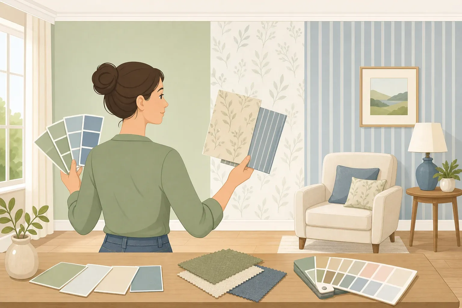
For pistachio walls, the approach that prevents the color from reading as thin or overly pastel is tonal layering. House Digest recommends pairing pistachio wall color with deeper forest green on trim or millwork, so the room reads as a deliberate statement rather than an unfinished one. ELLE Decor describes a related technique called "color capping" running one hue across a room at varied tonal weights, from lighter walls to darker upholstery or ceiling.
If the room feels cold or starved of warmth, start with umber on the dominant wall. If it feels flat or too stark, start with pistachio. If using both, give umber the walls and pistachio the upholstery or a single accent surface rather than the reverse, which tends to make the brown feel incidental.
Kitchens and bathrooms. Pistachio's yellow undertone makes it particularly effective in spaces that can run cold. Lee Thornley, founder of tile company Bert & May, notes that the shade's warmth "cosies up spaces that can be in danger of feeling stark," making it a better choice for splashbacks and tiles than cooler greens, per The Telegraph. Swapping a standard white kitchen splashback for soft green is one of the most contained changes available surface-specific, but with a disproportionately large visual effect. Copper fixtures are a natural material partner in these rooms, introducing a warm orange undertone that makes pistachio look deliberate rather than accidental, per House Digest. Chrome reads too cool against either shade.
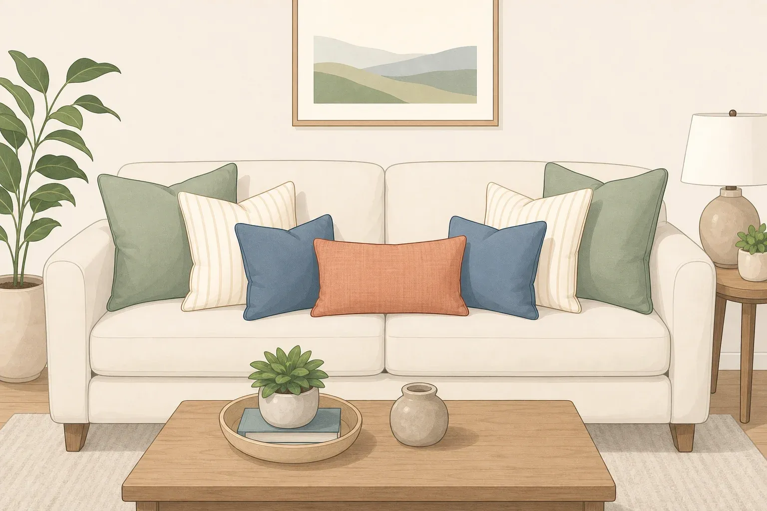
Upholstery and soft furnishings. Loaf fabric buyer Rosie Hallet specifically recommends against treating pistachio as too risky for large upholstered pieces. Green is the retailer's second best-selling fabric color after creams and whites a signal that a pistachio sofa has shifted from statement piece to considered choice, per The Telegraph. For lower commitment, a pistachio linen sofa against warm white walls is one of the most versatile entries into the color, per House Digest. Pale blue or blue-grey leans the combination toward serene; terracotta pulls it warmer and more grounded.
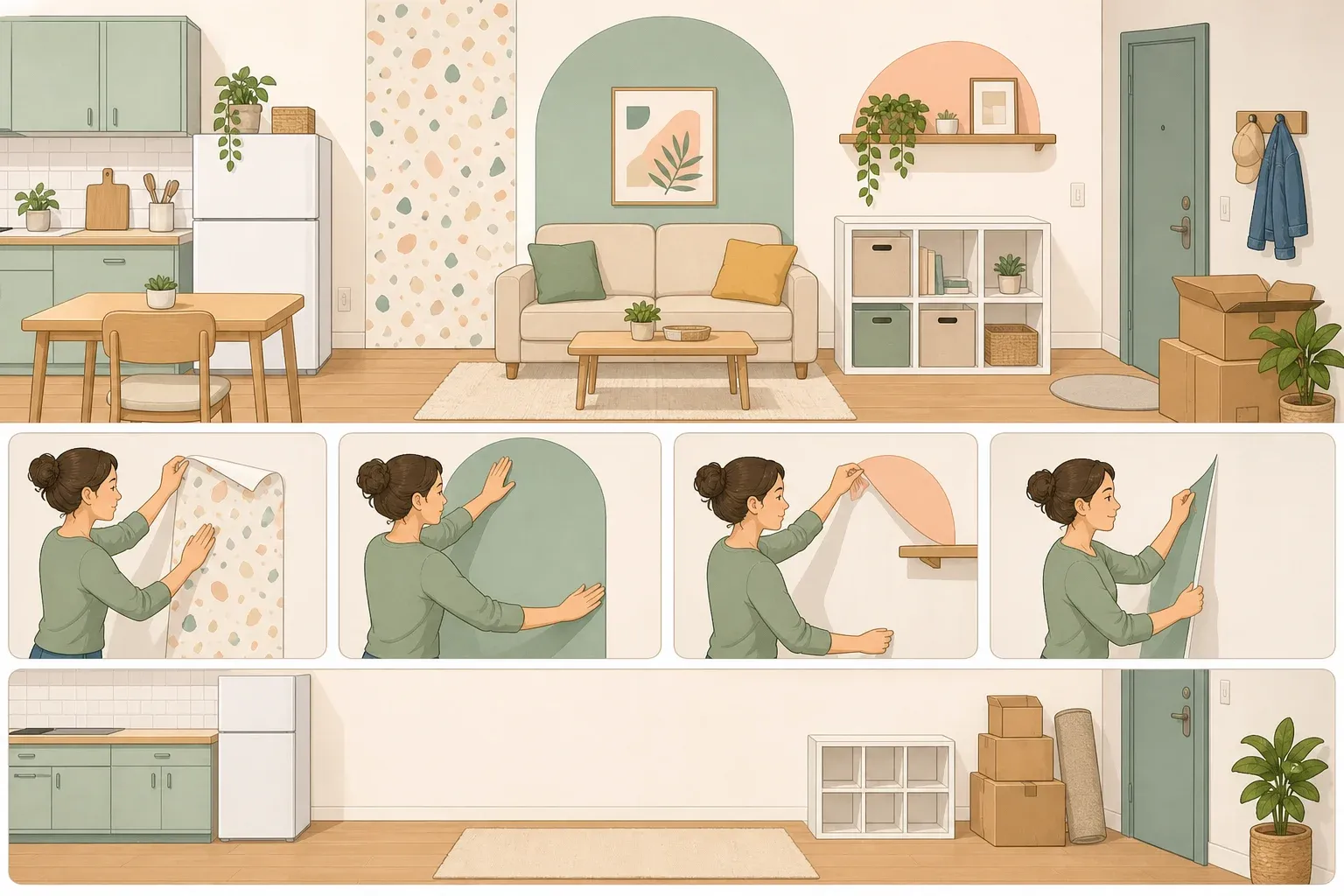
Accents and accessories. For rooms that aren't ready for paint or upholstery commitment, pistachio moves in through cushions, lamps, side tables, and glassware. The Telegraph notes that even a tablecloth can function as a "bold block of colour" that shifts a room's feeling without altering any permanent element. For earthy brown, art is the most flexible entry point. Home & Art Magazine suggests a large abstract at least 60 inches in warm earthy tones to anchor a wall without committing to paint. At that scale, the piece pulls the room into the palette without requiring anything else to change.
What the evidence actually says about this palette's staying power
The most credible case for this palette is commercial, not editorial. Retail green fabric at second-best-seller, three major paint brands converging independently on browns and muted greens for their 2026 flagship colors, and consistent designer feedback pointing toward the same earthy family these are separate market signals that reached the same conclusion, per The Telegraph and ELLE Decor.
One note of honest proportion. Pistachio is the better-documented of the two colors, with independent retail sales data, cross-industry adoption, and deep designer coverage. The earthy brown case draws on a broader pattern client preferences, paint brand selections, designer commentary on the wood-tone shift rather than a single breakout shade. Think of umber as the most precise name for a larger movement, and pistachio as the season's most precisely evidenced individual color.
Kerrie Kelly of Kerrie Kelly Studio frames what makes this palette durable: people are craving "warmth, tactility, and authenticity palettes that soothe without surrendering style," as Home & Art Magazine reported earlier this year. Umber and pistachio deliver both halves of that. A room built around this pairing will age better than trend language implies not because it's chasing timelessness, but because soil, foliage, and worn clay were never fashionable in the first place. They were just always there.














Comments
Be the first, drop a comment!