



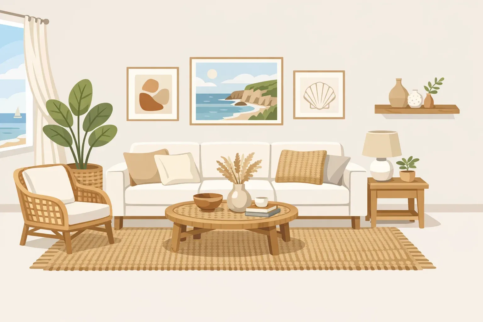
6 Coastal Design Rules for a Refined, Livable Home
When homeowners Laura and Jim DeMare hired designer Matt McKay to refresh their seven-bedroom Hamptons property, their brief was simple and uncompromising: no seasonal beach-house aesthetic, no clichés. "We wanted the sophistication and functionality of a year-round home," Laura told Architectural Digest earlier last year. McKay organized the interiors around their art collection, warm earth tones, and organic textures. The result reads as unmistakably coastal. Not one starfish in sight.
That project is the clearest illustration of what these coastal design rules actually produce: rooms that suggest the shore rather than illustrate it. The palette, the materials, the editing, the personalization all of it is a method for getting there, not an end in itself.
Designers featured by House Beautiful this month describe the overtly beachy look as dated and point toward a subtler direction one where the objects people instinctively reach for (starfish, anchor motifs, rope-everything, overdone blue-and-white rooms) are now the clearest markers of a tired interior. The gap between a coastal room that feels refined and one that feels like a vacation rental comes down to a repeatable set of decisions around proportion, materiality, and restraint, per Libby Langdon Interiors four months ago.
Six rules follow. They apply whether the home sits on the water or simply wants to feel like it does.
Coastal design rules for color: start with the view, not navy-and-white
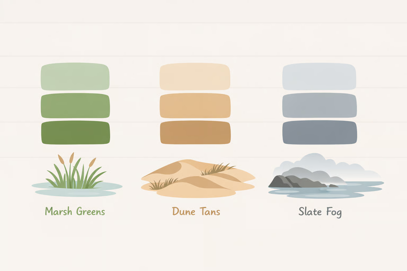
The navy-and-white formula has been applied so widely that it now reads as shorthand rather than a considered choice. Interior designer Cece Bowman, speaking to House Beautiful this month, puts it plainly: it feels gimmicky. Her corrective is practical. Look out the window. The palette of any coast is specific marsh greens, dune tans, slate fog, bleached sand and that specificity is what makes a room feel connected to its place rather than generically beachy.
The foundation consistent across designers: warm whites with creamy undertones rather than stark cool whites, which read clinical; soft greiges; and natural linen tones. A neutral base that lets natural light and views carry the coastal feeling, per Loni Lueke two months ago.
Blue still belongs but as a layering element, not a dominant contrast. Ian Mankin recommends working from pale sky tones to deeper ocean hues against the neutral base. In living areas, pale upholstery and tonal blues create continuity without overwhelming the eye, per Libby Langdon Interiors.
If the palette requires an explanation "it's coastal because of the blue" it's working too hard. A well-built coastal palette should feel like the light quality of the location, not announce its reference.
Rule 2: Add contrast and depth, but ground it with richer tones
A neutral foundation can easily go flat. The fix is contrast, not more layers of the same light register.
Designers are moving away from the cerused and whitewashed wood finishes that became a coastal staple. Richer wood tones, found in antiques and heritage pieces, now serve as grounding elements that give lighter rooms visual weight and longevity, per House Beautiful this month. Leah Hook of Gray Oak Studio explains the logic: pairing a deeper wood stain with visible grain or an organic shape keeps the piece feeling natural and complementary to the outdoor environment, not imported from a different design register entirely.
Repetition is the technique that makes an accent color read as intentional. Hook recommends repeating any given tone at least three times across a room so the eye tracks it as part of a system rather than an afterthought.
The honest caveat: some designers, including Loni Lueke, still endorse weathered and whitewashed finishes, and both approaches can work. The question is whether the finish feels like a deliberate choice or a coastal default. A whitewashed floor under dark wood furniture reads as contrast. The same floor surrounded by bleached rattan and white shiplap reads as habit.
One or two richer anchors a walnut console, a vintage wood table do more structural work than a dozen light-on-light layers.
Rule 3: Let texture replace theme

The single most consequential shift in elevated coastal design is this: stop decorating with motifs that reference the ocean and start choosing materials that embody its qualities. Libby Langdon Interiors frames it as selecting materials for "how they live, age, and feel over time" a different question entirely from whether they signal coastal style.
The material vocabulary that shows up consistently across designers: rattan, bamboo, wicker, grasscloth, linen, cotton, sisal, jute, timber, and natural stone. Not for their associations, but for the physical warmth and surface interest they bring, per House Beautiful, Loni Lueke, and Ian Mankin. Designer Jennifer Mabley points to hand-painted grasscloth wallpaper as a single surface treatment that delivers texture and color simultaneously, replacing what might otherwise require several decorative layers.
Think of it the way a good restaurant designs its dining room. The best ones don't hang food photography on the walls. The environment should feel like the experience, not illustrate it.
Woven materials work best used selectively. One rattan statement chair or a pair of wicker side tables reads as curated. A room full of woven pieces tips back into the themed territory designers are trying to leave behind, per Loni Lueke.
Shell art, rope detailing, and nautical references aren't categorically banned the distinction is execution, scale, and craft. Bowman's examples from House Beautiful: handmade shell panels by an artisan, rope molding applied architecturally to door casings, large-scale coquillage installations. Mabley adds that coquillage art carries genuine historical significance; the quality of the shells and the skill of the artist determine whether it reads as craftsmanship or souvenir. The practical test: bespoke and architectural belongs in an elevated coastal interior. Mass-produced and decorative belongs in a beach gift shop.
For homes in actual coastal environments, material choices carry real functional stakes. UV-resistant and moisture-treated fabrics, performance upholstery, and salt-air-resistant hardware in brass or marine-grade stainless steel are the infrastructure that keeps a beautiful room that way, per Livspace last year. Inland readers can deprioritize these specs without sacrificing the aesthetic.
Rule 4: Let architecture and light lead; decor follows

All the surface-level decisions rest on this one. Elevated coastal interiors are organized around the building itself and the quality of light it admits, not around what gets placed inside.
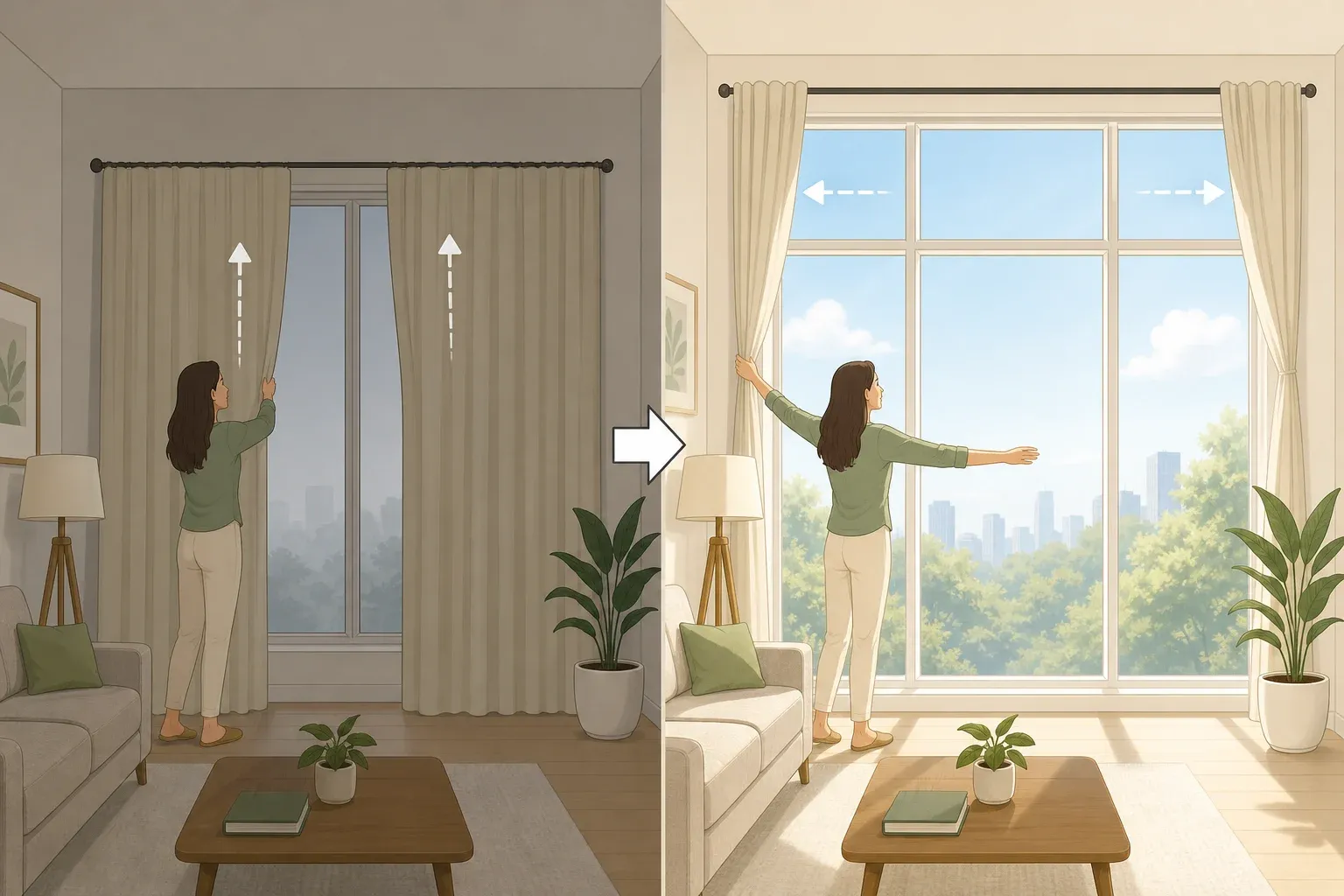
Paneled walls, generous windows, clean sightlines, and ceiling details do the foundational work of connecting an interior to its setting, per Libby Langdon Interiors. The furniture and objects support that architecture rather than compete with it. Window treatments stay minimal light sheers rather than heavy drapes, kept back so natural light shifts the room throughout the day. The view becomes the artwork. The interior supports it quietly.
The DeMares' Hamptons home demonstrates this at full scale. McKay's approach centered on a refined palette of warm earth tones and organic textures, with art and collected furnishings given room to be read clearly rather than competing with decorative noise, as Architectural Digest documented earlier last year.
This principle scales down readily. Without architectural interventions, treating the existing structure as the primary design element working with ceiling heights, window placement, and floor material reduces the number of decorative objects actually needed. Less is required when the room is doing more work. And the architecture-leads principle transfers fully inland: wide windows, light-maximizing treatments, and clean sightlines work in any home as the foundation of a calm, coastal-feeling environment.
Before adding anything to a room, ask whether the architecture has been allowed to work. Blank walls, covered windows, and crowded sightlines are problems no amount of good furniture solves.
Rule 5: Edit hard
Restraint is the mechanism through which luxury communicates itself in a coastal context. A room with three well-chosen accents reads as more refined than one with thirty coastal-themed objects the editing is the message, per Loni Lueke. Not a failure of commitment.
Libby Langdon Interiors describes the accessory approach as sparse and intentional: sculptural objects, books, greenery things that add warmth without accumulating into clutter. Negative space is embraced as a design element, not treated as a gap to fill. Each accent should earn its place by being beautiful, interesting, or personally meaningful, not simply because it references the ocean.
The practical two-part edit: remove anything that references the coast generically rather than specifically, then add one thing that is irreducibly yours a piece of art, a book stack, an object with a story that happens to belong in this room.
Rule 6: Make it specifically yours

The deeper reason cliché coastal rooms feel cheap isn't cost. It's impersonality. Anyone can buy a framed sand dollar from a souvenir shop, which means that object communicates nothing about who lives in the room, as House Beautiful notes this month. Impersonal objects make decorated spaces feel staged.
Leah Hook of Gray Oak Studio puts the alternative plainly: lean into what you actually love about the coast and share it through art, books, and objects. The unique details change everything. Practical examples that work: a vintage map of a meaningful coastline, framed handwritten postcards from a specific trip, commissioned art, local landscape or aerial photography, a single piece of coral or driftwood displayed as a sculptural object rather than part of a collection, per House Beautiful and Loni Lueke.
The DeMares' Hamptons home is the most complete case study. The coastal quality of the space comes almost entirely from personal collection: work by emerging artists acquired over time, vintage and contemporary furniture in dialogue, a palette of warm earth tones chosen for the four-season life the family actually lives there, not for summer staging, per Architectural Digest.
The test for any accent, borrowed from Loni Lueke: does this feel like something you'd find in a well-traveled person's home, or does it feel like it was purchased at a beach gift shop? That question is more useful than any style checklist.
What these rules build toward
The six rules above aren't six separate ideas. They're six expressions of one: coastal interiors that hold up over time don't announce themselves. They create conditions in which the shore is felt rather than seen.
That's what the DeMares' brief was really asking for a home that works as well in January as in July, organized around life as actually lived rather than around a seasonal aesthetic. Ian Mankin frames this as the Coastal Luxe principle: simplicity, longevity, and connection to place, where natural materials and timeless craft take precedence over trend cycles. Libby Langdon Interiors puts the stakes directly: a coastal home built around proportion, materiality, and restraint stays beautiful and relevant for years not just until the next design cycle makes the décor feel dated.
For room-by-room application kitchens, bathrooms, outdoor-indoor transitions the same logic extends with different material and scale considerations. For real coastal environments, the durability specs flagged in Rule 3 deserve their own research pass before purchasing.
The shift in how designers are working isn't about abandoning the shore as inspiration. It's about trusting that inspiration enough not to illustrate it.
















Comments
Be the first, drop a comment!