


How to Style Kitchen Counters: 5 Steps to a Functional Look
Here's the governing rule: anything left out in the open should be beautiful or essential, and ideally both. Knowing how to style kitchen counters so they satisfy that standard takes a specific sequence, though. Decide what earns display, improve those pieces, arrange them with intention, then pressure-test for upkeep and demote anything that fails.
This guide covers a short setup step plus five steps. Apply it to one counter zone at a time, not the whole kitchen at once.
Before you start: pick one zone
Don't attempt the whole kitchen. Pick a single defined stretch the area beside the stove, the coffee and breakfast station, or one section of an island. Style that zone completely before moving to another. One finished zone gives a reference point and keeps the process from becoming overwhelming.
The three zones most worth styling, and what belongs in each:
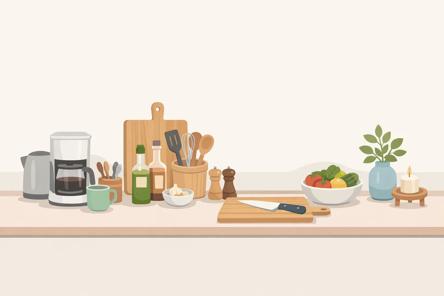
Stove side: Cooking oils, a salt cellar, a utensil crock, a spoon rest. Everything within arm's reach during cooking; nothing that doesn't get used weekly.
Coffee or breakfast station: The machine, a tray holding coffee, tea, and sweeteners, one or two mugs on display. Contained and purposeful.
Island or larger counter stretch: More room for decorative layering. A fruit bowl, a vase, stacked cutting boards or a cookbook, glassware. Reserve this zone for items that can carry visual weight without becoming obstacles.
Placing styled groupings in corners or at the midpoint of a counter run keeps the main workspace clear while adding visual interest, according to House Beautiful. For galley kitchens, the same logic applies with a narrower margin for error: what reads as an elegant trio on a wide island can block the only prep surface on a narrow run shared with a toaster and a kettle.
Step 1: how to declutter kitchen counters before you style them
Do this: Remove everything from the chosen zone. Put it all on the kitchen table. Apply a two-part filter to each item: Do you use this at least several times a week? And is it worth looking at every day?
Items that pass both stay. Items that fail one go into a cabinet or drawer. Items that fail both go into a cabinet, a donation box, or the trash.
Shannon Slattery, Director of Design at Eisen Design House, puts the standard plainly: keep only essentials and make them beautiful, per House Beautiful. Both filters have to be satisfied, not just one. Something useful but unattractive should either be upgraded or stored. Something decorative but unused rarely survives contact with a real working kitchen.
Appliances need a harder look than most people give them. A toaster used every morning earns its spot. A bread machine that came out twice last year does not. Counter space is finite; protect it accordingly.
One exception worth naming: medication, accessibility tools, or infant gear may need to stay visible regardless of how they look. The framework is for discretionary items, not everything.
Visible clutter, even when technically organized, increases stress and reduces focus by demanding mental energy to process. Psychologists call this "visual noise," and Designing Idea covered the concept in late 2024. That's what the edit step addresses before any arrangement begins.
Gotcha: Don't skip this step hoping that trays and arrangement will fix things. Organization tools manage what stays. They don't justify keeping more than you need.
Step 2: give every remaining item a contained home
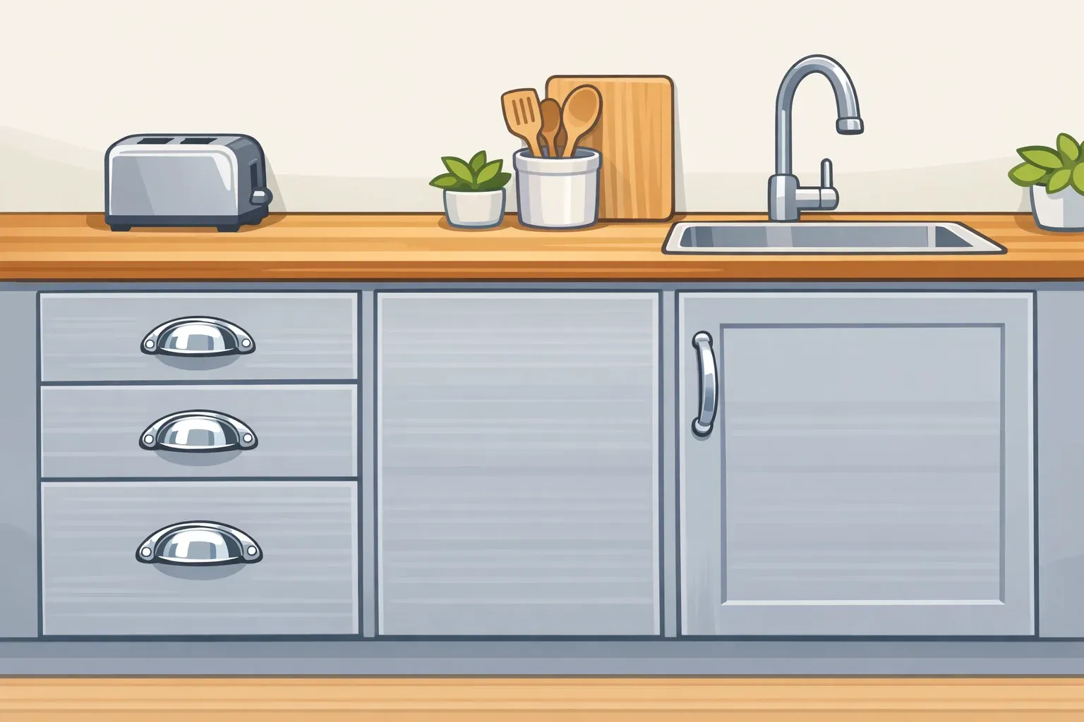
Do this: Assign every category of item that stays out to a specific vessel, tray, or crock. Oils and condiments go on one tray. Utensils go in one holder. Coffee essentials occupy one defined spot. Nothing floats loose on the bare counter.
A tray turns a loose scatter of bottles into a composed grouping. A crock makes five utensils read as one deliberate object rather than a pile. That's the whole mechanism—containment is what converts "stuff on a counter" into something that looks considered.
Terry Mainord, a home stager and interior designer, points to a simple tray as the single most effective counter tool: a small rectangular or round tray holds olive oil, a salt grinder, and a vinegar bottle while protecting the counter surface from rings and drips, per House Beautiful. On a larger island, a bigger tray can hold a vase, glassware, or a pitcher, keeping them accessible for meal service without scattering them across the surface.
The key to clutter-free counters is infrastructure, not willpower Bon Appétit makes that case directly: shelves, baskets, and containers don't add clutter, they contain it. For zones where vertical space matters, a stackable shelf lets a toaster or appliance sit below while jars and canisters go above, saving space on the counter surface rather than spreading across it.
One scale check worth making: a tray that dominates the entire zone defeats the point. If it can't be lifted with one hand, it's probably too big for a counter that sees hard daily use.
A lazy Susan is underrated for a stove-side condiment cluster. It consolidates several bottles into one rotating footprint, keeps everything accessible, and reads as a single organized unit rather than a crowd, per Bon Appétit.
Gotcha: A basket full of miscellaneous items is still clutter. It's just contained. Each vessel should hold one category of related things, not serve as a catch-all for whatever didn't make it to the cabinet.
Step 3: upgrade the pieces that earned display
Do this: Look at each item that passed the edit. Now ask whether the specific version you own is worth displaying. A salt cellar, utensil crock, or olive oil bottle used daily should look as good as anything purely decorative. If it doesn't, either replace it or decant its contents into something better.
Replacing doesn't have to mean spending much. Decant oil into a glass bottle already on hand. Move mismatched utensils into a single ceramic crock. Get the branded packaging off the counter and into a drawer. The goal is to stop drawing attention to the container and let the collection read as a whole.
Bon Appétit covered this directly earlier this year: display-worthy trays, spoon rests, and utensil holders keep a kitchen tidy while keeping tools within reach, with styling and function pointing in the same direction. Slattery's framework for a chef's kitchen takes it further a sculptural oil decanter, quality salts, a well-made knife block, pieces that communicate care without sacrificing utility, per House Beautiful.
For finishing salt, Bon Appétit recommends a covered vessel to protect the flakes from dust and oil splatters near the stove. Whether covered or not comes down to how close it lives to the burners.
Utensil crocks in ceramic, stoneware, or enamelware hold up to daily use, clean easily, and look considered. If yours came with a plastic utensil set, that's the first upgrade to make.
Gotcha: This step is about improving what already passed the edit, not acquiring new decorative objects. Anything bought purely for looks needs to pass the Step 1 filter first.
Step 4: compose with contrast, height, and odd numbers
Do this: Arrange the items in the zone as a group of three. Vary the height within the group: one tall element, one low and grounded, one mid-height sculptural piece. Choose objects whose material or finish contrasts with the counter surface. Then push the entire grouping toward the backsplash, leaving the majority of the counter clear in front.
Slattery's trio formula is simple: something tall, something grounded, something sculptural. Odd-number groupings tend to create a natural visual rhythm that even numbers resist, per House Beautiful. Three is enough on most counters.
Material contrast matters more than most people account for. As Slattery put it: "A white marble bowl on a white marble counter disappears. But a matte black, smoked glass, or warm wood will hit the right note," per House Beautiful. The visual separation is what makes individual objects register as deliberate rather than incidental.
Keeping objects close to the backsplash means the majority of the counter stays usable as a prep surface. It also improves how the grouping reads by creating depth rather than blocking the counter's natural sightline, per House Beautiful.
What this looks like in practice: A stove-side trio: a tall ceramic utensil crock, a small covered salt cellar in matte black, and a sculptural olive oil decanter in amber glass. All three in daily use. All three against the tile backsplash. None of them in the way.
Gotcha: Resist adding a fourth object to complete the scene. The constraint is the point.
Step 5: pressure-test for maintenance, then move what fails
Do this: After styling the zone, live with it for one full week of actual cooking. Then look at it honestly. Anything that has collected grease, accumulated dust, degraded visibly, or become a nuisance to keep presentable gets moved into closed storage.
Display is a maintenance commitment. The test isn't how a counter looks when freshly styled. It's how it holds up on a Thursday after three dinners have been cooked.
Kitchen environments are harder on displayed items than most people expect. Temperature swings, humidity, and grease splatter can visibly degrade wood, paper, fabric, and many metals over time, per Designing Idea. Cookbooks are a useful case: near the stove, sunlight bleaches spines and heat warps pages. Keep them on an island if they're going to be on the counter at all, or put them away.
Mixing open and closed storage rather than committing to one approach is what design advisors consistently recommend, per Designing Idea. The balance keeps a kitchen looking calm without requiring every functional object to be concealed, and it takes the maintenance pressure off the surfaces that are hardest to keep up.
Glass-front cabinet doors are worth considering for attractive items that don't tolerate open exposure well: visible and curated-looking, but shielded from the kitchen environment and requiring no daily tidying, per Designing Idea.
For dry pantry staples left out in plain sight pasta, grains, beans decanting into uniform sealed containers tidies the look and can help extend shelf life, per Bon Appétit.
Gotcha: Real estate agent Al Froehlich has reported that extensive open display can reduce a home's buyer appeal, since buyers anticipate the upkeep required to keep everything presentable, per Designing Idea. That's Froehlich's observation, not a market-wide finding, but it's worth taking seriously before over-styling a zone.
What the finished zone should look like
No loose items. Everything contained, everything earning its place, the display grouping composed rather than accumulated, the prep area in front of it clear.
The look associated with designer kitchen counter organization comes more from the edit and the containment than from any single beautiful object. Arrangement gets the visual credit. The first two steps do the actual work.
As countertop materials become more visually prominent richer stones, more intricate veining—the objects placed on them attract more scrutiny by default. Designers tracking current kitchen trends note this shift is making intentional countertop styling less of an aesthetic luxury and more of an expected baseline, per House Beautiful.
Once the first zone is finished, apply the same sequence to the next stretch: clear, contain, upgrade, compose, pressure-test. The method scales. Start with the zone that bothers you most.


Comments
Be the first, drop a comment!