



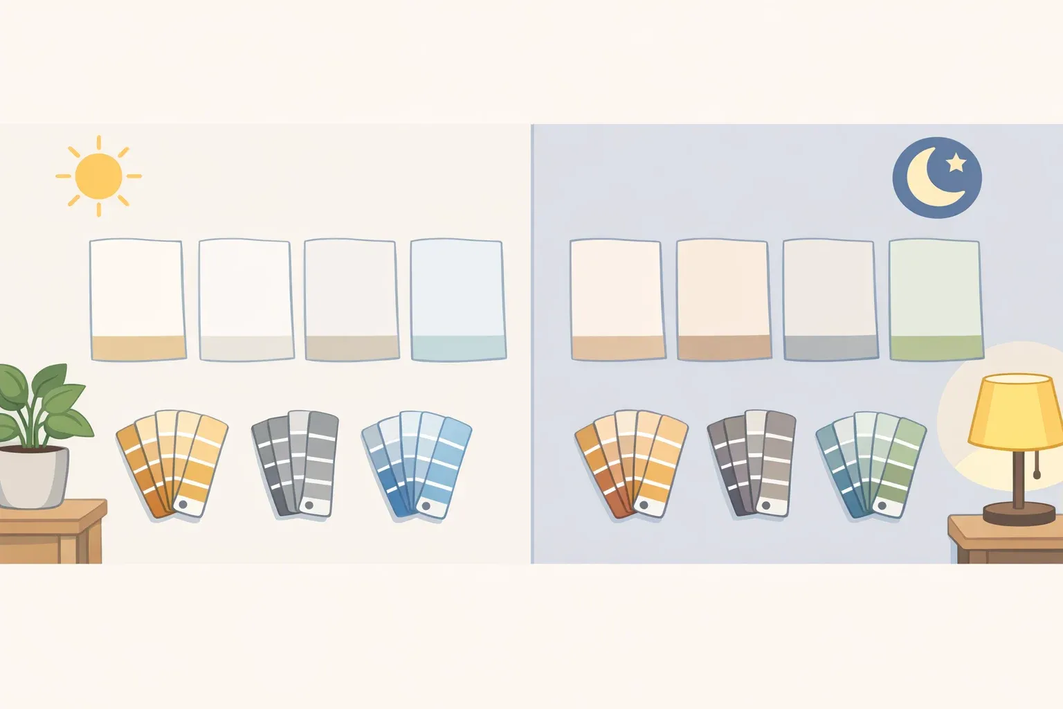
Paint the same white on two walls in your house, and there's a decent chance you get two different colors. The paint didn't change; the light and the surroundings did, because white shifts with its environment more than most people expect, sliding from cream to gray depending on what's nearby. That's the puzzle behind how to choose the best white paint color for a room, and it's why this guide treats the decision as a sequence of checks rather than a shopping list.
Paint professionals sort whites into three families: warm, cool, and true or neutral, based on trace amounts of pigment blended into the base. Those undertones are often invisible on a two-inch chip and only reveal themselves once paint covers a full wall.
This guide walks through five steps: read the undertone, read the light, check it against what's already in the room, test it big, then lock in sheen and trim. Skip any one of those, and repainting becomes the likely next project.
Step 1: How to choose the best white paint color, starting with undertones
Most white paints carry a visible undertone, though a few read close to neutral. Manufacturers blend tiny amounts of yellow, pink, gray, blue, green, or violet into a white base, and that trace color is what nudges the paint away from pure white.
Warm whites lean on yellow, peach, or pink and read cozy, soft, and inviting. Cool whites carry blue, gray, or green instead, and read crisp, modern, and architectural.
A perfectly undertone-free white is rare, though some paints read close to neutral in the right light. Even shades marketed as pure or bright white typically carry a slight cool bias or an optical brightener baked into the formula. A handful, like Benjamin Moore's Chantilly Lace or Sherwin-Williams' Alabaster at its most neutral reading, come close to genuinely undertone-free.
There's a low-tech way to check before buying a sample pot. Hold a sheet of plain white printer paper, which sits close to a neutral 6500K reference, against the shortlisted swatches. If the paint looks cream or yellow next to the paper, it's warm; if it looks about the same or slightly gray, it's cool or neutral. Treat this as a useful gut check, not a lab measurement.
Undertone is the variable everything else in this guide reacts to. Light doesn't create an undertone; it amplifies whichever one is already there, and finish and sheen work the same way later on.
Step 2: How lighting affects white paint color
Natural light shifts how a white reads over the course of a day, sometimes dramatically. That's the main reason a swatch that looked perfect under store lighting, or on a laptop screen, can look off once it's actually on the wall.
Room orientation is a reasonable starting point, though not a rule, when weighing warm white vs cool white paint for a specific room. North-facing rooms get cooler, less direct light that can make cool whites look even flatter, so a warm white with yellow or beige undertones tends to bring balance back into the space. South-facing rooms get abundant warm sunlight and tend to be the most forgiving, since both warm and cool whites generally hold up well once the light hits them.
East- and west-facing rooms swing more within a single day. East-facing rooms get bright morning light that turns cooler by afternoon, while west-facing rooms lean warm and golden as evening approaches, with undertones growing more pronounced as the day goes on.
Artificial light matters just as much. Warm incandescent-style bulbs sit around 2700K, while daylight LEDs run 5000 to 6500K, a gap wide enough to pull a warm white toward neutral or push a cool white toward looking clinical. Worth checking before finalizing a color, especially in rooms lit mostly after dark.
Dim or windowless rooms call for a different filter: Light Reflectance Value, or LRV, a 0-to-100 scale measuring how much light a surface bounces back. David Griffiths, owner of Paint Pro New England, points to warm whites in the LRV 82-90 range as a starting point for dark or north-facing rooms. That figure reflects one regional painter's practice rather than an industry standard, so check it against the manufacturer's own LRV listing before treating it as a hard rule.
Light explains why a white shifts hour to hour. What's already installed in the room explains why it might clash no matter the time of day.
Step 3: Match white paint to your room's fixed finishes and style
Before opening a fan deck, take stock of what's staying. Flooring, countertops, tile, cabinetry, upholstery, and metal fixtures all carry their own undertones, and they'll either support or fight whatever white goes on the walls. This is the step people skip most often when figuring out how to choose white paint for a room, and it shows.
The failure mode is specific and common. A creamy warm white next to a cool gray countertop can suddenly look yellow, while a cool white against warm wood flooring can feel sterile or uncomfortable. This is simultaneous contrast, the effect where neighboring colors shift how the eye reads a hue.
Style tends to sort along the same warm-cool line. Warm woods, brass, bronze, antiques, and traditional or historic architecture generally call for softer, warmer whites. Stainless steel, marble, black accents, and contemporary interiors tend to suit cleaner, cooler whites instead.
A more useful question than "what color do I want" is what feeling the room should have: bright and modern, soft and welcoming, or collected and historic. That answer points toward an undertone family faster than flipping through swatches ever will.
Step 4: How to test white paint samples in your room
One point every source in this guide agrees on: don't trust a paint chip on its own. The standard worth following:
Paint at least a 12-by-12-inch swatch directly on the wall (one contractor at Paint Pro New England recommends a full two-foot square), applying two coats and covering at least two different walls, including spots that get direct light and spots that sit in shadow.
Skip paper or cardboard. Paint goes directly on the wall, since that's the actual surface and texture it will live on.
Check the sample across the day, not just once. Interior designer Rachel Blindauer recommends specifically 8 a.m., noon, 4 p.m., and 9 p.m., with the real light fixtures turned on.
Look at the sample next to what's staying, not on its own. Hold it against the sofa fabric, the floor finish, and the cabinet color, since that's the context it actually has to work in.
Give the sample at least four days before deciding. Paint typically reads darker when freshly applied and shifts slightly as it cures. One source puts fresh paint at roughly 10 percent darker than fully dried paint, a rule of thumb rather than a fixed number.
Four days sounds like a long wait for a paint decision. But a color that reads perfectly at noon can feel entirely different once the sun's down and the lamps are on.
Step 5: Finalize sheen, trim, and ceiling for a cohesive finish
Sheen changes how intense an undertone looks. Higher-gloss finishes reflect more light, which can make a warm white read warmer or a cool white read cooler than the identical color in matte.
Each finish trades durability for forgiveness in its own way. Matte and flat finishes hide surface imperfections well but wear less gracefully and take more effort to clean. Eggshell and satin add durability and a gentle glow but show more surface flaws than matte. Semi-gloss and high-gloss are the most durable and reflective options but unforgiving of sloppy prep work.
A common pairing is matte or eggshell on walls with a higher sheen, satin or semi-gloss, on trim and millwork. Designers describe the combination as one of the most reliable moves in residential painting.
The relationship between walls, trim, and ceiling deserves its own decision. Painting walls and trim the same white can unify a room with strong original millwork, while a warmer wall paired with a brighter trim white gives flat, builder-grade trim more visual presence than it naturally has. Ceilings generally read best in a true neutral or a shade slightly cooler than the walls, which keeps the ceiling from competing as its own separate color.
Conclusion
The sequence matters more than any single product recommendation: identify the undertone family, read the room's actual light rather than just its compass direction, check the choice against fixed finishes already there, sample generously on the real wall for at least four days, then settle sheen and trim strategy last. That order is what actually determines the best white paint color for walls in a given room, more than any specific can of paint.
Once undertone and light are dialed in for one room, the same process carries over to the rest of the house, even if the paint can doesn't. Paint Pro New England's David Griffiths says his crews often use two or three related whites in a single home, chosen room by room for the light each one gets, rather than defaulting to one shade throughout. A bedroom and a kitchen rarely get the same light, so there's little reason to expect they'd want the same white.















Comments
Be the first, drop a comment!