


5 living room styling mistakes making your space feel off
By the end of this guide, you'll know which living room styling mistakes are most likely making your space feel off, and what to fix first, in order. No vague guidance about "finding your aesthetic."
Most living room problems aren't taste failures. They're proportion failures, warmth failures, and intention failures. Designers who walk into hundreds of rooms a year describe the same spaces coming up repeatedly: rooms that feel cold despite expensive furniture, rooms that feel cramped despite not much in them, rooms that feel unfinished no matter how many accessories get added. In almost every case, the same root causes are at work. This guide covers all five, with specific measurements and a triage diagnostic at the end.
Three root causes, five mistakes. The sections below are organized around what actually explains why rooms fail: light, proportion, and intention. Fix them in that order and the room gets easier to read at every step.
Living room lighting mistakes to fix first
Lighting is the mistake designers cite with unusual unanimity, and the fix is more specific than "add more lamps."
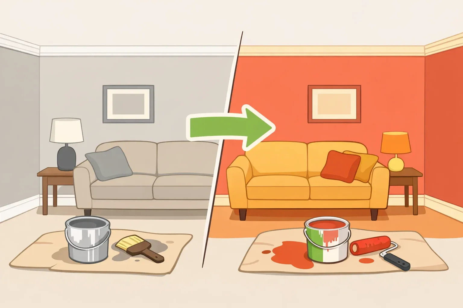
Every designer consulted by Architectural Digest agreed: lighting determines whether a room reads as warm and human or cold and institutional, before furniture, color, or accessories enter the equation. Design researcher Alyse Archer-Coité puts it plainly: "There's no substitute for good lighting — even an ugly room can be well lit and look good," she told Architectural Digest. There is no shortcut to getting it right.
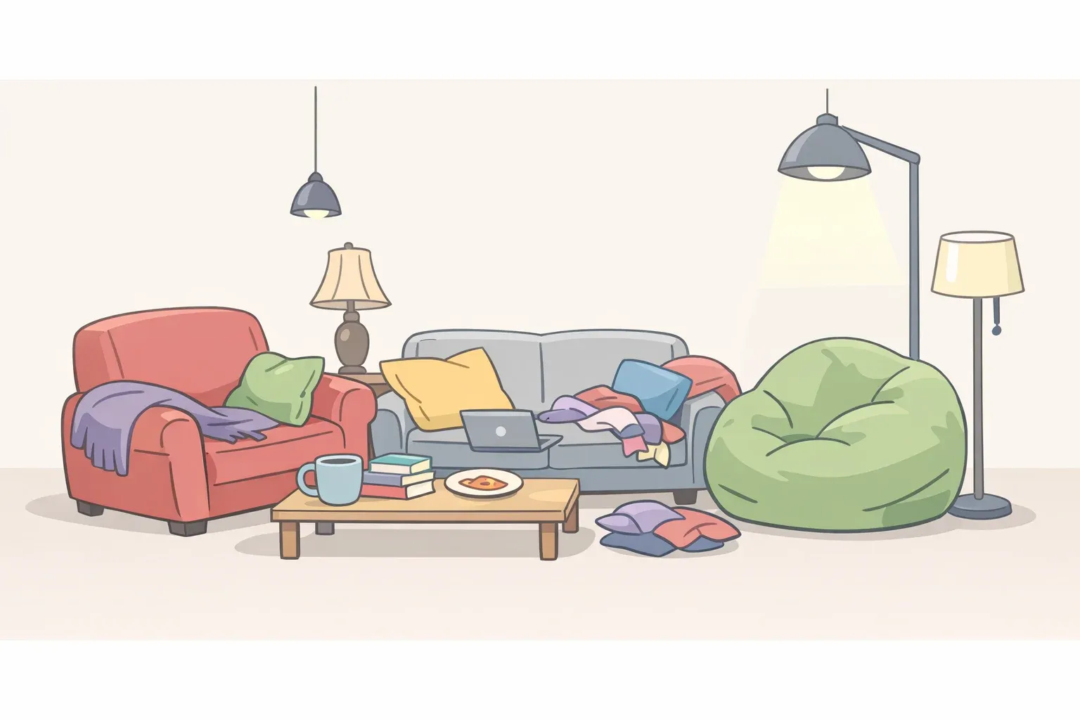
The problem usually has three parts working together: bulbs that run too cool, a single overhead source doing all the work, and fixtures so small they disappear into the room.
Bulb temperature first. Bulbs in the 2700K range produce the warm glow that makes a living room feel inhabited. Go above 3000K and the light tips into blue-white territory that reads as harsh and clinical. Per Architectural Digest, 3000K is the ceiling, not the target. Archer-Coité will only consider overhead lighting if every bulb has been swapped to 2700K, a useful rule of thumb she shared with Architectural Digest. Every bulb should also sit behind a shade, dome, or globe; diffused light softens the harshness that any bare source produces, according to the same Architectural Digest coverage.
Wall sconces are the most efficient first addition beyond bulb swaps. Designer Jessica Alpert calls them one of her favorite tools for introducing mood: they wash light across the wall surface, create atmosphere, and let you turn off the overhead entirely for evening use, she told Architectural Digest. Dimmers extend what any fixture can do; an overhead that serves functional daytime needs can recede at night, letting lower sources carry the mood.
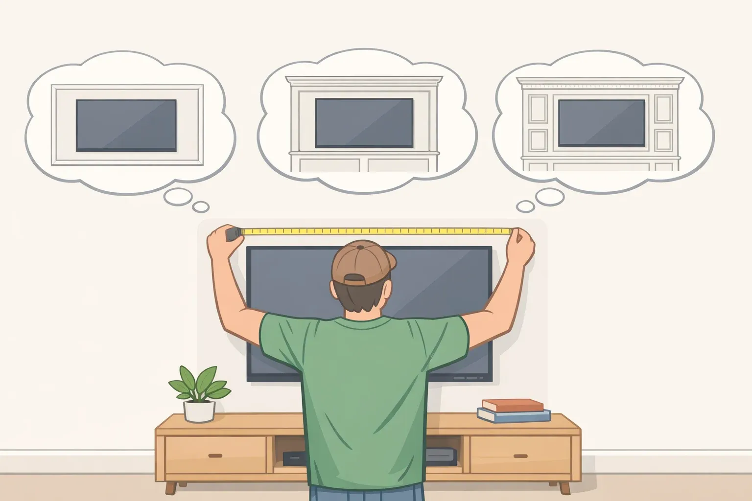
Fixture scale is also a proportion problem, not just a lighting problem. A statement overhead should fill roughly one-third of the room's width, large enough to register as a deliberate anchor rather than decorative detail, per designer Flanigan at The Spruce.
Fix steps:
Replace all bulbs above 3000K with 2700K equivalents start with the overhead.
Install a dimmer on the overhead if it doesn't have one.
Add at least one lower light source per seating zone, positioned near where people sit rather than in room corners. Floor lamps and table lamps illuminate people and textiles; corner placement lights the corner.
Cover any exposed bulbs with a shade or diffuser.
Check that any pendant or chandelier is scaled to approximately one-third of the room's width. If it reads as decorative detail rather than a room anchor, it's undersized.
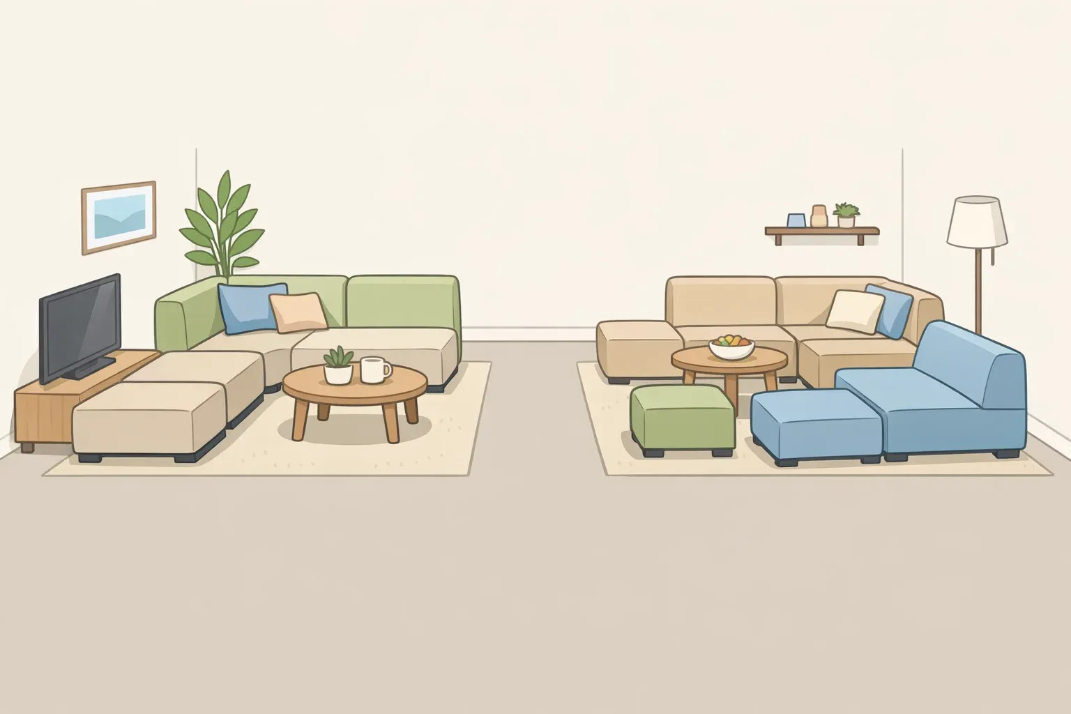
Mistake 2: Getting scale and proportion wrong across the room
Once the lighting reads correctly, proportion becomes visible. And proportion is where most living rooms quietly fall apart not because of any single bad piece, but because pieces weren't chosen in relation to each other or to the room.
Scale is a system. Flanigan's description is precise: When it's right, the room breathes — it feels open yet grounded, functional yet inviting. When it's wrong, even a space with minimal furniture can feel cramped," as The Spruce reported. Scale misjudgment, not excess furniture, is the actual reason most living rooms feel cramped.
The most common individual proportion errors:
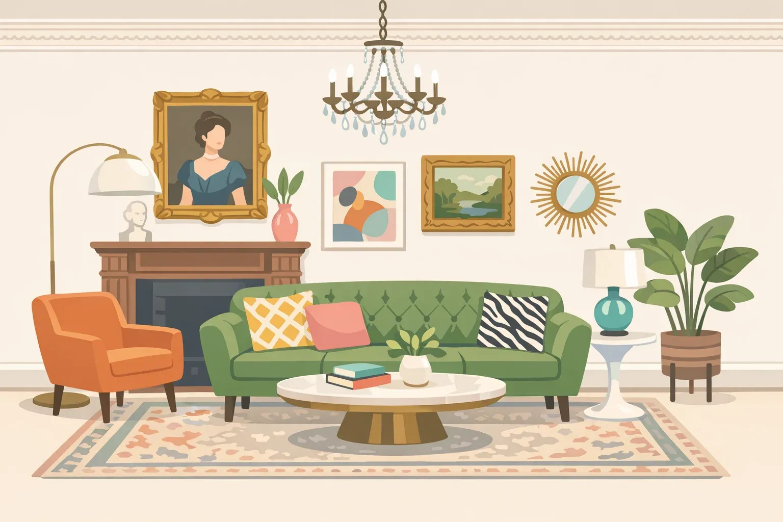
Sofa: In a standard living room, an 84- to 90-inch sofa is typically the right range. Sectionals usually work best between 110 and 120 inches. Beyond those dimensions, the piece dominates rather than anchors, per The Spruce.
Coffee table: Should run roughly two-thirds the length of the sofa and sit 16 to 18 inches from the seat edge close enough to reach without leaning, far enough to allow circulation. An undersized coffee table makes the entire seating arrangement look disconnected, per The Spruce.
Uniformity of scale: Rooms where everything sits at the same height or the same approximate size feel flat — visually cluttered even when they're not physically full. The fix is deliberate variation: a low sofa paired with a tall arched lamp, open-framed chairs alongside a skirted sofa, bookshelves that draw the eye upward, per The Spruce.
Not measuring: One creator told Architectural Digest that a piece she'd been excited about turned out "way too small for this room" entirely because she hadn't considered proportion before buying. Designer Klarić noted in the same piece that "even one inch can have a significant impact on the overall layout and functionality of a space."
Fix steps:
Before buying any anchor piece, tape its footprint on the floor. Walk around it. Sit near it.
Measure the sofa length, then verify the coffee table is roughly two-thirds that length and positioned 16–18 inches away.
Check height variation: is there at least one tall element in the room (lamp, shelf, plant) to work against the horizontal weight of seating?
If the room feels crowded, measure the sofa. If it exceeds 90 inches in an average-sized room, the sofa is likely the problem, not the room.
⚠️ Common mistake: Confusing statement scale with oversized scale. A large mirror or substantial artwork in a small room adds drama intentionally. An oversized sectional in the same room removes function and leaves nothing else room to breathe. The question isn't size — it's whether the piece serves the room or consumes it, per The Spruce.
Mistake 3: Choosing a rug that's too small
With the broader scale logic established, the rug deserves its own section because it's the most common single proportion error, the most visually obvious, and the highest-impact fix for readers on a budget.
An undersized rug doesn't just look wrong. It actively makes the seating arrangement look like it's floating: disconnected from the floor, disconnected from the room, like furniture that happened to land in the same general area.
Designer Flanigan's minimum is 8x10 feet, with the front legs of every piece in the seating arrangement sitting on the rug. A 9x12 tends to look more grounded, especially if the room can accommodate it, per The Spruce. Designer Whitney Durham describes an undersized rug as looking "like a stamp in the middle of the room." Her sizing rule: leave 6 to 12 inches of bare floor between the rug edge and the walls, enough to frame the rug without making the room feel wall-to-wall carpeted, as she explained to The Spruce.
When budget forces a choice, Flanigan names the rug first: it's "the single piece that can instantly make your living room feel larger, more anchored, and more intentional," per The Spruce. Coffee tables and side tables can be budget placeholders. The sofa and rug cannot.
Fix steps:
Measure your seating arrangement not just the room.
Choose a rug large enough that the front legs of all primary seating rest on it.
When deciding between two sizes, go larger.
Before ordering online, tape the rug dimensions on the floor and live with them for a day.
⚠️ Common mistake: Ordering a rug based on a product photo without taping out the dimensions first. What looks proportional on a screen typically looks like a bathmat in the actual room.
Living room layout mistakes that make a room feel smaller
This is the most counterintuitive mistake on the list and the one most readers are most confident they're doing correctly.
The instinct to line furniture along the perimeter is almost universal, especially in small rooms. The logic seems sound: keeping pieces against the walls frees up floor space in the middle. In practice, it tends to produce the opposite of what's intended.
Designer Blanks notes that when small rooms combine white walls with furniture pressed to the perimeter, the result is often a space that reads as "uninteresting and cold" rather than spacious, as The Spruce reported. The open floor in the center registers as empty, not airy. Pulling furniture even a few inches off the wall changes how the room reads that gap signals intentionality; the room looks arranged rather than stored. As Flanigan told The Spruce: "This subtle shift creates the illusion of more space."
Floating furniture inward and establishing a defined conversation zone makes the room feel more intimate and more functional. Designer Mary Buford Guthridge's direction: "pull it in, float some pieces, and bring everyone into the conversation area for a more intimate feel," as The Spruce reported.
Fix steps:
Pull the sofa at least 3 to 6 inches away from the wall more if the room's depth allows.
Arrange all seating to face inward toward a central anchor (the coffee table, the rug, a focal wall) rather than outward toward the room's perimeter.
In smaller rooms, resist adding more pieces around the edges. Two or three floating pieces create more livable space than six wall-hugging ones.
If pulling furniture in still leaves the room feeling cold, address warmth through color or textiles before buying anything new.
⚠️ Important: Floating furniture only works if the rug is correctly sized. A sofa pulled from the wall while sitting on an undersized rug will look more unmoored, not less. Fix the rug before rearranging the layout.
Mistake 5: Defaulting to "safe" choices white walls, tiny accents, no contrast
The previous four mistakes are largely mechanical. This one is a decision pattern, and it reliably produces the same cold, flat result.
In small living rooms, the instinct to play it safe is understandable. White or pale walls, small-scale accessories, nothing too bold the hope is that restraint will make the room feel larger. What it often produces instead is a room that feels neither spacious nor comfortable: pale, spare, and somehow unfinished no matter how many small things get added.
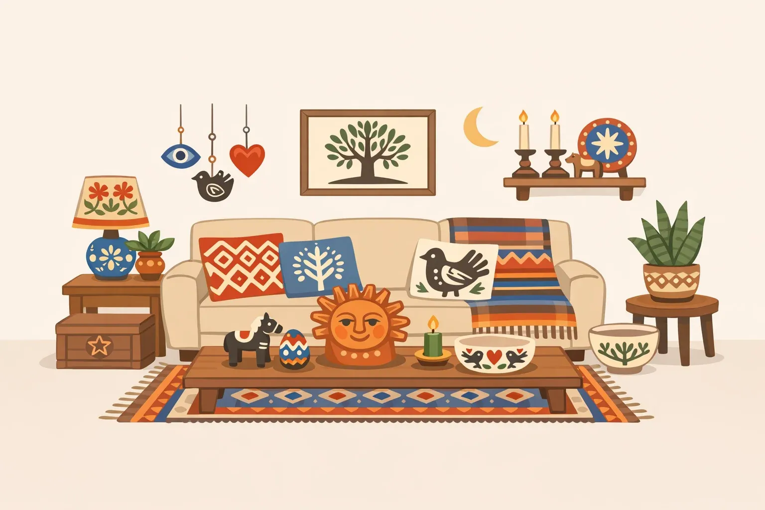
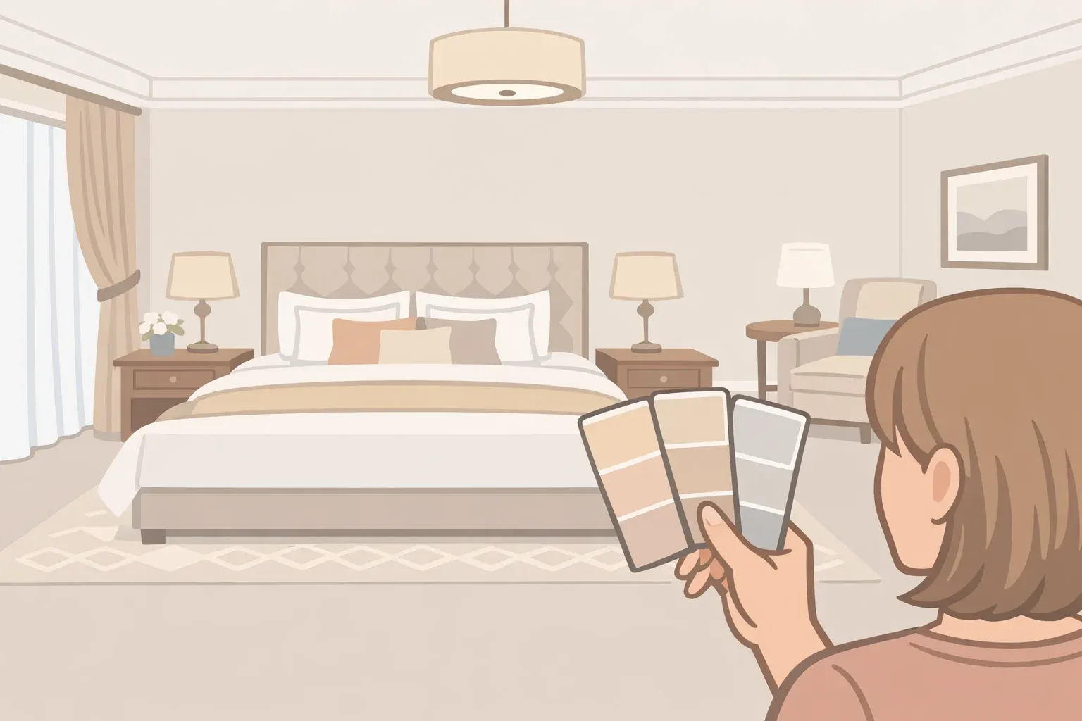
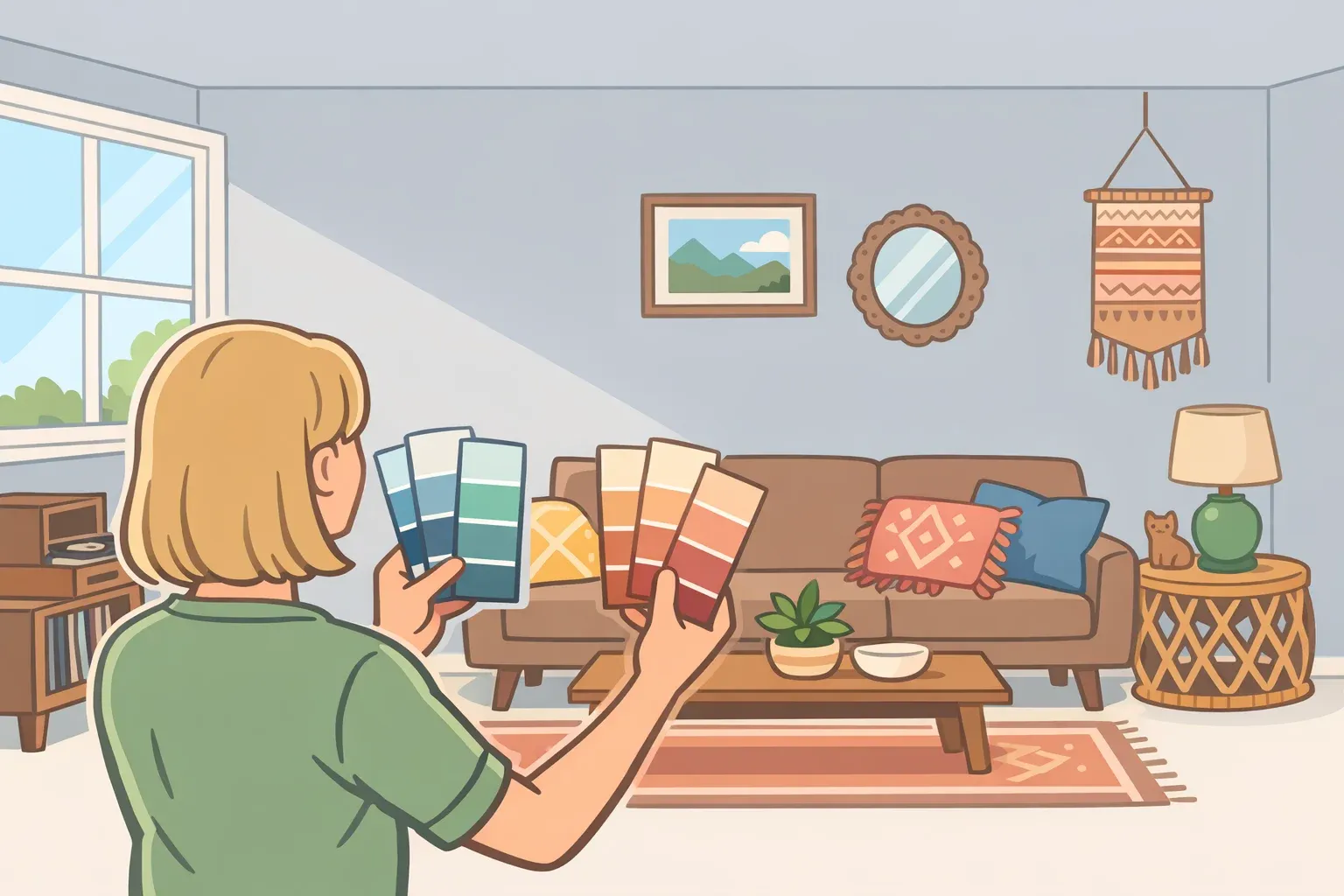
Designer Erin Paige Pitts makes the case directly: "If a space is truly small, stop trying to make it big instead, embrace its smallness and make it cozy instead," per The Spruce. The goal of appearing larger tends to be a dead end. Design culture has been shifting in this direction; as designer Regan Baker told Architectural Digest last year, "People are embracing 'dark and moody,' though we are still seeing some 'light and bright' rooms." Both directions exist the point is that reflexive brightness is no longer the obvious default.
Accumulating small accessories rarely solves this. As designer Blanks noted to The Spruce, white walls plus perimeter-hugging furniture in a small room reliably reads as "uninteresting and cold" more small objects just add noise. Designer Cameron Jones recommends a different approach: one or two large-scale statement pieces, an oversized mirror, a bold lamp, a significant artwork, chosen deliberately and given room to register. "Painting the walls and trim and even the ceiling the same color can help lead to less distractions visually so your eye can focus more on the furnishings, art, and accessories in the space," Jones told The Spruce.
Fix steps:
Identify whether the room feels cold or flat. If it does, more small pieces won't help this is a depth and contrast problem.
Try a saturated or moody wall color before buying new furniture. Paint is the lowest-cost, highest-impact change available.
In a small room, paint the walls, trim, and ceiling the same color to reduce visual noise and let furnishings and art carry the room.
Choose one statement piece a large mirror, an oversized lamp, a significant artwork and position it as a deliberate anchor, not as part of a cluster.
⚠️ Common mistake: Confusing bold with trendy. Painting walls dark because it's circulating on design feeds produces the same regret as any other trend-chasing decision. The question is whether the choice serves the specific room.
Triage your room in 10 minutes: a diagnostic before you buy anything
The five mistakes above share three root causes: under-lit with the wrong quality of light, scaled without measuring, or styled toward safety rather than warmth. Fix the root cause and the surface symptoms tend to resolve. Here's how to work through them quickly.
Step 1: Check bulb temperature. Replace anything above 3000K with 2700K equivalents start with the overhead. Add a dimmer and at least one lower light source per seating zone. This costs almost nothing and changes the emotional register of the entire room, per Architectural Digest.
Step 2: Measure the sofa and coffee table. Verify the sofa sits within the 84–90 inch range for a standard room. Confirm the coffee table runs roughly two-thirds that length and sits 16–18 inches from the seat edge, per The Spruce. Check that at least one tall element a lamp, shelf, or plant works against the horizontal weight of the seating.
Step 3: Verify the rug footprint. Tape out the dimensions before ordering anything. If the front legs of all primary seating aren't on the rug, size up. An 8x10 minimum; a 9x12 if the room allows it, per The Spruce.
Step 4: Pull the sofa off the wall. Even 3 to 6 inches changes how the room reads. Float the seating inward and arrange it around a central anchor rather than along the perimeter, per The Spruce.
Step 5: Assess contrast and depth. If the room still feels flat, more small objects won't fix it. One large-scale statement piece and a considered wall color will do more than a cluster of small accessories ever could, per The Spruce.
Quick diagnostic:
If the room feels…Check…Cold or clinicalBulb temperature (target 2700K), number of light sources, bare bulbsCramped despite spaceSofa size, coffee table ratio, fixture scale, height variationUnanchored or floatingRug dimensions almost certainly too smallOddly large and emptyFurniture is against the walls; pull it inFlat and unfinishedWall color and scale contrast more small items won't fix this
Budget priority order: Bulbs and a dimmer ($20–60). Repositioning furniture (free). Rug upgrade ($150–400). Paint ($50–100). Statement lamp or mirror ($100–300). New furniture last.
Swap the bulbs, size up the rug, pull the sofa forward. The room that's been resisting every fix may only need a measuring tape and an afternoon.


Comments
Be the first, drop a comment!