



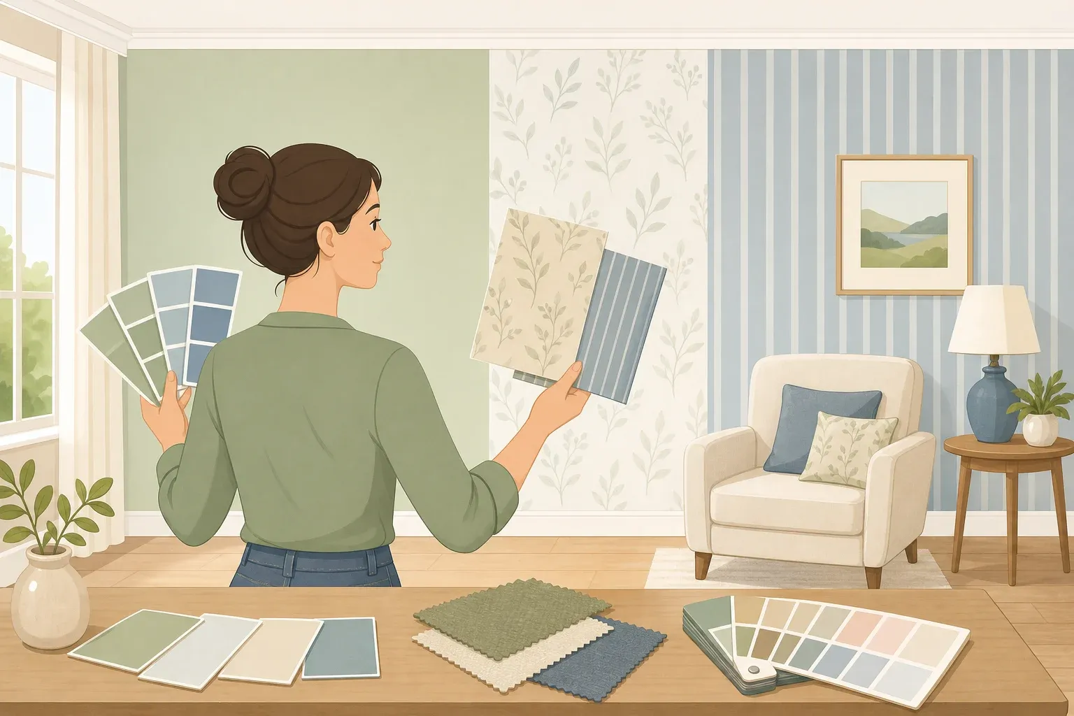
Picking a wallpaper is usually the easy part. Making everything else in the room look like it belongs next to it is where most people get stuck.
This guide walks through four practical checks for how to match wallpaper with paint and decor: repeat one wallpaper color in at least two other spots, consider undertones before chasing an exact shade, vary pattern scale instead of avoiding pattern altogether, and test the full combination in your own lighting before anything becomes permanent.
These four checks work with almost any print, from bold florals to quiet tone-on-tone designs, because they're about relationships between colors and scale, not a specific style.
None of this requires design training. If you've already chosen a wallpaper, or you're deciding between a few options, these checks help the wallpaper and the existing room feel connected instead of like two separate decisions.
One caution before starting: wallpaper and paint can look different under changing light, so don't finalize anything from a small swatch alone. House Beautiful spoke with designers who recommend living with samples in the actual room before committing to a scheme.
What you'll need before you start
A physical wallpaper sample, ideally large enough to show a full pattern repeat, not just a photo on your phone.
Paint chips or sample pots in a few candidate colors pulled from the wallpaper's palette.
Fabric swatches for any curtains, upholstery, or bedding you're weighing alongside the wallpaper.
Painter's tape to mount samples directly on the wall.
A plain sheet of white paper or fabric for comparing undertones in step two.
This is beginner-friendly room styling, not an installation guide. Hanging wallpaper so seams disappear and wall texture doesn't show through is a separate skill; follow the wallpaper manufacturer's instructions or hire an installer for that part.
Step 1: How to match wallpaper with paint and decor using one repeated color
Start by deciding which kind of color to repeat:
Dominant color. If one shade clearly stands out in the wallpaper, repeating it creates a bold, graphic effect.
Background tone. If the pattern is busy with no single color jumping out, pick the quieter tone running throughout the print instead. Repeating that can keep the room calm.
Accent color. A smaller color buried in the print adds a pop without competing with the wallpaper itself.
Any of the three can work. What matters is choosing a color that connects the wallpaper to the rest of the room, rather than trying to repeat several at once.
Interior designer Wendi Gee recommends repeating that single color in at least two other places in the room, whether that's trim, an accent wall, cushions, a lamp base, or artwork.
A color that resurfaces elsewhere makes the space feel intentional, she explains in Good Housekeeping. Gee recommends two or three repetitions to establish a clear visual connection.
This doesn't have to mean paint. House of Londinium points out that the same color can show up in cushions and throws, or in curtains pulled directly from the wallpaper, such as navy lifted from a geometric print.
Step back from the room and count the repeats. If the color only shows up in the wallpaper itself, try adding one or two more touches, such as a throw pillow or lamp base, before moving on to paint selection.
Resist repeating every color in the wallpaper; that can scatter attention rather than focus it. A second repeated color is worth trying once the first one is clearly working, not before.
Step 2: Match wallpaper to paint colors by checking undertones first
Before worrying about finding an exact match to any single wallpaper color, figure out whether the paper reads warm or cool overall.
Hold the sample next to a plain white sheet or piece of paper in natural light and use it as a neutral comparison. Note which undertones become more noticeable against the white, not just the main color, since that overall temperature can help guide paint, wood tones, and major upholstery choices.
Next, lay the sample next to existing wood furniture and any fabric swatches under consideration.
Gee warns that cool-gray furniture can feel slightly off next to warm, saturated wallpaper, while warm-toned upholstery and natural wood often create a more cohesive pairing, Good Housekeeping notes.
That's a useful starting point, not a rule that warm and cool colors can never work together. Deliberate contrast can also be effective when the rest of the room supports it.
Once the undertones are clear, compare the paint or upholstery samples and set aside anything that makes the wood or fabric look unexpectedly gray, yellowed, or otherwise out of place next to the wallpaper.
That elimination step is often faster than hunting for a perfect match.
Designer Lindsay Angyus takes this further, treating trim, doors, and ceilings as part of the same design concept instead of leaving them an afterthought white, according to House Beautiful.
For a sense of contrast between trim and walls, Sherwin-Williams offers combinations such as warm Shoji White trim with earthy Evergreen Fog walls, or bold Borscht trim with Oyster White walls.
Treat these as examples of contrast, not matches for every wallpaper.
If something about the finished room looks slightly off rather than clearly wrong, check for an undertone mismatch before deciding the color itself was a bad choice.
Step 3: Coordinate wallpaper with furniture through pattern scale
Decorating a room with bold wallpaper doesn't mean everything else needs to be plain.
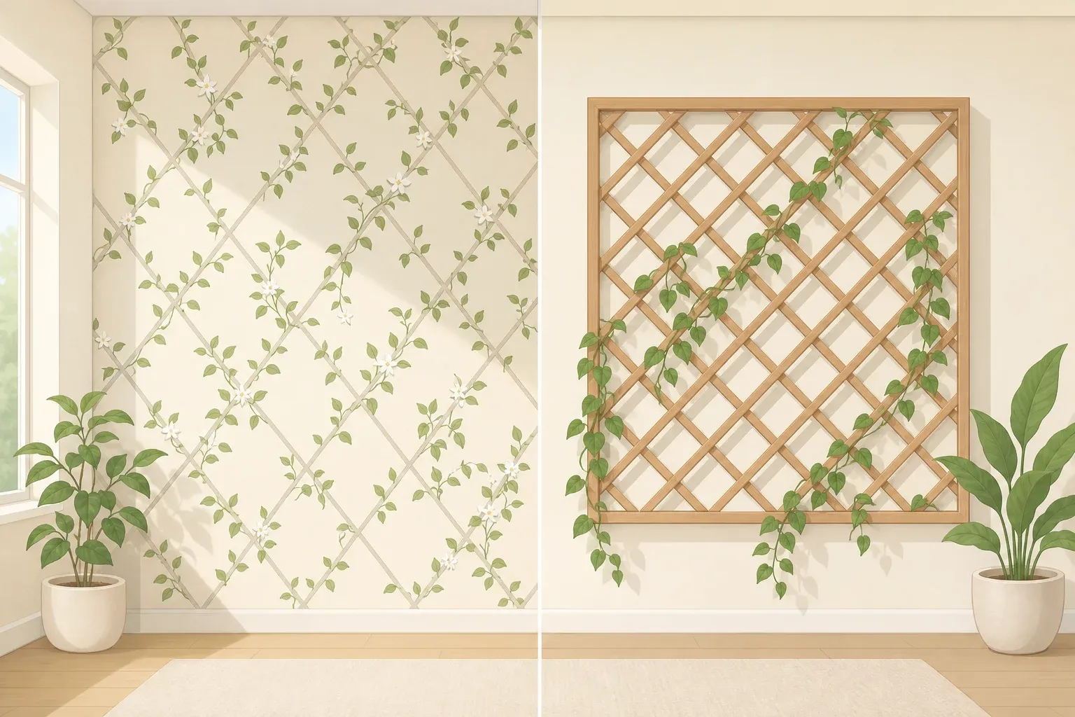
Designer Joe Waroquier mixes patterns as long as there's variation in scale: pair a large wallpaper print with a smaller stripe or subtly patterned upholstery fabric, then tie the two together with a shared color, Good Housekeeping reports.
Here's a quick way to test scale before buying fabric.
Hold a swatch of anything under consideration, such as curtains, upholstery, or a throw pillow, next to the wallpaper sample.
If the pattern repeat on the fabric is close to the same size as the wallpaper's repeat, the two may compete. Look for a clear size difference instead: a large floral wallpaper can sit comfortably next to a narrow stripe, a subtle woven texture, or a plain solid.
Turn that into a simple checklist once fabrics are on the table: one dominant pattern, usually the wallpaper; one smaller or quieter pattern; and one solid or textured surface to give the eye somewhere to rest.
If everything ends up looking similarly busy or similarly scaled, replace one patterned piece with a solid or texture instead.
When wallpaper already carries a lot of color or movement, Waroquier suggests adding a material that provides visual balance. A wood antique, rich velvet, or natural woven texture can complement a bold pattern without competing with it, according to Good Housekeeping.
Furniture density matters too. House of Londinium notes that a sparsely furnished room can accommodate a large-scale print, while a room already crowded with furniture may benefit from a smaller-scale or quieter wallpaper.
If the room feels too busy once everything's installed, House Beautiful's designers suggest balancing the pattern with softer textiles, simpler lighting, or artwork with more breathing room before assuming the wallpaper itself was the wrong choice.
Step 4: Test the full combination in real light
Tape the wallpaper sample to the actual wall next to the paint chips and fabric swatches.
Leave it up for several days and check it at different points: morning, midday, late afternoon, and again at night under the room's actual lamps.
View it from where you'd normally sit or stand in the room, not just up close against the wall, since that's how the combination will look day to day.
While the sample's up, check the real pieces too, not just swatches. Hold the actual curtain fabric, a sofa cushion, or a dining chair near the wallpaper if those pieces are already in the room, since full-size materials sometimes look different from small samples.
Designer Anna Franklin says living with a wallpaper sample is one of the best ways to judge it before committing, rather than trusting how it looks under store lighting, House Beautiful notes.
Natural light can change how colors appear throughout the day. Direct morning sunlight may give colors a warmer cast, while bright midday light can make some shades appear washed out. Late-afternoon sunlight may add warmth, particularly in west-facing rooms.
The exact effect depends on window orientation, weather, surrounding surfaces, and how much direct sunlight the room receives, according to Sherwin-Williams.
Check the combination under the room's actual bulbs, too.
Incandescent bulbs produce warm, yellowish light that can intensify warm colors and dull cooler ones. Fluorescent lighting varies, with some bulbs producing cooler light that changes how warmer colors appear.
LEDs also vary by color temperature: warmer LEDs produce a yellowish light, while cooler LEDs can make colors look crisper or more blue-toned.
Test the sample under whichever bulbs are actually installed in the fixtures rather than assuming all lighting of one type behaves identically.
If trim is part of the scheme, check its sheen alongside the wallpaper as well. Higher-gloss paint reflects more light and can make a color look brighter or richer than the same color in a flat or satin finish on the walls, Sherwin-Williams notes.
If the wallpaper, paint, and fabric still look like they belong together in the room's usual daylight and evening lighting, the combination is ready to commit to.
Expect some shift in how a color looks across the day; the goal is coordination, not an identical appearance in every light.
What a well-matched wallpaper room looks like
Matching wallpaper with room decor comes down to four checks: a repeated accent color, compatible undertones across paint and furnishings, variation in pattern scale or solid surfaces for visual rest, and a lighting test in the actual room.
Furniture doesn't need to match the wallpaper exactly. Designers interviewed by House Beautiful recommend connecting pieces through undertone, scale, or style rather than making everything identical in color or pattern.
Commit to the scheme once it holds up in the room's main daylight hours and under evening lamp light.
At that point, stop changing multiple variables at once. If a room still feels disconnected, adjust one thing at a time: swap a patterned curtain for a solid in the repeated accent color, or change a bulb's color temperature, and reassess before repainting the whole wall.
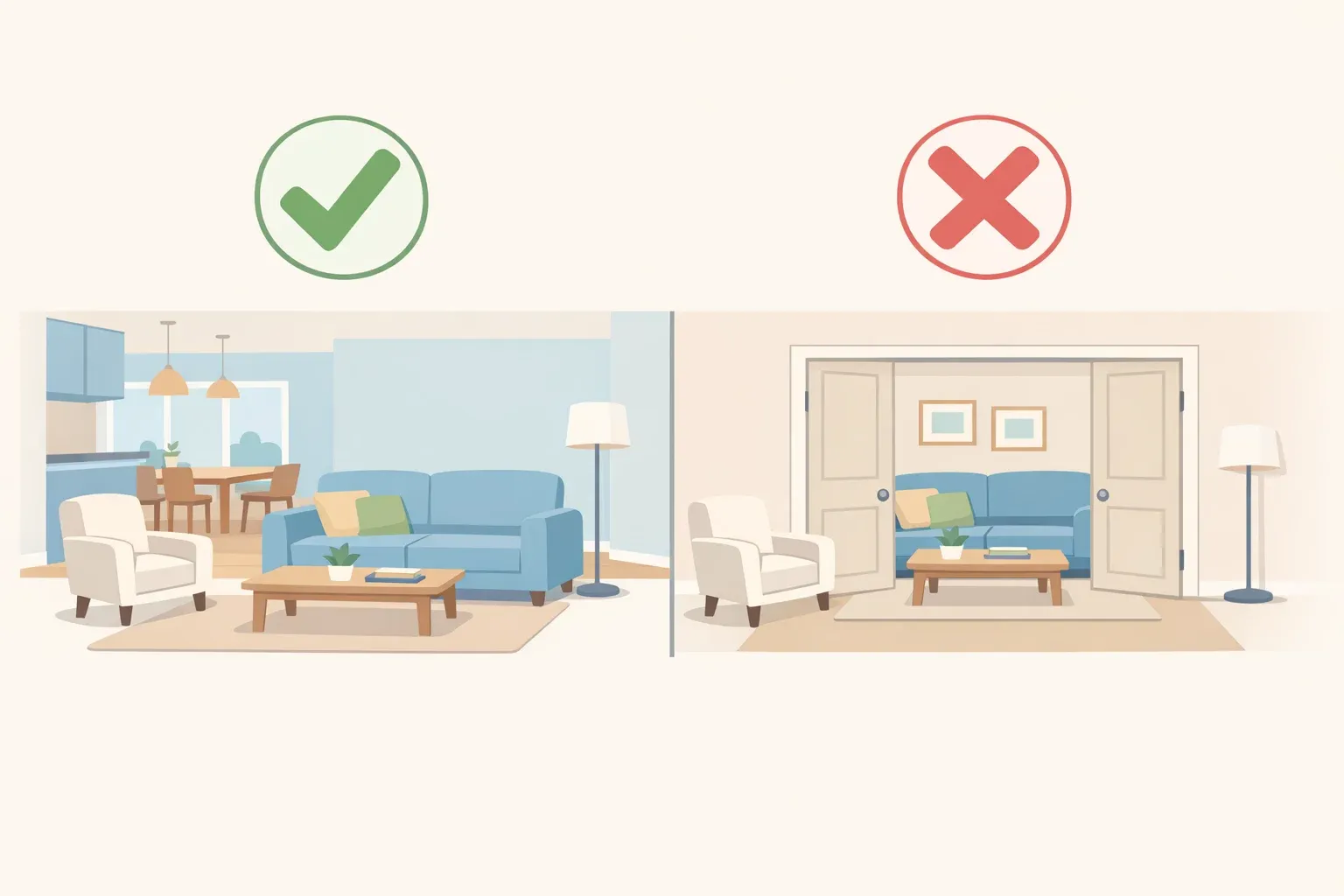
For homes with connected, open-concept rooms, keep a consistent color scheme between spaces that flow into one another. Rooms fully separated by a door or hallway have more freedom to carry their own palette, House Beautiful notes.
Within that shared color scheme, adjacent rooms can still alternate pattern scale, such as a large-scale print in one room paired with a smaller-scale pattern next door, so neither space feels overwhelming.




Comments
Be the first, drop a comment!