




Why the Cashmere Kitchen Trend Beats White for Renovations
Kitchen renovations force a difficult bet. You're committing a major investment to choices that are nearly impossible to undo, and design history is littered with kitchens that looked sharp in year one and exhausted by year five. Designers working in this space keep arriving at the same solution: the cashmere kitchen trend, which uses warm, softly pigmented neutrals, tactile natural materials, and restrained contrast to split the difference between sterile white and short-lived statement palettes.
The argument is straightforward. Cashmere kitchens appeal to designers because they solve three renovation problems at once: they're warmer and more livable than all-white kitchens, less exposed to trend cycles than bold statement palettes, and built around specific materials unlacquered brass, natural stone, stained wood that improve with age rather than dating themselves. Understanding why those three things matter, and how the look actually delivers on them, is the most useful framework for evaluating whether this approach fits your space.
Heather Peterson, speaking to Good Housekeeping this week, describes a pendulum swing in kitchen color between all-white and aggressive multi-tone statements, and positions warm-neutral cashmere as the resolution to both extremes. Elle Decor frames the approach not as a new invention but as a conscious correction: a palette "neither too bold nor too beige," which is a precise description of the design problem it's solving. The Houzz community, which counts more than 3 million design and construction professionals alongside 70 million homeowners, gives its 2026 Kitchen Design Trends Report a broad sample base useful context when the look in question relies on premium materials.
What is a cashmere kitchen, exactly?
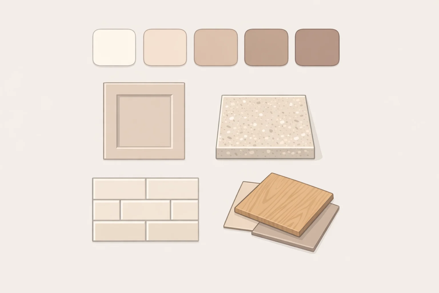
The name carries more weight than it first appears. A cashmere kitchen isn't defined by a single paint color or cabinet profile. The palette runs from warm off-whites and creamy taupes through earthy latte tones: pigmented enough to feel intentional, neutral enough to stay flexible. Think of it as the color of a morning coffee, from light cream to warm brown, applied across a kitchen's permanent surfaces.
Three things distinguish it from a plain beige kitchen and from an all-white one:
- Color with warmth, not color with statement. The palette sits between white and anything bold. More depth than white, less commitment than a strong hue.
- Texture as a design tool. Soft-matte cabinet finishes, natural stone with subtle veining, aged brass hardware, tactile tile. The visual interest comes from layering materials, not from contrast between them.
- Materials chosen to age well. Unlacquered brass patinas over time. Natural stone develops character. Stained white oak holds its warmth. The look is calibrated to improve, not fade.
What separates a cashmere kitchen from "just beige" is that last point. Melissa Oholendt of Oho Interiors told Good Housekeeping this week that the hallmark of the look is that it "may appear simple at first glance, but it's actually quite layered, just like a thoughtfully composed outfit featuring a cashmere sweater." The name is social-media packaging for a preference that has always existed. What's new is the label, not the instinct behind it.
Why designers recommend it: warmth, practicality, and the longevity argument
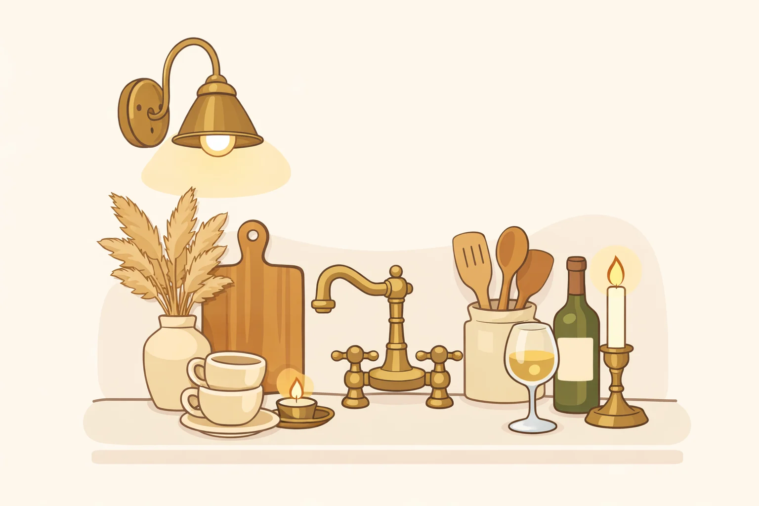
Professionals keep steering clients toward this look for three distinct reasons that often get collapsed into each other. Separating them makes the argument easier to evaluate.
The emotional case is less abstract than it sounds. Rachel Fisher, principal of Connecticut-based Further Afield, connects the appeal directly to a post-pandemic shift in how people relate to their kitchens. More time spent cooking and gathering created a specific desire to feel "safe and held" in the space, she told Real Simple about a year ago. That's a brief designers can actually build from. Elle Decor captures the dual message the look delivers: soft lighting, aged brass, and layered earth textures create a "lived-in luxury" that signals both "this is a special space" and "messy bakers are allowed here." Elevated but not precious. That combination is difficult to achieve, and it explains much of the professional enthusiasm.
The practical case against white is more concrete. White kitchens are unforgiving: every shadow, every warm-toned fixture, every smudge reads as a mistake. They also require every adjacent finish to match their crispness, which rules out warm-toned hardware, natural wood, and aged stone as intentional choices. Oholendt notes that cashmere palettes are easier to keep clean and feel less stark as a backdrop, while still providing the neutrality needed for a range of accent choices, per Good Housekeeping. Against a cashmere backdrop, the same materials that fight a bright white cabinet become part of the intended effect.
The longevity argument is where the analysis gets more honest. Peterson reframes luxury itself around not having to reconsider your choices: "What's more luxurious than knowing you made choices you won't need to reconsider, maybe ever?" she told Good Housekeeping this week. Designer Cantley makes the same point more plainly: kitchens that "don't demand attention" are a genuine asset in a room as permanent and expensive as a kitchen, where restraint has real value, per Real Simple.
Anne Sage goes further, predicting the aesthetic will still read as current in 10 to 20 years, per Good Housekeeping. That claim deserves a caveat: it's expert opinion, not evidence. Designers have called warm neutrals timeless in every decade. The more verifiable version of the argument is structural: because the permanent elements use a neutral base, mobile accents like bar stools, cushions, and window treatments can be updated as tastes shift without requiring another full renovation, as Elle Decor and Decorilla both note. That adaptability is something you can actually plan around.
How the cashmere kitchen color palette and material formula work
The cashmere kitchen operates as a system. Every material decision either reinforces the warmth-without-heaviness goal or undermines it. Four principles govern the formula: warm undertones throughout, layered texture over flat surfaces, restrained contrast, and materials that age gracefully.
Color and cabinetry establish the foundation. Designers consistently reach for the warm end of the neutral spectrum. Oholendt recommends Farrow & Ball Shaded White or Pointing for those wanting something close to a warm off-white; Benjamin Moore Stone Hearth for a deeper mushroom read. Sage points to Behr Cappuccino Froth and Dunn-Edwards Shady for earthier, more pigmented options, noting both "have more presence than white or cream, but feel equally fresh and cozy," per Good Housekeeping. Cabinet finish matters too: a matte or satin surface lets wood grain read through rather than disappearing behind a high-gloss coat, adding texture without adding visual noise, as Decorilla noted two weeks ago. Stained white oak cabinetry, or integrated wood handles in place of metal hardware, reinforces the tactile quality the look depends on, per Good Housekeeping.
Hardware and stone introduce warmth and definition. Unlacquered brass is the near-universal recommendation, chosen specifically because it ages and develops patina, becoming more appropriate to the look over time rather than less, per both Elle Decor and Good Housekeeping. For stone, the principle is quiet presence: fine-grained veining, honed finishes, and surfaces with subtle tonal variation. Sage used Taj Mahal quartzite in a recent renovation and found that "the swirls of brown, gray and cream beautifully complemented the cabinets." Bold streaking works against the restrained contrast the look requires; Decorilla specifically warns that dramatic veining can clash with cashmere's refined quality. A counter a shade darker than the cabinets typically provides enough definition without tipping into high contrast.
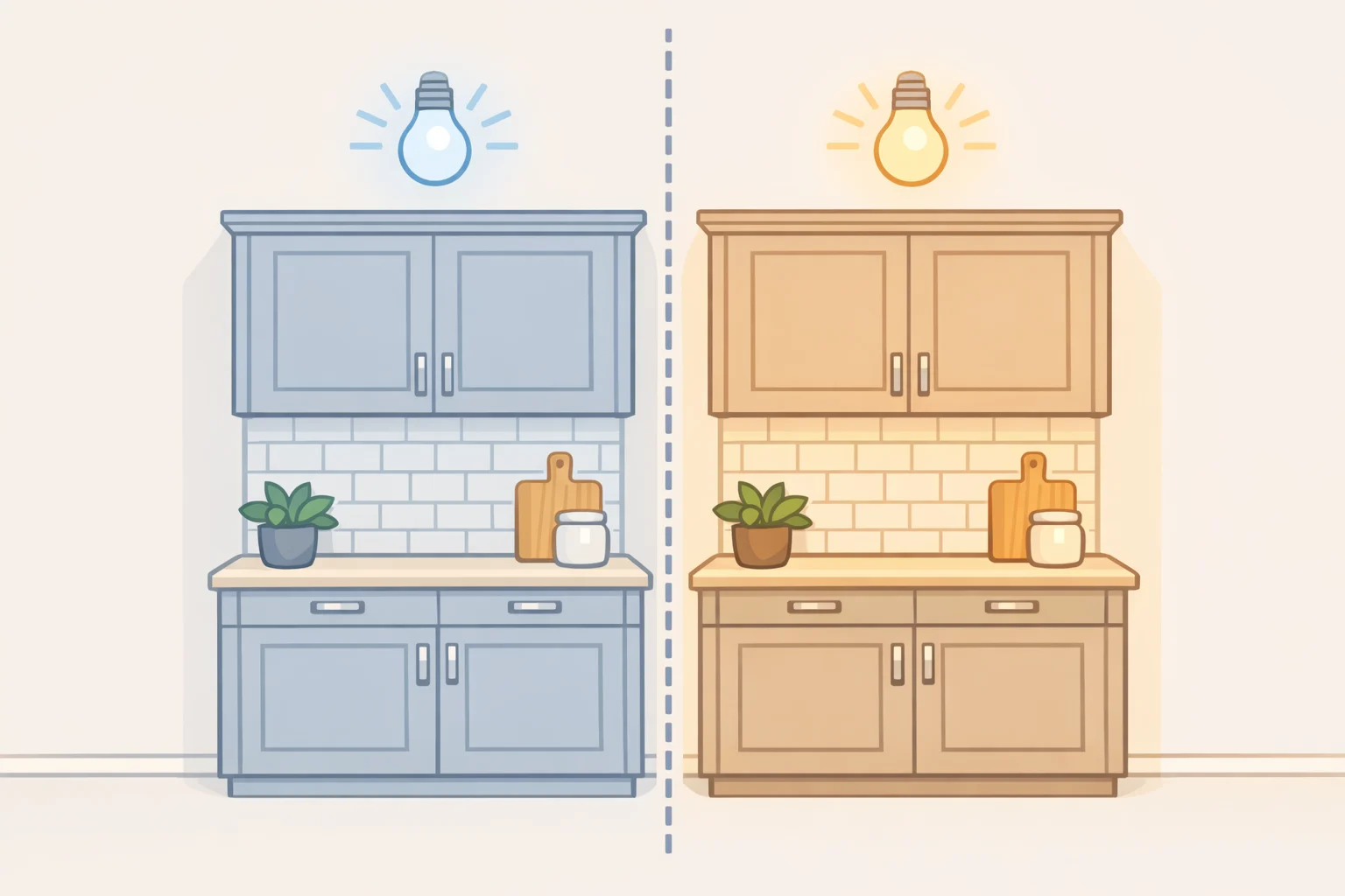
Lighting is the element most often overlooked and most consequential. The entire palette shifts under the wrong color temperature. Cool or neutral-white light makes warm neutrals read as gray and stone feel cold. Warm-white LEDs in the 2700K to 3000K range maintain the tonal integrity of the palette and prevent materials from working against each other, per Decorilla. Fabric pendants in linen or paper reinforce the tactile quality of the look and diffuse light more softly than glass globes; designer Hillary Cohen of HCO Interiors told Elle Decor that softer, more tactile lighting fixtures add warmth and interest "where glass globes have been predominant for so long."
Where the look fails is almost always execution, not concept. Overly cool lighting flattens the palette fastest. Monochrome surfaces with no textural variation produce what the look is trying to avoid: a kitchen that feels generic rather than considered. Cold metallic finishes in chrome or steel work against everything else. And highly dramatic stone bold dark veining or aggressive speckle competes with the quiet warmth the cabinet palette is trying to establish, per Decorilla. Every element needs to carry some warmth; one cold choice in a prominent position can undercut the rest.
Before you renovate: who this works for and what to test first
The cashmere kitchen's durability as a designer preference comes from its structural logic, not its trendiness. It addresses three renovation pressures emotional warmth, practical forgiveness over white, and financial resilience against future taste changes in a way that neither all-white nor statement palettes can.
Who should choose it: kitchens that currently feel stark, cold, or heavily tied to a dated palette. If the problem is clinical-white cabinets or a navy island that's stopped feeling exciting, warm neutrals are the more defensible direction.
Who should think twice: anyone who genuinely wants a statement kitchen, bold color, high contrast, or a specific maximalist direction. The cashmere approach works because it stays restrained. Push it too far toward personality and the neutral foundation loses its structural advantage.
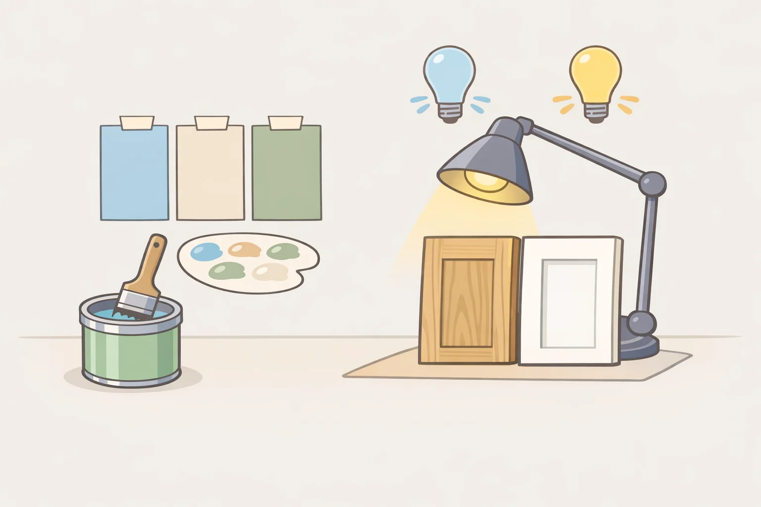
Before committing, test the palette under actual conditions. Sample paint swatches on the cabinet surface and look at them under 2700K to 3000K bulbs, not daylight, since that's the lighting that will govern how the finished kitchen reads. Compare cabinet finish against hardware in that same light. Decide whether you want the permanent elements to be the feature or the backdrop. The cashmere kitchen answers that question with "backdrop," and it's a choice that deserves to be made deliberately, not by default.
The simplest planning principle: treat permanent choices cabinets, stone, hardware as a warm neutral system, and reserve contrast or personality for elements you can change. Bar stools, cushions, window treatments, open shelving arrangements. That's the approach designers keep recommending, and it's why this preference resurfaces under new names every few years, per Good Housekeeping and Real Simple. The label changes. The logic doesn't.














Comments
Be the first, drop a comment!