



Pink Bathroom Remodel Ideas: Work With Vintage Tile, Not Against It
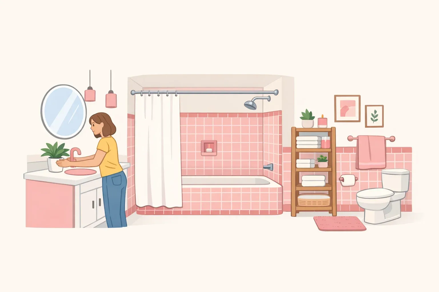
Original pink tile, the glazed ceramic common in bathrooms from the 1920s through the early 1960s, tends to trigger one of two reactions: gut it, or ignore it. Both approaches usually produce a worse bathroom than the one you started with. These pink bathroom remodel ideas are for anyone in the middle position: the tile is structurally sound, the room has good bones, and a full renovation isn't the right move right now.
The goal is a bathroom that looks deliberately designed and works reliably in daily use, without opening walls, moving plumbing, or losing access to the room for weeks.
Two problems, one approach
The practical case for designing around original pink tile is partly financial, partly about time. "Just changing the finishes and leaving the plumbing and electric work where they are is the easiest and least expensive way to upgrade a bathroom," one contractor told Architectural Digest in late 2024. Full gut renovations can easily reach $30,000, and professional teams hustle to finish in two to three weeks, with individual DIY projects often running three months or more. If you have one bathroom in your home, those numbers matter.
A renter's makeover of a 46-square-foot bathroom built in 1929 shows the approach under the tightest possible constraints. Working entirely around bright pink tile she couldn't remove, she used $4 cabinet knobs, warm wood-stained trim, and a $10 trash can chosen to match the tile's hue rather than fight it, and described the result as completely changing how the room looked, per her account on YouTube from mid-2024. The specific choices are hers. The logic applies broadly.
A midcentury bathroom presents a consistent tension: gut it and you erase the period character that gives the house meaning; leave everything untouched and you often end up with something too worn for contemporary daily use, Architectural Digest noted earlier this year. Designers who renovated architect Paul R. Williams' 1952 Los Angeles home treated the original green plumbing fixtures, floor tile, and period murals as assets worth researching and preserving, even going so far as to track down the powder room's original paint color, because that kind of period authenticity can't be cheaply replicated.
There's a design argument for working with the tile rather than against it, which the next section covers. The financial and functional case alone, though, is enough reason to exhaust surface-level updates before anything more disruptive.
Why original pink tile is worth working with, not around
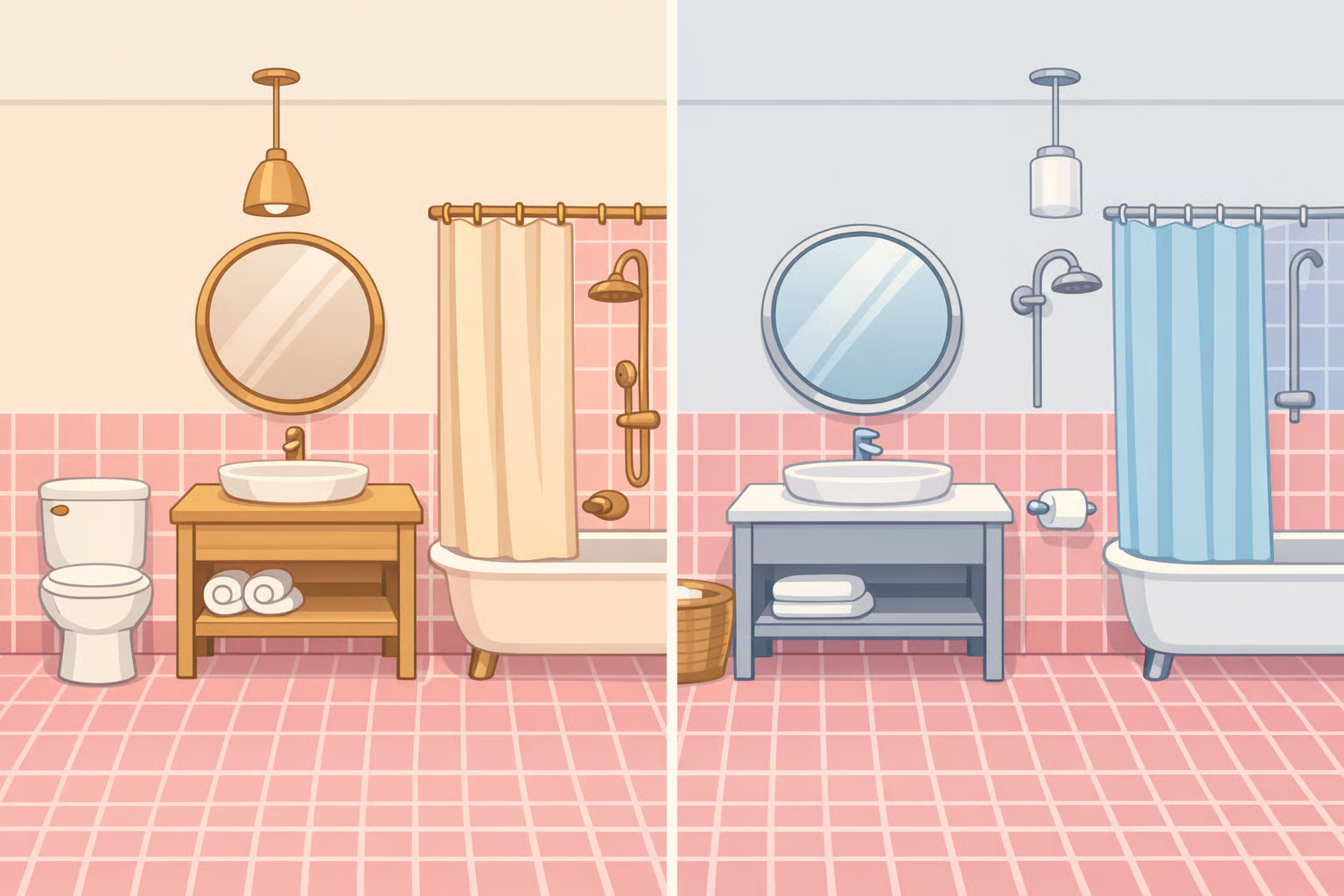
The instinct to modernize a pink bathroom by neutralizing it, cool gray walls, chrome fixtures, stark white accessories, doesn't resolve the pink. It fights it. The room ends up feeling like a negotiation between what was there and what someone wanted instead.
The more useful framing: the tile is the fixed point. It sets the palette. Everything else is context.
One contractor's tile preference, shared with Architectural Digest in late 2024, is telling: he steers toward porcelain or high-quality glazed ceramic because natural stone and cement tile are difficult to keep clean and maintain. Original glazed ceramic that has already survived 60 to 100 years is, by that standard, exactly what you'd choose if you were starting over.
The Paul R. Williams renovation makes the design logic concrete. Not because every pink tile bathroom is a historic landmark, but because the team's approach was the same one that applies here: preserve the original elements as a deliberate choice rather than a concession, because what's genuine can't be reproduced. Original pink tile belongs in the same category. Irreplaceable if removed, genuinely useful if treated as a starting point.
Pink bathroom remodel ideas that work with original tile
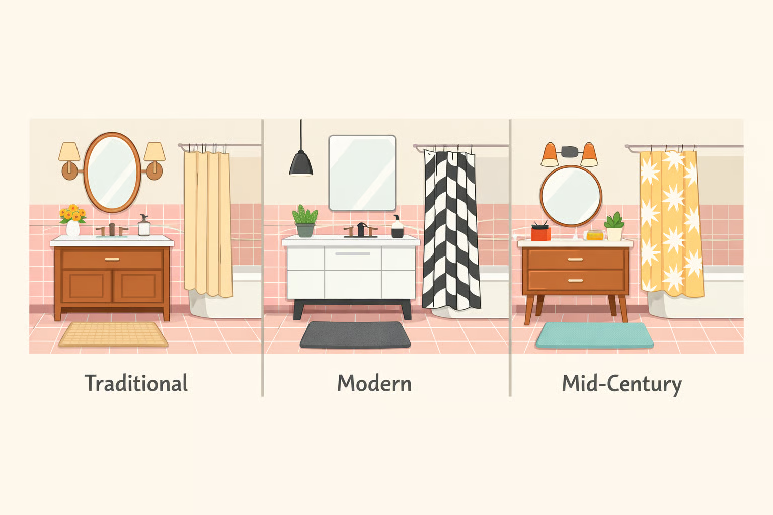
Understanding the argument for working with pink tile is one thing. Knowing what that actually looks like in a room is another. Three directions cover most vintage pink bathrooms, from warmer and more traditional to cleaner and more contemporary.
Warm traditional. Cream or soft linen walls, unlacquered brass fixtures, honey-toned wood accessories, and an oval or round mirror. Keep the floor simple: small white hex tile or the original if it's intact. No busy patterns. The pink reads as intentional rather than inherited when everything around it is warm and slightly aged.
Modern pink bathroom makeover. Warm white walls with a slight yellow or peach undertone, brushed brass or matte gold hardware, a rectangular frameless mirror, and a single warm-wood shelf or stool for texture. The restraint is the point. Fewer materials, more considered placement, and the pink becomes an accent rather than a problem.
Midcentury bathroom renovation. Lean into the era. Warm off-white walls, period-sympathetic hardware reproductions in brass or chrome, terrazzo-look floor tile or simple black-and-white hex, and an arched or pill-shaped mirror. This direction works especially well in homes with other midcentury details, where the bathroom can feel continuous with the rest of the house rather than stranded in its own decade.
For all three: avoid cool whites, gray-blue tones, matte black in large doses, and any pattern louder than the tile itself. Pattern-on-pattern is a particular risk in a small space. The tile is already doing work. Let it.
Building the right palette: color, hardware, and what to avoid
Color and wall treatment
Pink tile reads warmer or cooler depending almost entirely on what surrounds it. Warm wall colors, creamy whites, soft linens, warm beige, pull the tile into coherence. Cool whites and gray-blue tones create tension that makes the tile look dated rather than composed.
In the 1929 bathroom, the existing wall paint was a simple white linen, which worked precisely because it was warm-adjacent rather than stark, per the YouTube documentation of the project. Wood tones are the most reliable complement. A reddish-brown stain, honey-toned trim, or warm natural wood accessories sit naturally alongside pink without competing with it. Introducing those tones through stained cabinet trim, even at the scale of a small medicine cabinet, shifts the whole room's temperature.
Hardware and metal finishes
Brass is a particularly strong metal pairing with warm pastel tile. It has period-appropriate resonance without feeling nostalgic, and, as one contractor put it, "brass finish is back in full force," according to Architectural Digest. Chrome runs cold. Matte black can work in small doses but risks making the pink feel theatrical rather than deliberate.
Period-sympathetic hardware, reproductions that match what's already in the house rather than introducing a new visual vocabulary, reinforces coherence at modest cost. In the 1929 bathroom, that meant reproductions at roughly $18 per piece, per the YouTube account.
Accessories and decor
Whether a room looks curated or abandoned comes down to a specific visual question: do the accessories acknowledge the tile's color, or pretend it isn't there? A $10 trash can chosen to match the tile's hue signals that the pink was intentional, not inherited, as the 1929 bathroom demonstrated. Three or four choices made with that logic are enough to create the impression of a whole. Push further and it tips into theme.
What to avoid
Bold geometric wallpaper, busy floor patterns, and cool-toned fixtures will all read the pink as a problem rather than a feature. Keep everything else quieter than the tile, not louder. This guidance applies to any small bathroom remodel, but it's especially consequential here because the tile is both the dominant surface and the thing you're working around.
Functional upgrades that make the room actually work better
Styling is half the job. A bathroom that looks considered but still feels damp, poorly lit, or annoying to use in small ways has only been half-improved. The functional side of these functional bathroom design ideas addresses three systems: lighting, ventilation, and moisture control. None require touching the plumbing.
Lighting: the most underrated surface upgrade

Older bathrooms typically have a single overhead fixture. That produces flat, unflattering light and makes close work at the mirror harder than it needs to be. The fix is layering: a dedicated vanity light above the mirror alongside the general overhead. "I like to have both overhead lighting for general purpose and a second vanity light over the mirror for close up things like makeup and shaving," one contractor told Architectural Digest. In a small space, that second light can also make the room feel larger. Swapping or adding a vanity fixture is within reach for most confident DIYers and sits firmly in cosmetic-refresh territory.
Ventilation: the most overlooked problem in vintage bathrooms
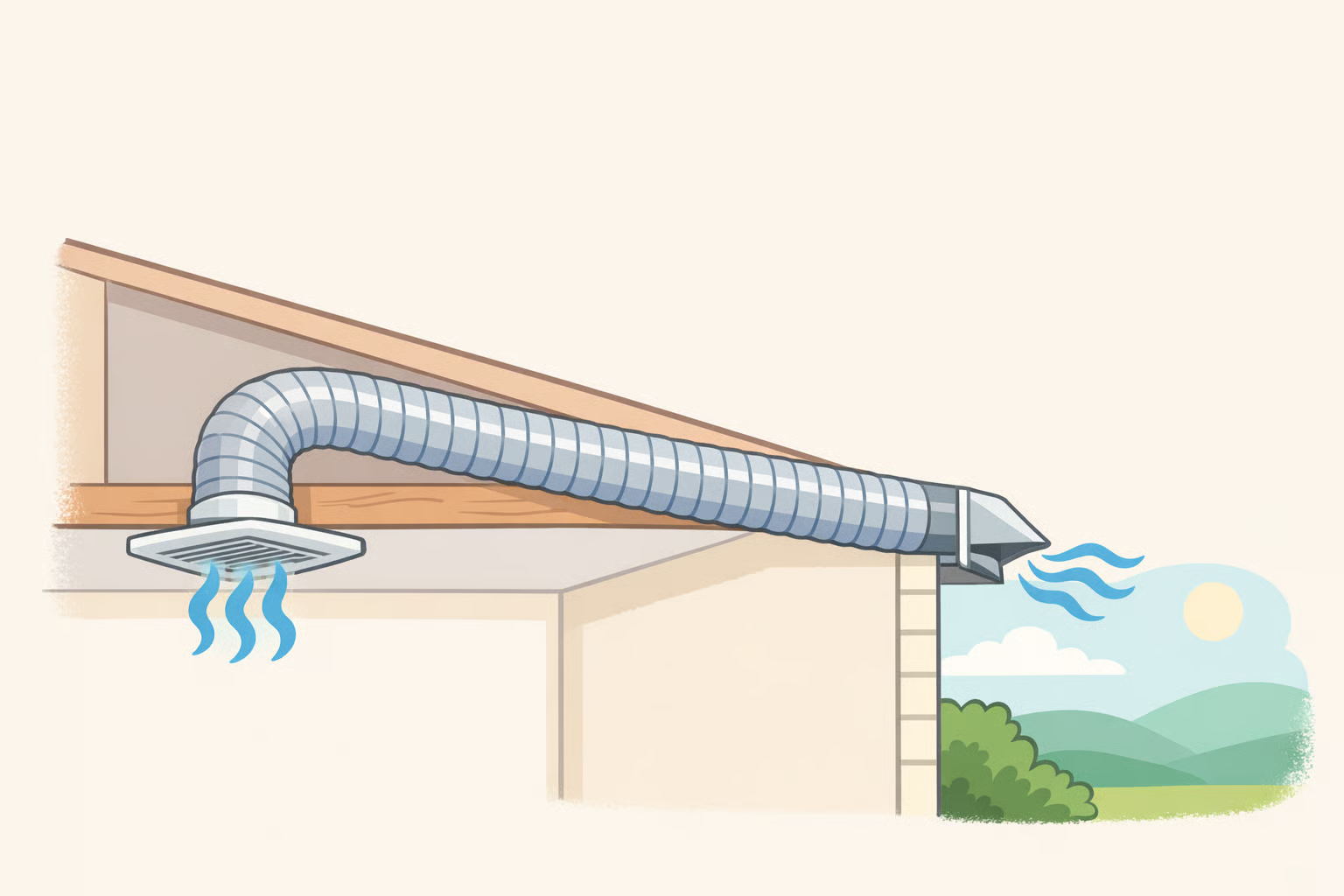
Exhaust fans are rated by how many cubic feet of air per minute (CFM) they can move. A small powder room typically needs around 50 CFM; a standard 5-by-8 bathroom requires closer to 80 CFM; larger bathrooms need 110 to 150. The exhaust must vent to the outside of the building, not into an attic or wall cavity, to actually remove moisture, per Architectural Digest.
An undersized or improperly vented fan is one of the most common reasons older bathrooms feel persistently damp regardless of how often they're cleaned. In a vintage bathroom, this is often a day-one issue that cosmetic refreshes never touch.
Moisture control and paint
Bathrooms with limited ventilation need a semi-gloss or mold-resistant paint, not standard matte. That specification is easy to miss, and a wrong choice deteriorates noticeably in a high-humidity bathroom. Paint is also where small failures compound: "a bad bathroom paint job at the end of the project can make a beautiful space look cheap," one contractor warned Architectural Digest.
Daily usability details
Beyond the three systems above, small functional failures accumulate invisibly until they don't. In the 1929 bathroom, there was a window blind that was noisy and difficult to operate, and an area near the shower that had been left unsealed and exposed to moisture rather than protected, per the YouTube account. A room with those friction points doesn't feel functional regardless of how well-styled it is. Walking the space with that lens, asking what's annoying, what's exposed, what doesn't work smoothly, surfaces the fixes that pay off most in daily use.
A decision framework: what to keep, swap, or leave to a pro
The design-around approach applies differently depending on your situation.
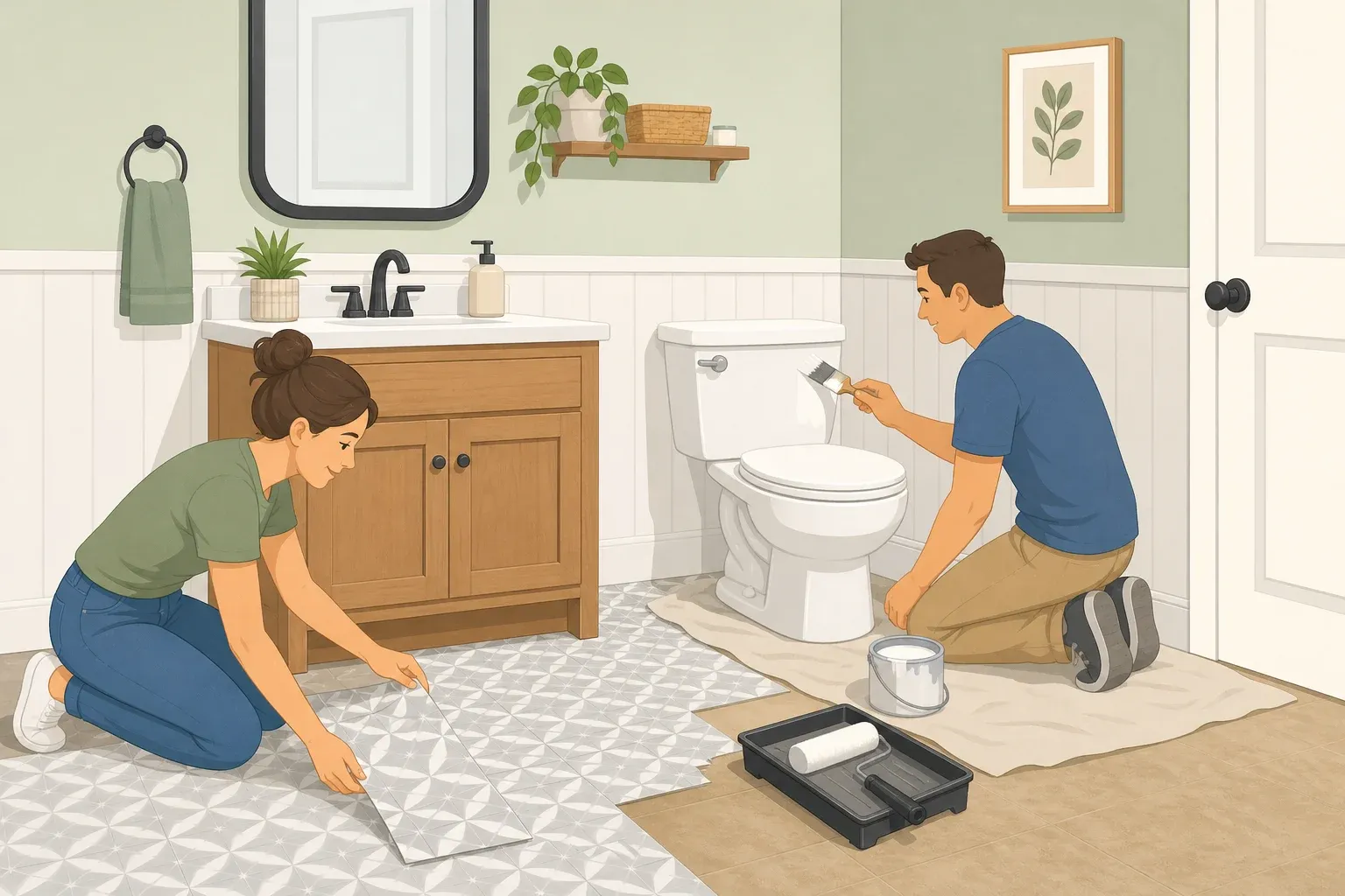
If you're a renter: Surface-level updates are almost always available. Paint, hardware, accessories, lighting where permitted, window treatments. Reversible changes are the rule. The 1929 bathroom is the model: significant visual transformation within fixed structural constraints. Anything requiring permanent alteration, new tile, or plumbing access requires landlord approval.
If you're an owner doing a cosmetic refresh: The full palette and functional toolkit applies. Ventilation can be addressed more completely, and lighting changes that a renter can't make become available. The original tile stays; everything else is negotiable.
If you're an owner weighing a larger renovation: Exhaust the design-around approach first. A full gut renovation in a single-bathroom home means losing the room for weeks or months, a real practical cost that has nothing to do with budget. The question worth asking before committing to that disruption is whether the visual result actually requires it.
Where to stop and call a professional:
Surface work is forgiving. The moment work goes behind the walls, the error cost rises sharply. Waterproofing is a layered system where a single failed component can cause hidden structural damage far more expensive to fix than the original renovation. One contractor described his approach to Architectural Digest: a hardened cement bed, a waterproof pan clamped to a specialized drain, a second cement bed, then a liquid membrane covering not just the wet area but the floor outside it. "It is not something you can just 'wing it' with," he said. Permit requirements also vary: moving plumbing in the walls or opening significant wall area often triggers local permit requirements depending on your municipality.
Upgrade sequence for most pink tile bathrooms:
- Confirm the tile is structurally sound, no loose pieces, no water intrusion behind it
- Update paint, lighting, and hardware (highest visual return, lowest risk)
- Address ventilation and moisture-related fixes
- Choose accessories and finishes that work with the tile's color, not against it
- Stop before the walls; bring in a professional for anything structural or waterproofing-related
What a genuinely improved pink bathroom looks like
"Modern" for a vintage bathroom doesn't mean new materials. It means better light at the mirror, moisture that moves out instead of building up, hardware that was chosen rather than defaulted, and details that feel intentional rather than inherited.
Small, palette-conscious choices, hardware, accessories, trim, and paint in the $4 to $20 range per item, deliver the highest visual return per dollar when selected to work with the tile's warmth rather than neutralize it, as the 1929 bathroom project demonstrated. Layered lighting, correctly sized exhaust ventilation, and moisture-appropriate paint are the functional fixes most likely to be skipped in a cosmetic-only refresh, and the ones most responsible for whether the room feels like it actually works, per Architectural Digest.
The line between accessible surface work and professional-territory renovation runs at the walls. Everything in front of that line is achievable. A bathroom like that, functional and composed, can exist with the original pink tile exactly where it is.















Comments
Be the first, drop a comment!