



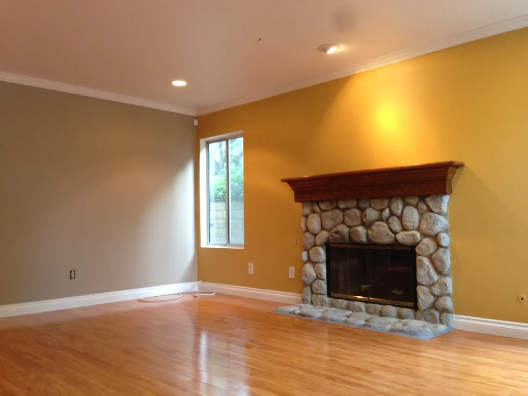
Living Room Paint Colors Out in 2026: Dated Shades and Replacements
Cold whites, blue-based grays, and flat greiges are the living room paint colors out in 2026. That's the short answer. Designers across the country have been saying it consistently for months, clients are already requesting something different, and the major paint brands have placed their bets on earthy, warm, complex hues rather than anything cool or flat. If your living room is currently a sea of icy white or slate gray, you're not imagining the growing sense that it looks like a staging photo from five years ago.
The argument worth making precise: the problem is not neutrals. It's cold neutrals. Warm whites, sandy greiges, and earthy mid-tones are holding their ground. What's losing relevance is the blue-leaning, gray-tinged end of the palette the shades that made rooms look provisionally occupied rather than genuinely lived in.
Outdated living room paint colors 2026: the shades losing ground
The dated palette breaks into three categories, and the common denominator is the same across all three: cool or blue-leaning undertones that flatten a room rather than anchor it.
Stark and icy white. The issue is not white itself. It's white with nothing going on underneath. Designer Lauren Lerner said cold whites make a home feel "stark and uninviting," and that designers are moving toward warmer whites with softer undertones that make spaces feel "lived-in and cozy," per Martha Stewart. On this point, ELLE Decor reported earlier this year that Pantone's 2026 Color of the Year, a stark white called Cloud Dancer, is failing to resonate in working design circles. Designer Allison Babcock, known for neutral coastal interiors, named "white rooms!" as the single thing she most wants to leave behind. That said, Babcock also offered a workaround: layer the same neutral across different paint finishes on walls, trim, and ceiling to build depth without committing to a new color.
Blue-based and cool gray. Gray's run is winding down. Designer Anabella Mainetti described the most desaturated gray tones as reading like "a pandemic-era palette," adding that cool, blue-based grays make spaces feel cold and lifeless rather than refined, per Martha Stewart. Designer Stephanie Hunt confirmed the same pressure from clients, noting that homeowners are moving away from "millennial grey" toward warmer, friendlier finishes that don't feel austere or minimal, per ELLE Decor. One caveat: Real Simple still includes Farrow & Ball's Blue Gray as a viable 2026 living room option for homeowners who want something soft with personality. Not every blue-gray is finished, but the category is under real scrutiny.
Flat greige. Greige was supposed to be the safe middle ground. It became the signature of builder-grade interiors that nobody chose with intention. Designer Tyka Pryde put it plainly: greige "now reads as builder-grade rather than designer-chosen" and "lacks the warmth people are craving right now, often making spaces feel flat and uninspired," per Martha Stewart. The distinction matters here. Warm, sand-based greige with brown undertones is still in active use. It's the gray-dominant version that's dated.
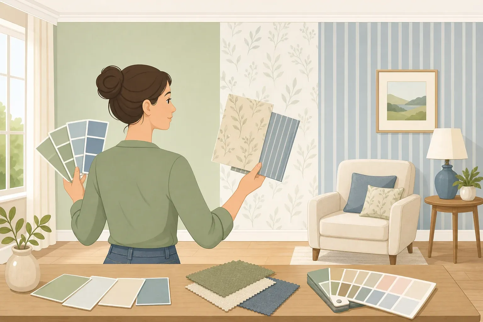
The practical test across all three: pull a chip in natural daylight and ask where the undertone goes. Blue or gray means it'll fight the room. Cream, sand, or brown means you're probably fine.
Why the shift is happening now
Cold neutrals became the palette of rooms optimized for resale and photography, not for actually being in. That's what designers are now correcting against.
Designer Nannette Brown told ELLE Decor earlier this year that the most sophisticated living rooms will feel "artful, but highly intentional, rather than styled, layered and expressive without being performative." A cold white wall doesn't support that kind of layering. It erases it. The Brownstone Boys put the client-side shift directly: "Homes are becoming more expressive. Clients want rooms that feel deeply personal and lived-in. Spaces that communicate identity are replacing neutral, 'safe' design," they told ELLE Decor.
The paint manufacturers have already moved accordingly. Benjamin Moore's 2026 Color of the Year is Silhouette, a rich espresso brown with charcoal undertones. Behr chose Hidden Gem, a smoky jade. Valspar selected Warm Eucalyptus, a muted green, according to ELLE Decor. Three major brands, zero cool neutrals. That's not a coincidence.
What to paint instead
The replacement palette is not a mandate for terracotta. There's a range, and the right entry point depends on how much disruption makes sense for a given room.
Safest swap: warm white, ivory, or creamy off-white. The move here is just from cool to warm within the white family. Designer Brittny Button described Backdrop Home's Moonlight as providing "a kind of sweeping wash that embraces the space in warmth," noting that "traditionally, whites can read as cold. This one has a built-in hug with it," per Real Simple. Ivory, chalk white, and creamy ecru are the specific upgrades Martha Stewart points to. In strong natural light, these read as white. In lower light, they read as warm. The swatch difference looks small. The room difference doesn't.
Moderate update: warm greige, soft taupe, earthy greens. This is where the majority of the trend is concentrated. Sherwin-Williams' Simple Stone, a greige with warm, sandy undertones, earns its place in Real Simple's 2026 picks because, as Button says, it has "universal appeal and feels extremely elevated. And it has some grit to it." That grit is precisely what flat greige lacks. Earthy greens also belong at this tier. Mainetti specifically called out olive, eucalyptus, and moss as more uplifting than desaturated sage or gray-green, per Martha Stewart.
Bolder, but still versatile: warm browns, terracotta, chalky mid-tones. This end of the range has the clearest momentum. Designer Emily Lindemann noted that clients are gravitating strongly toward browns, rusts, and greens, per ELLE Decor. Designer Jen Baxter described the 2026 palette as earthy organic mid-tones: chalky rose, tobacco brown, dusty olive, sunbaked terracotta, soft charcoal, "colors that feel timeworn, like they already belong to the house," also via ELLE Decor. Benjamin Moore's Silhouette and Sherwin-Williams' Iron Ore are the most prominent specific options in this category, per Real Simple. Clay and terracotta are gaining ground as replacements for millennial pink and pale blush, which Pryde described as feeling overly trendy now, like they're "trying too hard to stay relevant," per Martha Stewart.
On jewel tones: some designers are pushing into deep sapphires and muted emeralds, and that's a real direction for those ready for it. For living rooms specifically, though, Mainetti suggested these dramatic colors work better as accents on trim, doors, or cabinetry rather than across full walls, per Martha Stewart. Start there if the idea appeals but the commitment doesn't.
If repainting isn't the move
Paint is not the only lever. For rooms where wall color isn't changing, the materials around it matter more than people expect.
Babcock's advice for working with an existing neutral: layer different paint finishes (matte, eggshell, satin) across walls, trim, and ceiling in the same color to create depth without touching the hue. She also recommended adding wood, stone, and soft materials like cashmere and faux fur to generate warmth the paint alone can't provide, per ELLE Decor. This matters because a room fitted with cold-finish furniture and chrome hardware will read cool regardless of what's on the walls. Warm wood tones, brass, pewter, and aged iron are among the materials designers are prioritizing this year, with Shea McGee noting that patinaed silver "layers seamlessly with the warmer wood tones we've been loving," per ELLE Decor.
For homeowners hesitant about committing to color, designer Meg McSherry offered some perspective: clients moving away from all-white walls are finding that nuanced colors "feel timeless and classic, not intimidating," per Real Simple.
Stand in your living room in natural daylight and ask whether the wall color makes the space feel cooler and emptier, or warmer and more grounded. That single question is more diagnostic than any trend list. What designers are saying this year isn't that rooms need to be dramatic. It's that rooms need to feel chosen. Cool, flat neutrals no longer read as a choice. They read as an absence of one.














Comments
Be the first, drop a comment!