




Colorful townhouse decorating ideas: lessons from an artist's home
Michael Pybus is a self-employed artist with a tight budget and a sharp eye. When a 100-year-old UK townhouse appeared at a reduced price while he was refreshing listings, he called immediately, viewed it, and put in an offer that was accepted on the spot, as Apartment Therapy reported this week. These colorful townhouse decorating ideas come from what he did next: spending one year redecorating every room himself, filling 710 square feet with saturated color, a patterned flower floor, and an ultramarine-painted kitchen ceiling. No design firm. Working solo, on a constrained budget.
What he bought was, by his own description, a "landlord special." Everything painted white, a plain new kitchen dropped in, the kind of interior that signals nothing about the person who might live there. He saw it differently. "Not very homely but a blank canvas, which was absolutely perfect for me to come in and put my mark on," he wrote. That reframe from characterless to uncommitted turns out to be the key to understanding every decision that followed.
The result is what he calls "cosy and visually stimulating" but also "very practical" and suited to both living and working. The more instructive question is how he got there, and what the logic looks like when you apply it to a home this size.
Where the approach comes from: art practice, not a color wheel
Pybus doesn't start from a rulebook. He starts from his paintings. "As an artist I use every color available in my paintings and enjoy combining them in unusual ways. I apply this same approach to how I decorate my home. I want it to feel like stepping into one of my paintings," he writes. He describes treating his home as "an extension of my art" which is less a decorating philosophy than a statement about what rooms are for.
That's a meaningful departure from how most people approach eclectic color palette interiors. The more familiar method works outward from restraint: pick a dominant hue, add one or two accents, anchor with a neutral, hope for the best. Pybus inverts that logic. The paintings set the visual register; the rooms follow from there.
The distinction matters because it's structural, not stylistic. He isn't randomly picking colors room by room. His reference point is fixed, and it carries across the whole house. For anyone without an art practice, the lesson isn't to think like a painter. It's that having a concrete anchor at all, something you actually respond to, whether that's a tile, a rug, a piece of furniture, or a clear sense of how a space should feel, is what keeps bold color from becoming noise. Without something to organize against, saturated choices end up in competition rather than conversation.
At 710 square feet, that kind of coherence matters more than it would in a sprawling house where one discordant room can simply close its door on the others. Fewer rooms means palette decisions carry further. The small scale amplifies both good choices and bad ones, which is an argument for being intentional before you open a single tin of paint.
The signature moves: what artist-inspired home decor actually looks like here
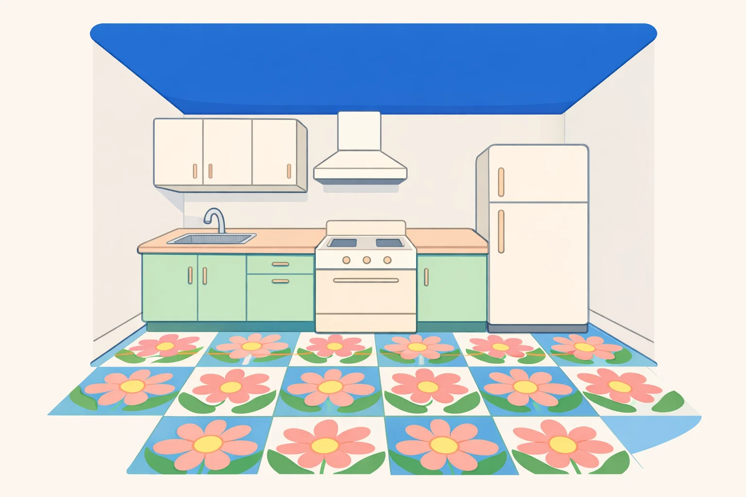
The kitchen is where Pybus says he is particularly happy with the result. He paired a patterned flower floor with an ultramarine-painted ceiling, two large architectural surfaces treated as saturated color fields rather than neutral backdrops. The conventional wisdom for tight rooms is to keep them light and expansive-feeling. He went the other direction: enclosure and warmth rather than the illusion of extra square footage. It's a room you want to feel like somewhere, not a room you want to feel bigger than it is.
The living room takes a different method to the same end. A bay window filled with plants provides color through organic texture and living material rather than paint. The density of visual interest is high, but the walls don't have to carry it. Greenery and layered objects do the same work, and they're easier to edit if your tastes shift.
These two rooms together demonstrate something worth sitting with: vary your method of introducing color, not just the colors themselves. Paint a ceiling in one room; fill a window in another. Treat a floor as the main event somewhere else. The cumulative effect reads as deliberate precisely because each room has its own internal logic rather than repeating a formula. That variation is what separates a home with a strong point of view from one that simply used a lot of the same paint.
This approach connects to a broader pattern in how people successfully decorate small townhouses with color. Natasha Landers, an interior designer who transformed her own Victorian terrace in East London, wrapped a kitchen extension in olive, light bronze green, and a bold sunshine yellow, describing the colors as acting "like art" in the space, House Beautiful reported earlier this year. The specific colors are different, but the underlying approach is the same: each room gets a considered palette that serves its particular character, rather than a single scheme applied uniformly throughout.
The one white room and what it reveals about every other choice

The most instructive detail in this transformation is the room Pybus didn't paint. His art studio, the space most directly connected to his creative identity, he kept entirely white.
Read in isolation, that sounds like a contradiction. The man who wants every room to feel like stepping into a painting left one room looking exactly as he found it. But it's actually the clearest expression of the whole philosophy. The white studio reveals a limit to his maximalism that's functional rather than aesthetic: where a room needs visual neutrality to perform its purpose, he leaves it alone. The choice is consistent with his framework, function driving the decision, not convention.
This distinction separates intentional decorating from rule-following in either direction. Pybus isn't avoiding white because it's generic. He's using it where it's the right tool. That reframe has real practical value: the question to ask of any room isn't "how much color can I add?" but "what does this room need to do, and what does that require of the walls?"
Charleston-based designer Angie Hranowsky has articulated the same balance from the professional side. Working on a 1960s home in Charleston's South of Broad neighborhood, she pushed bold color into a pink dining room and a seafoam-green kitchen while being precise about where saturation belonged and where it didn't. "I really tried to give them as much color as I could while keeping everything in balance," she told Elle Decor this week. Maximum color and functional restraint aren't opposites. The question is always which rooms can hold what.
Colorful townhouse decorating ideas for small spaces: what to actually borrow from this
Pybus's townhouse isn't a template. It's the product of a specific person's visual training applied to a specific home, and treating it as a set of instructions to copy wholesale would miss the point. But the decisions behind it are transferable, even for someone with no art background. Here's how to decorate with bold colors using the same underlying logic.
Find a fixed anchor before choosing any colors. Pybus's paintings are his reference point, a concrete and established thing he responds to. Yours might be a rug you already own, a tile sample, a piece of furniture, or a photograph of a room that stopped you mid-scroll. The anchor doesn't have to be art. It has to be real and specific. Start from it, then work outward. Without something to organize against, bold color choices have no relationship to each other. With one, they build toward something coherent rather than canceling each other out.
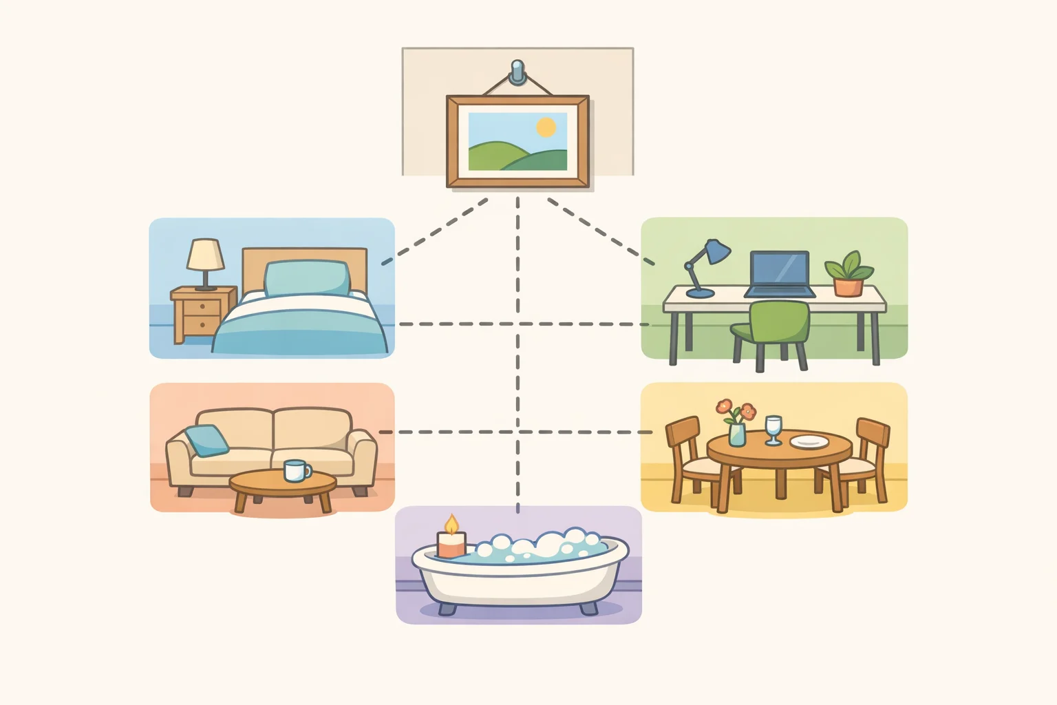
Assign each room a functional role before choosing its palette. The studio is white because it performs better that way. The kitchen absorbed the flower floor and ultramarine ceiling because Pybus wanted that room to feel vivid and inhabitable, and the result bears that out. Ask what each room needs to do before deciding what it should look like. A space used for calm recovery will land on different decisions than one you move through quickly or cook in. Function doesn't limit the palette; it focuses it.
In a small home, treat white as a deliberate choice rather than the safe default. The old reflex is to keep compact rooms light, open, and neutral. Pybus's home pushes against that: in 710 square feet, bold color in the right rooms reads as warmth and intention, not overload. The white room in his house exists because it needs to. Everywhere else, he made an active decision about what he wanted the space to feel like. That's the practice worth borrowing, not his specific colors, but the habit of asking the question before reaching for the roller.
The pattern holds across the broader world of maximalist townhouse interior design. In Sheffield, artist Suzy Banner transformed a four-bedroom Victorian terrace that had been entirely grey, swapping neutral walls for deep blue in the living room and hanging her own large-scale portraits throughout, describing the result as feeling "like a little gallery space," House Beautiful reported three months ago. The starting point was always a decision about what the room should become, not a formula applied from outside.
Pybus spent one year, working alone on a tight budget, turning an anonymous white shell into a home he describes as cosy, visually stimulating, and entirely practical. The 710 square feet didn't constrain what was possible. If anything, the compact footprint forced sharper decisions, and sharper decisions, made from a clear point of view, are what the home shows.














Comments
Be the first, drop a comment!