



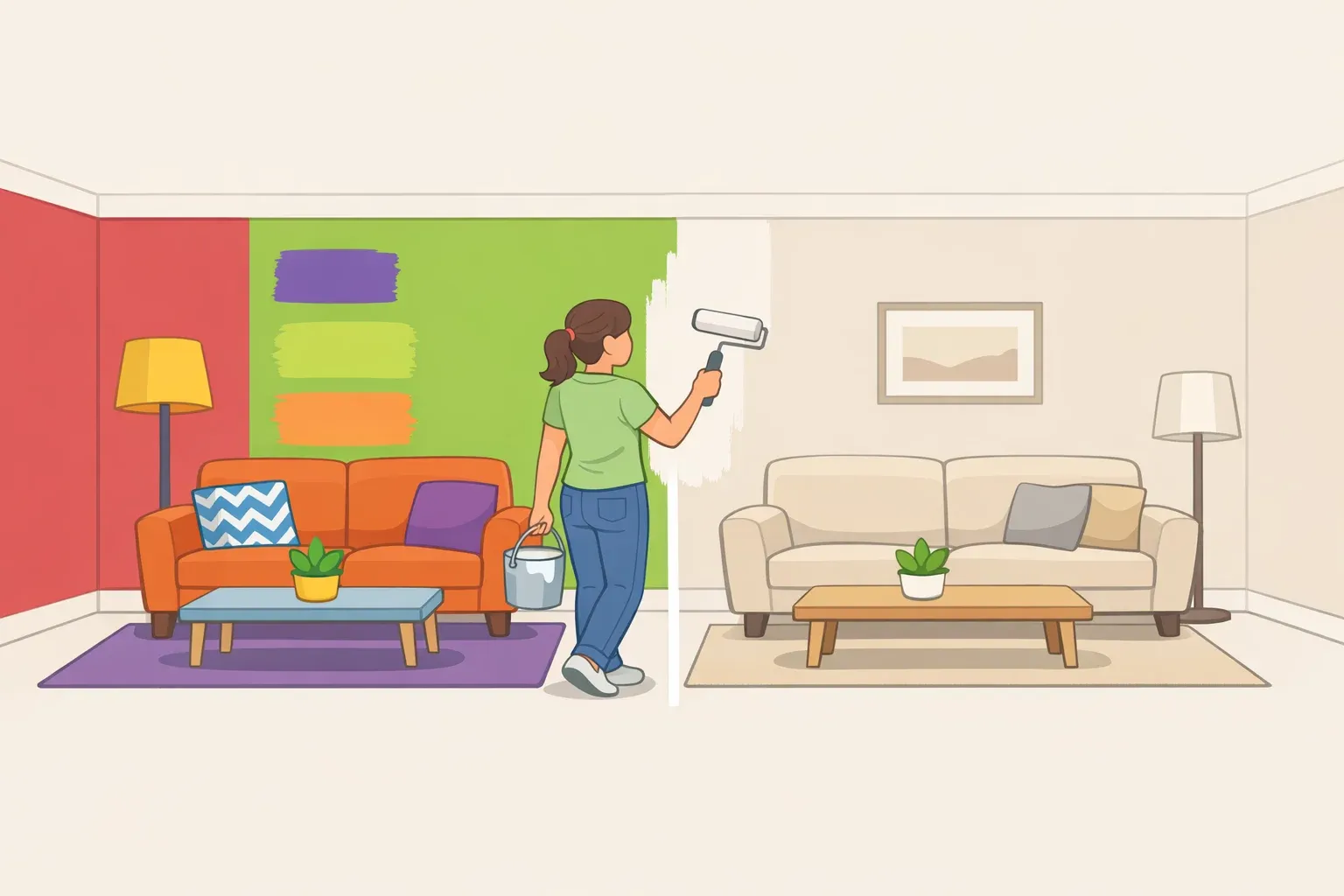
Survey data from home stagers and designers identifies six high-saturation colors that hurt broad appeal and resale value, and points toward what works instead.
The paint colors that date your home don't make it onto staging professionals' worst-offender lists by accident. They share a specific, identifiable trait. And that trait shows up in the survey responses of hundreds of design professionals and, separately, in offer-price associations that are real enough to take seriously before listing.
The plain-language version: these six colors date a home because they're intensely personal and era-specific. High-saturation hues that ask every buyer walking through the door to share your taste rather than imagine their own life in the space. That's the mechanism, and it's more durable than any trend cycle.
A 2025 survey of home stagers and designers conducted by Fixr.com ranked the most off-putting interior colors for buyers. The list: lime green (73%), bold pink (42%), red (35%), purple (33%), bold orange (30%), and mustard yellow (20%).
There's also a financial dimension. Daisy yellow walls in kitchens or living rooms were associated with offers roughly $3,900 lower, and fully saturated red in bedrooms or living rooms with reductions of around $1,800 to $2,000, per a mid-2025 analysis by Redesign Daily. These figures come from survey-based estimates rather than controlled market data, so treat them as directional, not precise.
What follows: why these six colors read as dated rather than simply bold, which rooms they hurt most, and a practical framework for what to repaint before listing.
Paint colors that date your home: the saturation problem
"Dated" describes something specific, worth distinguishing from "polarizing." A polarizing color divides opinion but doesn't anchor a room to a particular moment. A dated color does both it signals not just personal preference but the era when that preference was fashionable. When that era passes, the color signals stasis rather than choice.
High-saturation colors are particularly vulnerable to this because their intensity is tied to a specific cultural moment. A soft sage doesn't announce a decade. Electric lime green does.
That's why many of the outdated paint colors most likely to narrow buyer appeal aren't bad colors in the abstract; they're colors used too loudly, in too much space, for resale. The pattern across the Fixr survey is consistent: every color on the list is the most saturated version of its hue. Not red broadly, but fire-hydrant red. Not yellow, but daisy yellow. Bold, bright colors pull buyers' attention away from the home itself.
Think of an all-over saturated wall color like a very specific haircut from a specific year. Technically still a haircut, but instantly readable as belonging to a moment. Neutral and low-saturation tones don't trigger that recognition. That's their design advantage, not their limitation.
One distinction this article holds throughout: "dated" is not the same as "wrong in all contexts." Color depth and application matter. The sections below show where the line sits between an all-over wall color and a selective, intentional use that can work.
Worst paint colors for resale, room by room
1. Lime green
The single most cited offender: nearly three-quarters of staging and design professionals named it the most off-putting interior color for buyers. Realtors' guidance specifically flags living spaces, bedrooms, and open-concept areas as the rooms where it backfires, the worst spaces where its intensity radiates across the entire footprint of the home with no visual relief.
The problem isn't green. It's the electric, mid-2000s register of green that immediately places a room in a specific decade.
The fix is saturation, not color family. Olive green cabinetry was associated with offer prices roughly $1,600 higher in kitchen contexts, per Redesign Daily evidence that green works when its chroma is pulled back. A muted sage or earthy olive gets you the color without the era.
2. Bold pink
Named by 42% of professionals as a buyer deterrent. The word "bold" carries the full weight of that finding. Dusty blush and soft rose function differently in current interiors. The survey is specifically targeting the saturated version.
Bedrooms, playrooms, and bathrooms are the rooms where bold pink hurts most: spaces where buyers need to mentally inhabit the room as their own rather than read it as someone else's personality already installed.
A barely-there blush or warm off-white maintains softness without requiring buyers to commit to an identity. The goal is a color that opens the room rather than defines it.
3. Red
Flagged by 35% of professionals. The specific culprit is fully saturated, fire-hydrant red on large wall surfaces associated with offer reductions of $1,800 to $2,000 in bedrooms and living rooms, per Redesign Daily. These are also the rooms where staging professionals flag it most often.
Deeper, earthier reds operate in a different register entirely. In 1stDibs' annual Designer Trends survey, the share of designers planning to use dark red rose to 20%, up from 12% two years prior. Worth noting: that's design-preference data, not resale data. Oxblood and rust read well in current interiors; whether they translate to higher offers is a separate question. What the evidence does support is that richness of tone rather than raw saturation separates the two.
4. Purple
Cited by 33% of stagers and designers. All-over saturated purple has no neutral register; buyers can easily overwrite mentally, and it reads as intensely personal in a way few other colors match. Living areas, bedrooms, and hallways are the worst contexts, where it defines too much of the visible home at once.
Deep plum, at the quiet, brownish end of the purple family, is a different matter. Designers identify it as a shade that "can read as a brown," making it far easier to work into a space. A soft taupe with a faint violet undertone accomplishes something similar with even less risk. Both options let you keep the depth without the decade.
5. Bold orange
Named by 30% of professionals. Like lime green, bold orange carries a direct period association, and that association ages the room alongside it. Small rooms and hallways suffer most, where there's no visual relief from the intensity.
The warm orange is available at a lower saturation. Designers describe reddish browns and burnt oranges as offering "rich, grounded warmth" as a natural evolution from the terracotta trend of the early 2020s — the same emotional register, desaturated enough to feel grounded rather than era-specific.
6. Mustard yellow
Alabama Realtors guidance is unambiguous: avoid it entirely. Daisy yellow walls in kitchens and living rooms were associated with offers around $3,900 lower, the steepest single-color penalty in the available data. These happen to be the rooms that carry the heaviest weight in buyers' assessments.
Warm greige or a golden-toned taupe carries the warmth mustard was approximating, at a saturation level that reads broadly appealing rather than era-specific. Greige, warm beige, and light taupe consistently test well for buyer appeal and tend to make spaces feel larger and more open.
What to use instead: a framework that holds across rooms
Why white isn't automatically safer
Brilliant white can feel cold and clinical in rooms meant for relaxation, accentuate dirt in high-traffic areas, and flatten architectural details like molding and trim that benefit from tonal variation. Cool gray, once the safe default of the 2010s, now carries its own datedness. Design professionals have been shifting toward warmer, creamier neutrals for several years, and that trajectory is expected to continue.
What broad-appeal colors have in common
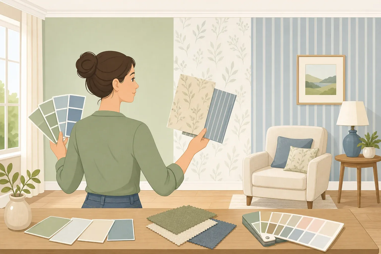
Low saturation, warm undertones, and room-appropriate depth. Colors that don't announce a decade. The practical test: would this color still feel at home in ten years, or does it belong to right now?
Warm whites like Sherwin-Williams Alabaster, Benjamin Moore White Dove, and Valspar Swiss Coffee offer flexibility without sterility. Earth tones carry particular staying power. Four designers working on the 2025 Real Simple Home independently gravitated toward earthy, soft neutrals, and one put it simply: "They've literally been around since the dawn of time. If you're worried about choosing timeless colors, earth tones are always a safe bet."
Room-by-room colors that perform best
The offer-price data from Redesign Daily points in the same direction across rooms: navy blue in bedrooms was associated with offers roughly $1,815 higher on average; dark gray in living rooms with a lift of around $2,600; dark gray kitchens with approximately $2,400 more, though with narrower buyer appeal overall. The pattern holds: it's saturated brightness, not darkness, that consistently alienates buyers.
For bedrooms, soft blues and muted greens create a restful environment without overwhelming the space. For bathrooms, pale blue, light sage, or soft white make rooms feel clean and airy. The common thread is that none of these colors requires the buyer to share a specific personality to feel at home in the room.
Finish and scale still matter
A jewel tone in a powder room or on a single feature wall operates completely differently than the same color on every wall of an open-plan floor. Designers recommend starting small for any richer hue — one accent wall or a contained room where it reads as intentional rather than dominating.
Finish matters too. Redesign Daily flags the sheen quality as a factor that can undermine an otherwise sound color choice. Flat finishes hide imperfections but show scuffs, while eggshell or satin in high-traffic rooms holds up and reads cleaner.
One note on neutrals: warm grays and oatmeals are versatile, but "if overused, they can feel bland." Pairing lighter wall tones with slightly darker trim, baseboards, and door casings creates the contrast that keeps a lighter palette from going flat.
Where to start before you list
Address bold wall colors in the main living spaces first: living room, kitchen, primary bedroom. These carry the most visual weight and the clearest data on buyer impact. Use warm whites or greiges in common areas. Reserve deeper or richer colors for smaller, lower-stakes rooms, a powder room, a home office, or a single accent wall where they read as deliberate rather than dominating.
Most homeowners won't repaint everything before listing, and they don't need to. The research points to kitchens, bedrooms, bathrooms, and living rooms as the rooms where color most directly affects offers. A fresh coat in those spaces is inexpensive, fast, and can drive meaningful price movement, per Redesign Daily.
The colors that age best are the ones that don't ask the room to belong to a specific era or a specific personality. Buyers aren't just evaluating your choices; they're trying to picture their own life there. Give them room to do that, and the walls stop being an obstacle.














Comments
Be the first, drop a comment!