



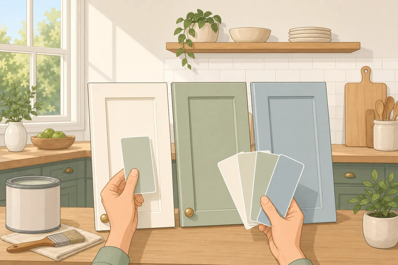
Picking a cabinet color feels overwhelming until you stop hunting for one "perfect" shade and treat it as a four-step process instead. This guide walks through choosing the best kitchen cabinet paint colors for every design style by working through what's already fixed in your kitchen, then style, then contrast, then light, in that order, so you land on a color you're not scrambling to redo next year.
Fixed materials come first because replacing a countertop or backsplash to match a paint chip is rarely worth it. Style narrows the color family your kitchen can actually wear. Contrast decides how much of that color goes where. A lighting check then confirms the shade looks right in your kitchen, beside the actual finishes, rather than under store lighting.
This doesn't require design training. It requires comparing samples against your fixed finishes under your own bulbs before you buy paint by the gallon. Neutrals stay a dependable fallback throughout, since cabinetry and finishes typically double as the room's focal point, according to Sherwin-Williams' color guidance.
One note before you start: the named paint colors below come from Sherwin-Williams' current lineup and are used here as examples of a color family, not the only options in it. Another brand's version of that same family may work too, once you compare actual samples, since undertone, formula, and sheen vary by manufacturer. This guide covers picking the color only. Actually painting cabinets is a separate project with its own primer, prep, and cure-time requirements.
What you'll need
Photos or physical samples of your countertop, backsplash tile, and flooring
A piece of your cabinet hardware, or a clear photo of it
Two or three candidate paint samples within the color family you're testing
A 2-by-2-foot white poster board or peel-and-stick paint sample sheet
Access to your kitchen at different times of day, under the light bulbs you actually have installed
How to choose a kitchen cabinet paint color: start with what's already in the room
Countertops, backsplash tile, floors, and hardware cost real money to replace, so let them limit your color options before style enters the conversation.
Go through your fixed finishes one at a time. These undertone reads are practical heuristics, not hard rules, but they're a reasonable starting point: cream or gold veining in stone usually reads warm, gray or blue veining usually reads cool. Honey, red, or amber wood floors typically read warm, while gray-washed or ashy wood tends to read cool. Brass and gold hardware read warm; chrome, nickel, and stainless read cool.
Sherwin-Williams frames its own whites the same way in its kitchen design guide: White Duck and Creamy carry a yellow undertone and read warm, while Toque White and Eider White carry a blue undertone and read cool. Start with the undertone that repeats most clearly across your fixed finishes, then test that color family beside the actual countertop and backsplash. This is also why white or cream cabinetry can draw out the veining in a marble countertop or backsplash instead of competing with it.
If your fixed finishes send mixed signals (a warm wood floor sitting next to cool gray quartz, for instance), don't force a bold, style-driven color onto the cabinets. Default to a warm-leaning neutral or greige and test two adjacent shades side by side before deciding anything else.
Kitchen cabinet paint colors by design style
Once you've matched a color temperature to your fixed finishes, your kitchen's design style narrows the family further. These are the pairings Sherwin-Williams' design team uses in its own kitchen examples.
Farmhouse and cottage kitchens
A farmhouse kitchen built around wide-plank floors and a large wood island is one example Sherwin-Williams cites for this style. Sage or cream cabinetry complements that warm, wood-heavy setting.
Traditional kitchens
One traditional kitchen example Sherwin-Williams uses mixes antiques with carved woodwork. Navy and red both bring intensity to that setting. If navy or red feels like a bigger commitment to you than sage or cream, that's worth weighing before you paint every door.
Transitional kitchens
Consider transitional kitchens as a blend of straight-lined cabinet fronts with softer, traditional touches. For this look, consider a deep green on cabinets against neutral walls, an example Sherwin-Williams uses in its kitchen guide to add contrast without pushing the room fully bold. For a quieter version, Sherwin-Williams pairs a mid-gray (Anew Gray) on walls and upper cabinets with a deeper neutral (Elephant Ear) on the island, a tone-on-tone approach that adds dimension without a saturated color commitment.
Contemporary kitchens
Sherwin-Williams points to pale wood flooring, open shelving, and an airy feel as one contemporary kitchen example. Cool blues and yellows reinforce that airiness. If white fits better, Sherwin-Williams names Pure White, Futon, and White Duck among its most popular whites for contemporary homes overall.
Modern kitchens
Modern reads differently than contemporary: minimal ornamentation, mixed materials like metal, glass, or concrete, and a move toward smooth, matte finishes and clean, European-inspired cabinet forms rather than carved detail. That same forecast groups popular kitchen cabinet colors into a handful of broad families: whites, neutrals, greens, blues, reds, and grays or black. Which family fits your modern kitchen is your call, since the material mix is already doing a lot of the room's visual work.
At a glance
Farmhouse/cottage
Starting color families: Sage, cream
Lower-commitment placement: Cream on the perimeter, sage on the island
Watch for: Test against warm wood tones
Traditional
Starting color families: Navy, red
Lower-commitment placement: Navy or red on an island only, neutral elsewhere
Watch for: Both are bigger commitments than sage or cream
Transitional
Starting color families: Deep green, or tone-on-tone gray/neutral
Lower-commitment placement: Cabinets in color, walls neutral
Watch for: This pairing is editorial guidance, not a defined design rule
Contemporary
Starting color families: Cool blue, cool yellow, Pure White, Futon, White Duck
Lower-commitment placement: Try a white first if you're unsure
Watch for: Confirm against pale wood flooring
Modern
Starting color families: Whites, neutrals, greens, blues, reds, grays/black
Lower-commitment placement: Sample one family against your material mix
Watch for: No single family is prescribed for this look
Quick checklist before you shop for paint:
Note the undertone of each fixed finish in your kitchen
Shortlist two or three color families that fit both your finishes and your style
Decide placement: full cabinetry, island only, or two-tone
Test the samples using the lighting method below
Buy paint only after the final check confirms the color
If two candidates both look right against your fixed finishes, choose the smaller painted area, an island accent instead of a full repaint. Expanding later is easy. Undoing a whole kitchen of cabinets is not.
Decide how much contrast you want, and where
Once you know the color family, decide how much of the kitchen wears it and where.
Low contrast means one color across most or all of the cabinetry. If you're using a bolder family like navy or deep green, go with a lighter tint within that family, or confine the color to a single island instead of every door.
Medium contrast covers two-tone cabinetry, light uppers with darker lowers or the reverse, which creates depth without covering every surface in a saturated color. Tone-on-tone layering, a mid-gray on walls and upper cabinets with a slightly deeper neutral on the island, adds dimension while staying inside one color family.
High contrast means a bold color on all the lower cabinets, or full cabinetry against a light wall. If stark black lowers feel too harsh next to warm-toned granite, a saturated greige echoes the same stone colors with less visual weight.
Before committing to a bold color across every cabinet, test it on a large sample under your kitchen's own light and leave it up for several days rather than judging it after one look. The lighting method in the next section covers exactly how.
Confirm the color under your kitchen's actual light
LRV describes how much light a paint reflects, on a standardized 0-to-100 scale used by major manufacturers. It's worth knowing because it explains why a color can look brighter or more washed out once it's covering a large cabinet surface, not because there's one ideal number to hit for kitchens specifically.
Don't judge a color from a small in-store swatch. Retail lighting runs roughly 4000K to 5000K and can mask a paint's true undertone. Cool light, including north-facing windows and bulbs rated 4000K or higher, pulls out blue or violet undertones, while warm southern light or 2700K bulbs intensify yellow and red undertones. Satin and semi-gloss bounce light back more directly than flat paint and can make a color look one to two LRV points brighter than the same shade in matte.
In a response to a homeowner, Sherwin-Williams advised trying clear or LED bulbs before repainting, noting that color shifts substantially with lighting. If your kitchen's bulbs run noticeably cooler or warmer than the middle of the range, KEA Decor identifies 3000K soft-white as a balanced reference point for residential interiors worth testing under before you judge a sample.
Run the test this way:
Paint two coats of your candidate color onto a 2-by-2-foot white poster board or peel-and-stick sample, leaving a 1-inch white border so your current wall color doesn't distort the read.
Prop the board against your actual countertop and cabinets, not a bare wall.
Check it in the morning, at midday, in late afternoon, and again in the evening under your installed bulbs.
For an ordinary candidate, that one-day check is usually enough; glance at it again the next morning if you can. For a bold color going on every cabinet, leave the board up for several days before buying paint by the gallon.
What success looks like
The color is ready when the shifts you see across the four checks feel acceptable against your fixed finishes, and it still matches the placement you decided on, full cabinetry, island, or two-tone.
If the sample looks muddy, too pink, or too cool at any point, don't repaint the whole kitchen to fix it. Test one shade warmer or cooler in the same family before abandoning the family altogether.
Once a color passes this test, the color-selection part of the job is done. Approve the sample, buy the paint, and move to a cabinet-specific painting guide for the primer, coats, and cure time.
















Comments
Be the first, drop a comment!