



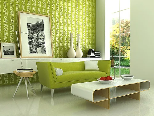
Choosing an accent wall starts well before the first coat of paint goes on. The right wall, color, finish, and prep all determine whether the result still looks intentional once the furniture is back in place.
More DIY accent wall projects fail at the planning stage than at the painting stage, and color is rarely the actual problem. A frequently cited estimate suggests roughly four in ten DIY accent walls get repainted within 18 months, although the figure lacks published methodology and is best treated as directional rather than definitive. The more useful takeaway is simpler: the repeat offender is often the wrong wall, the wrong color balance, or an unresolved relationship with the trim.
Should this room have an accent wall at all?
Not every room needs one wall singled out. A single accent wall and color drenching, where the walls, trim, and sometimes the ceiling all get painted the same shade, can both work depending on the room.
Drenching can suit small rooms under 12 by 12 feet, spaces with ceilings under 8 feet, north-facing rooms with cooler light, or rooms with dated trim worth visually minimizing. A single accent wall tends to work better when the room already has a clear focal point, ceilings at 8 feet or taller, mixed furniture finishes, and generous natural light.
Size also changes how saturated color reads. The same Hale Navy that can create a jewel-box effect when drenched across a 10-by-10 office may look more arbitrary when confined to one wall in a 14-by-18 great room. Room proportions, lighting, and furnishings matter more than any strict size cutoff.
Bathrooms are a useful exception to the idea that small rooms should avoid accent walls. A lighter, higher-reflectance color, such as Sea Salt with a light reflectance value around 63, can still introduce color without absorbing as much of the room's limited light.
Outside bathrooms, a tight or dim room may benefit more from drenching than from isolating one dark wall. If the room already has a clear focal point and decent daylight, a single accent wall is easier to make feel deliberate.
How to choose the right accent wall before you buy paint
Start with whatever surface already functions as a focal point: a fireplace, niche, existing paneling, or built-in shelving. Wall size, the main sight line from the entrance, and the wall behind focal furniture also help narrow the choice.
If there's no obvious architectural anchor, look at the wall directly facing the room's entrance. In many living rooms and bedrooms without a fireplace or built-in, another natural candidate is the wall behind the largest piece of furniture.
Be cautious about painting the wall directly opposite a sofa or bed. Without another architectural feature to anchor it, the color can feel isolated and leave the furniture visually disconnected.
The wall containing the room's largest window can create a similar problem. Strong backlighting may weaken perceived color saturation and make a dark shade feel heavier than expected, although the room's actual light levels should decide whether that wall works.
Before buying paint, run through these questions:
Is there an existing focal point, like a fireplace, built-in, or the wall behind the largest piece of furniture?
Will the wall actually be seen from the room's entrance or main seating spot, rather than tucked out of view?
Is a piece of furniture anchoring the wall instead of leaving it stranded on its own?
Has the paint sample been checked in daylight and under the room's actual bulbs at night?
Does the surface need patching, sanding, or primer before color goes on?
Mistake to avoid: stacking several bold moves in the same room, such as drenched trim, a saturated rug, and a strong accent wall, can upset the room's balance. Give the space one dominant color statement rather than making every surface compete for attention.
Accent wall color mistakes to avoid when choosing paint
Once the wall is chosen, three decisions determine whether the color reads as intentional: contrast level, how the shade performs in the room's real light, and how dark to actually go.
Pick a contrast strategy first. A complementary pairing pulled from opposite sides of the color wheel, like blue and orange or green and red, creates a stronger, higher-contrast focal point. An analogous palette of three or four neighboring hues, such as sage, olive, and moss, produces a quieter, more blended result.
The complementary route works best when the rest of the room has enough neutral space to absorb the contrast.
Test the sample before buying a full can. The same paint can look noticeably different at noon than at 9 p.m. Natural daylight and warm artificial light can reveal different undertones and change how saturated a shade appears.
Check a sample patch at multiple times of day before committing. If a color looks wrong specifically at night, judge it under the room's actual bulbs before assuming the paint itself is the problem.
Pay attention to how dark the color actually reads, not just its name on the swatch. Light reflectance value, or LRV, runs from 0 for black to 100 for white.
An LRV of roughly 5 to 30 can provide the stronger contrast many people want from an accent wall, with many deep accent shades falling between about 8 and 22. Colors above roughly 30 to 35 can create a subtler effect rather than the dramatic contrast associated with darker feature walls.
Those numbers are guidelines, not universal cutoffs. Hue, lighting, sheen, surrounding colors, and room size all affect how the finished wall reads.
Use the 60-30-10 idea as a balance check rather than a fixed formula. The basic concept assigns a dominant tone, a secondary tone, and a smaller accent, but designers do not always agree on whether an accent wall belongs in the 10% or 30% share. The useful test is whether the finished room feels balanced.
Pick sheen deliberately once the color is settled. Eggshell is a practical middle ground for many accent walls because it balances appearance and durability, unless the paint manufacturer's instructions or the room's conditions call for something different.
Before you paint: surface and safety checks
Gather these before starting:
Sample pots to test color and light before buying a full can
Painter's tape designed for clean paint lines. FrogTape Multi-Surface uses a PaintBlock polymer that reacts with water in latex paint to form a micro-barrier along the tape edge and help prevent bleed.
Drop cloths, a putty knife, an angled brush, and a roller
Patching compound and fine sandpaper for dents or holes
Primer, if the paint label or surface condition calls for it
A stable step stool
Plan for more than a single afternoon. The first coat needs to dry fully before a second goes on, and the wall needs additional time before furniture goes back against it. Check the paint can for its specific recoat and cure windows rather than assuming one timeline applies to every product.
Ventilate the room while you work, and use a step stool instead of reaching from furniture. Before patching, inspect the wall for damage beyond small dents and holes.
Deep cracks, soft spots, or staining that suggests water got behind the drywall can point to a larger problem that should be addressed before painting over it.
If the home was built before 1978 and the paint hasn't been confirmed lead-free, take extra care before sanding or scraping. EPA lead-safe guidance recommends treating paint in pre-1978 homes as potentially containing lead unless testing shows otherwise.
Accent wall mistakes to avoid once you start painting
Patch and sand any dents or holes, then wipe the wall free of dust. Inspect the patched area from a few angles under room light and run a hand across it to confirm there's no ridge where new compound meets the original wall. Dark colors make uneven coverage more noticeable, so check patches closely before applying a bold shade.
Apply painter's tape to clean, dry trim edges and press it firmly with a putty knife to seal the line. Make sure the tape lies flat with no lifted corners or visible gaps where paint can bleed through.
Apply the first coat and let it dry fully before adding a second. Check the paint label for the exact recoat window because drying times vary by formula.
Load the roller evenly and work excess paint out on the tray before it touches the wall. Dark, saturated colors often need two coats, and two thin coats generally produce a cleaner, more even finish than one thick coat, which can drip and dry unevenly.
Stop once coverage looks even across the whole wall, with no roller lines, drips, or lighter patches.
Remove the tape while the final coat is still damp, pulling it at a 45-degree angle. If the tape has already dried and begins lifting paint with it, score along the remaining tape edge with a craft knife before continuing to peel.
Once the tape is off, the line where paint meets trim should be crisp and straight, with no feathering onto the trim and no gaps where color missed the edge.
Let the wall cure before pushing furniture flush against it. Full cure can take considerably longer than surface drying, often two to four weeks depending on the paint and conditions. Follow the manufacturer's guidance rather than judging cure time by touch alone.
Troubleshooting common accent wall mistakes
If tape starts lifting dried paint during removal, stop and score along the remaining tape edge with a craft knife before continuing the peel. If the line is already exposed and looks jagged, a small angled brush is usually the more practical tool for touching it up.
If the color still looks off once the second coat has dried, check it in natural daylight and under the room's actual bulbs before assuming the shade itself was wrong.
A color can also look different once furniture and decor return because the surrounding colors change how the wall is perceived.
If the wall still feels disconnected after that, reconsider whether it was really the room's focal point to begin with rather than assuming the paint color failed.
Finish: check it in real light, then let it cure
Once the second coat dries, walk the room in the morning and again in the evening to confirm the color and wall choice still look intentional under the room's actual daylight and bulbs.
Follow the paint manufacturer's recoat and cure instructions, and hold off on pushing furniture flush against the wall until the finish is ready for that contact.
If the wall still reads as a mismatch after both checks, rule out lighting before deciding the paint itself was wrong. If it still looks off once everything is back in place, revisit whether the wall earned the treatment in the first place rather than automatically reaching for a different shade.














Comments
Be the first, drop a comment!