



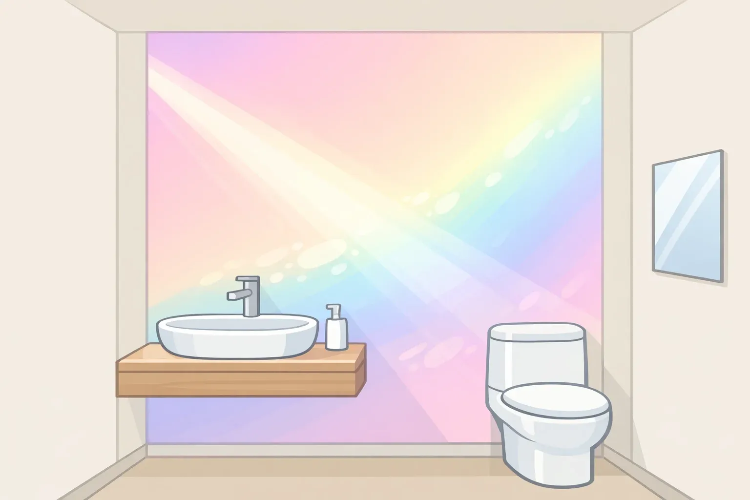
The version of shine-maxxing circulating on social media entire rooms wrapped in rainbow-slicked surfaces, every wall shifting and gleaming is not what professional designers are actually specifying. What they're doing is quieter and more considered: one iridescent feature wall in a powder room that moves from pale gold to violet as afternoon light crosses it, or a single pearlescent tile niche set behind a freestanding tub.
The effect is precision. The shine-maxxing interior design trend, as the trade understands it, is about restraint, not maximalism, and the gap between those two versions is what determines whether an iridescent surface ages well or becomes a renovation regret within a year.
"Shine-maxxing" is a consumer-facing social label, not a formal design category. The underlying material practice of iridescent, metallic, and pearlescent surfaces used as deliberate architectural moments carries genuine traction in the industry under different names.
But iridescence can also be purchased as a cheap printed effect, tiled across an entire open-plan kitchen, and installed under warm ambient lighting, in which case it looks dated before the grout dries. The term covers both versions.
The stakes are concrete. An AweDeco analysis cited by Elle Decor last month put Americans' spending on trend-driven home decor at an estimated $8.7 billion annually, with most of those purchases abandoned within six to twelve months. The difference between a surface that holds up and one that doesn't usually comes down to a single question: was it chosen for the room, or chosen for the feed?
Material first: real iridescence vs. the printed version
Authentic iridescence is a physics phenomenon, not a pigment. Genuine glazed iridescent tile or dichroic glass carries microscopic angular variation across its body, so visible light bounces back in shifting wavelengths. The room's appearance changes as daylight moves through the space and as the viewer's position changes.
A printed "iridescent-effect" tile reflects from a single flat plane in a fixed set of tones, the way toner reflects from coated paper. The shift simply doesn't happen, as both GR Mosaic and Bark and Chase have noted in their respective 2026 coverage.
That distinction matters because the color-shifting behavior across the day is the whole reason trade forecasters are specifying these surfaces. Install the printed version, and you've bought the look in a static photograph, not the material itself. The two are often stocked by the same retailers, sometimes with nearly identical product names.
The current wave is also architecturally scaled in a way the previous shimmer moment wasn't. The early-2010s glass mosaic trend used iridescent material in narrow strips and decorative bands accent material in the narrowest sense. The 2026 specification uses it as a single primary surface: larger format, more structural, one deliberate focal point per room.
Consider the difference in practice. The working version is a powder-room feature wall in genuine glazed tile, set within a room that otherwise reads as restrained pale champagne at noon, shifting toward lilac by late afternoon. The failure version is printed pearl-effect subway tile covering a full open-plan kitchen backsplash under 2700K pendant lighting, reading vaguely flat from the day it's installed.
These are illustrative rather than documented cases, but they reflect the material logic accurately. Authentic options include iridescent and metallic glazed ceramics, dichroic glass, and capiz shell, per Bark and Chase. A practical field test: hold a directional light source close to the surface and move it slowly. A genuine structural material shifts visibly. A printed surface stays static.
Without authentic material, none of the guidance that follows matters.
Why the industry aligned on iridescence this year
The 2026 industry convergence around metallic and pearlescent interiors is unusually broad. GR Mosaic's April 2026 roundup summarizes coverage from Coverings' industry preview, which called out gold, bronze, copper, and silver finishes as moving into the center of the specification conversation with iridescence treated as the year's defining decorative quality alongside texture and three-dimensional relief.
Why Tile read the same shift across major paint forecasts from Pantone, Behr, and Sherwin-Williams, and arrived at the same conclusion: 2026's defining colors perform best on slightly luminous surfaces, which is pushing iridescent and pearlescent tile into wider use. Daltile's 2026 trend launch leaned heavily on metallic glazes and shifting opalescent finishes; Marazzi framed the year around surfaces that are expressive but disciplined.
The cultural appetite that forecasters are responding to has its own logic. Domus argued earlier this year that post-pandemic homes are now carrying overlapping functions work, rest, social life, self-care within the same square footage, and that designing for sensory pleasure in that context isn't indulgence but an adaptive response to the limitations of stripped-back neutral interiors. Calm without warmth has a ceiling.
The beige fatigue is real and directional. Clients want to keep neutral foundations warm woods, soft walls, clean lines but are willing to introduce one expressive element. Designer Priscilla Tan of StyledbyPT describes it as keeping the Japandi foundation while "layering in personality" through coloured ceramics, textured textiles, and unexpected surface finishes. Iridescence fits that brief precisely: visible, distinctive, and contained.
One qualification is worth making explicitly. "Dopamine decor" implies a neuroscience mechanism it can't fully support. Psychologist Annabelle Chow is clear on this: there is no direct evidence that color triggers dopamine release. Color can shape mood, attention, and the emotional tone of a space, but through the meanings and associations people bring to it, not through any direct biochemical pathway, per The Straits Times. The case for iridescence doesn't need that claim anyway. A surface that looks different at 8 AM than it does at 6 PM is interesting on its own terms.
Neither the trade momentum nor the emotional appetite behind this trend requires full-room application. Both actually point toward the opposite.
How to use iridescent surfaces well
The decisions here run in sequence. Material authenticity comes first; everything else is in service of giving one good surface the conditions it needs to perform.
Choose the material carefully. Start with genuine glazed iridescent tile, dichroic glass, capiz shell, or pearlescent mosaic with real angular variation, not a print. Then consider the base environment. Creamy or warm-toned whites with yellow undertones work against most iridescent materials; the warmth clashes with the cool spectral range most iridescent surfaces produce, making pearl finishes look dingy. Cool or neutral whites with faint blue or grey undertones harmonize significantly better.
Choose the right room. The best applications are small and enclosed: powder rooms, cooker-hood backsplashes, tub niches, any space where a single surface can be read in full from a fixed vantage point, per GR Mosaic. These spaces benefit from the effect without competing visual noise. Poor fits include busy open-plan kitchens with multiple surface materials and rooms where the primary lighting is warm and fixed; the effect gets neutralized before it starts.
The 60-30-10 discipline that Domus identifies in mature expressive interiors applies directly here: a dominant neutral foundation, a secondary material or tone, and an accent at roughly 10% of the visual field. That ratio is what makes an iridescent surface read as a jewel rather than noise. Bark and Chase puts the same principle in concrete terms: aim for 90% matte or satin white to 10% iridescent accent.
Plan the lighting deliberately. Directional light, track lighting, or recessed cans aimed at the surface is required to activate iridescence. Ambient room glow isn't enough. Bulb temperature is equally critical: 2700K warm white suppresses the blue and violet shifts most iridescent materials produce. The target range is 3500K to 4000K cool white, which mimics daylight and allows the full color range to express.
Consider tile scale. In tile applications, smaller mosaic formats one-inch hex or penny rounds maximize the number of surface facets catching directional light. Large-format pearlescent tiles tend to read flat, which defeats the purpose of the material.
For renters or anyone not ready to commit, dichroic window film applied to the interior side of existing glass produces genuine structural color rather than a printed effect, and can be removed without significant risk to the underlying surface, though Bark and Chase notes that interior application is specifically recommended to protect the film from external damage. Holographic cushions or a dichroic glass side table test the look at even lower commitment.
Commit, test, or skip
Commit to a permanent iridescent surface if the room is small and enclosed, the lighting can be controlled or upgraded, the rest of the space reads as neutral and restrained, and the material is a genuine glazed or structural product rather than a print.
Test with reversible options first if the pull is coming from social content rather than a specific room problem, the existing lighting is warm and fixed, or there isn't yet a clear answer to which single surface would serve as the focal point. The regret data from Elle Decor is specific: seven in ten Gen Z and millennial homeowners report buyer's remorse within six months of a trend-driven purchase, with furniture carrying the highest regret rate at 75% by category. The same logic applies to permanent tile work.
Skip it entirely if the room already carries multiple competing materials or finishes, the base environment is warm-toned, and the lighting can't change, or the driver is the trend name rather than a specific visual outcome. Designer Nicole Cole of Vestige Home put it plainly in Elle Decor last month: spaces built around a "-core" naming convention tend to be one-dimensional and may have less staying power over the long term. The reasoning extends here. A room designed to express an aesthetic convention usually reads as exactly that and shows its age faster than one that would hold up regardless of what was trending at the time of installation.
The more durable question isn't whether iridescent surfaces will stay in specification books. Given the breadth of 2026 trade endorsements across manufacturers, forecasters, and industry bodies, they almost certainly will. The underlying design logic is what matters: one surface, carefully chosen, that does something interesting with light held within a room that would stand on its own without it. That's the version worth investing in.














Comments
Be the first, drop a comment!