



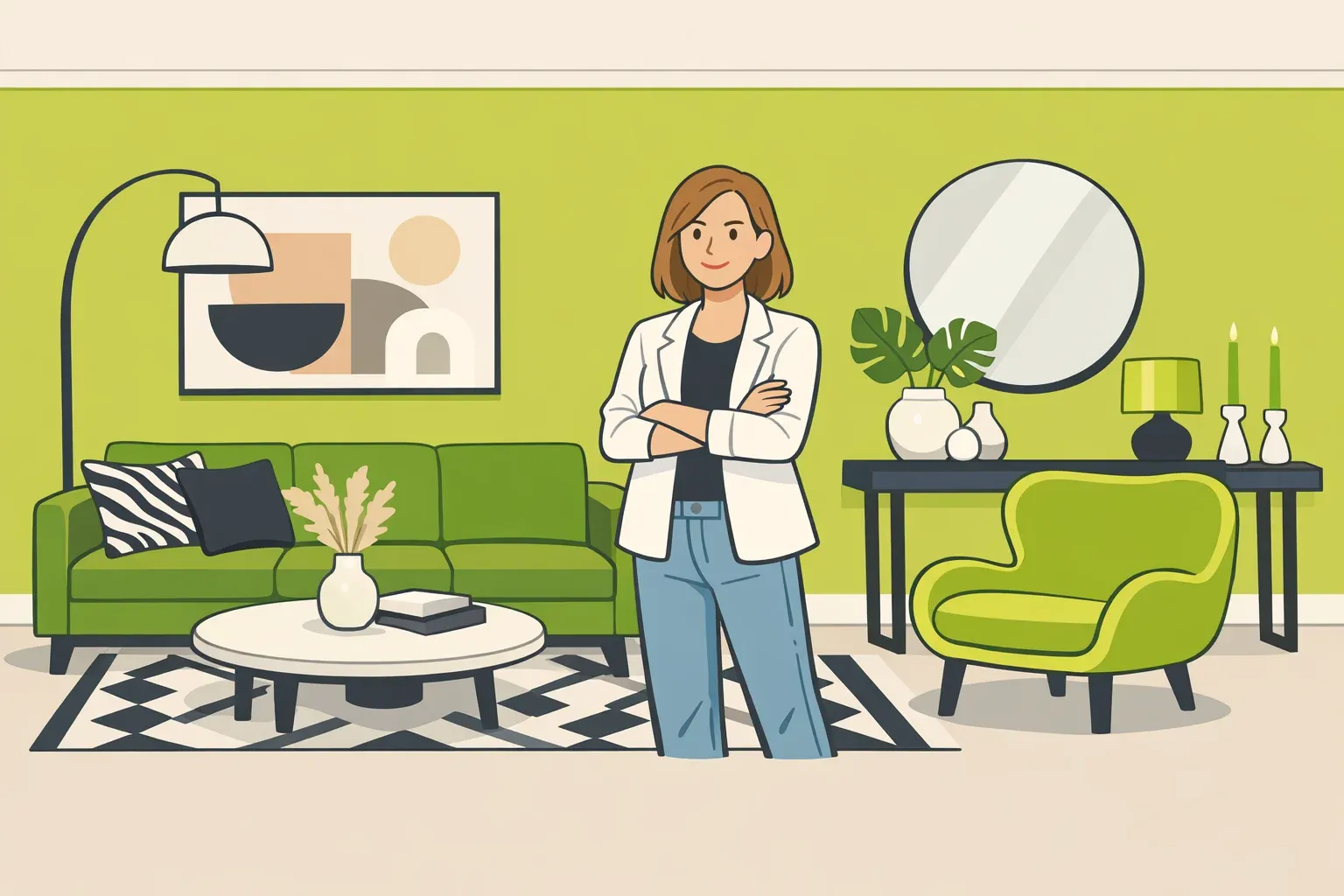
Chartreuse, the yellow-green that sits somewhere between a fresh tennis ball and a ripe lime, is one of those colors that designers either champion loudly or refuse outright. Yet here it is again in 2026, showing up at design markets worldwide, landing in Pinterest's boldest color palette for the year, and sitting at the center of Sherwin-Williams' annual campaign to spotlight its least tinted shade. Decorating with chartreuse has attracted coordinated attention from fashion runways, interiors editors, and paint brands all within the same cycle.
That last detail is worth sitting with. Each year, Sherwin-Williams identifies its least tinted shade to make a point about how popularity determines nothing. In 2026, they chose Offbeat Green SW 6706, a vivid citric lime, framing it as a statement about personal confidence in design. The campaign is marketing, not market research. But the tension it identifies is real.
A color that most people would pass over is being positioned as aspirational. The reasoning goes well beyond aesthetics. This isn't a case for painting every wall chartreuse. It's an examination of why a polarizing, uncommonly chosen color keeps drawing serious attention, and what that tells us about where home design is heading.
Why chartreuse keeps coming back: visibility without mass adoption
The current moment is not a chartreuse explosion in living rooms across the country. The sources here don't include survey data showing broad homeowner adoption. What's documented is something narrower but significant: editorial momentum, designer enthusiasm, and convergence across taste-making industries.
Etsy named chartreuse its color of the year back in 2020; Pinterest included it among four bold hues in its 2026 color palette; VERANDA editors spotted it across textiles, lighting, and tableware at design markets worldwide. That kind of parallel visibility across fashion, interiors, and paint strategy tends to precede broader consumer uptake, though it doesn't guarantee it.
Part of what makes chartreuse a recurring editorial subject is its unusual optical behavior. Sitting between yellow and green on the spectrum, it shifts noticeably based on what surrounds it and what light hits it, reading warmer in some conditions, cooler in others, more lime or more gold depending on neighboring colors.
VERANDA Style Director Rachael Rummel cites this dynamism as the driver of its current appeal in textiles and tableware specifically: "the color doesn't behave the same way twice," she told VERANDA. Designers who favor it describe it as capable of functioning almost like an unexpected neutral, one that adjusts rather than dominates. Its luminous, reflective quality can solve the problem of rooms that feel flat or uninspired in ways that neutral palettes only camouflage.
The Sherwin-Williams framing adds a third dimension to understanding why chartreuse keeps resurfacing. Positioning your least tinted shade as a confidence move reads as a response to something real in the market: editors and designers across multiple publications are actively pushing clients and readers toward homes that feel personal rather than presentable to hypothetical future buyers.
Sue Wadden, Sherwin-Williams' director of color marketing, put it directly in the campaign's press release: "The most authentic spaces are the ones shaped by what feels right to you, not by what's popular." Chartreuse just happens to make that argument impossible to ignore.
Why is chartreuse so divisive? The split between personality-first and safety-first design
This is the more interesting story, and chartreuse makes it unusually legible because the color forces a choice. You can't accidentally use it. It requires a decision.
Designer Cortney Bishop describes it plainly: "Chartreuse is not a filler color; it's a point of view. To me, it feels bold, unexpected, and slightly irreverent in the best way," she told AOL. New York designer Emily Eerdmans walks into her chartreuse parlor and describes the experience as "an antidepressant," a burst of energy she has built into her home deliberately, per VERANDA. These are not people who stumbled into a bold choice. They made an argument with their walls.
The skeptics are equally clear, and their objections are substantive rather than merely conservative. Designer Maggie Griesbeck of MNG Design says she would never advocate for chartreuse on a project, not because she avoids intensity, but because even small doses of it disrupt the calm she works to establish.
"Even in small doses, whether it's the cording on a pillow or an accent color on an ottoman, I find chartreuse overpowering, which creates a sense of unease in a home," she told VERANDA. Designer Cathy Purple Cherry raises a more practical concern: chartreuse is unusually sensitive to light, and the same wall can read entirely differently depending on the hour, the fixture temperature, and the angle of shadows, making it genuinely difficult to predict how it will live day to day.
The useful framework here is not "does chartreuse work" but "what is this room meant to do?" That question matters before any color decision, but chartreuse makes the stakes concrete. Rooms designed around calm, rest, or broad appeal to future buyers are poor candidates, according to several designers in the cited coverage. Rooms designed around personality, surprise, and a guest's first impression are where chartreuse consistently earns its use.
Purple Cherry notes that growing designer interest in "playful, jewel-box spaces" is creating new openings for the color. That framing is worth noting: the chartreuse conversation is partly about a specific color, and partly about a design philosophy that prioritizes the people who live in a space over the people who might someday buy it.
Decorating with chartreuse: how to use it without overwhelming a room
Given that even enthusiastic chartreuse advocates agree quantity controls everything, the practical guidance from designers reduces to a few durable rules. The chartreuse interior design conversation, across all the sources here, keeps returning to the same themes: scale, reversibility, room type, and material grounding.
Accents first, paint second
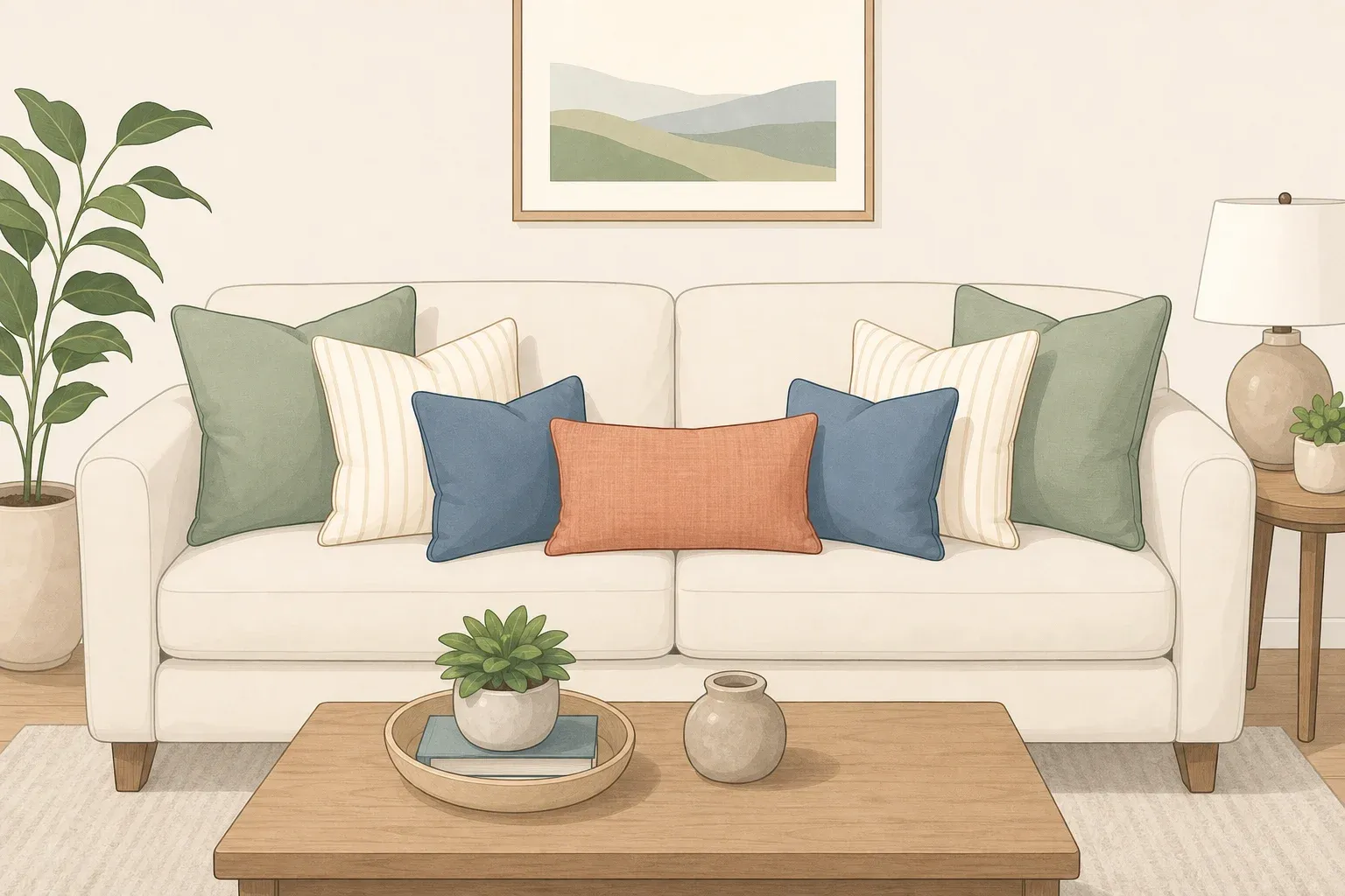
The lowest-risk entry point is textiles. Designer Rebecca McGee recommends throw pillows, blankets, and draperies as the natural starting place, because fabric delivers the color at lower reflectivity than semi-gloss paint and can be removed without preparation.
"Fabrics should help to soften the amount of vibrancy because it is typically not as reflective as, say, a semi-gloss paint." Small decorative objects, vases, glassware, Mahjong tiles, and wall art introduce chartreuse home decor at a scale where it reads as stimulating rather than consuming.
The jump to chartreuse wall color is a different commitment. On a single accent wall in a contained space, it can work well. Spread across an open-plan living area, it tends to overwhelm. Bishop puts it plainly: "The biggest risk with chartreuse is that it naturally commands attention. That can be wonderful when you want a room to feel memorable, but it can also create too much visual energy if it's used too broadly or without enough restraint," she said.
Where it works, where it doesn't
The rooms that come up repeatedly as ideal applications for chartreuse interior design are small and contained: powder rooms, butler's pantries, and the backs of mudroom cubbies. Bishop specifically names powder rooms and butler's pantries as places where "personality and a little surprise" are assets rather than liabilities. Purple Cherry adds ceilings, wainscoting, and botanical wallpaper pairings as options worth considering in those same contained contexts.
The bathroom vanity is a viable candidate, though Purple Cherry flags kitchen cabinetry as a riskier bet because cabinets dominate so much of the visual field in most kitchens, she noted to AOL. Bedrooms are broadly cautioned against by Bishop because the color's stimulating quality actively works against the environment a bedroom needs.
Large, open-concept living spaces carry real risk unless the architecture and natural light are genuinely exceptional, Bishop notes. This is worth taking literally: the same chartreuse accent wall that feels energizing in a small room with one window can feel relentless in a great room with 14-foot ceilings.
Style fit and material grounding
Not every design context suits chartreuse equally well. McGee pairs it with midcentury modern style, from a front door to an accent chair, and the logic holds: MCM's clean lines and warm woods absorb chartreuse's intensity without competing with it. Maximalist interiors are another natural fit. Purple Cherry notes that the current interest in jewel-box spaces creates an opening for the color that more restrained styles do not.
When it comes to materials and color pairings, Bishop's approach is consistent: "Chartreuse needs grounding. I love pairing it with warm woods, plaster, linen, stone, antique brass, woven textures, and anything with an organic softness. Those materials keep it feeling sophisticated," she said.
In color terms, creamy whites, camel, tobacco, olive, and muddy blues give the eye somewhere to rest. For those who want contrast rather than warmth, Emily Eerdmans suggests lilacs and delphinium blue while Globe & Crown's coverage notes that royal blue or deep plum can create a modern edge that reads lively without tipping into chaos. Chartreuse also pairs with grey, white, taupe, navy, and blush pink, Globe & Crown notes, giving it a wider range of workable palettes than its reputation might suggest.
The resale question
Purple Cherry recommends chartreuse only for "braver, more maximalist" clients and explicitly advises against permanent applications when resale is near-term. Bishop's position is consistent: keep it in paint, upholstery, and accessories rather than built-ins or cabinetry if you're not committing long-term. "It might not be the most universally appealing choice, so from a resale standpoint I would use it in ways that are easier to change, rather than in highly permanent applications, if resale is a near-term concern," she told AOL. That's three designers making the same call, not a fringe position.
What to take from this, whether you use the color or not
The evidence for chartreuse's moment is real but narrowly sourced: editorial observation, designer testimony, and brand campaigns, not consumer survey data or paint sales figures. What can be said clearly is that chartreuse is gaining visibility because it is difficult. It forces a decision about what a room is for. That decision is increasingly one designers and editors are encouraging people to make consciously.
Sherwin-Williams selecting its least tinted shade as a platform for a campaign about confidence is not accidental, as the June announcement made clear. It reflects a direction that design media and tastemakers are pushing: away from broadly acceptable presentations for hypothetical buyers and toward spaces that say something specific about who lives in them. Whether that direction constitutes a broad market shift is a different question, and the sources here don't settle it.
Chartreuse is not the point. The question behind it is: is this room designed to be livable for anyone, or livable for you? For designers and homeowners who have already answered that, chartreuse in the right application is less a trend decision than a confidence one. A powder room wall, a set of draperies, an accent chair in a midcentury room. For everyone else, the color's moment is worth understanding anyway, because the conversation it sits inside is already reshaping what rooms people want to live in.














Comments
Be the first, drop a comment!