



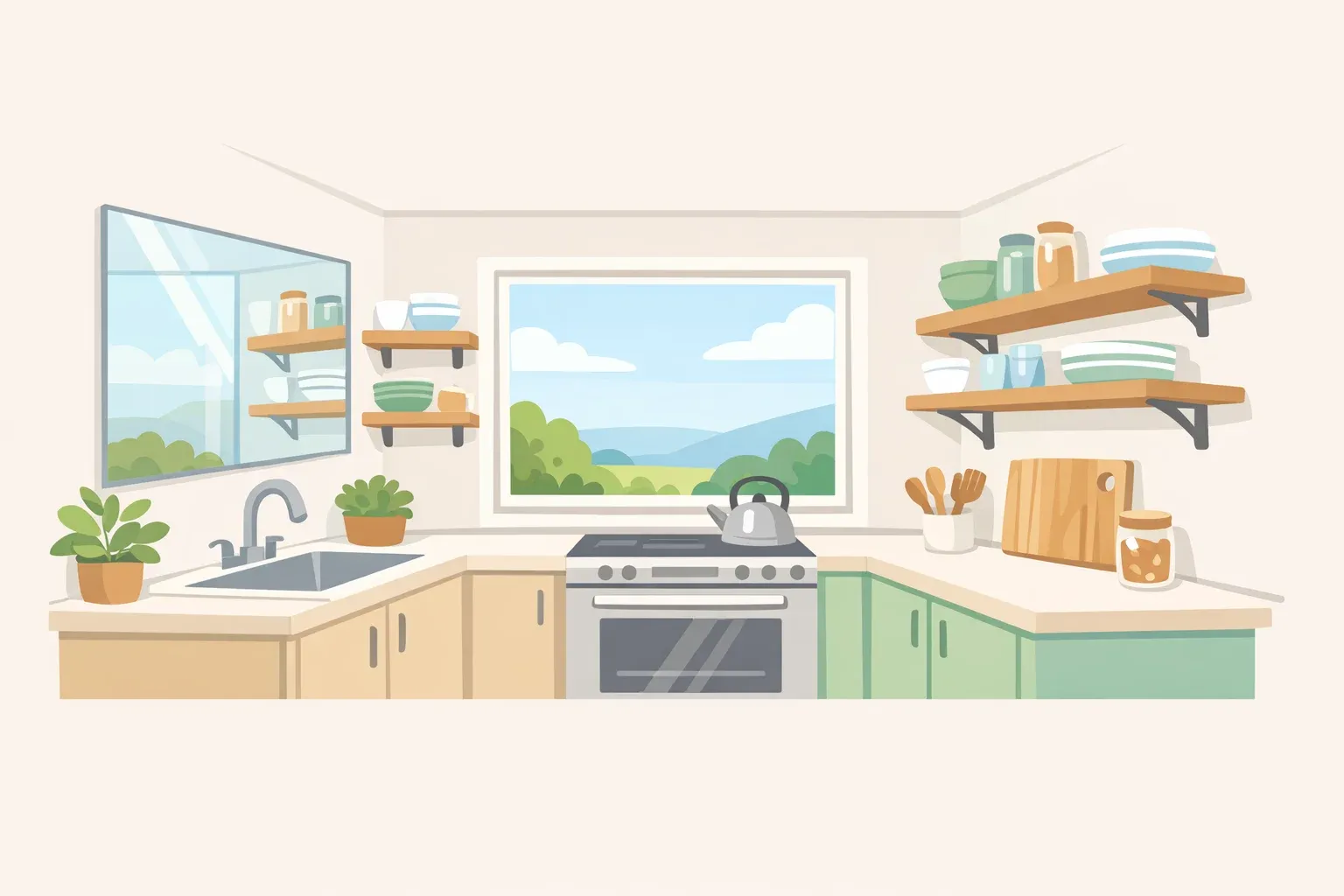
For 11 months, the homeowner lived with a 62-square-foot galley kitchen: one north-facing window, oak cabinets dating to 1987, and a room that felt, in her own words, "more like a closet" than somewhere worth lingering.
Two weekends and $2,347 in materials later, the appliances hadn't moved, the window was still north-facing, and the layout stayed put. The room read as open and airy anyway. That gap between what changed and what didn't is the whole premise of this guide: making a small kitchen feel bigger is rarely about adding square footage. It's about fixing what's tricking your eye into thinking the room is smaller than it is.
Designers are increasingly explicit about this. "Most small kitchens feel cramped because of what's blocking your line of sight, not because of square footage," says Michelle Squire, founder of Studio SQUIRE.
A 2024 study lends some backing to that idea: in simulated interiors viewed on screens and in VR, larger window and view access, along with natural, textured materials, measurably increased how spacious a space felt to viewers. The study tested 35 college students in a lab setting rather than homeowners in real kitchens, so treat it as supporting evidence, not proof of what will happen in yours.
This guide walks through a sequence: start with a free audit of your specific room, move through the lighting, decluttering, and surface fixes that don't require a contractor, then close with an honest budget and the functional limits a cosmetic refresh can't paper over.
Step 1: Audit the room before you buy anything
Before you touch a paint chip, figure out what's actually wrong, and do it with something more useful than a walk-through. Squire starts every project by standing in the doorway and tracing where the eye lands first, before she looks at a single sample. Borrow her method and make it concrete:
Photograph the kitchen from the doorway twice: once in daytime light, once at night with only the overhead fixture on.
Circle the darkest zone on the counter in each photo. That's usually the shadow band under an upper cabinet.
After a normal week, list every item still sitting on the counter with nowhere else to go.
Measure the clear aisle width with every appliance door open at once, not just closed.
Each result points somewhere specific. A dark counter zone is a lighting problem, which Step 2 covers. Items with no home are a storage problem, which Step 3 covers. A room that looks heavy and busy even with the counters wiped clean is a surfaces-and-sightlines problem, also Step 3. A tight aisle measurement is a limit worth knowing before you spend a dollar, which Step 4 comes back to.
Before choosing any finish, note where your numbers fall against a professional baseline. Kitchen-design guidance from retailer WC Supply, attributed to National Kitchen & Bath Association recommendations rather than any legal code, suggests a minimum 36-inch general walkway, 42 inches of aisle space for a single cook, adequate landing space beside the sink and refrigerator, and appliance doors that don't collide with each other when open. Treat these as benchmarks to check your kitchen against, not as code, and confirm anything electrical, structural, or ventilation-related with your local building department separately.
Hold onto your aisle measurement for Step 4: the case-study galley kept a 24-inch aisle even after its full refresh, well under the 42-inch benchmark above. That's a limitation worth knowing about now, not discovering after the budget's spent.
Small kitchen lighting ideas that make a tiny kitchen look bigger
Once your audit points to shadows or a dim corner, lighting is usually the cheapest thing on the list to fix, though "cheap" and "no electrician needed" aren't always the same claim, as the pendant example below makes clear. The move designers keep coming back to is pushing light sources to the edges of the room instead of the center.
Designer Jess Cooney replaces pendants with wall sconces and under-cabinet strips for exactly this reason, and Darlene Molnar avoids hanging fixtures in tight kitchens entirely because "pendants... can be visually obstructive."
For kitchens where the audit flagged a dark counter zone, under-cabinet task lighting is a low-disruption place to start. Squire uses this fix specifically to erase the shadow lines that make a kitchen "read as boxed in."
In the case study, a warm-white 2700K LED strip replaced a flat fluorescent fixture overhead. It worked, mostly: the homeowner had to add a second $47 strip near the stove because the first left cooking-area task lighting inadequate, a reminder that ambient glow can make a room feel bigger while still leaving you chopping vegetables in your own shadow.
If a statement pendant appeals to you, know what you're signing up for. The case study used an 18-inch hammered-brass fixture for $340, but installing it meant rewiring the junction box to handle a higher-wattage LED.
That's an electrical job, not a weekend swap, and worth confirming against local electrical code before you buy the fixture. Professional guidance also recommends dedicated task lighting at every work surface and GFCI-protected outlets at the counter, a useful baseline rather than a guarantee that any particular fixture meets code where you live.
Step 3: Declutter and unify surfaces, choosing storage by what's actually cluttering the counter
Lighting fixes what you see. Storage fixes what's in the way. If your audit turned up items with nowhere to go, add or improve concealed storage. If storage is already adequate but the room still looks heavy, the fix is lightening or unifying what's already there. Only consider removing cabinetry or opening a wall if you're already planning a fuller remodel.
If clutter is the issue, look up and down. Designer Kaitlyn Loos runs cabinets all the way to the ceiling for extra concealed storage and swaps lower cabinet doors for drawers, arguing it "makes organization and function much easier." Both are cabinetry-level projects, more involved than a paint job, but neither requires moving a wall.
If storage is already fine but the room still reads heavy, these small kitchen visual tricks target seams, not clutter. Cooney recommends carrying one material, like a counter finish, up the backsplash so the eye reads it as one continuous plane instead of a series of joints. Reflective finishes do similar work by bouncing light around the room: honed stone, glossy tile, and polished nickel all add depth a flat matte surface can't.
Open shelving can help, but only in moderation. Contractor guidance from Hanson Design Build Remodel recommends one or two open runs paired with strong closed storage elsewhere, reserved for daily-use items like mugs and glassware rather than pantry goods or the plastic-container collection. Put rarely used platters on an open shelf near the cooktop, and a design feature turns into a cleaning chore fast.
Two moves that show up often in small kitchen layout ideas deserve their own caution flag. Consolidating appliances onto a single wall, or opening a sightline into an adjoining room, can meaningfully change how a kitchen reads. Both typically involve plumbing, electrical, or structural work, which belongs in a larger renovation budget, not a weekend refresh. The case study in this guide didn't attempt either.
Step 4: Budget realistically and respect the room's limits
The case-study renovation itemized $2,347 in materials: walnut cabinet fronts at $890, limestone flooring at $620, the pendant at $340, under-cabinet LED strips at $47, brass pulls at $112, peel-and-stick tile at $128, paint at $68, and grout and supplies at $142.
Against the reported $2,847 total budget, that leaves roughly $500. Worth flagging: the source itself claims a $653 remaining buffer, a figure that doesn't reconcile with its own numbers, so treat any single project's math as illustrative rather than a firm benchmark.
That budget assumed two weekends of DIY work, and it only pencilled out because the appliances stayed white; replacing them "would've consumed the entire budget" (Journée Mondiale, 4 months ago). If your kitchen needs new appliances too, this isn't the budget template to copy.
Durability is worth planning around, not just admiring in photos. After two months, the veneer cabinet showed slight discoloration near standing water at the sink, and the peel-and-stick backsplash needs a 6-inch buffer from the burners because it can't tolerate direct heat. That's a two-month check-in, not a long-term performance record, so treat both materials as good-looking but somewhat fragile choices.
Before calling any project finished, return to your Step 1 measurements. A prettier kitchen isn't automatically a safer or more functional one. Professional guidance recommends 42 to 48 inches of work aisle and ducted ventilation of at least 150 CFM. The case study's 24-inch aisle is a constraint the homeowner worked around, not a layout worth copying.
Conclusion
Treat this as a sequence, not a shopping list. Run the sightline and clearance checks from Step 1 first. Solve whatever they reveal with the least invasive option: lighting before storage, storage before surfaces, and only after that anything touching plumbing, wiring, or walls. Skip the audit and the visual tricks in this guide just end up disguising a kitchen that doesn't clear the functional bar in the first place, rather than fixing one that does.

















Comments
Be the first, drop a comment!