



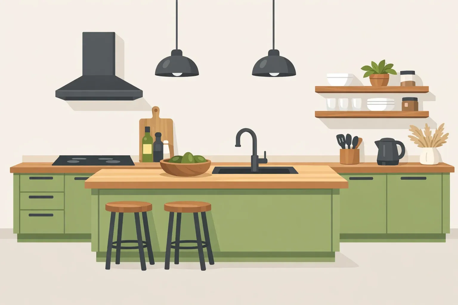
The practical fix for decorating with avocado green right now is to stop treating it like a bold statement color and start treating it like an earthy neutral. That's the direct advice from designer Alison River, who tells readers to think of the shade "instead of a statement color" when planning a room. Pair it with the right modern materials, and you can acknowledge the 1970s avocado green comeback without recreating a period room.
Here's why that works. Designer Cindy Praesel says today's avocado tones feel "less bold and more muted" than the original shade, and the real difference comes down to what surrounds the color, not the color itself. Quartz countertops, white oak, matte black or unlacquered brass hardware, and warm-white walls are what keep avocado green feeling current instead of dated, according to Praesel.
This guide covers how to decorate with avocado green through styling, sampling, and paint on furniture or walls, moving from the lowest-commitment options up to the biggest. Kitchen cabinetry and an island get discussed as an application to plan for, but a full cabinet repaint has its own material rules and cure schedule that vary by manufacturer, so that project belongs in its own guide rather than in these steps. Tile work, including a fireplace surround, is out of scope entirely here.
Why avocado green reads as a neutral now
Designers describe a broader shift away from all-white, minimalist interiors toward warmer, more personal spaces. Genna Jacobs Freeman says people are seeking color that feels like "connection rather than sterility" after years of stark minimalism, and that a muted avocado can sit quietly behind furniture, art, and hardware instead of competing with them (Better Homes & Gardens, this week).
Vogue's 2026 design coverage points to a related move: darker woods, and rooms that mix periods and materials instead of chasing one perfectly coordinated look. Paint brands are backing similarly muted greens. Behr's 2026 color, Hidden Gem, is a smoky jade, and Valspar's is called Warm Eucalyptus.
None of that guarantees a specific green will look right in your room, though. That's why the steps below start with sampling and palette-building before any paint touches a wall or piece of furniture.
Choose the application that fits your room and skill level
Decide up front which of these three tiers you're doing. That choice changes what you need to buy and how long the project takes.
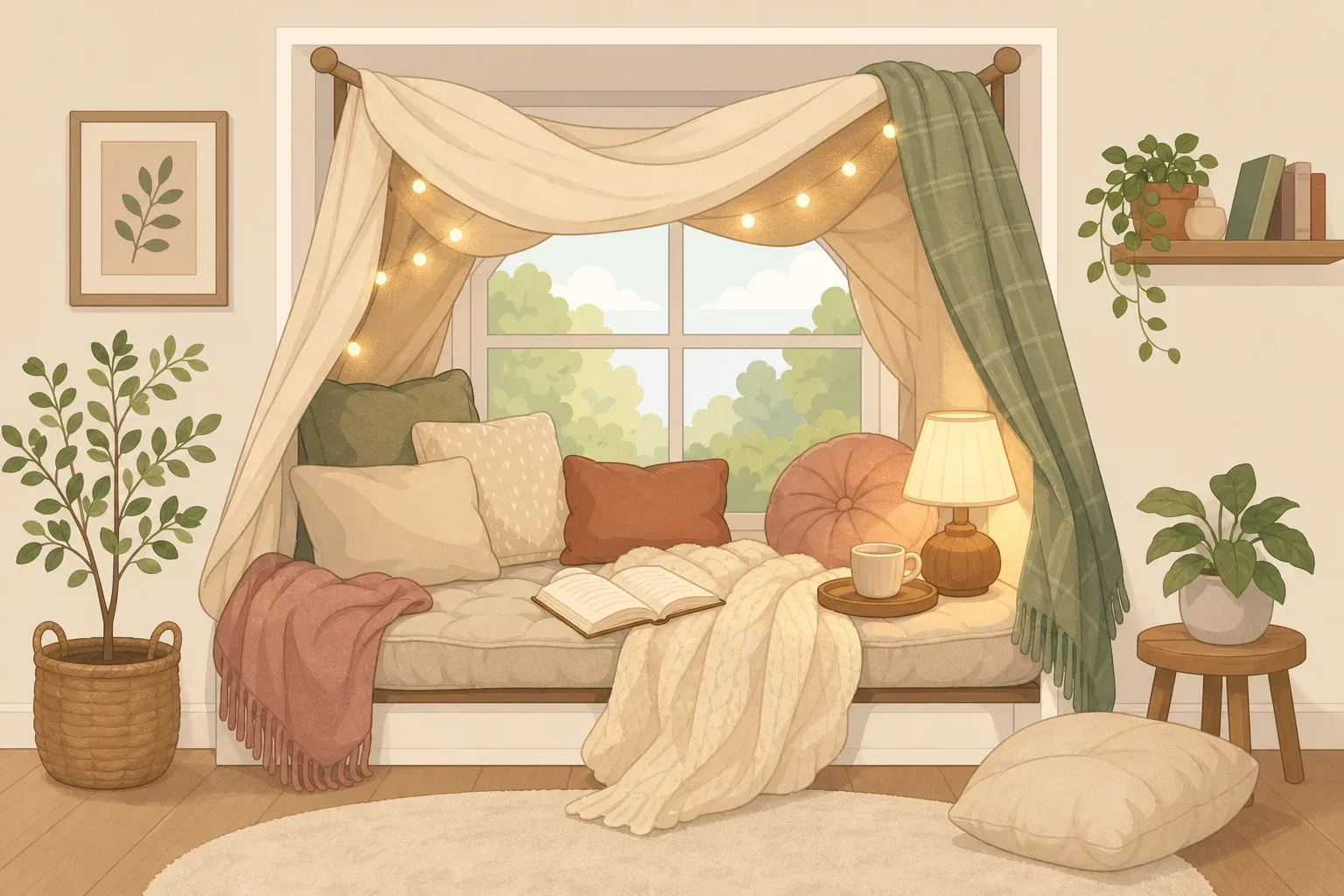
Styling only, no paint. Bring in the color through accessories, artwork, a vintage furniture find, or a single accent piece. Since no paint is involved, this works in a rental too, though it's worth checking your lease if you're hanging or mounting anything. River recommends this route when a full wall or cabinet run feels risky, suggesting readers introduce the color through "an upholstered sofa, a pair of dining chairs, kitchen stools, or even cabinetry" as an anchor piece.
Paint, on a contained surface. An accent wall, a piece of furniture, a powder room, or a child's room all work well here. It's a real paint project, so budget time for surface prep and cure, not just an afternoon with a roller. Designer Thecla Glueck names color-drenched powder rooms and children's rooms specifically as strong, contained entry points; she says the shade works as "a beautiful gender-neutral backdrop" in a kid's room.
Kitchen cabinetry or an island. Jacobs Freeman recommends cabinetry or a kitchen island as a way to make the color feel intentional without reading as overly trendy, since its earthy quality keeps it grounded even at a large scale. Treat this as a separate project once you've settled on a palette. Cabinet material, whether wood, laminate, or thermofoil, determines which primer and paint you need, and that decision has to come from the product manufacturer rather than a general guide.
Tile fireplace surrounds come up in the same design conversations, but tile-setting isn't covered in these steps at all. If you're considering avocado tile near a fireplace, check local code and manufacturer clearance requirements before you start anything.
Four avocado green color combinations to try
Designers interviewed by Better Homes & Gardens keep coming back to a handful of pairings. Treat these as starting points to test against your own room, not fixed rules, and place actual samples next to your existing floor, backsplash, or wood tones before committing to any of them.
Avocado green, warm white, white oak, and unlacquered brass. Jacobs Freeman describes this kind of combination as giving avocado green "panache" as a neutral.
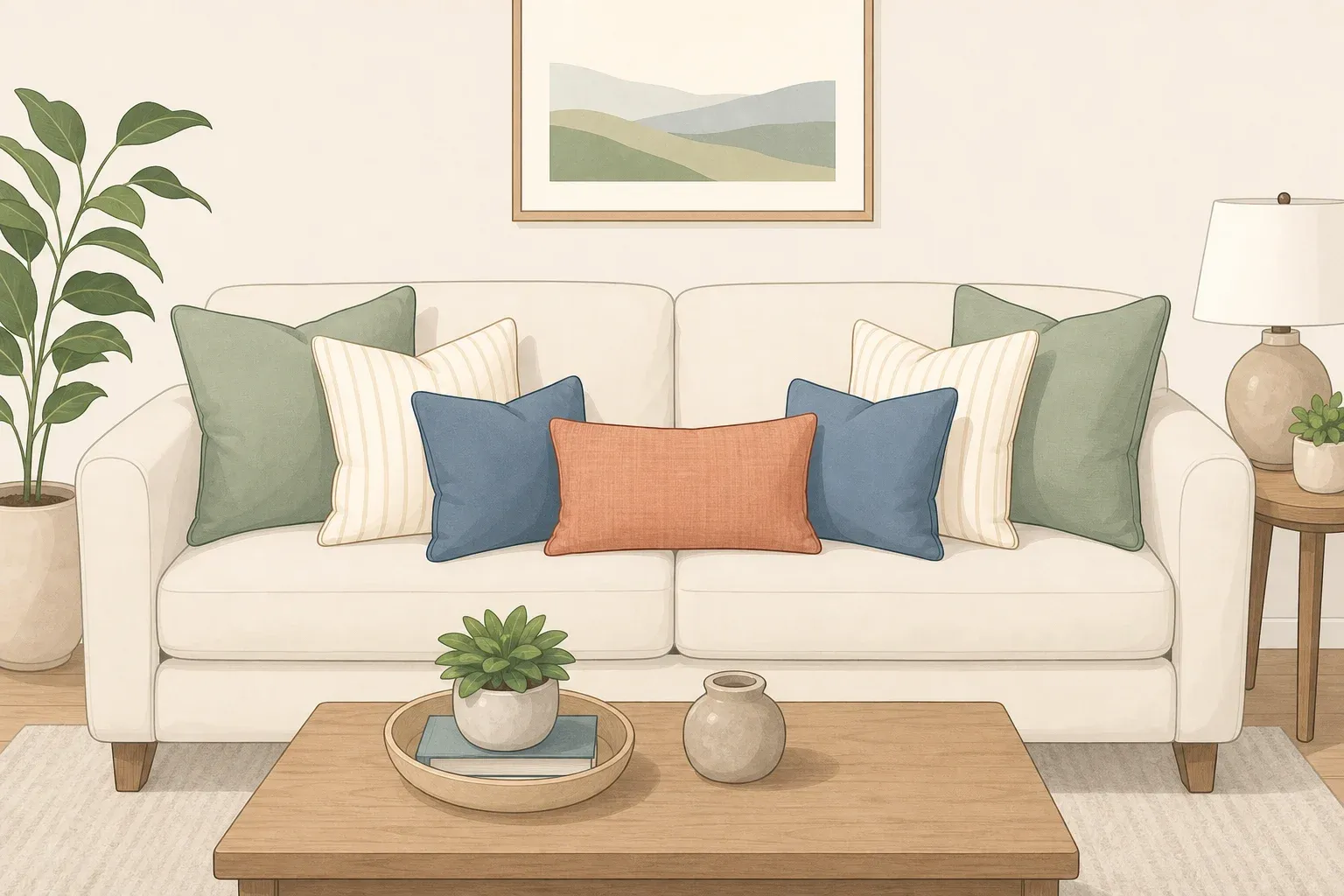
Avocado green, walnut, natural linen, and muted blue. One of River's preferred combinations.
Avocado green, terra-cotta, and camel. Another pairing from River.
Avocado green with one saturated accent, like saffron. Glueck suggests adding a rich color like saffron into an avocado palette to create depth and keep the room feeling organic rather than "overly retro." As a cautious first test, try it on a single movable piece, a pillow or a lampshade, before painting anything saffron.
How to decorate with avocado green: sample, pair, and apply it
What you need depends on which path you picked above.
Styling-only path: paint sample chips or peel-and-stick swatches, one or two textile or decor pieces you're considering, and a spot to view them in both daylight and lamplight.
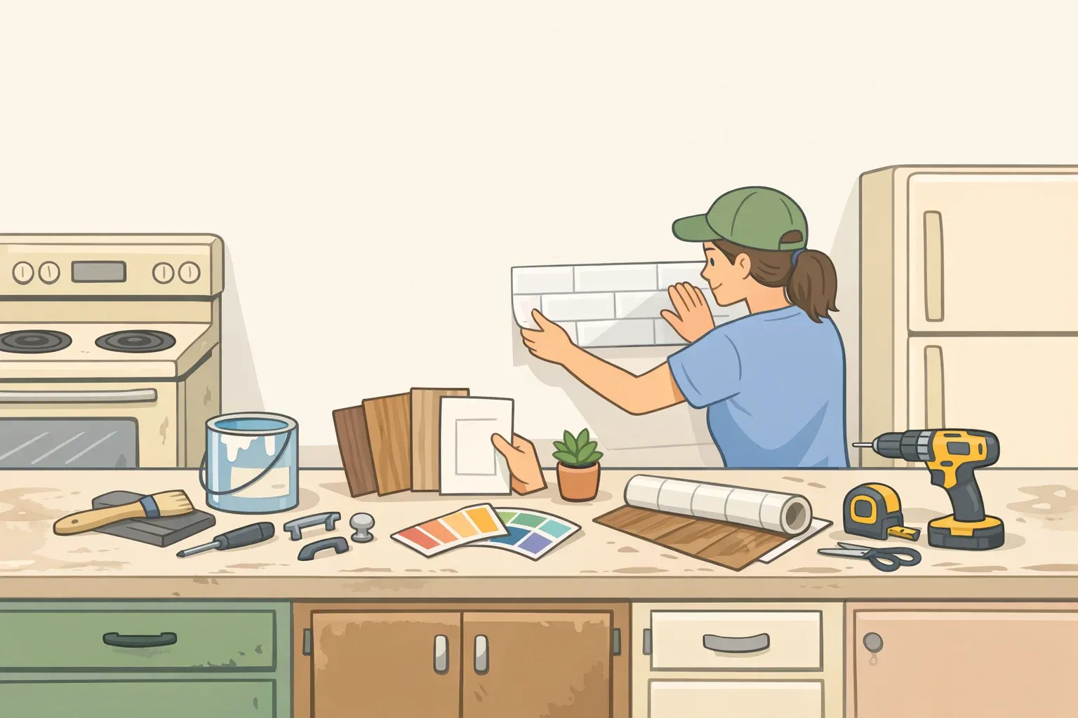
Paint or furniture refresh path: everything above, plus a quart-size paint sample, a sanding sponge or deglosser for previously painted or finished surfaces, a tack cloth, and painter's tape.
1. Sample the shade in your actual lighting before buying full-size paint. Current avocado tones run muted, so they can look different under daylight than under a warm bulb. View the sample on the intended surface at two different times of day. Success looks like a soft, grounded green in both lighting conditions, not gray, not olive-drab, and not unexpectedly bright.
2. Test your palette against the sample before you apply any color. Set the sampled green next to the wood tones, hardware finish, and wall color you're considering from the combinations above, along with any flooring or backsplash you're keeping. You'll know it's working when none of the pieces fight each other. If the green makes the wood look washed out or the hardware look mismatched, swap that piece before you buy full-size paint.
3. Prepare the surface before applying paint. Clean and degrease it, then sand or degloss any existing finish so the paint has something to grip. Check the paint label for a dry-to-touch time and, if it lists one separately, a longer full-cure time, and follow the longer figure before putting the surface into regular use. If the surface is damaged, delaminating, or you're not sure what the existing finish is, stop and check the manufacturer's guidance or bring in a professional refinisher before going further.
4. Apply the color. Follow the product's recommended number of coats and recoat times rather than rushing to a second coat before the first has set up. Success looks like even coverage with no lap marks. A coat can feel dry to the touch well before it's actually cured, so give it the full time the label specifies before setting anything on it.
5. Bring in the tested palette and finishing accents once the paint is fully cured. Install or style the wood tones, wall color, and hardware you tested in step 2. This is also the point for optional retro-inspired extras: velvet, chenille, boucle, a vintage rug, or sculptural lighting like smoky-glass pendants or ceramic lamps.
The mistake most worth avoiding is recreating a literal 1970s room. Mustard-and-brown palettes, wall-to-wall shag, and overly matched retro furniture read as costume rather than design, according to House Beautiful's roundup of designer advice on retro styling. Designer Kasandra Rafter puts it plainly: "It's not about copying a decade, it's about capturing a mood."
Stop-before-painting checklist
Run through this before you open a can of paint:
Have you viewed the sample in daylight and lamp light, on the actual surface?
Have you checked it against the wood, hardware, and existing floor or backsplash you're keeping?
Do you know whether your surface is raw, previously painted, or a material like laminate that needs a specific primer?
Do you have time in your schedule for full cure, not just dry-to-touch time, before the surface needs to go back into use?
If this is cabinetry or tile, have you set it aside as its own project with manufacturer-specific instructions rather than folding it into a weekend paint job?
If you can't check every box, wait and gather what's missing rather than starting the coat.
Adjustments and troubleshooting: if the room feels dated instead of fresh
Work through these fixes in order, cheapest and easiest first.
Reduce competing retro elements first. If a saturated pattern, a themed accessory, or a mustard-and-brown item is fighting with the green, remove or swap that one piece before touching the paint. Rafter's point about forced retro styling looking like a costume applies here: the piece leaning hardest into a single decade is usually the one to pull first.
Add warmth through small, swappable pieces next. Bring in warm-white textiles, linen, or a wood-toned accessory instead of repainting, using pieces you may already own before buying new ones.
Update small hardware or lighting accents. Swapping cabinet pulls for matte black or unlacquered brass is a low-cost reset that doesn't require new paint or furniture. A plug-in lamp is a lower-risk swap than changing a hardwired fixture; if you want to replace a wired fixture instead, bring in a licensed electrician rather than doing it yourself unless you're trained for that kind of work.
Limit avocado to one focal application at a time. If you've already committed to cabinetry or an accent wall, hold off on adding a second large avocado surface until you've lived with the first one.
Reserve major material changes for planned renovations. Countertop or cabinet-box replacement isn't a casual troubleshooting step. Treat it as its own project with its own budget and timeline, not a quick fix for a color that feels slightly off.
Live with it before judging it
Before deciding a new avocado green space isn't working, check it under both daylight and evening lamp light, the same way you sampled it in step one. A shade that read well on a small chip can still surprise you once it covers a full wall or a run of cabinets, and that's normal, not a sign the color was wrong.
If something still feels off, change one textile or accessory first: a throw pillow, a lampshade, a small piece of hardware, before jumping to a repaint. From there, work through the troubleshooting list above in order: remove competing retro patterns, add warm neutral accents, then update small hardware before considering anything bigger.
If you started with the low-commitment styling path and it's working, move up one level, a single anchor piece or a contained wall, rather than jumping straight to cabinetry or multiple rooms at once. And if any part of the project involves tile, a fireplace surround, or a structural change, stop and bring in a professional. The paint and styling steps above cover everything short of that.














Comments
Be the first, drop a comment!