Reviewed by: Y. Garcia
Ever wondered why some homes feel polished and intentional while others seem off? Professional designers have spent years learning what works and what does not. Many common decorating choices that seem harmless can make your space look amateurish or dated.
Most of these mistakes have simple fixes that will not break your budget, according to Good Housekeeping. Whether you prefer clean minimalism or bold personality, skipping these designer no-nos helps you create a home that feels both comfortable and sophisticated.
Skip the cheap hardware—it shows more than you think
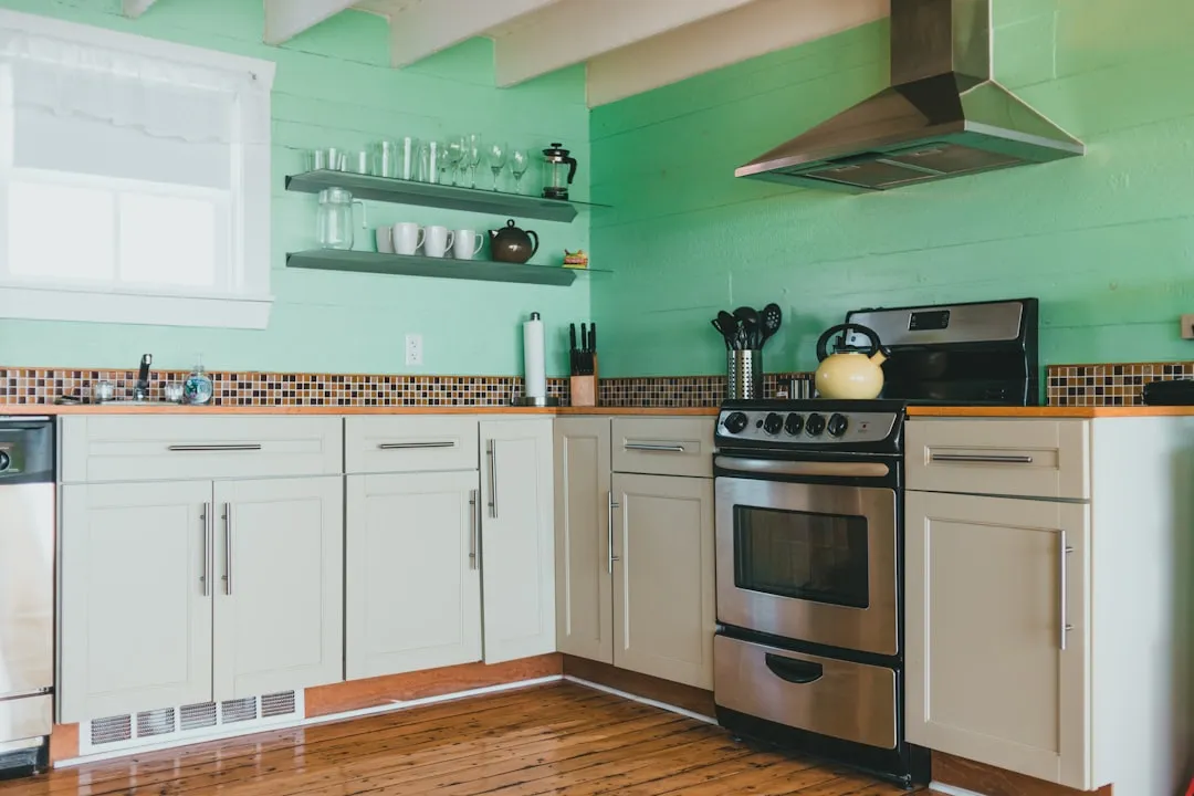
Here is something that might surprise you: cabinet hardware is basically the jewelry of your home. You know how a great pair of earrings can elevate an entire outfit? Same idea here. Good Housekeeping points out that cheap powder-coated pulls and knobs will instantly cheapen your entire space, no matter how expensive everything else looks.
The good news? This is one of those fixes where a little investment goes a long way. Quality hardware on budget cabinets can elevate the whole look instantly. Think about it this way: spending $200 on solid brass or stainless steel pulls can make a $2,000 cabinet look like it costs twice as much. It is basically magic, but with screwdrivers.
Instead of falling into the matchy-matchy trap, try specific hardware pairings that create intentional contrast. Pair warm brass cabinet pulls with cool stainless steel appliance handles, or combine matte black drawer pulls with polished chrome faucets. Apartment Therapy notes that designers never use matching furniture sets in their own homes because they create flat, uninspired spaces. The same principle applies to hardware; mixing finishes adds visual depth.
Do not overlook the small stuff that ties everything together, either. My Bespoke Room reminds us that finishing touches like handles, light switches, and outlet covers might seem minor, but they create visual cohesion throughout your home. When everything flows together, your space feels polished rather than piecemeal.
Rethink your lighting strategy completely
If you are relying only on overhead fixtures, you are basically creating the interior design equivalent of unflattering fluorescent office lighting. Good Housekeeping reports that this approach makes any room feel flat and unwelcoming. Professional lighting design uses three layers: ambient for general light, task for focused work, and accent for highlights. That single ceiling fan with lights? It is doing none of these jobs well.
Bulb selection matters just as much. The Spruce warns that oversized recessed lights look dated, while blue-hued bulbs create that unwelcome hospital feeling nobody wants in a living room. The fix is simple, switch to soft-white LEDs and add table lamps, sconces, and pendants for visual interest.
Here is a budget-friendly hack that is perfect for renters: Redesign Daily suggests using rechargeable sconces to add layered lighting without electrical work. Position them at eye level flanking artwork or mirrors for an instant upgrade. Designer look, no electrician, no landlord approval.
Get your scale and proportions right
Nothing screams amateur hour like furniture and decor that are the wrong size for your space. You have seen it before, tiny artwork floating on a huge wall, or oversized chairs crowded around a dining table meant for dolls. Good Housekeeping emphasizes that the scale should relate to your room size and the surrounding pieces.
This is especially crucial with area rugs, where size matters more than most people realize. Small area rugs make spaces feel incomplete and choppy, like trying to cover a swimming pool with a hand towel. Good Housekeeping notes that properly sized rugs anchor furniture groupings beautifully. For a standard sofa, your rug should be at least 8x10 feet, with 6 to 8 inches extending beyond each side. Camille Styles adds that the rug should sit under at least the front legs of your sofa and chairs, if not all legs.
Pro tip that saves you from costly mistakes: use painter's tape to mock up sizes before committing to nail holes. Camille Styles points out that hanging art too high is incredibly common, pieces should sit at eye level, around 57 to 60 inches from the floor. One small tweak, big difference.
Avoid the trendy trap
Here is the thing about chasing every design trend, it sets you up for a space that feels dated within months. Good Housekeeping reminds us that trends are short-lived. Smart designers keep neutral elements for larger, permanent pieces and add trends sparingly through easily changeable accessories.
Some trends have already overstayed their welcome in a big way. Take boucle fabric, for instance. Homes and Gardens notes that what once felt fresh and modern now appears everywhere from every sofa to every ottoman, creating visual déjà vu. Similarly, Better Homes and Gardens reports that barn doors and exposed pipe shelving have become visual clichés that immediately date a space.
The smarter approach, focus on creating spaces that reflect your personality and lifestyle rather than whatever social media algorithms are pushing this week. When trends dominate design decisions, homes lose their authentic character and feel like temporary Instagram sets. HuffPost suggests adding trends through smaller items like throw pillows, lamps, and coffee table accessories that you can refresh later when your tastes evolve, or when that trend becomes the new "live, laugh, love" sign.
Clean up the visual clutter
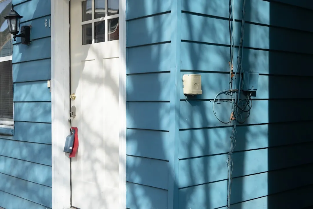
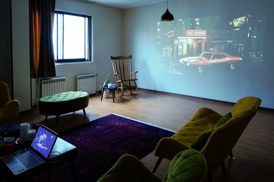
You might not realize it, but exposed cords and tangled cables are visual noise that disrupts your room's flow more than you think. Good Housekeeping points out that cable management systems and cord-hiding solutions maintain that clean, sophisticated look you are after. Use adhesive cord clips under desks or invest in a cable management box for entertainment centers. Even painting electrical outlets and switch plates to match your wall color can make a dramatic difference, like hiding the seams in a well-tailored suit.
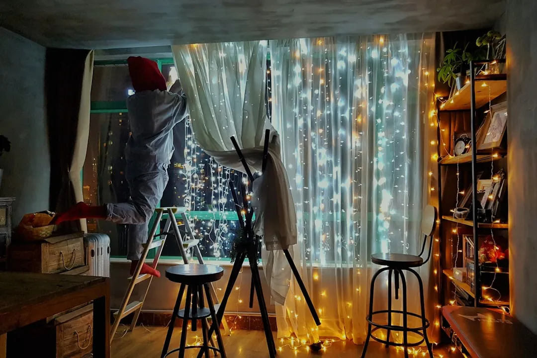
This attention to detail extends to window treatments, where ill-fitting curtains can make otherwise polished rooms look sloppy. The Spruce notes that store-bought panels are often too short, too long, or feature rod pockets that make them difficult to operate smoothly. Meanwhile, Living Etc warns that thin, flimsy curtains or plastic blinds instantly cheapen a room, while solid curtains in natural fabrics add polish.
Here is something that might seem minor but creates big visual impact: heavily textured walls can be tricky to work with and may make some spaces feel dated, so consider smoothing them out to create a clean backdrop for paint, art, and decor.
Investing in smoothing them out creates the perfect backdrop for paint, art, and decor to shine. Think of smooth walls as the equivalent of good lighting for your face; everything just looks better.
Focus on what really matters
The biggest mistake, trying to fill every space immediately instead of thoughtfully curating pieces over time. Southern Living points out that designers never buy furniture just to fill a room; they are thoughtful in their approach and would rather wait for something specific than choose something safe. Your home should tell your story through meaningful pieces, not random purchases made to quickly complete a look.
What you are aiming for is a space that prioritizes function alongside beauty, creates visual interest through varied textures and scales, and feels authentically like the people who live there. Yahoo Shopping notes that choosing quality pieces and decorating with intention creates a home that feels stylish and personal.
Remember, every great home shares a few fundamentals: great lighting that transforms the space, properly scaled furniture that feels balanced and comfortable, and thoughtful details that tie everything together.
The goal is not to impress visitors with the latest trends; it is to create a space where you genuinely love spending time and where every element has a purpose and tells part of your story.










Comments
Be the first, drop a comment!